Florida Panthers
How the Florida Panthers Maximize Their Workflow & Win New Clients Using Visme.
Build professional graphs and charts in minutes with 50+ chart types, live data from Google Sheets and Excel, and your brand applied automatically.

 4.5
4.5
 4.5
4.5
Bar graphs, line graphs, pie charts and more, pre-designed and pre-formatted. Pick a template, plug in your data and your graph is project-ready.
Chart types, data integrations, brand control and collaboration compared side by side.
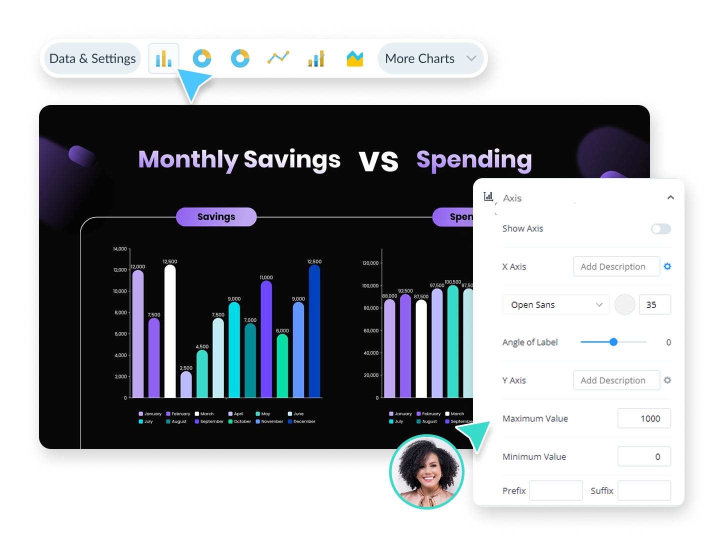
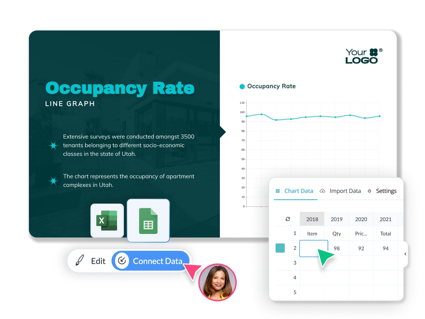
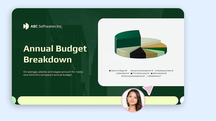
Produce reports, dashboards and campaign recaps in record-breaking time.
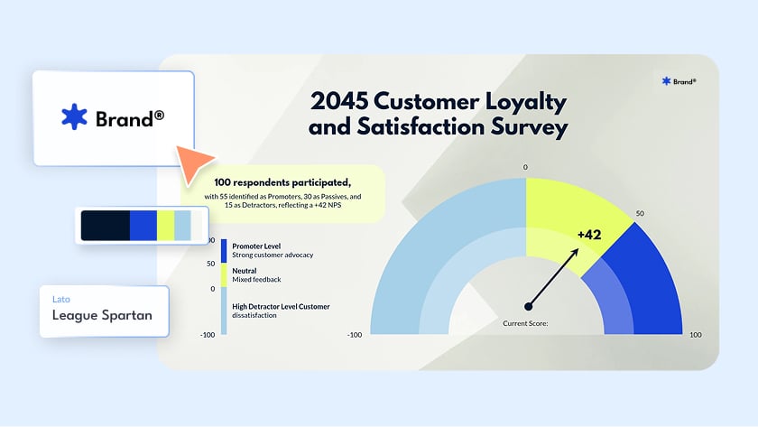
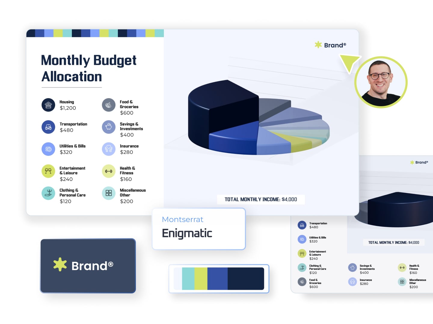
Keep every deliverable on brand with AI templates tied to your team's identity.
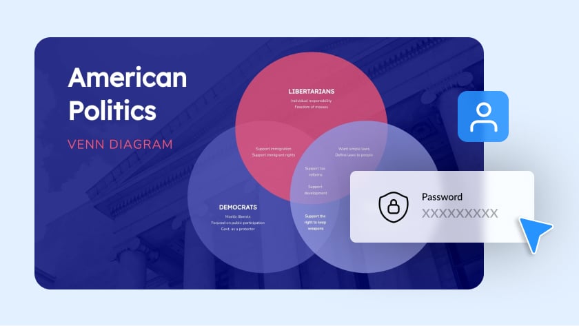
Enable privacy controls, including password protection and encryption, while scaling design output across departments.
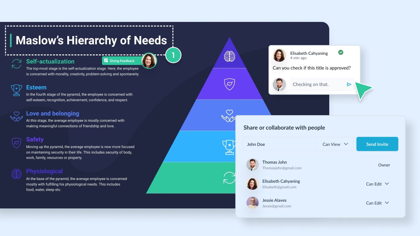
Improve synergy across departments with all the controls you need to ensure consistency, communication and visibility.
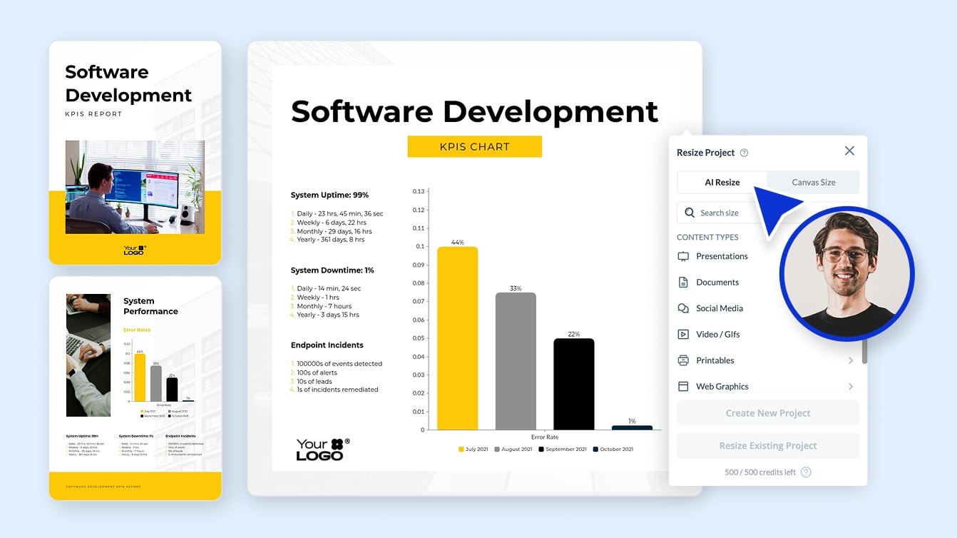
Create winning content for all your print and digital needs, including proposals, reports, social media posts, videos, signage, internal presentations and more.
Make charts fast by generating customizable first-draft data visualizations. Find the chart maker inside the Visme dashboard or the template library. It takes your descriptive text prompt and generates pie charts, area charts and more in less than two minutes.
Learn more about the various chart types available in our graph maker and find the right one for your project below.
You can make graphs at no cost on Visme’s free plan, which includes chart types, templates and online sharing. Paid plans add premium features like your Brand Kit, data integrations and more download formats. See the pricing page for current plans.
Download your graph as a PNG, JPG or PDF, share it with a live link, or embed it on any webpage with HTML code. Embedded graphs connected to Google Sheets stay in sync as your data updates.
Visme is the best graph maker for professionals who need branded, presentation-ready visuals with live data connections. Spreadsheet tools like Excel and Google Sheets handle quick internal charts, while dedicated BI platforms suit heavy analytics workloads. For visuals that go in front of clients, leadership or the public, a design-first graph maker wins. See how the options compare.
All graphs are charts, but not all charts are graphs. A graph specifically plots mathematical relationships between numeric variables, like a line graph showing revenue over time. A chart is the broader category and includes non-plotted formats like pie charts, tables and flowcharts. In everyday business use, the terms are interchangeable.
Use a bar graph when comparing values across categories or tracking change over time, and use a pie chart when showing parts of a whole with six or fewer segments. If your segments are close in size or you have many of them, a bar graph will always read more clearly.