Free Chart Maker for Making Beautiful Charts Online
- Fully customizable chart maker with a number of different chart types.
- Visualize your data within minutes with our online chart maker tool.
- Create beautiful charts that are easy for your audience to understand.
Chosen by brands large and small
Our chart maker is used by over 34,300,000 marketers, communicators, executives and educators from over 133 countries that include:
EASY TO EDIT
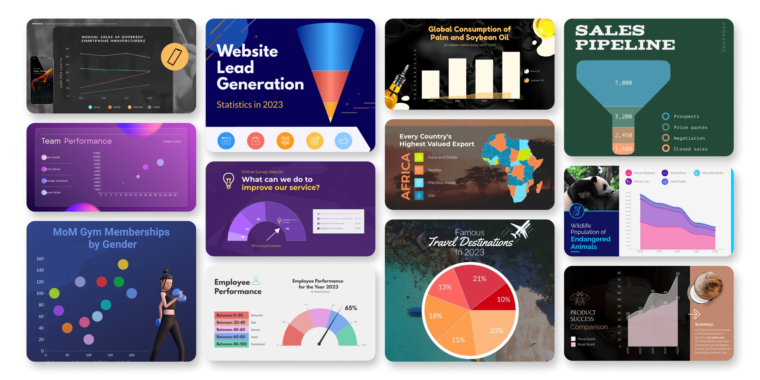
Chart Templates
Create custom charts online with our free and easy-to-use chart templates and data widgets. Whether you need a comparison chart maker or a radar chart maker, there is a chart type for you to drag and drop onto your design. Start with one of our premade infographic or presentation templates to showcase your chart.
Features of the Chart Maker
Beautiful chart templates
Log into your Visme dashboard and click Create to get started. Choose a template for any type of project, whether it’s a presentation, an infographic or another design. Many of our templates are premade with chart templates right inside so you can customize them with your own data. You can easily add any chart types to any template by choosing a chart from the Data tab.
Build your chart
Once you’ve logged into the free chart maker, you can easily add any type of chart to any design. Just click on the Data tab and choose from our 16 chart types and many more data widgets to find the perfect representation of your information. Choose your animation, your colors, your fonts, your X and Y axis labels and more.
Customize every aspect of your chart to share easily understandable information
Instead of throwing a bunch of numbers and statistics in your audience’s face, why not turn it into a chart? This helps you to showcase data at a glance and create a way for your audience to easily understand what your numbers mean. Not everyone can visualize data right off the bat, and using our free chart maker to create a visual aid can be helpful for your audience.

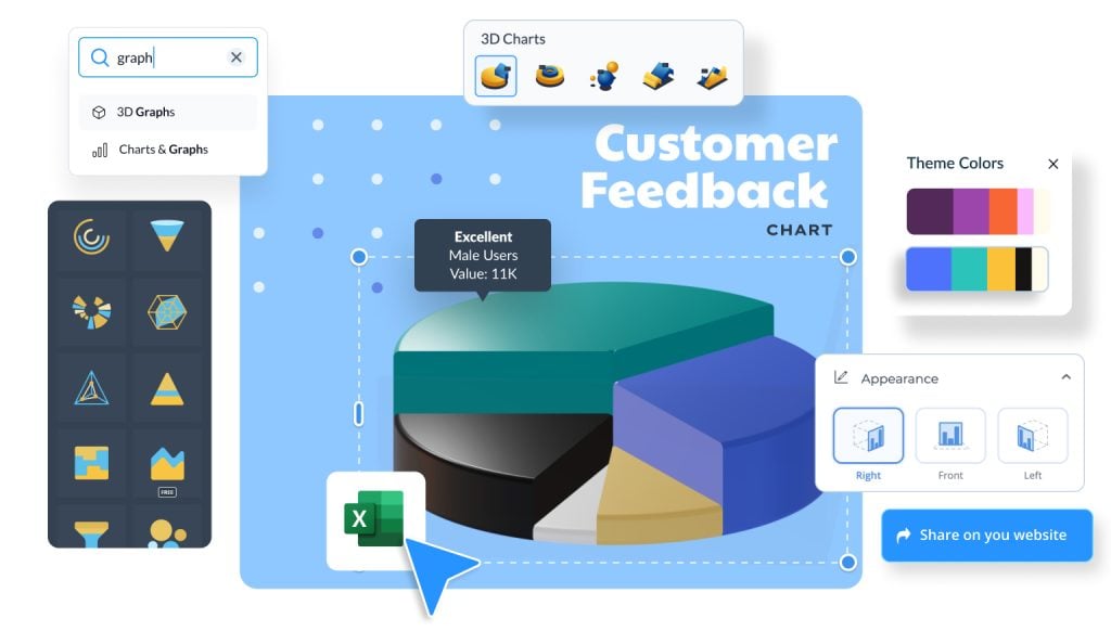
Add interactivity with 3D Charts & Graphs
Elevate your data visuals with interactive, fully editable 3D charts and graphs - no coding or design experience needed. Choose from 3D line, multi-line, bar, pie, ring, and bubble charts, customise colours, labels, and rotation, and create a modern, professional look that few tools can match.

More Great Features of the Chart Maker
-
Over a dozen different chart types to help represent your data
-
Customize each color in your chart to match what it visualizes
-
Name your X- and Y-axis to let your audience know what they’re looking at
-
Easy drag-and-drop design tools, made with the non-designer in mind
-
Choose from our popular free fonts for your chart title and labels
-
Embed an interactive chart on your website or save as an image file and share
Share Your Chart
Our chart maker automatically animates each individual piece of your chart. This allows you to create online charts and embed them on your website or share a link to your chart. You can also download a static chart as an image or PDF to share. Place your chart in a larger infographic or presentation or share it on social media.

LEARN ABOUT CHARTS
What is a Chart?
A chart is a visual representation of data and statistics. When you create a chart in Visme’s free online chart maker, you’re able to input your own data manually or import an Excel or Google spreadsheet. Your chart will automatically update to fit the data you insert.
Creating professional charts online is easier than ever with our chart maker. Customize it to match your company’s brand colors and fonts or choose a color scheme that matches your chart topic. Create an area chart, bar chart, line chart and more.

Use the chart maker to visualize your data.
While you can always tell your audience what your data means, what better way to persuade them than by creating a visual aid? Looking at a visual can actually resonate better with your audience than reading numbers. If there’s a large difference in categories, being able to see it in a chart can have an even bigger effect.
EVERYTHING YOU NEED + MORE
More than a Chart Maker
Create charts that stick with your audience and help them to further understand your data. You can use it as a pie chart maker, a line chart maker, a table chart maker, a bar chart maker and more. Use the chart maker however you need to create beautiful custom charts that sell your point.
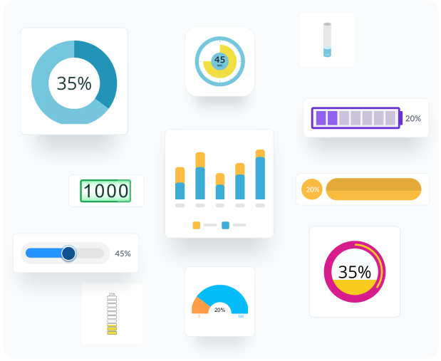
VISUALIZE YOUR DATA
Charts & Graphs
Choose from different chart types and create pie charts, bar charts, donut charts, doughnut charts, pyramid charts, Mekko charts, radar charts and much more.
MAKE IT ENGAGING
Interactivity
All of Visme’s charts give you the option to add hover-over legends that give your audience more information and make your charts engaging.
BEAUTIFY YOUR CONTENT
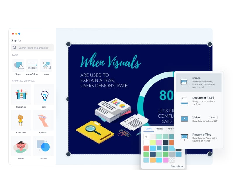
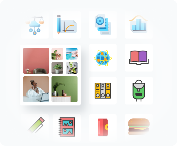
Images & Graphics
Choose from over a million stock photos, icons, illustrations, characters, lines, shapes and more to decorate your chart and make it engaging.
HOW IT WORKS
How to Make Charts in 5 Steps
Create custom charts that help showcase any type of data or statistics for your audience. Create pie charts, line charts, bar charts and more with our free online chart maker. Use these online charts in your infographics, presentations, social media graphics, reports and anything else you can create with Visme.
Watch our quick video tutorial or follow along with our five-step guide below to start creating your own chart.
- Log into Visme and open a new project in the dashboard.
- Click the Data icon in the left navigation menu to access the available chart types and choose the chart that best represents your data.
- Input your data manually or by importing an Excel sheet or Google spreadsheet.
- Customize your colors, fonts, background and more.
- Download your chart as an image file and share on your website, on social media or in an email newsletter.
QUICK TIPS
How to Use the Chart Maker
Log into Visme to access the chart maker. Start a new project and choose a template based on how you want to showcase your data.
Once you’ve chosen a starter template, click the Data tab in the left sidebar to find your chart type. You can choose a table chart, a line chart, a radar chart or any other chart type you need to properly visualize your data.
The chart maker already has some data examples to help you create your own. If these don’t help, you can start from scratch.
Input your data and decide the way in which the data will be shown. With decimals or percentages, in unitary bars or groups of bars and where the legend will be placed.
Customize the fonts in your chart. The Settings tab in the bar graph maker will let you customize the font size and color as well.
Color code the chart elements to match your brand or your topic. You can also customize the colors of the axis lines and the background.
If you are working on an interactive infographic or presentation, customize the animation setting to add extra emphasis to your data. There are four animation options to choose from.
Download your finished design from the chart maker as a high resolution image file to share with your audience. You can also generate an online link or embed the animated chart onto your website.
Bar Graphs
Line Charts
Pie Charts
Scatter Plots
Other Charts
A bar chart is a simple way to visualize a distribution of data points or compare metric values across different subgroups of your data. It uses bars of various lengths, where each bar represents a category and the longer the bar, the bigger the value. You can use a bar chart to compare two or more categories, such as sales by region or product.
A line chart is used to show changes over different short and longer periods. It is created by connecting a series of data points or markers with a line. This chart type is commonly used to monitor changes, such as stock prices over a year or the growth of website traffic over several months.
Pie charts are circular graphs that show how a whole is divided into different parts. Each slice of the chart represents a category, and its size shows how much of the whole it represents. You can use pie charts to show market share, survey results and budget allocations.
Scatter plots are used to observe and display the relationship between two variables. This chart type uses dots on a graph to represent the values of the variables. Scatter plots can be used for many things, like showing the relationship between marketing spending and sales growth, tracking stock price changes and comparing customer satisfaction scores with product features.
Who can benefit by using our chart maker?
Data Analysts
- Turn complex data for detailed insights for decision-making
- Design charts to easily communicate trends and patterns
- Compare and analyze data points to make strategic findings
Educators
- Design fun and engaging charts for students and trainees
- Customize charts with colors that match the topic's themes
- Use charts to track student details and retention rates
Marketing Teams
- Create charts to track marketing activities and campaigns
- Present stylish charts in reports to make data more attractive
- Design charts for marketing content, such as blogs and social media
Business Professionals
- Create charts for quarterly reports, business plans, and presentations
- Present financial data and performance metrics clearly to stakeholders
- Use charts for quick data interpretation and strategic decision-making
Researchers
- Design charts to quickly present findings to investors or stakeholders
- Use charts to compare experimental results and draw conclusions
- Create interactive charts without the need for a designer
Consultants
- Illustrate client data insights with colorful charts and graphs
- Add beautifully designed charts in proposals and presentations
- Showcase past client success rates and results in charts
Questions about the Chart Maker
How much does it cost to create a chart with the chart maker?
Creating online charts with Visme is 100% free. Downloading the chart as an image file is also free. If you would like to download your chart design as a PDF, you will have to pay for a Standard Plan.
Are all the fonts available inside the chart maker?
Yes! You have all of the same font options within the chart maker settings that you do within the regular design dashboard, including your uploaded brand fonts.
Can I use my Brand Kit with the chart maker?
You sure can. When you have a Brand Kit set up in Visme, it’s available for any project you might need to create, not just charts. To have a Brand Kit you need to upgrade to a Standard Plan.
Can I create any type of chart with Visme?
Literally any type of chart. We have 2D charts, 3D charts, line charts, radar charts, flowcharts, stacked charts, scatter charts and so much more.
How much data can I add into my chart?
You can add up to 40 units of data on the x axis and 50 on the y axis. You can also import live data from Google Sheets.
Can I animate charts with the chart creator?
All charts are automatically animated. If you share the online version of your chart, it will include the animation. You can also choose to turn the animation off in the Graph Engine’s Settings.
What our users say about us?
“I personally had experience with similar applications before Visme and found their tools weren’t as user-friendly as Visme, and their tools didn’t handle data very well. They didn’t provide the solution I really wanted.”
“Very easy to use and it makes your data stand out! I have used Visme for over a year and I am very satisfied.”