Software Sales Dual Chart Template
Use This TemplateCompare trends in software sales with insights into customer retention using this dynamic dual chart template.
Targeted at sales managers and business development teams, this dual chart is perfect for quarterly business reviews and strategy meetings. It visually compares the number of units sold versus return customer rates, offering a snapshot that gets to the heart of sales performance and customer satisfaction. Use the interactive features of Visme to modify the template with current industry data for a fresh, relevant presentation.
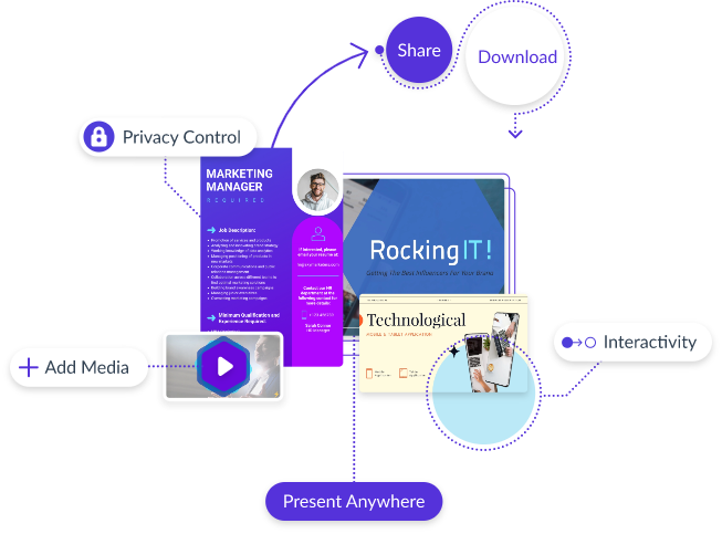
- Change colors, fonts and more to fit your branding
- Access free, built-in design assets or upload your own
- Visualize data with customizable charts and widgets
- Add animation, interactivity, audio, video and links
- Download in PDF, JPG, PNG and HTML5 format
- Create page-turners with Visme’s flipbook effect
- Share online with a link or embed on your website
Edit this template now or check out more of Visme’s dual chart templates to find the perfect fit for your data presentation needs.
Edit this template with our pie chart maker!
-
Dimensions
All chart templates come in two sizes: horizontal (1920 x 1080 pixels) and square (800 x 800 pixels)
-
Customizable
This chart template can be fully customized. You can edit content, change image(s), apply custom colors, add or subtract pages and more.
-
Formats
Can be shared as public or private link online, embedded to a site or blog, or downloaded as JPG, PNG, PDF or HTML5. If downloaded as an image, you can also insert into other documents and presentations.
Related Charts & Graphs


