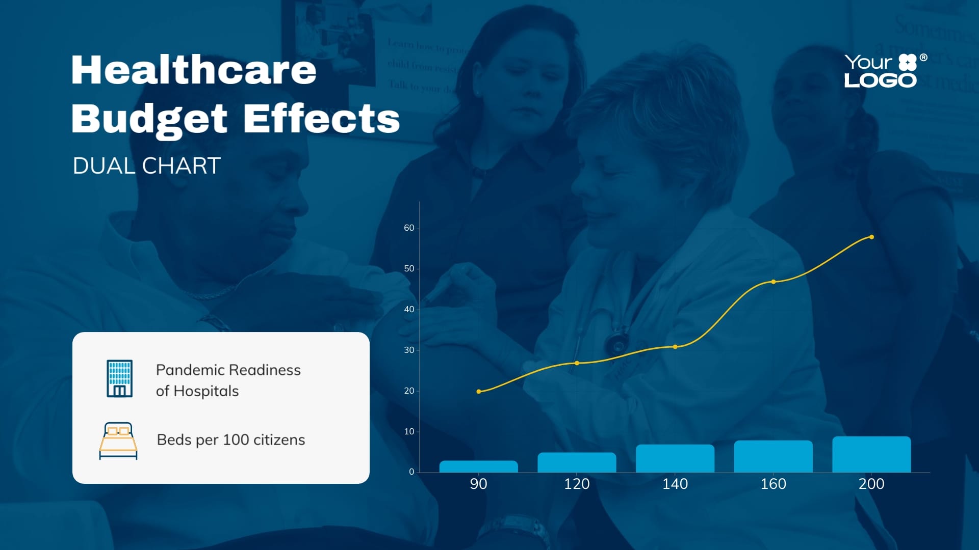
Hospital Bed Availability Dual Chart Template
Use This TemplateShowcase the average number of hospital beds available between two given countries using this dual chart template.
Featuring a blue color palette, this dual chart caters to healthcare administrators and public health officials seeking to compare healthcare resources. Compare two different regions or periods to identify trends or indicate the need for policy changes. Embed in reports or presentations to make them stand out. Personalize your dual chart with Visme's editor and make it truly yours.
- Change colors, fonts and more to fit your branding
- Access free, built-in design assets or upload your own
- Visualize data with customizable charts and widgets
- Add animation, interactivity, audio, video and links
- Download in PDF, JPG, PNG and HTML5 format
- Create page-turners with Visme’s flipbook effect
- Share online with a link or embed on your website
Edit this template now, or browse through our extensive gallery for more dual chart templates that can help you bring your data narratives to life.
Edit this template with our pie chart maker!
-
Dimensions
All chart templates come in two sizes: horizontal (1920 x 1080 pixels) and square (800 x 800 pixels)
-
Customizable
This chart template can be fully customized. You can edit content, change image(s), apply custom colors, add or subtract pages and more.
-
Formats
Can be shared as public or private link online, embedded to a site or blog, or downloaded as JPG, PNG, PDF or HTML5. If downloaded as an image, you can also insert into other documents and presentations.
Related Charts & Graphs


