Greenhouse Gas Emission Pie Chart Template
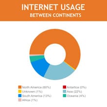
Use This TemplateDemonstrate the distribution of greenhouse gas emissions with this modern pie chart template.
Boasting a green color palette perfect for environmental contexts, this template is beneficial for climate scientists, environmental organizations, educators, and politicians aiming to communicate emission data with ease. Present emission percentages from different sectors, like transportation, industry, or agriculture, in a visually striking and digestible manner. Tweak this template as required with the Visme editor.
- Change colors, fonts and more to fit your branding
- Access free, built-in design assets or upload your own
- Visualize data with customizable charts and widgets
- Add animation, interactivity, audio, video and links
- Download in PDF, JPG, PNG and HTML5 format
- Create page-turners with Visme’s flipbook effect
- Share online with a link or embed on your website
Edit this template now, or browse through Visme's extensive range of pie chart templates for more ideas and inspiration.
Edit this template with our pie chart maker!
-
Dimensions
All chart templates come in two sizes: horizontal (1920 x 1080 pixels) and square (800 x 800 pixels)
-
Customizable
This chart template can be fully customized. You can edit content, change image(s), apply custom colors, add or subtract pages and more.
-
Formats
Can be shared as public or private link online, embedded to a site or blog, or downloaded as JPG, PNG, PDF or HTML5. If downloaded as an image, you can also insert into other documents and presentations.
Related Charts & Graphs


