Lung Cancer Demographics Bubble Chart Template
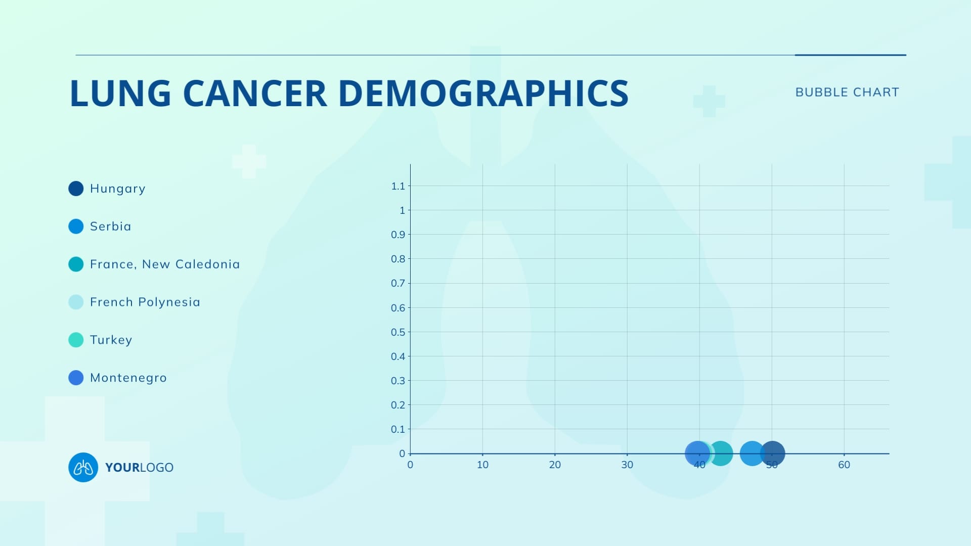
Use This TemplateShare lung cancer demographics data with this customizable bubble chart template.
Bubble charts effectively visualize three data dimensions in a two-dimensional space, providing insights into the relationships between variables. With this template, you can analyze three aspects of lung cancer demographics for a group of locations. Each bubble represents a country, and the graph has numerical placeholders that you can update easily with your data. Import the values directly into Visme’s editor from a Google Sheet or Excel Spreadsheet.
- Change colors, fonts and more to fit your branding
- Access free, built-in design assets or upload your own
- Visualize data with customizable charts and widgets
- Add animation, interactivity, audio, video and links
- Download in PDF, JPG, PNG and HTML5 format
- Create page-turners with Visme’s flipbook effect
- Share online with a link or embed on your website
Use this bubble chart for your lung cancer data, or look for other bubble chart templates to suit your data needs.
Edit this template with our pie chart maker!
-
Dimensions
All chart templates come in two sizes: horizontal (1920 x 1080 pixels) and square (800 x 800 pixels)
-
Customizable
This chart template can be fully customized. You can edit content, change image(s), apply custom colors, add or subtract pages and more.
-
Formats
Can be shared as public or private link online, embedded to a site or blog, or downloaded as JPG, PNG, PDF or HTML5. If downloaded as an image, you can also insert into other documents and presentations.
Related Charts & Graphs
