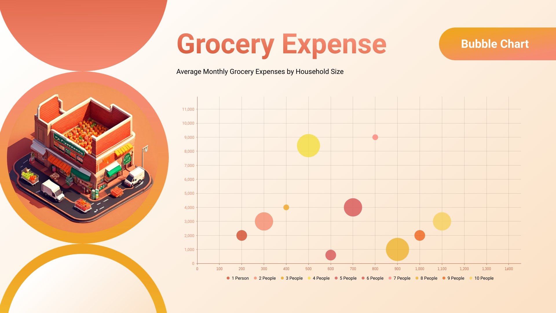
Grocery Expense Bubble Chart Template
Use This TemplateUse this bubble chart template and Visme’s chart maker to create a data visualization for your analysis report.
Adding data visualizations to reports, documents, or presentations is easy when you have Visme templates like this bubble chart. The design is tailored to analyze the average monthly grocery expenses by household size. But if you have other data to visualize, this template is easy to customize and personalize. Open the template in the editor and enter the chart settings window to input your data. Color code the bubbles with contrasting colors so the values are easy to read and understand.
- Change colors, fonts and more to fit your branding
- Access free, built-in design assets or upload your own
- Visualize data with customizable charts and widgets
- Add animation, interactivity, audio, video and links
- Download in PDF, JPG, PNG and HTML5 format
- Create page-turners with Visme’s flipbook effect
- Share online with a link or embed on your website
Use this bubble graph template for your data, or choose another bubble chart templates from Visme’s template gallery.
Edit this template with our pie chart maker!
-
Dimensions
All chart templates come in two sizes: horizontal (1920 x 1080 pixels) and square (800 x 800 pixels)
-
Customizable
This chart template can be fully customized. You can edit content, change image(s), apply custom colors, add or subtract pages and more.
-
Formats
Can be shared as public or private link online, embedded to a site or blog, or downloaded as JPG, PNG, PDF or HTML5. If downloaded as an image, you can also insert into other documents and presentations.
Related Charts & Graphs
