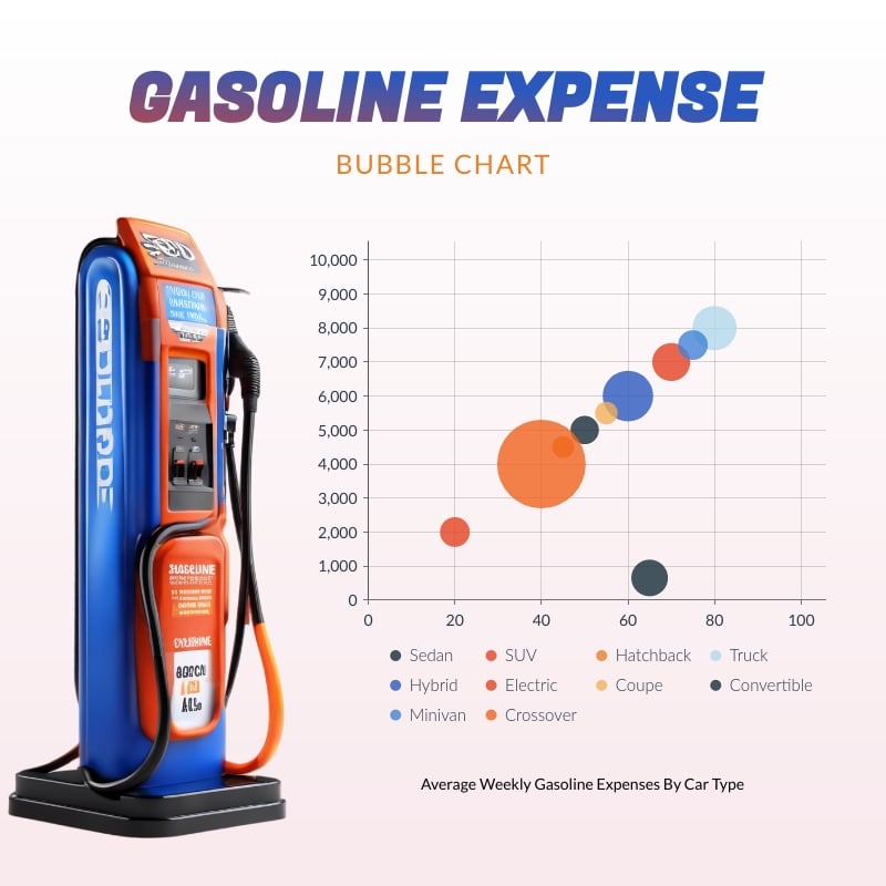
Gasoline Expense Bubble Chart Square Template
Use This TemplateGraph the average weekly gasoline expenses by car type with this bubble chart template and Visme’s editing features.
Do you need a data visualization to support your data analysis and include it in your report or presentation? Look for further than this bubble chart template. The chart’s design is perfect for visualizing the average weekly gasoline expenses by car type, but you can switch it to whichever data you have. To change it, simply open the chart settings in the editor and import a Google Sheet or CSV. You can also manually add the values to the provided area. When done, save the graph as a content block or download it as an image or PDF.
- Change colors, fonts and more to fit your branding
- Access free, built-in design assets or upload your own
- Visualize data with customizable charts and widgets
- Add animation, interactivity, audio, video and links
- Download in PDF, JPG, PNG and HTML5 format
- Create page-turners with Visme’s flipbook effect
- Share online with a link or embed on your website
Use this bubble graph template for your analysis report, or find many other bubble chart templates in Visme’s template gallery.
Edit this template with our pie chart maker!
-
Dimensions
All chart templates come in two sizes: horizontal (1920 x 1080 pixels) and square (800 x 800 pixels)
-
Customizable
This chart template can be fully customized. You can edit content, change image(s), apply custom colors, add or subtract pages and more.
-
Formats
Can be shared as public or private link online, embedded to a site or blog, or downloaded as JPG, PNG, PDF or HTML5. If downloaded as an image, you can also insert into other documents and presentations.
Related Charts & Graphs
