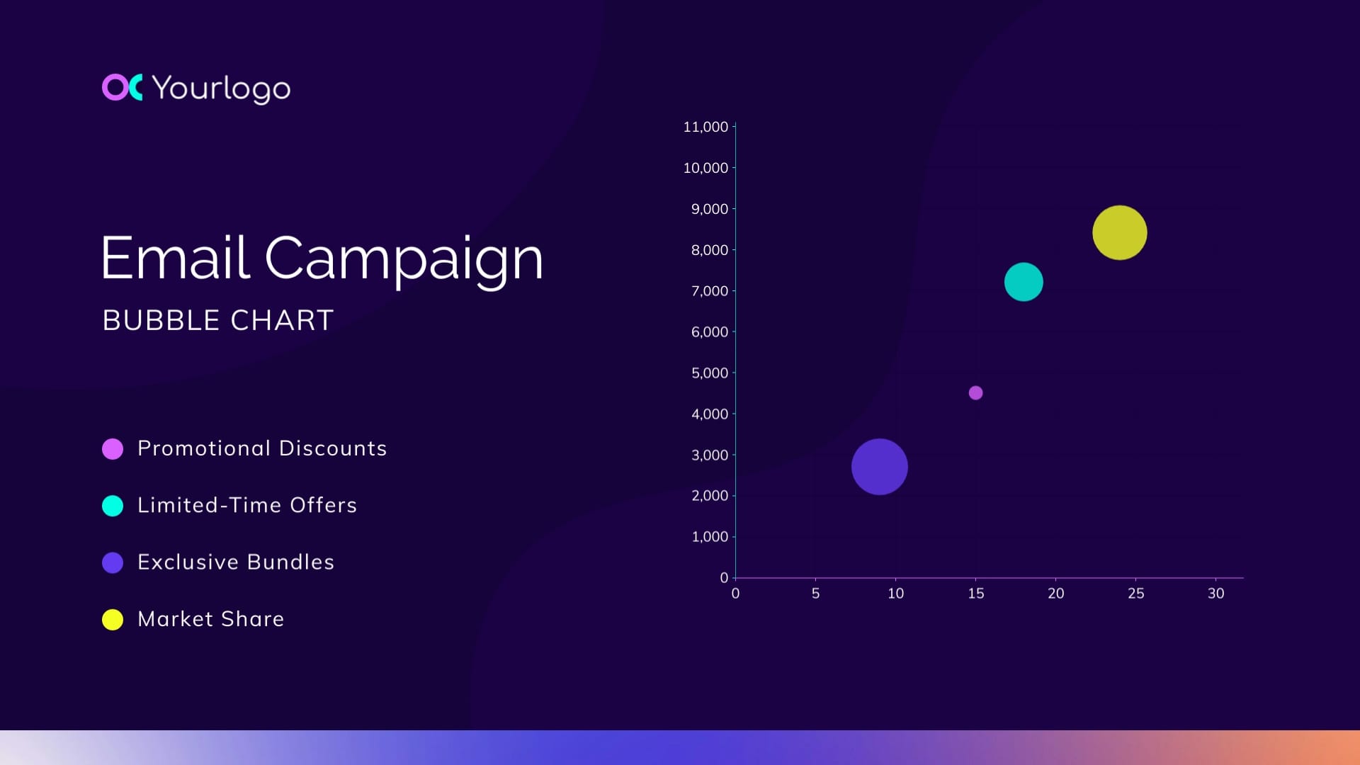
Email Campaign Bubble Chart Template
Use This TemplateShare data about your email campaign with this customizable bubble chart template.
Do you need to report the latest results on the current email campaign? Use this template to help you visualize the data in three variables. This bubble chart design includes value labels that show up on hover and display the number of sales, the amount of money brought in and the market share score. Each bubble represents promotional discounts, limited-time offers and exclusive bundles. Customize the chart easily using Visme’s data visualization editor and importing your data.
- Change colors, fonts and more to fit your branding
- Access free, built-in design assets or upload your own
- Visualize data with customizable charts and widgets
- Add animation, interactivity, audio, video and links
- Download in PDF, JPG, PNG and HTML5 format
- Create page-turners with Visme’s flipbook effect
- Share online with a link or embed on your website
Customize this bubble chart to visualize your email campaign data, or browse other bubble chart templates in different designs.
Edit this template with our pie chart maker!
-
Dimensions
All chart templates come in two sizes: horizontal (1920 x 1080 pixels) and square (800 x 800 pixels)
-
Customizable
This chart template can be fully customized. You can edit content, change image(s), apply custom colors, add or subtract pages and more.
-
Formats
Can be shared as public or private link online, embedded to a site or blog, or downloaded as JPG, PNG, PDF or HTML5. If downloaded as an image, you can also insert into other documents and presentations.
Related Charts & Graphs
