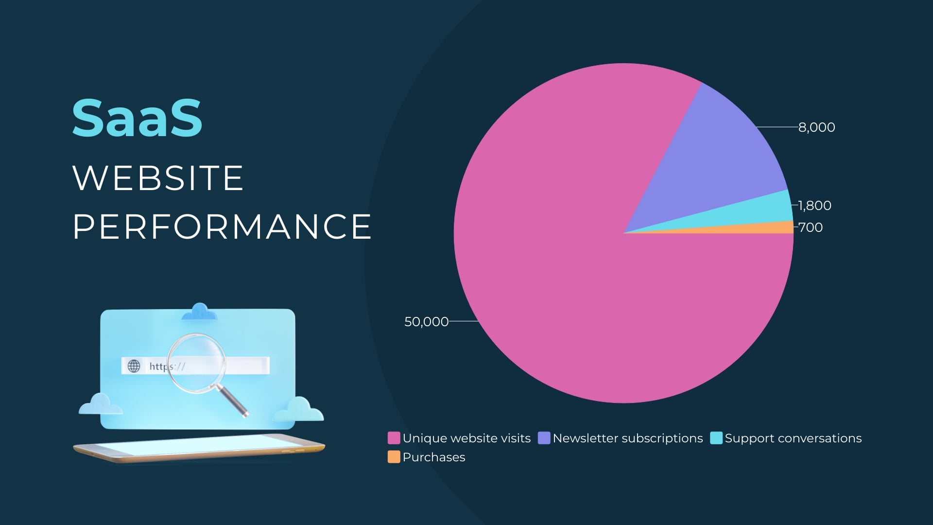
Covid-19 Infection Rate Pie Chart Modern Template
Use This TemplateTrack and communicate the COVID-19 infection rate with precision with this modern pie chart template.
Ideal for healthcare experts, data analysts, and journalists, this template allows for the visual representation of COVID-19 infection rates across different regions or demographic groups. The use of contrasting colors and intuitive design ensures a better understanding of the topic.
Modify this template according to your data using Visme's flexible editor tool.
- Change colors, fonts and more to fit your branding
- Access free, built-in design assets or upload your own
- Visualize data with customizable charts and widgets
- Add animation, interactivity, audio, video and links
- Download in PDF, JPG, PNG and HTML5 format
- Create page-turners with Visme’s flipbook effect
- Share online with a link or embed on your website
Begin editing this template now, or discover more pie chart templates in Visme's template gallery that could further meet your requirements.
Edit this template with our pie chart maker!
-
Dimensions
All chart templates come in two sizes: horizontal (1920 x 1080 pixels) and square (800 x 800 pixels)
-
Customizable
This chart template can be fully customized. You can edit content, change image(s), apply custom colors, add or subtract pages and more.
-
Formats
Can be shared as public or private link online, embedded to a site or blog, or downloaded as JPG, PNG, PDF or HTML5. If downloaded as an image, you can also insert into other documents and presentations.
Related Charts & Graphs


