Bandwidth Consumption by Social Media Platform Bar Graph Template
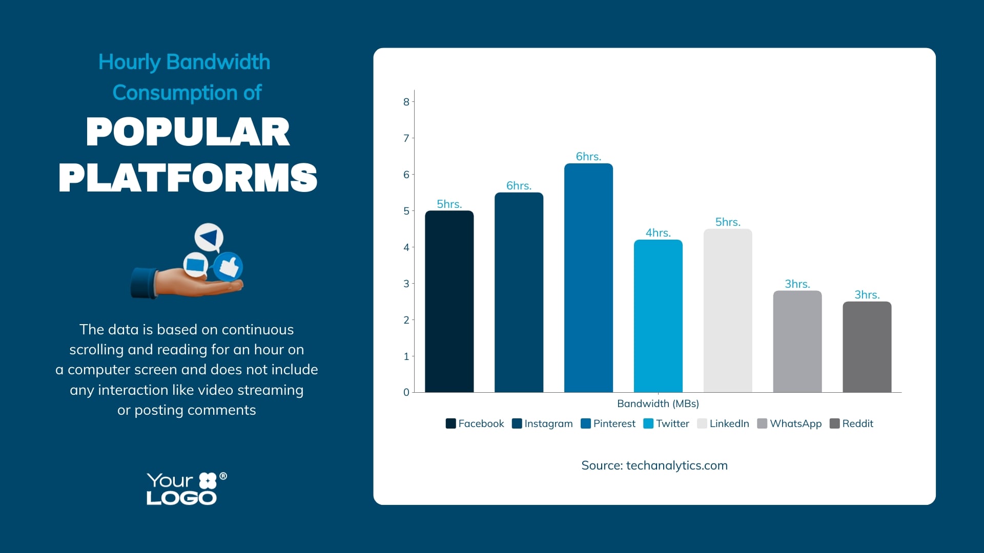
Use This TemplateHelp your audience understand how different social media platforms consume bandwidth using this bar graph template.
From Facebook to YouTube, this bar graph template provides a stark visual comparison of bandwidth consumed by different social media platforms. This template helps to highlight data usage trends and makes it easier for consumers to understand their digital footprint. From telecom companies and data analysts to tech bloggers — all can benefit from using this insightful template.
- Change colors, fonts and more to fit your branding
- Access free, built-in design assets or upload your own
- Visualize data with customizable charts and widgets
- Add animation, interactivity, audio, video and links
- Download in PDF, JPG, PNG and HTML5 format
- Create page-turners with Visme’s flipbook effect
- Share online with a link or embed on your website
Edit this template using Visme's feature-rich editor and browse additional bar graph templates to meet your data visualization demands.
Edit this template with our pie chart maker!
-
Dimensions
All chart templates come in two sizes: horizontal (1920 x 1080 pixels) and square (800 x 800 pixels)
-
Customizable
This chart template can be fully customized. You can edit content, change image(s), apply custom colors, add or subtract pages and more.
-
Formats
Can be shared as public or private link online, embedded to a site or blog, or downloaded as JPG, PNG, PDF or HTML5. If downloaded as an image, you can also insert into other documents and presentations.
Related Charts & Graphs


