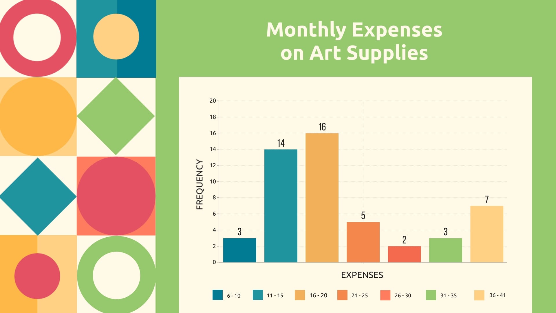
Associate Professor to Professor Bar Graph Template
Use This TemplateHighlight the promotion journey from associate professor to professor with this informative bar graph template.
Ideal for academic departments, educational researchers, or career-focused blogs, this modern-looking template provides a birds-eye view of career progression in academia. Highlight the tenure track, present the frequency of promotions, or visualize the faculty growth without fuss.
Make complex academic data understandable and interesting all with Visme’s interactive editor.
- Change colors, fonts and more to fit your branding
- Access free, built-in design assets or upload your own
- Visualize data with customizable charts and widgets
- Add animation, interactivity, audio, video and links
- Download in PDF, JPG, PNG and HTML5 format
- Create page-turners with Visme’s flipbook effect
- Share online with a link or embed on your website
Edit this template now or browse through a variety of remarkable bar graph templates to meet your unique needs.
Edit this template with our pie chart maker!
-
Dimensions
All chart templates come in two sizes: horizontal (1920 x 1080 pixels) and square (800 x 800 pixels)
-
Customizable
This chart template can be fully customized. You can edit content, change image(s), apply custom colors, add or subtract pages and more.
-
Formats
Can be shared as public or private link online, embedded to a site or blog, or downloaded as JPG, PNG, PDF or HTML5. If downloaded as an image, you can also insert into other documents and presentations.
Related Charts & Graphs


