


Typography Infographics: 12 Inspiring Examples & Techniques


An infographic is a visual way to communicate information quickly and clearly. It combines charts, diagrams, icons and minimal text to help people understand ideas at a glance.
While video dominates many platforms today, infographics still cut through the noise. As Robert at The Product Agency puts it, they feel a bit retro but remain highly consumable and easy to share.
Infographics are especially useful for explaining complex topics in areas like education, science and public policy. Businesses and marketers also use them to boost engagement across blog content, presentations, reports and social media.
If you are new to infographics or unsure how to use them effectively, this guide covers the basics. You will learn what an infographic is, when to use one and how to create your own infographic. You will also find infographic templates and real examples you can start using right away.
But first…
If you need valuable tips for creating amazing infographics for marketing and business, we've got it all covered in this video.
Here’s a short selection of 10 easy-to-edit infographic templates you can edit, share and download with Visme. View more templates below:


Infographics are visual tools that present information, combining different types of graphs and charts and other elements, such as text, images, and diagrams, to simplify complex ideas. They summarize data, explain processes, and illustrate relationships effectively to capture attention. Features such as color coding, icons, and layouts make subjects more accessible to a wider audience.
Common applications include education, marketing, journalism, and data science to enhance understanding.
Keep in mind that the goal of an infographic is to inform your audience through visuals.
Alberto Cairo, a renowned data visualization expert from the University of Miami, emphasizes this point well:
“The purpose of infographics and data visualizations is to enlighten people—not to entertain them, not to sell them products, services, or ideas, but to inform them. It’s as simple—and as complicated—as that.”
Whether it’s a study on market trends or a step-by-step guide on how to do your laundry, an infographic can help you present that information as an attractive visual graphic.
Take a look at the infographic example below from the Visme template library.

This infographic presentation explains how marketers can use content as a selling tool. Notice how the use of bright color schemes, illustrated icons, and bold text instantly grabs your attention and gives you an overview of the topic as you skim through it.
As you can see in the infographic below, there are different types of infographics you can create.

The secret to creating an exceptional infographic all comes down to how you combine different graphic elements—like colors, icons, images, illustrations and fonts—to explain a topic in a compelling and easy-to-understand layout.
Infographics have a rich history that starts with the human need to visualize our experiences. Some say that cave drawings were the first infographics, followed closely by Egyptian hieroglyphics. But infographics in the way we refer to them now, were created much later.
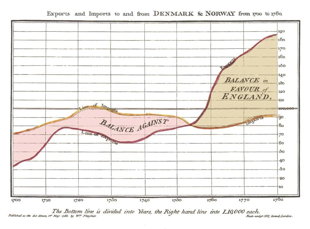
In 1785, William Playfair created the infographic you see here as part of his analysis of trade between England, Denmark and Norway. Around the same time, he also invented the line graph, bar and pie chart, paving the way for the modern infographic.
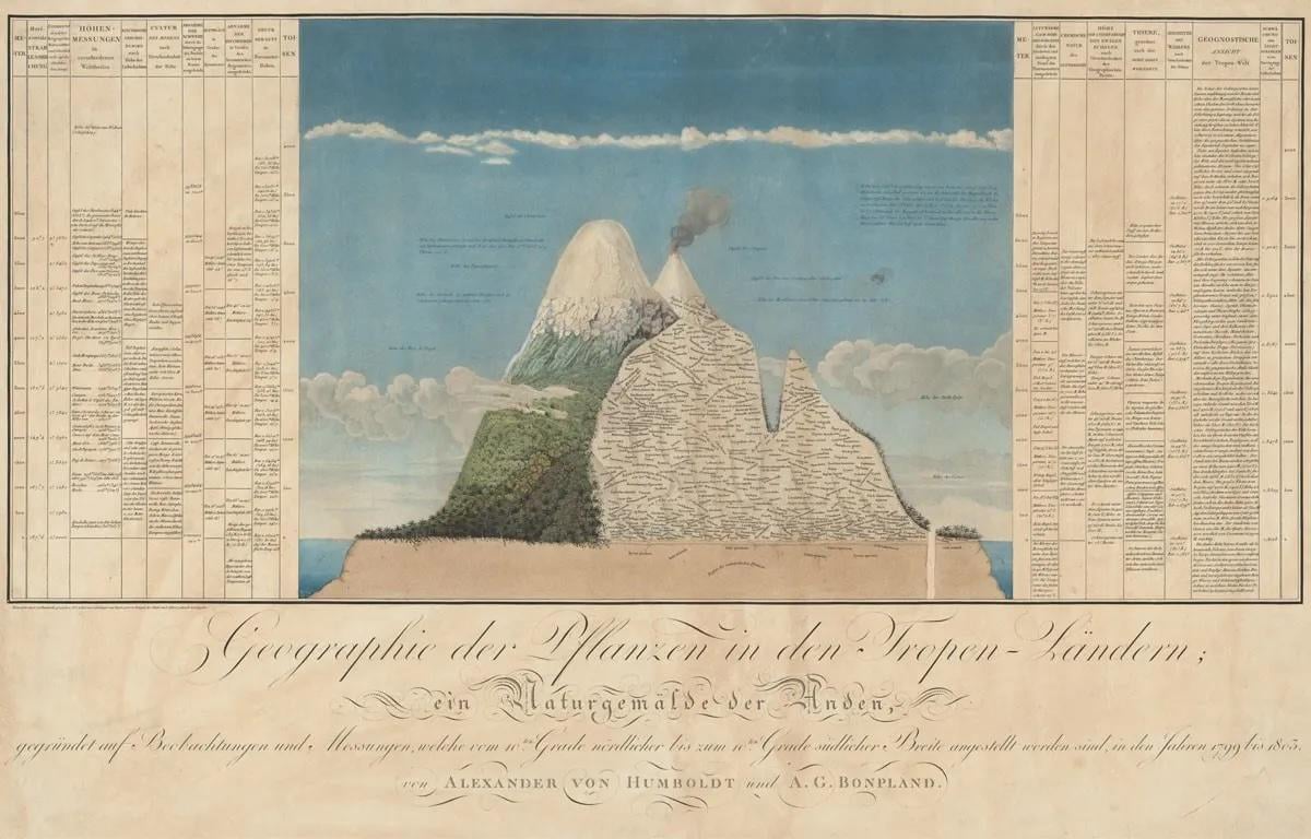
In the early 1800s, explorer Alexander Von Humboldt created Naturgemälde, a data-centric painting about the Chimborazo volcano, including the plant species and weather patterns in the area. According to some historians, it’s “a diagram and a work of art that might be considered history’s first infographic.”
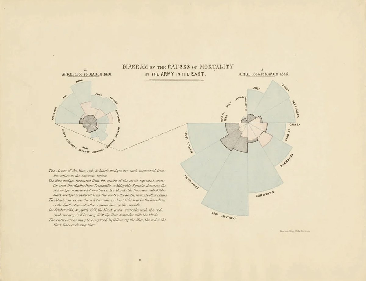
As data analysis became more widespread, so did infographics. By the end of the 19th century, Florence Nightingale, an army nurse, together with a team of expert statisticians, published infographics that helped improve public health. This is the Rose Diagram, one of their infographics, which visualizes the mortality rate and causes of soldiers in the army.
Over time, infographics have evolved into a wide variety of formats. A few years ago, they were all the rage on blogs and Pinterest. Now they appear in publications of all types, from blogs to news sites and social media.
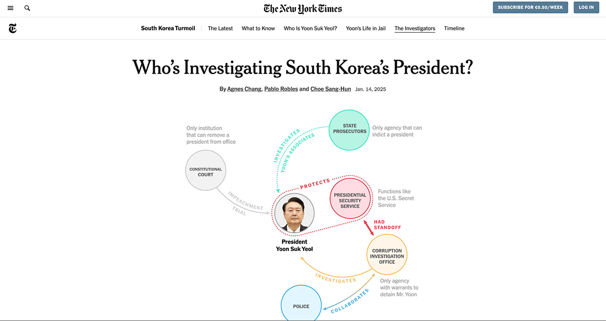
The growth of infographics in the media helped coin the term “ data journalism.” Data journalists analyze data and write stories rich with infographic visuals. Like, for example, this article from The New York Times about South Korea’s president.
A good infographic is more than just a collection of nice-looking graphics and minimal text. It’s a strategic blend of design elements and content that work together to tell a compelling data story. Here are the key elements that make an infographic truly effective:
The infographic below is an excellent example of a good and compelling infographic. It shares the information simply and is easy to skim. The colors and design are well-balanced.

Here’s another infographic above that showcases the statistics and percentages visually using a combination of pie charts, bar graphs, icons and maps.
Even if you don’t read the text above the data widgets, you’ll still get the picture.

Transitioning from purely textual information to visual storytelling can significantly enhance understanding and engagement.
As David Mccandles, founder of Information is Beautiful remarks in his TED Talk:
Data is a really fertile medium, and it feels like visualizations, infographics, data representations, are flowers blooming from this medium. If you look at it directly, it’s just a lot of numbers and disconnected facts. But if you start working with it and playing with it in a certain way, interesting things can appear and different patterns can be revealed.
David Mccandles, Founder of Information is Beautiful
There are several reasons why infographics are so popular—they’re fun, engaging and super easy to share.
They’re also a great opportunity to get some important backlinks for your site.
Infographics also have tons of benefits for all kinds of content creators, including businesses, educators and nonprofits.
Marketers use infographics to drive website traffic, increase visibility and brand awareness, and boost engagement. Infographics are also highly linkable content assets, meaning they can generate valuable backlinks that boost SEO efforts.
Marketers include infographics inside blog posts, and social media content to garner engagement and start conversations.
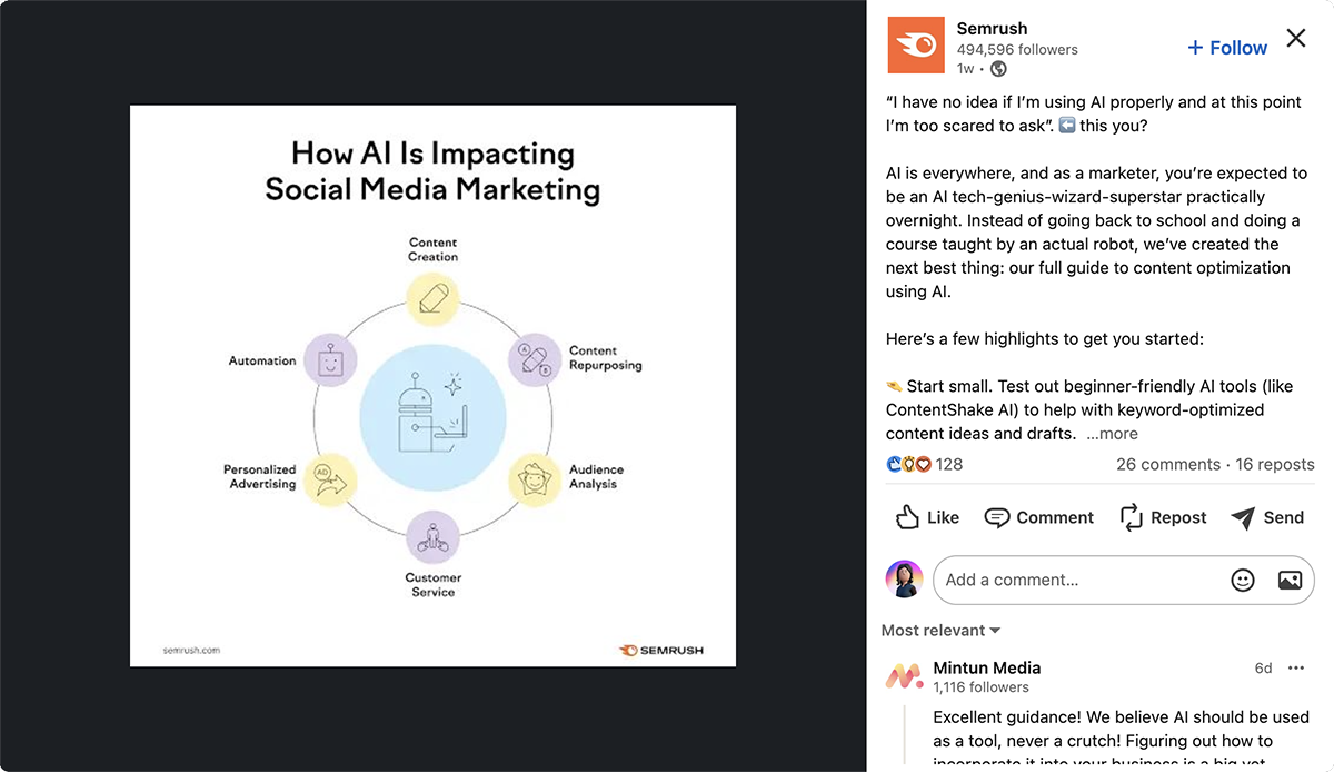
A great example of using infographics on social media to promote blog content is Semrush. They have been sharing infographics on Instagram, LinkedIn and Facebook for years to encourage people to read their guides and engage with their posts.
Here’s one of their latest examples:
Educators, trainers and scientists use infographics to explain difficult concepts or break down complex information. These infographics are increasingly crucial in a world where attention spans are diminishing and people need more visual cues to retain information.
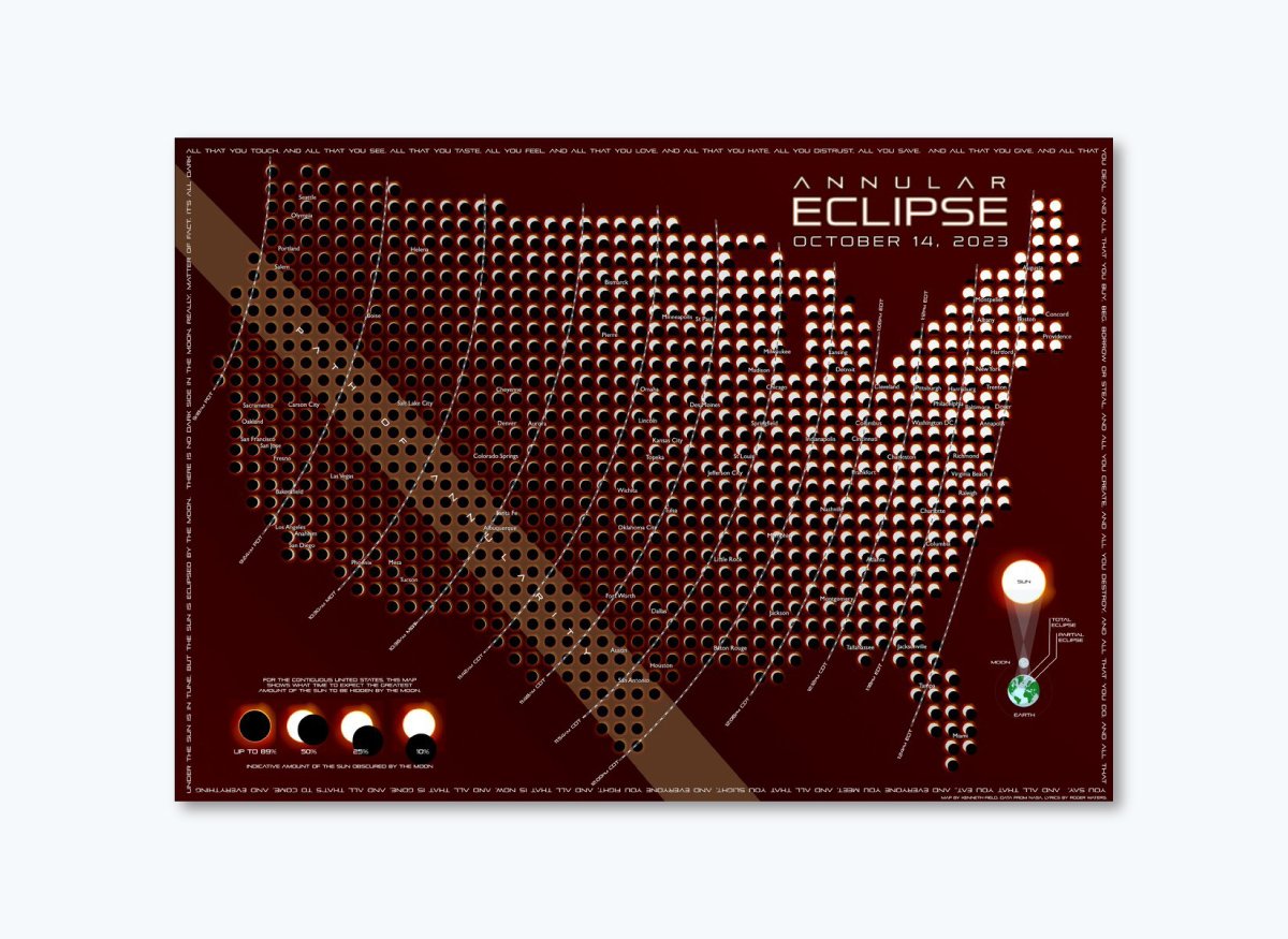
Here’s an example of a scientific and educational infographic about the full solar eclipse in the US in 2023. In hardly any words, the viewer can fully understand the path of annularity.
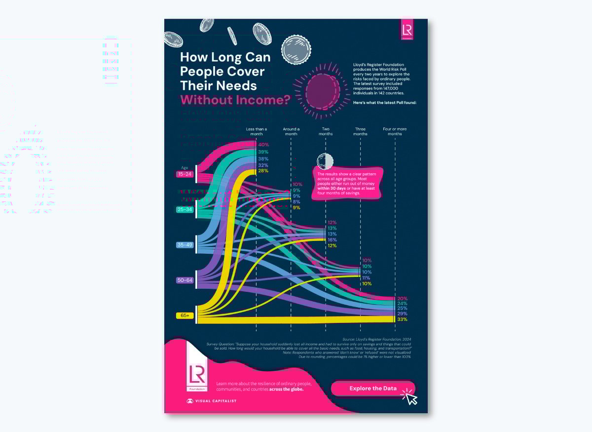
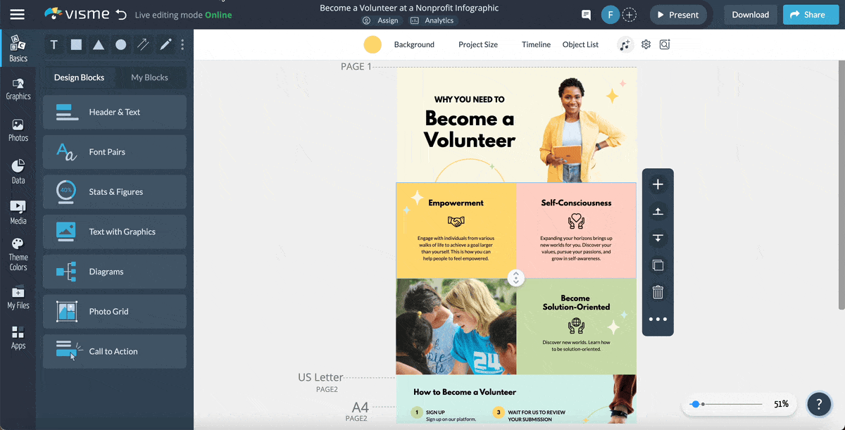
Nonprofits and social work organizations use infographics to spread awareness about a cause or ongoing social issue. Take a look at this example infographic from Visual Capitalist that highlights data from the World Risk Poll Report 2024.
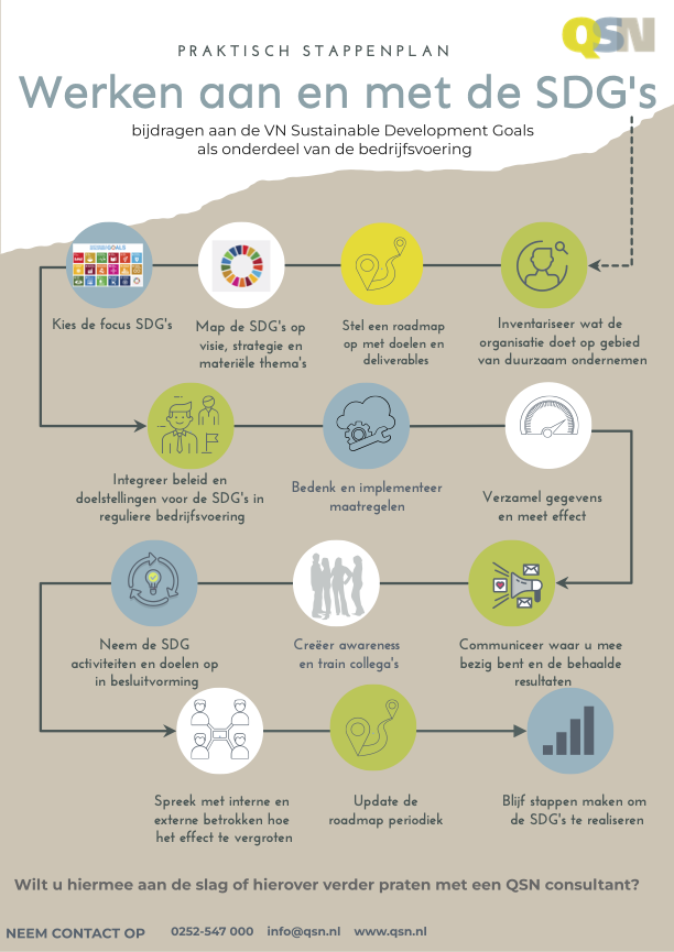
Consultants use infographics to help clients understand their processes and workflows. One such example is QSN, a consulting company in the Netherlands that creates infographics using Visme.
This is what the case study author, Victoria Taylor, has to say about QSA,
"Visme makes it easy for team members to create infographics that help visualize complex subjects. By using data widgets to visualize numbers, diagrams and flowcharts to visualize concepts, and charts to visualize data, infographics help pull complicated information into an easily digestible format, making it easier to understand."
Here’s an example of one of QSA’s infographics made with Visme.
In this article, we’ve shared 101 infographic examples to give you all the inspiration you need to create beautiful infographics.
Creating a beautiful infographic can be tricky, especially if you’re not a professional designer. However, Visme makes it a breeze.
Not only does it save you time, but you also save money due to high infographic design costs by agencies.
With a Visme account, you get access to thousands of professionally designed templates, millions of design assets and dozens of advanced features.
You don’t need to be a designer to use it, but even your designer would love it!
Check out this video to learn how to create an infographic with Visme.
Check out this video to find out how you can create an infographic in Visme.
Additionally, here’s a step-by-step guide to creating an infographic using Visme’s drag-and-drop editor and premade templates, and some best practices to make designing them even easier.
The first step is to sign up for Visme (it's free!) and choose a template to get started with.
Browse through hundreds of free and premium infographic templates inside the dashboard to find one that best suits your content and purpose.
When you find one you like, hover on it and click “Edit.”
If you need help or are running against the clock, Visme’s AI Designer can do the heavy lifting for you.
Just write a detailed prompt describing the type of infographic you want to create, along with the details of the design and content. Choose your design theme and watch the tool generate a compelling infographic filled with text, charts and other design elements.
Whether you're using the template or Visme's AI designer, Visme gives you complete control over your infographic design and content.
Once you select a template or have an AI-generated design to edit, you’ll be redirected to the Visme editor.
This is where you get to customize the infographic with your own colors, fonts, text, images, icons and much more and make it entirely your own.
Start by replacing the dummy text with yours. Even if you’re facing writer's block, Visme AI text writer is right there to help you.
With a text prompt, you can generate content ideas for your infographics and create outlines, headlines and draft copy. It can also assist in proofreading and editing your text for grammar, clarity, and conciseness.
You can change the entire color scheme of your infographic in one go using our preset color themes. Or automatically generate it with the Brand Design Tool and save your assets in your brand kit. This lets you to apply your branding to any design with a single click.
Visme also gives you unlimited access to the following:

If you are still looking for visuals that align with your vision, Visme offers an AI image generator.
Using a text prompt, you can whip up beautiful visuals in a variety of output styles: photos, paintings, pencil drawings, 3D graphics, icons, abstract art, and more.
Exciting, right? The best part is that this takes literally a few minutes.
Check out our infographic design guide for more tips on how to make an eye-catching infographic!
Create an animated infographic and hold the reader's attention with animated elements and interactive features, such as animated graphics and charts, animated text and objects, gestures and illustrations, links, hotspots, hover effects, pop-ups and 3D animated characters.
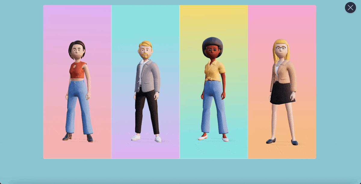
With our 3D character creator, you can customize their apparel, hair, gender, skin tone, and more until you’re satisfied with the final appearance. You also have the freedom to select their entry, waiting and exit poses.
But that's not all…You can embed interactive content in your infographic, like forms, audio, video and GIFs to make it even more memorable.
That’s it—you’re almost done!
Once you’ve finished customizing your infographic, it’s time to download or share it with your audience in a variety of ways.
Download it for offline use in image, PDF or HTML5 formats or share it with a public or private link with optional password access.

You can also embed it on your website or blog using a responsive code, or publish it on the web so anyone can search for and access it.
After sharing your infographics online, use Visme’s analytics to keep an eye on how your audience engages with it. You can find out who viewed it, the date and time of the view, the visitor's IP address, their location, the time spent on your project, and which sections they spent more time on.

Are you looking for the best tool to create infographics? Below are the best options available online for designing infographics easily.
| Tools | Key Features | Pricing | Best For | Core Uses | G2 Ratings |
| Visme | Advanced data visualization, customizable templates, infinite canvas, photo/video editing, animation, AI tools, collaboration, analytics and interactivity. |
Free; Paid plans from $12.25/month | Businesses, startups, teams, enterprises, agencies, consultants. | Presentations, infographics, social graphics with animations, lead generation forms, marketing materials, interactive content, short-form video | 4.6 |
| Venngage | Drag-and-drop editor, accessibility features, professional icons and illustrations, branding tools, collaboration and team templates | Free; Paid plans from $19/month | Individuals, professionals, enterprises, nonprofits. | Infographics, business designs, marketing designs, everyday designs | 4.7 |
| Canva | Advanced editor, Customizable templates, Collaboration features, Branding solutions, Text to image, whiteboard | Free; Paid plans from $9/month | Entrepreneurs, coaches, startups, nonprofits | Social graphics, infographics, printed material, video editing, mockups | 4.7 |
| Infogram | Interactive data display tools, drag-and-drop editor, millions of images and icons, team collaboration | Free; Paid plans from $19/month | Individuals, businesses, teams, enterprises | Charts, maps, infographics, reports, dashboards, social graphics | 4.7 |
| Snappa | Easy graphic design features, Buffer integrations, background removal, Image blur | Free; Paid plans from $10/month | Digital marketers, small businesses | Social graphics, infographics, digital ads | 4.6 |
For more details on these and other amazing tools check out our in-depth guide on the best infographic tools.
There’s no one-size-fits-all infographic out there.
There are various types of infographics you can create.
If you want yours to be effective, you need to pick a type that aligns with your purpose and the nature of the content.
In this video, we've covered the 13 types of infographics and when to use them, plus we've included templates to help you get started.
Generally, infographics are used for one or more of the following reasons:
Once you’re sure about what you need an infographic for, you can move on to selecting the right type of infographic for your needs.
Here are the different types of infographics available in Visme. And remember, any of these infographic types can be turned into interactive experiences using animation, hotspots and multi-layered data.
Statistical infographics make use of typography, charts and diagrams to present research, facts and figures visually. This helps make data look more interesting and easier to digest than a bunch of plain numbers or tables.
A statistical infographic can either focus on a single research or data set or use a mix of different visualizations to present various facts and figures about a topic.
The data visualisation infographic below displays data about the global penetration of social platforms using bar graphs.

This type of statistical infographic is ideal for use as part of a report or presentation or for visualizing a statistic mentioned in your blog post.
Now, take a look at the infographic below. Instead of a single visualization, it focuses on giving a statistical overview of a more general topic—cybersecurity.

This type of statistical infographic is ideal for educational purposes, creating awareness about a subject or cause, or building a case study infographic with before and after data.
Statistical infographics are usually less text-heavy and more data-focused. In the Visme editor, you get access to 50+ types of data visualizations, including charts , maps, diagrams, histograms, pictograms and widgets—in 2D and 3D formats.
Informational infographics use a mix of text and visual elements to explain or simplify a topic or guide readers through a series of steps.
The example below explains how to grow an email list using a colorful layout made up of rounded labels that make the design easy to follow and fun to read.

You can use an informational infographic to summarize long blog posts. When turning long-form content into visual form, leverage font size and styling, imagery, and the placement of different objects to lead the reader’s eye from one point to the next in the order of importance or position.

This kind of infographics usually follow a visual narrative to tell a story. This includes leveraging font size and styling, imagery and the placement of different objects to lead the reader’s eye from one point to the next in the order of importance or position.
Process infographics usually make use of flowcharts, diagrams and even timelines to guide readers through a series of steps or to help simplify the decision-making process.
Here’s an example of a process infographic. In this case, the content is about the customer decision process, so this infographic is perfect for sharing with employees in a training manual or as a page in an ebook.
These types of infographics are useful for giving instructions to employees, explaining a step-by-step process to customers or for light-hearted, humorous purposes.

Read this article to discover the different types of flowcharts you can use to map out steps or organizational processes.
Timeline infographics are useful for presenting information in chronological order.
They can help you showcase your brand history or show how something has evolved over time.
Here’s a horizontal timeline from Visme to get you started. The long vertical lines coming out of the center bar make the content easy to fit in a vertical layout

If you want to create a vertical timeline , below is a template to inspire you.
This template offers a great opportunity to create an interactive experience for your viewers. Each month label can be turned into a hotspot with a pop-up that provides more detailed information than what fits on the design.
The popup can be a text box or even a video explaining each step in the web design process.

You can use this type of infographic to creatively display your brand story on your website’s About page.
This type of infographic can also help you with project management purposes, such as creating project timelines.
Looking to break down and explain the different parts of something? An anatomical infographic can help you do just that.
This type of infographic has a labeled diagram format, which can help you highlight and explain ingredients, product parts, characteristics, personality traits, and more.
Check out this anatomical infographic as an example. It breaks down the key elements of a great ad copy.

Here’s another example of an anatomical infographic that explains the different moving parts of a sales business plan.

This type of infographic usually features a pyramid to help you display different levels of information.
Take a look at the hierarchical infographic below.

If you want to organize information by different levels, such as by priority, importance or difficulty, a hierarchical infographic like the one above is a good way to go. The use of bold arrows helps digest the information fast without having to read much more than the headers in each section.

List infographics help you summarize and present list-based information. This could be a list of items, factors and even steps to do something.
Here’s a list infographic you can customize.

You can use this type of infographic to sum up a how-to or listicle blog post. This kind of infographic is also likely to get shared as they’re usually straightforward and fun to read.

Comparison infographics are useful for comparing multiple objects, people, concepts, products or brands. Visually comparing ideas can help illustrate similarities and differences.
Here’s an example of a comparison in infographic format.

These types of infographics typically have a multi-column layout, which is useful for comparing and contrasting two different topics side by side.
Another version of this kind of infographic is a comparison chart, which compares and contrasts multiple features or brands in the form of a visual table.
Here’s a comparison chart template for that purpose. As you can see, these types of infographics are valuable for visualizing pricing plans. You can embed one into your website’s pricing page or include it in email sequences to potential clients.

A map or location infographic is a great option for showcasing geographic information in a visual form.
Here’s a map infographic made using Visme.

Map or location infographics can be used to display local, national or global data and statistics.
Color-code the map to highlight different regions. And use the map settings to make the layout interactive while keeping the design simple and uncluttered.
Set the map to have no legend or labels, but add hover pop-ups with information about each region or section. This way, the design looks simple but is really full of accessible data.

Location-based infographics make excellent visuals to add to your blog posts, reports and presentations.
You can also use them as solo graphics for sharing on social platforms to drive engagement and traffic.
Instagram is an excellent platform for solo infographics with location-based content. For maximum impact, use the portrait post size (1080 x 1350 pixels) which offers more visual real estate than the square format.
Employers receive hundreds of resumes at a time and only a handful of them stand out from the pile. If you want to take your resume to the next level, consider creating a visual resume infographic.
Check out this creative resume infographic .

Resume infographics offer a refreshingly new take on the standard infographic style. They use visualizations like radials, progress bars, icons and arrows to illustrate skills, interests, experiences and more.
Do take into account that not all job positions warrant a visual infographic resume, some corporate recruiters and resume scanning bots won’t necessarily think your beautiful infographic is good. These types of resumes are best for creative job positions where you have the chance to show your creative skills. Either way, always send a simple, standard resume alongside it just in case.
Now that you know the different types of infographics you can use and how to create one for yourself, here are some tips to help you take your visuals to the next level.
The most important piece of homework you need to do before creating an infographic is to find out if it will actually work with your audience.
Get to know the topics they like and what type of design appeals to them. You also need to know the kind of tone that works with your audience, as you’ll use that to craft compelling copy for your infographic idea.
You also need to figure out the social channels that are most used by your audience so you can create an infographic that is optimized to perform best on those specific platforms.
There are plenty of ways to figure out what type of infographic your audience will connect with.
There are millions of infographics and visuals floating on the internet. If you want to get yours noticed, create something unique and different.
Do some research before creating your infographic. Find out what kind of topics will appeal to your audience and what questions they might have unanswered. You can do keyword research to find topics that resonate with them.
Then go ahead and do a Google search to see if there are any existing interesting visuals or infographics on the topic.
If it’s a topic that’s already been covered before but you still want to create an infographic about it, make sure you create it with a fresh, new angle.
For example, if you're creating an infographic on improving employee productivity, analyze existing ones to see if they focus primarily on time management and overlook technology integration. This gap could be your unique angle.
Using original research or data can set your infographic apart. So you want to conduct surveys, collect unique statistics, interview experts or use case studies to provide fresh insights not found elsewhere.
Visual hierarchy is all about organizing information in your design according to the level of importance or order so that the reader’s eye naturally goes from one section to the next.
Establishing a visual hierarchy makes your infographic design look cleaner, more attractive and more professional instead of cluttered with all kinds of information.
For example, headings, subheadings, and sections can help break up the information into sections. Different font sizes and weights can help show which parts are more important, while bold or larger fonts can make key statistics or important points stand out.
Another critical element of visual hierarchy is spacing and alignment. With ample white space, your infographic looks uncluttered, clean, organized and easy to read.
This infographic shares a brief overview of the six elements of visual hierarchy.

The infographics you include in your blog or website should be optimized for SEO. Not only will this help your infographic show up in image searches, but it will also improve the SEO for the page it's included in.
First, let’s discuss the steps to take if you include the infographic as an image.
Now, if you embed the infographic onto your blog or a landing page, follow these steps:
In the Visme editor, give your infographic a file name that includes the keyword string in it. Add alt text to the objects inside your infographic using the Objects List in the editor. When you publish to the web, keep it as public.
Include the embed code on the page below the infographic so it’s easy to share with all your information as part of the code. You can even add a call to action to include in the code.
For both instances, write a line or two introducing the infographic image before the infographic’s placement in the content page. This is helpful both for web crawler bots to recognize your infographic and for screen readers to let the audience know what’s coming up.
Here are some questions you might be asking yourself about infographics.
Infographic means a visual representation of information or data. Semantically, the word infographic is made up of two base words, information and graphic. Both together make up the word “infographic.”
There are more than five types of infographics. In fact, there are ten including:
An infographic example is a representation of information in a visual layout. If someone says, for instance, Do you have an infographic example of this data? You would show them a visual chart, graph or diagram that shares that same data but in a visual format.
Infographics don’t exactly have limitations in terms of size and length, and it depends what type of page you mean. Is it a printed page, a web page or a presentation page (slide)?
Infographics are used for visualizing data and information using a visual design, they help simplify complex topics and explain otherwise lengthy topics. They are valuable content tools in all levels of education, in company training environments and most of all in the marketing industry.
They help teachers teach, companies visualize processes and keep employees informed, and in marketing they’re used as part of the content strategy for heightened visibility, shareability and brand awareness.
The main purpose of an infographic is to share information visually. It’s meant to make complex topics easier to understand for people who aren’t experts. Their function is to help anyone grasp a concept that might otherwise be too difficult due to factors like complicated spreadsheets and long walls of statistical content.
Infographic presentations combine slides with visuals like charts, icons, and diagrams to simplify complex ideas. These presentations minimize text, enhance engagement, and improve comprehension. Often used in business, education, and marketing, they make data memorable. Tools like Visme, Canva, and Piktochart help users create dynamic presentations easily.
Infographics are one of the most effective types of content out there, for good reason.
They’re visual, shareable, fun to look at, and can make even the most boring and technical information look interesting.
Now that you know what an infographic is, when to use it and how to create one, it’s time to get started with your own. Visme offers thousands of professionally designed templates, millions of design assets, dozens of intuitive features, AI-powered tools, collaboration and workflow management features to help streamline your content creation process.
Try out Visme's infographic maker for free and take it for a test drive!
Happy creating!
Design visual brand experiences for your business whether you are a seasoned designer or a total novice.
Try Visme for free


![How to Make an Interactive Infographic [+Templates]](https://visme.co/blog/wp-content/uploads/2023/11/How-to-Make-an-Interactive-Infographic-Quick-Guide-8-Customizable-Templates-Thumbnail.jpg)


