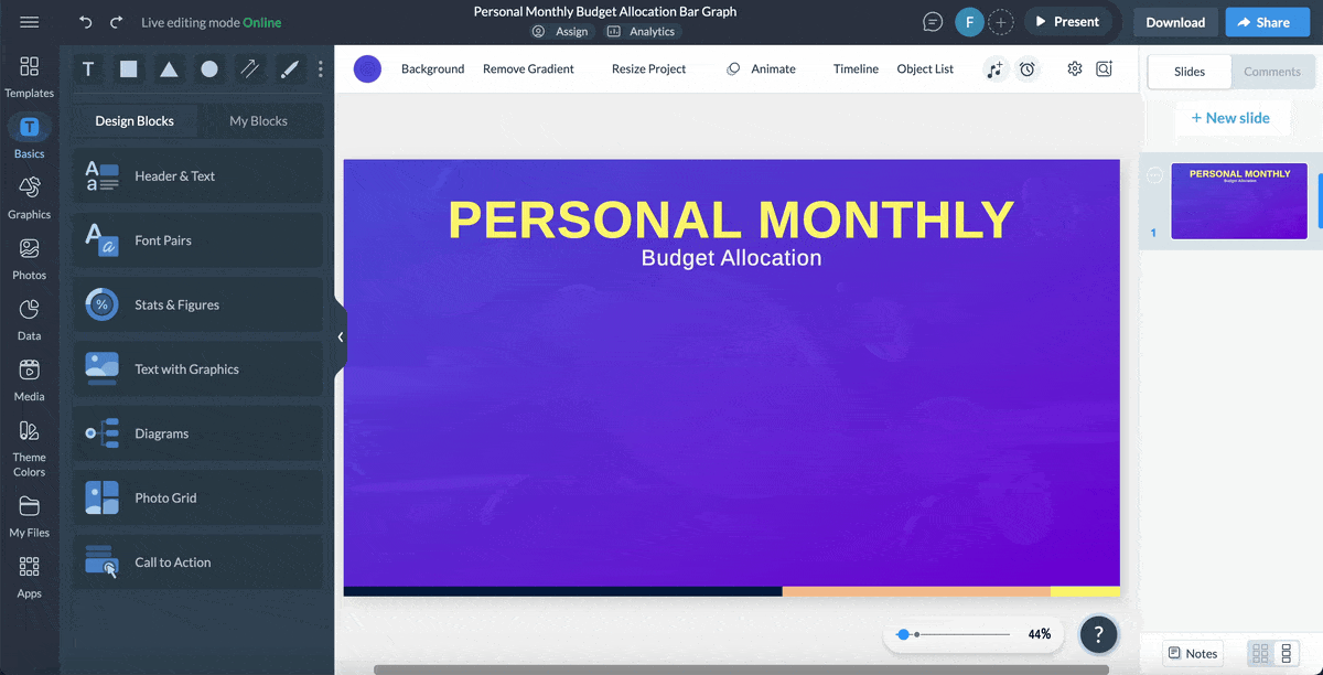
How to Make a Gantt Chart in Excel + Easier Alternatives

Throughout school and my career, charts and graphs have been my secret weapon for presenting big ideas in a way that sticks—whether in a research proposal for an academic project or a business report aimed at identifying trends.
Whether for visualizing data for education or business, graphs turn raw data into meaningful stories that are easier to understand and act upon.
While Microsoft Excel is renowned for its rows, columns, and calculations, it's also been a popular option for creating charts and graphs.
If you're new to Microsoft Excel, you might feel lost trying to turn rows of data into polished visuals. But don’t worry; it’s easier than it looks! With a few basic steps, you'll be on your way to making compelling charts that tell your story at a glance.
In this guide, I’ll explain how to make a graph or chart with Microsoft Excel.
I'll also introduce you to Google Sheets and Visme—an even more powerful alternative for creating eye-catching, professional charts and infographics.
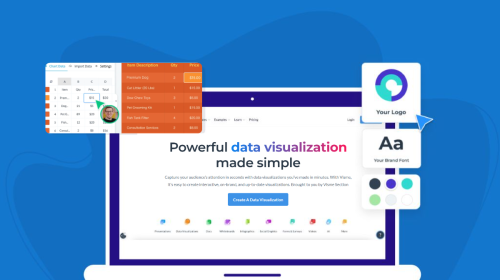
Before I move on, remember that making a chart is incredibly easy with Visme's Chart Maker or browse our extensive range of chart templates to make one in minutes.
This video tutorial will walk you through making your first chart with Visme.
A chart (or graph) is a visual representation of data.
These graphs and charts let you show relationships, visualize trends, compare data, identify patterns, and extract insights that might be difficult to spot in raw data.
Charts can take many different forms and styles, but their core function is to convert your data into a visually digestible format.
Data visualization tools like Microsoft Excel, Google Sheets, Visme, etc., all have different types of charts and graphs, such as bar, line and pie charts.
An Excel chart or graph is a tool within Microsoft Excel that turns your spreadsheet data into a visual story. Before other tools came on board, Microsoft had been a fundamental tool for creating graphs and charts in the business world for several decades.
Excel charts help you make sense of complex data with shapes like bars, lines, and circles instead of overwhelming numbers in rows and columns—whether you’re tracking changes, comparing categories or showing percentages.
In Excel, there are many different types of graphs, including bar graphs for comparing data across categories, line graphs for visualizing trends over time, and pie charts for showing proportions within a whole.
Below is an example of a blood pressure charted progress chart created in Excel.
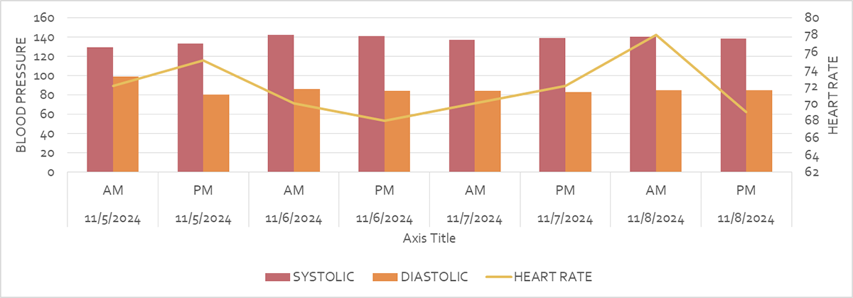
Take a look at this insightful combo chart that tracks both AM and PM blood pressure readings over several months.
What you’ll notice are the steady bars representing systolic and diastolic pressures, which together create a mean trend line that illustrates a promising path toward stable blood pressure.
But then, in bright yellow, we see the line chart of heart rate, fluctuating wildly above and below the bar chart.
From this combination, we can compare daily blood pressure readings alongside heart rate changes. But it offers so much more than just numbers this chart shows how one metric may influence or correlate with the other.
Before we continue, let's go back to the source data for this chart—which, while informative, may not provide the full story behind the numbers.
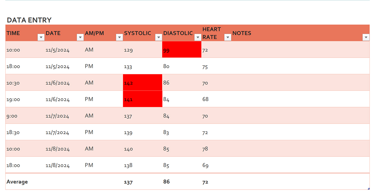
The last thing you want is to drown your audience in a sea of these confusing numbers.
When dealing with large data sets, an Excel chart or graph is particularly effective at conveying your findings at a glance, especially when you’re making comparisons or visualizing trends.
You can also customize these charts to look exactly how you want—adding labels, changing colors, and even highlighting specific data points (more on that in the next section).
This makes your data easier to understand and more engaging, especially when you're presenting it to stakeholders.

Whether you’re making a simple bar chart or a more complex pie chart or line chart, Excel offers a variety of options to fit your needs.
I’ll walk you through the process step-by-step, from selecting your data to choosing the right chart type.
Let’s get your first chart set up in Microsoft Excel.
Jump to:
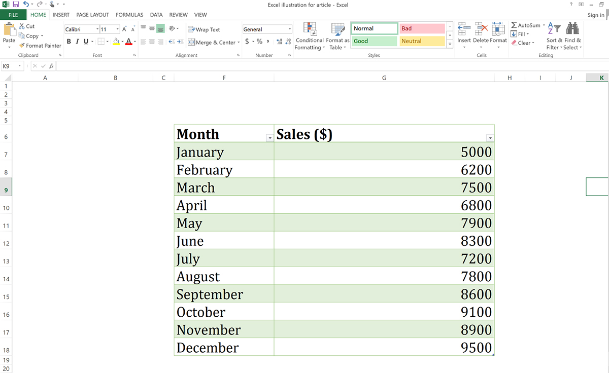
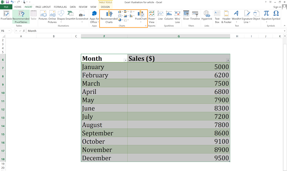
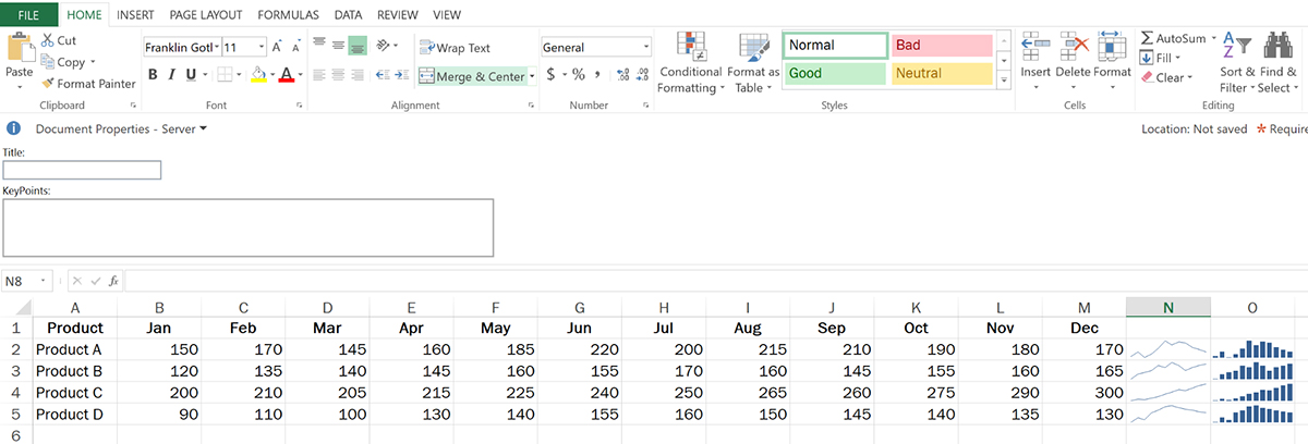
Start by opening your Excel Sheet and organizing your data in columns or rows. Remember to add headers for each category so the tool can easily recognize the data you want to chart.
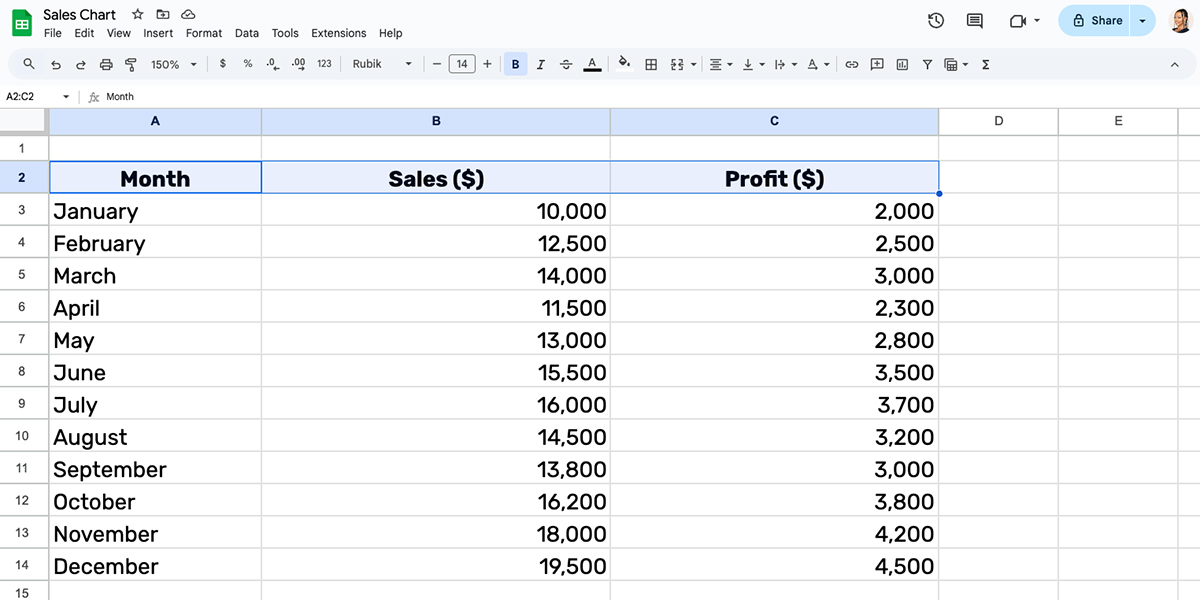
For example, I created the sample sales sheet below in Excel with columns labeled for Month and Sales clearly.
Next, highlight the specific data range you wanted in your chart. Click and drag to select all the relevant cells, including headers, if they’re part of your data.
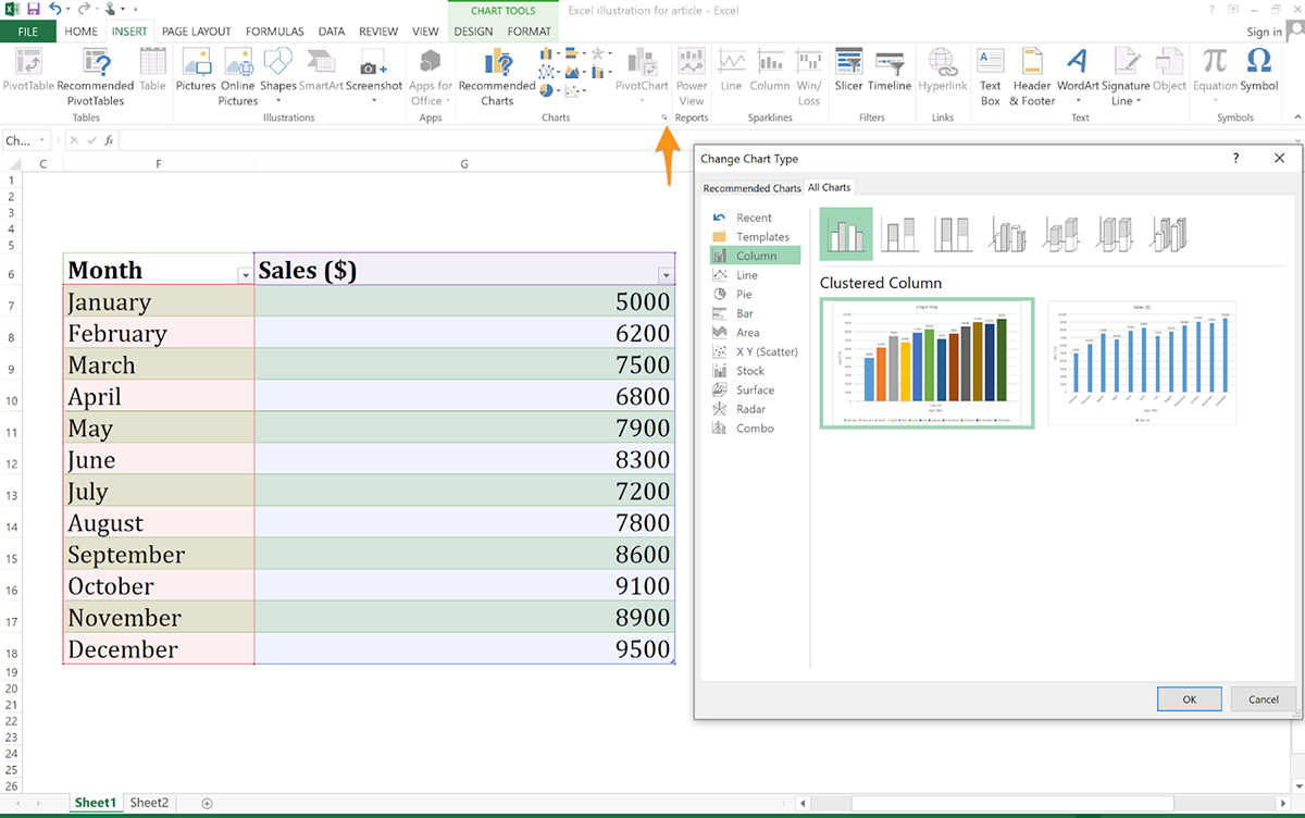
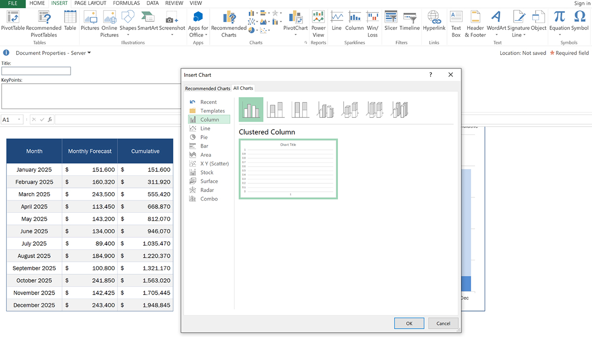
With your data selected, head up to the Insert tab at the top. Excel has tons of chart types, so go to the Charts group and pick the one that fits your data best.
For chart options, just click the tiny arrow at the bottom of the tab and you’ll find different chart variations, including column, line, pie, bar, area, scatter, stock, surface, radar and combo charts.
For example, you can choose a Line Chart if you want to show a trend over time. Interactive comparison charts like Bar or Column Chart work well for comparing things.
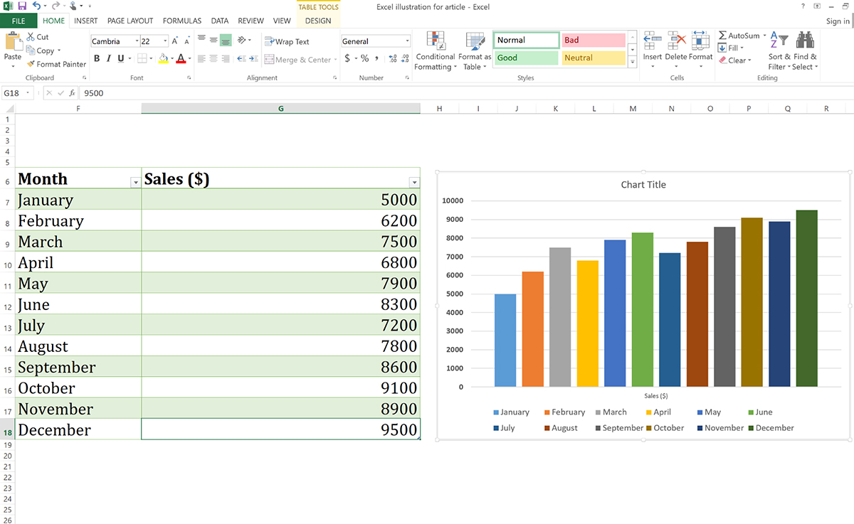
I went with a column chart in my sample chart so it would be easy to compare the heights and see which months had higher or lower sales.
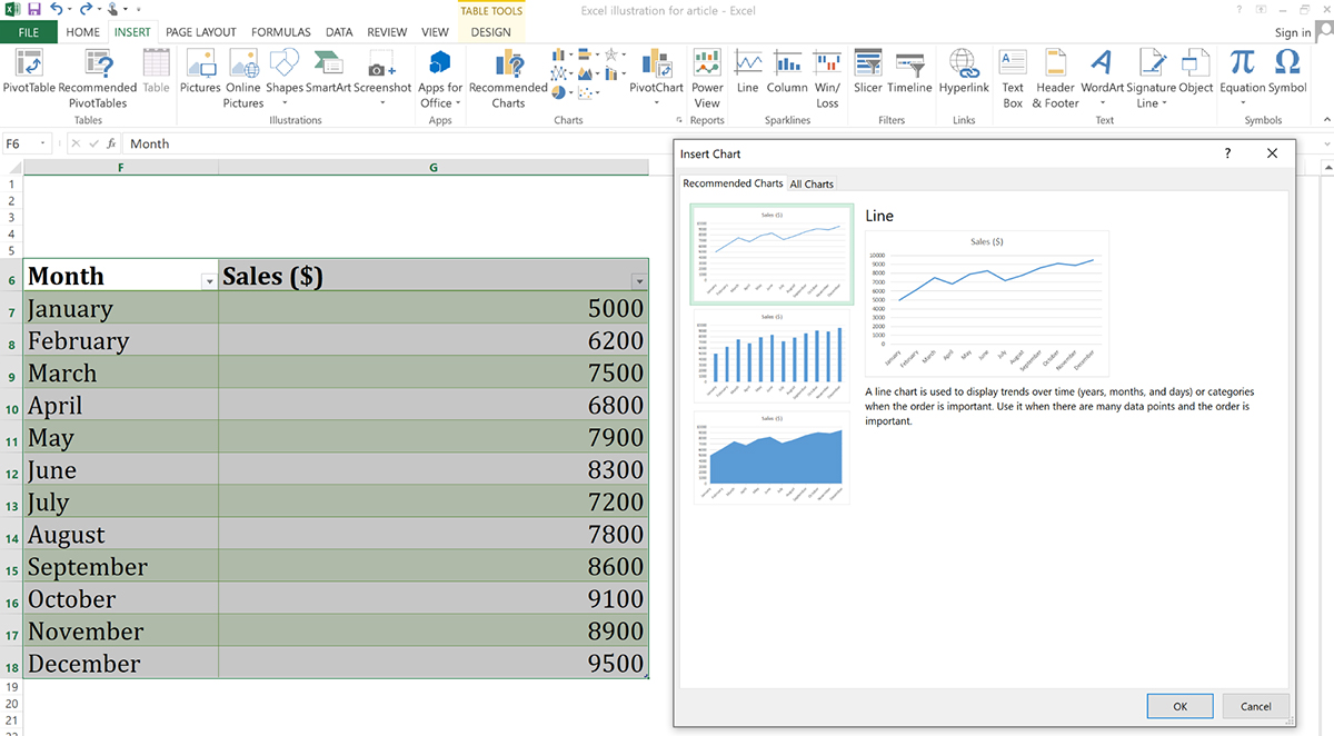
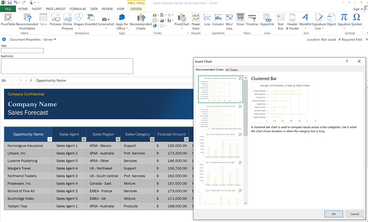
If you’re not sure what type of chart to use, try the Recommended Charts option to get suggestions from Excel tailored to your data set.
For example, when I used the Recommended Charts option, Excel recommended three chart types: a line chart, clustered column chart and stacked area chart.
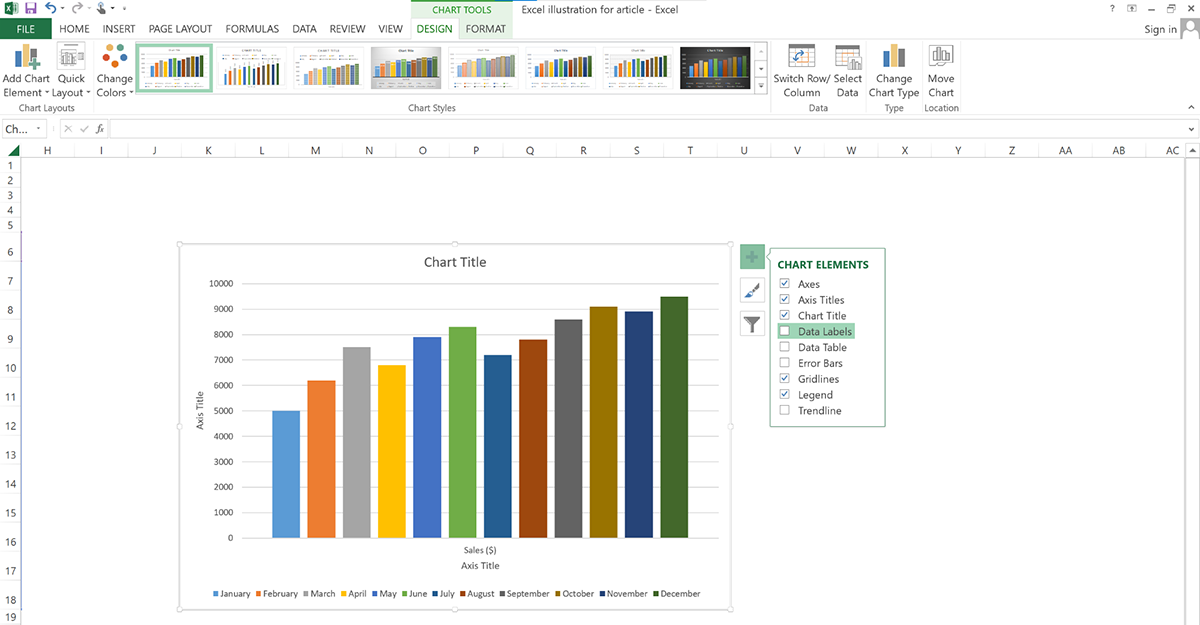
Once your chart comes up, click on it to bring up Chart Tools. From there, you can customize your chart. For example, if you click Chart Elements (a little “+” symbol next to the chart), you can add data labels, gridlines, legends and other elements to make your chart even clearer.
Besides the chart elements, here are some other ways you can do to customize your chart:
When you’ve finished customizing your chart, save your work so you don’t lose any of your hard-earned progress! And if you’re planning to share it, copy the chart and paste it into a Word document or PowerPoint slide or even send it as an image.
The first step towards creating your custom graph is to sign up for a new account. If you’re an existing user, just log into your account and you’ll be redirected to the Visme dashboard.

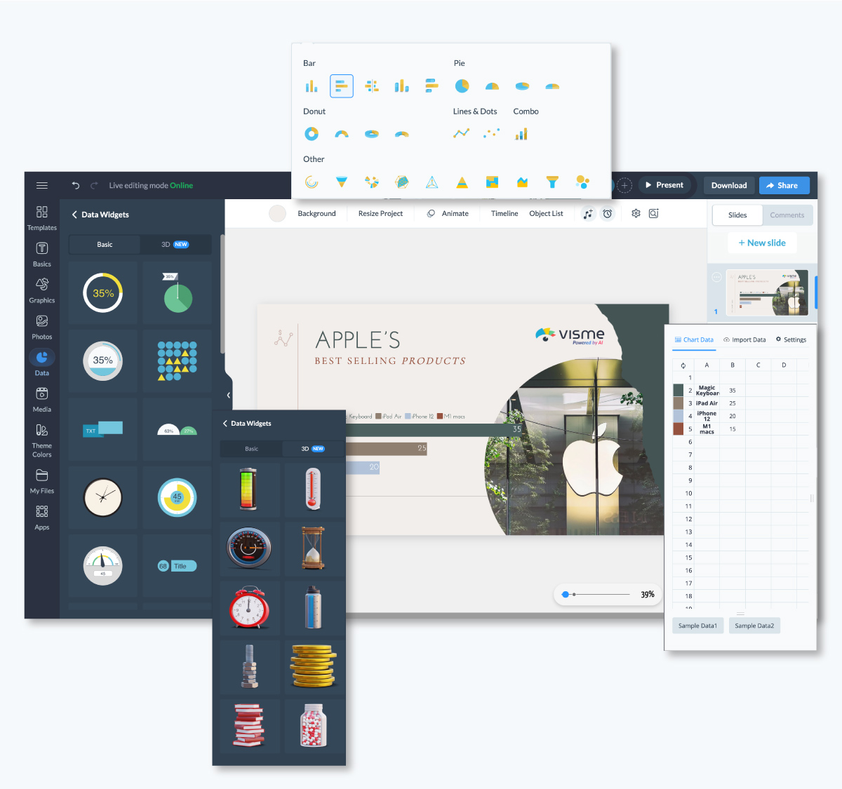
Next click on Create> Project> Charts/Graphs. Once done, you’ll find multiple chart categories:
Your custom graph could be any of these options. If you want to know more about each graph, skip ahead to the glossary at the bottom of the post before you continue with the tutorial.
Right below each category, there are dozens of pre-built templates from the library —scroll down to select a template that suits your project and start editing.
Alternatively, you can create from a blank canvas or generate your charts with AI Chart Maker.
If you choose to Create from Blank, choose the canvas size and click use this template. Then head to open the Visme chart maker.
You'll find the Visme chart maker inside the Data tab on the left-hand panel of your Visme editor.
Select the chart you want and place it in your project by simply clicking or dragging it into the canvas. The Visme Graph maker lets you switch between graphs easily, and you just have to enter the data once.
There are many different ways you can input the data for your custom graph into the Graph Maker.
The Visme Chart Maker makes it easy to import a data set. If your data is on a Google Spreadsheet, just copy the URL and paste it into Visme.
Then click Connect Sheet by URL or connect your chart to live data in Google Sheets. Better yet, download the spreadsheet as a CSV file and upload it to the editor.
And, if your data is in an Excel sheet, download the file as an XLSL or CSV file and upload it to the editor. There’s also an option for you to connect your sheets to Excel online.
After inputting the data, it’s time to customize the chart to match the rest of your project. The first step is to color code the data.
Use your brand colors or another custom palette. Choose colors that stand apart from each other so that the data is easy to read.
In the data tab, click on a color and choose from your color palettes or the Visme palettes. Change the color of the background in the settings tab.
Also in the settings tab, customize the title, style, values, axes and legends. Choose the fonts, the position of the legend, their visibility, the prefixes and suffixes for the data values and the chart style you want.
The settings tab is also where you choose to make your graph into a stacked chart. Every type of chart can be stacked.
Away from the settings tab, click on Graphics to access millions of stunning visual graphics and assets for your charts. Visme comes packed with beautiful images, icons, illustrations, special effects, avatars, shapes, arrows, characters, scenes and objects you can use for visual storytelling.
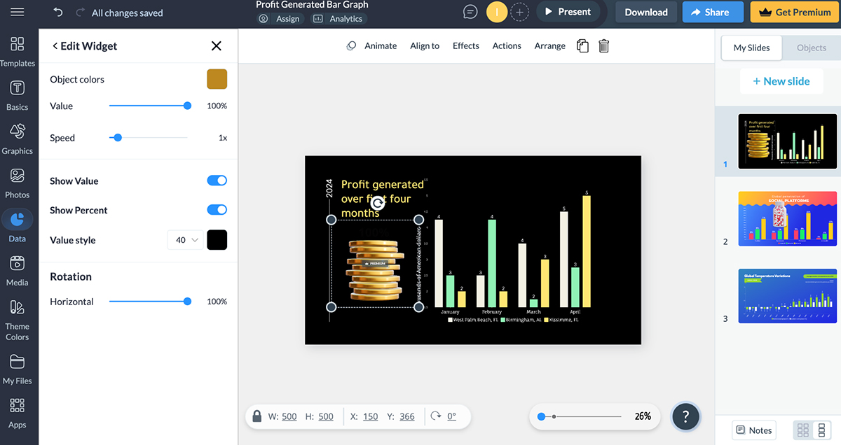
To keep your audience hooked to your presentation, tap into Visme’s wide variety of 2D and 3D widgets to display your data or emphasize specific data points.
Now that your graph is ready, add another level of customization with animation and interactivity.
Creating animated charts in Visme is super easy. In the settings tab, choose a style of animation for how the custom graphs loads onto your project when it’s seen.
Additionally, choose whether or not you want to show a caption on hover. But that’s not all. Visme lets you animate text and objects in your charts. Add text effects, and enter and exit animations to specific objects or everything on your canvas.

You’re done!
There are lots of things you can do with your graph, be it on its own or inside a larger project:
Share it with a live link or on social media by clicking on the ‘Share’ button. Embed it on your website or HTML email. Download it as an image or a PDF or as an interactive HTML file.
Have you ever wished your data visualizations could update automatically like your data? Well, there's a fantastic feature in the Visme chart maker that can do just that!
I realized that if I input data from a Google Sheet that’s published to the web, my chart can update automatically with any changes made to that sheet. This means if I want to share my graph online, I can give my team a link where they’ll always see the most current data – perfect for tracking progress or performance over time.
To set this up, all I needed to do is publish my chart (or the whole project) to the web. In the Visme editor, I just went to the Share tab and published it, and then I could send my team a link. They’ll be able to see the latest data every time they check it out – no need for constant re-uploads or adjustments. It’s such a convenient way to keep everyone aligned with real-time data.
Creating a chart or graph in Google Sheets is easier than you might think, and it’s one of the simple ways to make data stand out visually.
Here’s how to do it, step-by-step.
First things first, organize your data in a way that’s easy for Google Sheets to interpret.
Typically, I make sure the data I want to visualize is in a table format. That means each column has a header (like “Month,” “Sales,” or “Expenses”) and the rows are filled with the corresponding numbers or values.
Keeping it simple and tidy here will make things much smoother when creating the chart.
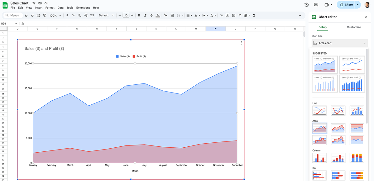
For this illustration, I used a simple table to track monthly sales and profit data.
The next step is to select the cells containing the data you want in my chart. This part’s important because Google Sheets will use whatever cells I highlight to build the graph.
If you want to compare specific columns or categories, then you’ll have to hold down the Command (or Control) key and click each section. Otherwise, just drag to select everything in the table.
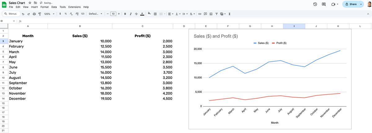
With your data selected, go to the top menu and click on Insert > Chart.
Google Sheets will automatically suggest a chart type based on your data. For my illustration, it immediately recommended this line chart below.
But that’s not all! If you click on the chart editor, click on Setup and head over to the chart type, option, you’ll find other chart or graph suggestions you can use.
Alongside the line chart, Google Sheets also recommended a column chart, area chart and area chart.

If you want to change the chart to something other than what Google Sheets suggests, like a pie chart or line graph, it’s easy to do so.
In the Chart Editor panel that pops up on the right, go to the Setup tab. Click the Chart Type dropdown menu to pick the one that best matches your data.
You can find various types of charts and graphs in Google Sheets, like line, area, radar combo, bar, and pie charts. There are also other graph types like maps, scatter plots, bubble charts, timeline charts, and more.
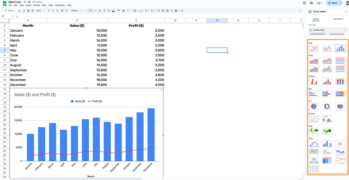
Google Sheets will preview the chart as you scroll through different options.
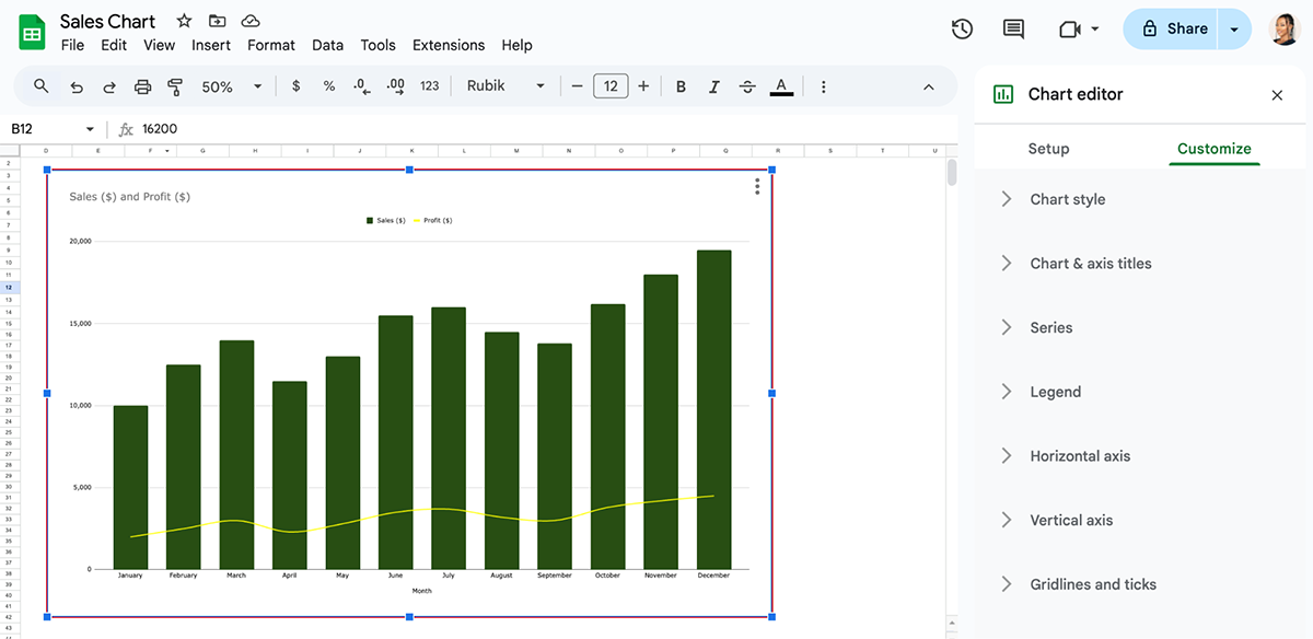
Now comes the fun part: personalizing the chart! Under the Customize tab, you can adjust things like colors, labels, and fonts.
Here's how I tackle this part for most of my presentations.
To make sections or bars pop, I go for colors that stand out but don’t clash with each other.
A captivating chart title and well-defined axis titles are essential, and I often include data labels to showcase exact values for clarity. And if I’m preparing this chart for a presentation, I’ll opt for fonts and styles that match the overall aesthetic. Go ahead and play around with the chart to make it look good and easy to read for your audience.
Click on the chart to move it around or resize it by dragging the edges to make it align with the rest of your data. Or just copy and paste it into other parts of your document if you’re using the chart in a report or presentation.
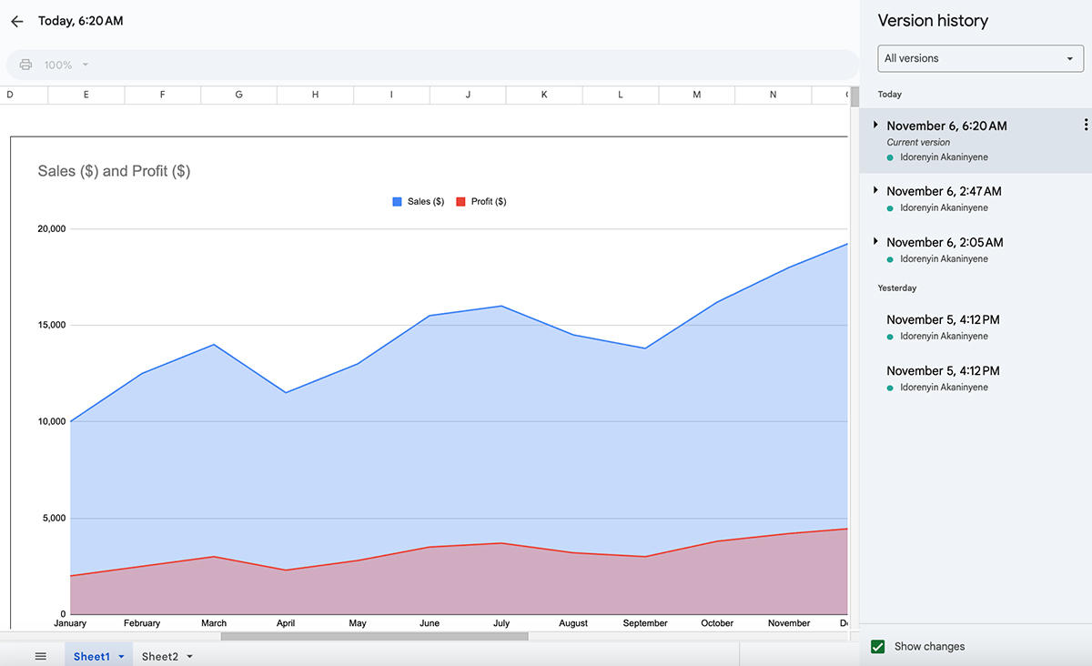
Once you’re happy with how the chart looks, you can save the chart within your Google Sheet.
From there, you can also download it as an image, copy it into a Google Doc or Slide, or even share it with others right from Sheets.
To export the chart, click on the three dots in the top-right corner of the chart, then select Download and choose a format (e.g., PNG, PDF, or SVG).
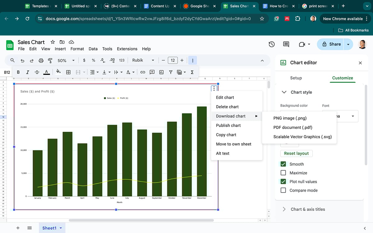
There’s also an option to publish your chart using a link or embed code. Click Publish chart> Choose a publishing option:
In this section, we've put together an exciting list of different types of data visualization that you can create with Microsoft Excel and Visme. Play around and see how these charts and graphs can bring your data to life.

Bar graphs are a classic type of graph that visualizes amounts for a set of categories.
For example, how many donuts did each student eat in one month? The x-axis measures the amount of donuts and each bar along the y-axis is one student. Visually, bar graphs can be vertical or horizontal.
Use a bar chart if you need to show different measurements of a group of things. Visme bar graphs can also be created as multi level bar graphs in which a category is separated into parts. This can also be set to be a stacked chart.
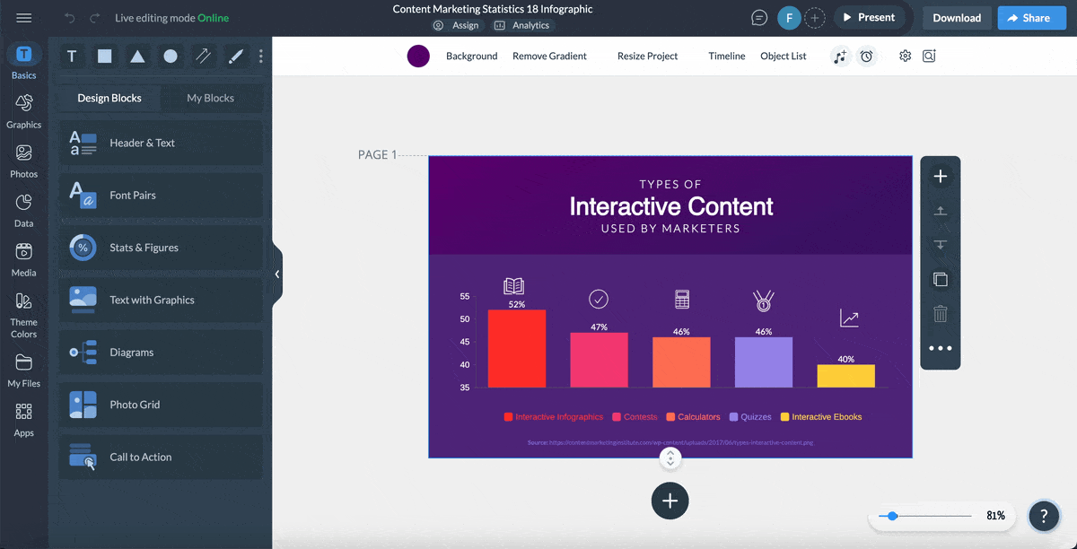
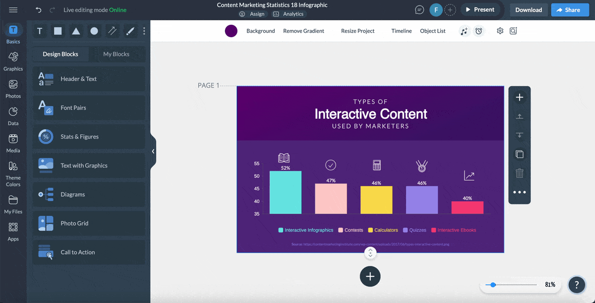
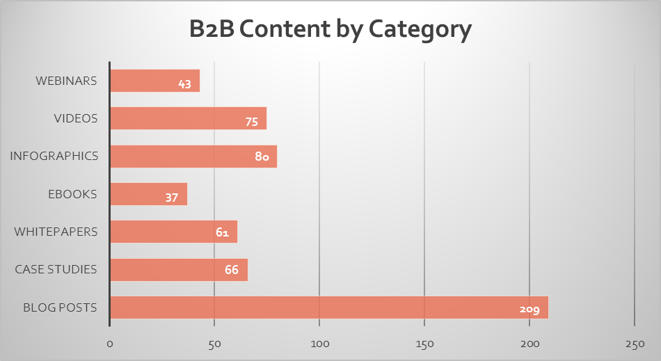
For instance, I created this bar chart in Excel that illustrates the distribution of B2B content by category, tailored for a company's annual B2B marketing strategy.
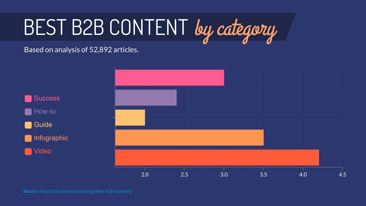
Take a look at a bar graph created in Visme using real data from BuzzSumo on a related subject.
Stacked charts are based on the regular bar graph but each category can be separated into parts. Using the same example from above, how many donuts each student ate is categorized into groups. Each color stack is a type of donut.
Use a stacked chart to show variable data about groups that can be separated into categories. To create a stacked chart with Visme, click on “enable stack” and choose between a regular view or a “100%” view.
The choice will depend on your data. For an irregular variable set of amounts, use the regular style. Alternatively, for a data set that demonstrates percentages that equal 100, use the “100%” view.
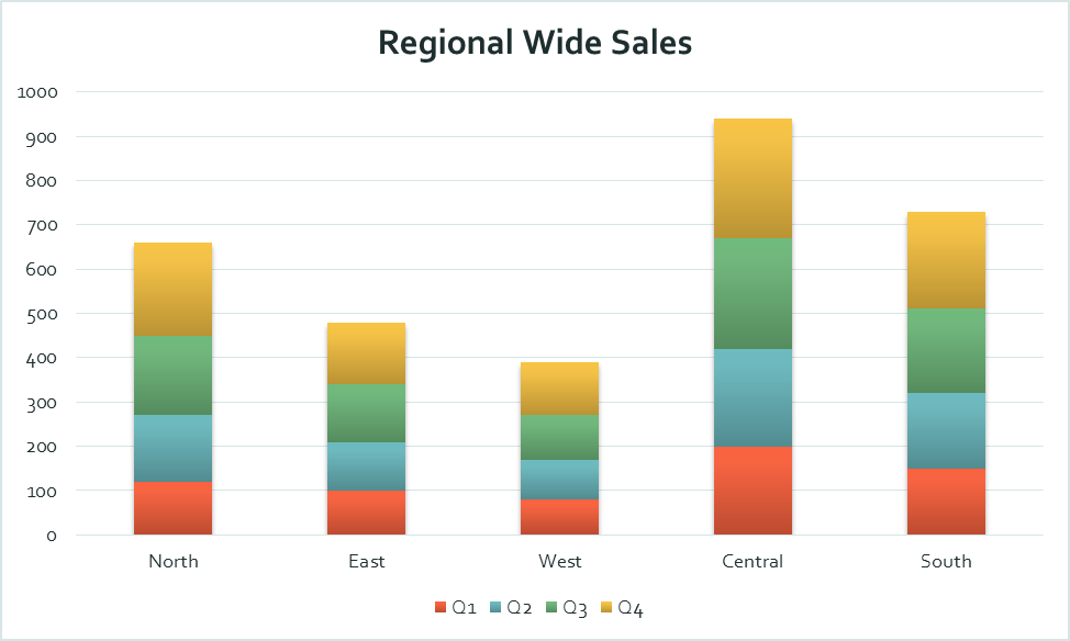
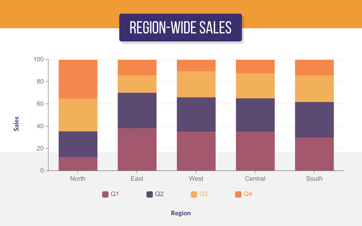
For the purpose of this illustration, I created this sample stacked bar chart in Excel to visualize sales data across four regions (North, East, West, Central, and South) for each quarter of the year (Q1 to Q4).
This captivating stacked bar chart template below created in Visme also visualizes sales data across four regions.
But you know what sets it apart? You guess right! It’s all in the eye-catching design and the rich blend of various design elements.
A histogram is visually a vertical bar chart, but it has a different purpose. A histogram visualizes the distribution of data over time or other numerical ranges.
The thing to remember about histograms is that your x-axis will always be a range of numbers instead of one fixed amount.
The x-axis shows time intervals or ranges and the y-axis shows frequencies or amounts. A good data set for a histogram is weather patterns, sales per day, or any type of information surrounding age ranges.
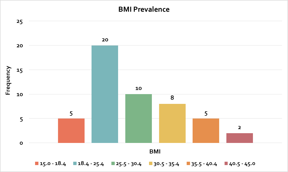
The histogram design I created in Excel is basic and helps you analyze BMI distribution without any visual distractions.
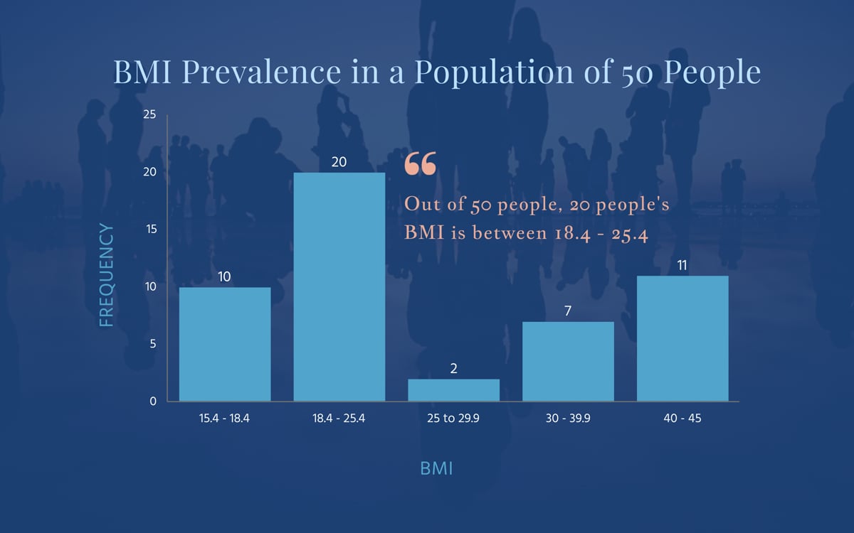
On the flip side, the Visme chart below brings an element of visual storytelling to your histogram. With options like semi-transparent background images and customizable color gradients, Visme makes your chart memorable —perfect for presentations where your visuals need to pop.
With Visme, you can create a histogram with the bar graph function. Simply input your ranges as the x-axis variables and add the frequency of things occurring to the y-axis, and you’ve turned your bar chart into a histogram.
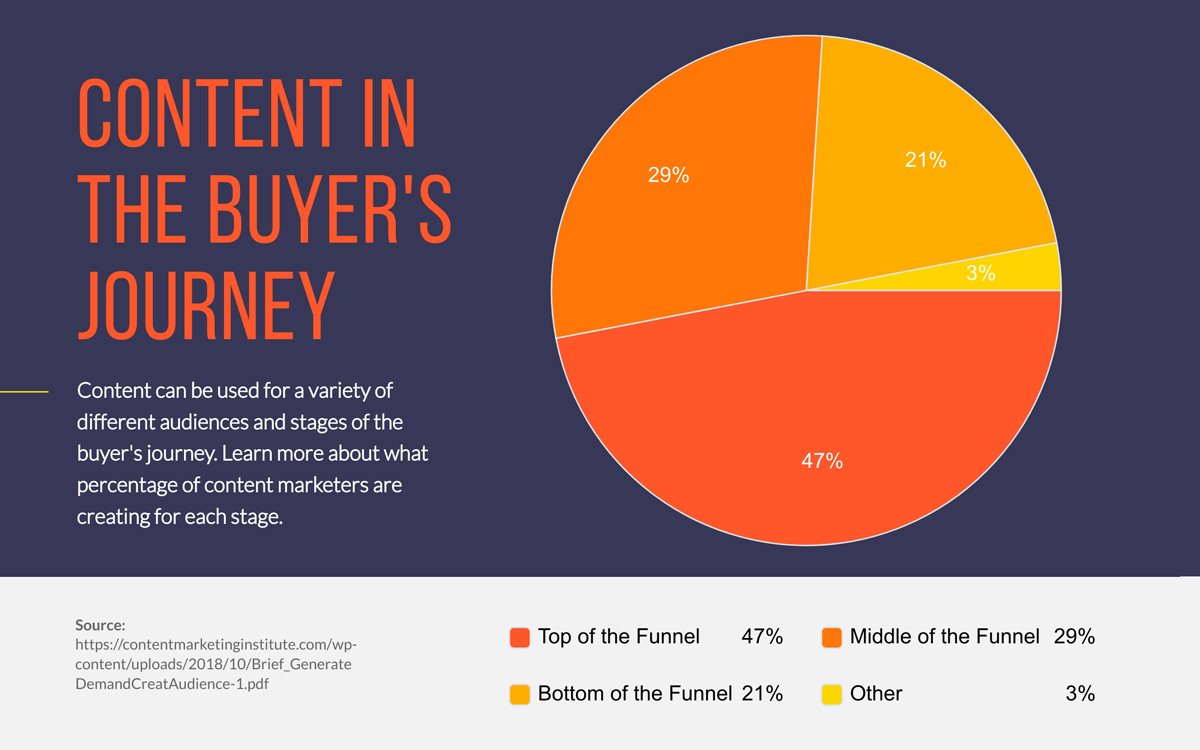
A pie chart is another classic visualization used in all sorts of presentations, reports and proposals. Use a pie chart when you have to visualize amounts of data that are part of a whole. Each section of the chart represents a percentage of a full amount or concept.
For example – what percentage of your time is spent on social media, working or reading? Each category is a slice, and they all together equal 100% of your time.
The Excel pie chart I created below visualizes the percentage of different content types in buyers' journeys with basic colors and visuals.
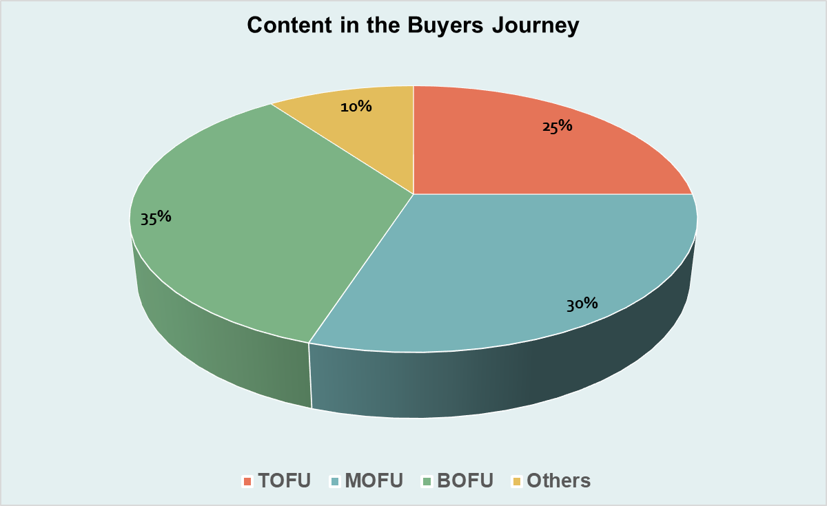
In contrast to the Excel variant, Visme’s pie chart is modern and eye-catching, with a rich blend of vibrant colors to show the different buyer journey stages.
To make a pie graph with Visme, simply choose the pie graph option in the Graph Maker. Additionally, you can choose to give the chart a 3D view.
A donut chart is essentially the same as a pie graph but with a hole inside. It displays the data in the same way. The upside of having that hole in the middle is that you can place information or titles there.
For both pie charts and donut charts, they work best with a small number of variables. When there are too many variables, the slices are difficult to read.
Here’s an example of a donut chart in Microsoft Excel. Unlike a traditional pie chart, this format offers a central blank area, which can be used for additional data labels or even annotations.
This donut chart I made in Visme offers a dynamic way to display data. It effectively illustrates how each part contributes to the overall picture, whether in financial reports or survey results.
Line graphs are the kinds of graphs you regularly see on analytics platforms for Google and social media platforms.
These types of graphs visualize quantitative data along a specific span of time. A line graph can be separated into small categories to show the difference between them over the same amount of time.
Use a line graph to show an analysis over time of things like sales, clicks and other quantitative values that happen constantly and can be grouped at intervals.
Here’s a sample line chart I designed in Microsoft Excel.
This line chart illustrates trends over time, allowing for a clear visualization of changes in data points across specific intervals.

This line chart below was crafted using Visme’s line graph maker, and you can customize it to fit the rest of your design. It clearly illustrates how values have changed over time with smooth connecting lines.

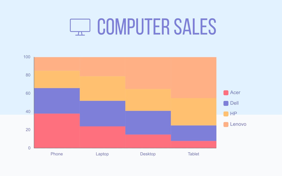
A stacked line graph is just like a line graph, but with a stacked design.
It’s basically a variation of a regular line graph where multiple data series are displayed on top of one another.
Instead of each series being represented by a separate line, the values of each data series are stacked one on top of the other. This lets you see both individual trends and how they contribute to the overall total.
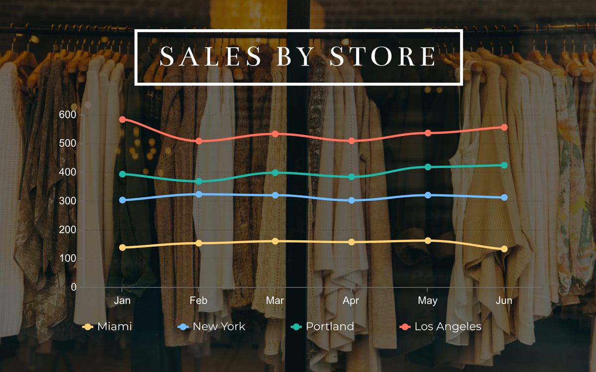
This stunning stacked line chart, crafted in Visme, comes to life against a captivating backdrop of a trendy clothing store. The graph overlays elegantly in the foreground and looks super amazing!
To choose this option, simply click on the ‘stacked’ toggle in the settings tab when creating a line graph.
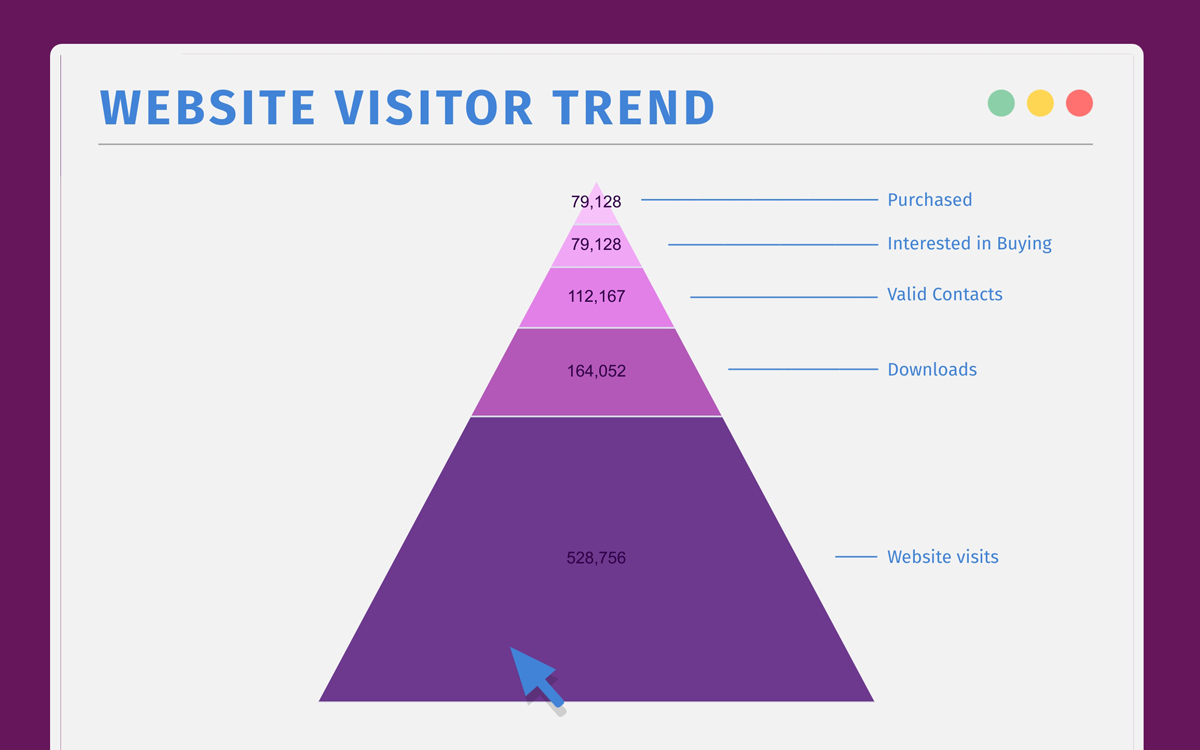
Pyramid charts are great for showing hierarchical data. The values don’t need to be part of a whole and can be of varying numerical values. It helps visualize levels of data; this could be levels of importance, levels of income or other hierarchical data.
When inputting the data, make sure it’s set up with the smallest value at the top of your graph and increasing downwards.
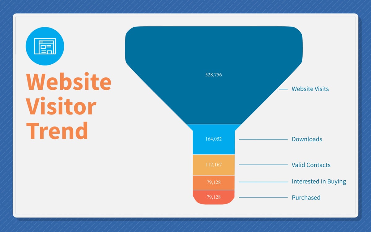
A funnel chart is essentially a pyramid chart upside down. It’s great for visualizing a customer’s journey inside your company, from that first contact to downloads to sales. A funnel chart, like a pyramid chart, can include varying value sets.
When inputting the data, make sure it’s set up with the highest value at the top of your graph and decreasing downwards.
A Mekko chart is similar to a stacked bar chart with an added bonus. The columns have different widths, adding another level of data. In a Mekko chart, the related variables inside the categories are more noticeable.
Keep in mind that this type of chart is not a good choice if you have too many variables as it can get messy fast.
Spider graphs (or radar charts) are best kept simple with only a few variables in one or two categories.
This type of chart is good for visualizing performance. All variables start from the same center axis and radiate outwards at different levels.
Each axis represents one variable, and data points are plotted along each axis. The points are then connected by lines, creating a web-like shape.
The graph is called a "spider" because of the web-like structure formed by connecting the data points. Each line on the graph represents a specific category or variable, and the shape of the graph reveals how these categories compare across different values.
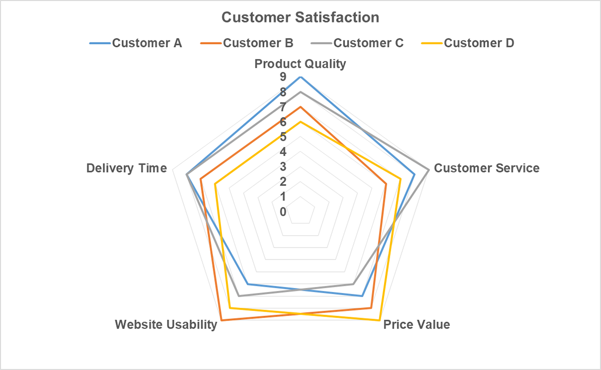
Take a look at this spider chart I put together in Excel to compare customer satisfaction ratings for four clients. It’s useful for spotting patterns and disparities in customer feedback across various satisfaction factors: delivery time, customer service, website usability and price value.
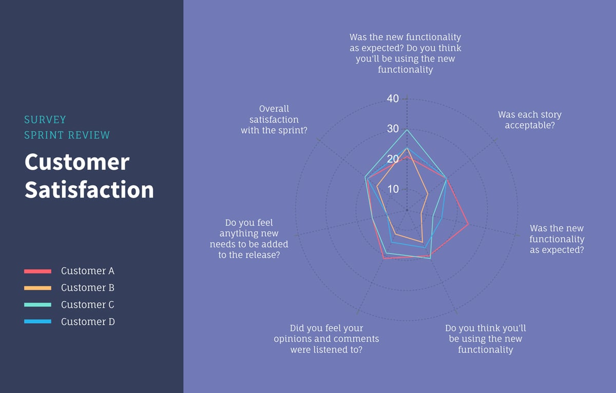
Here's a radar chart template you can customize for better visual impact. It evaluates customer satisfaction during a sprint review based on eight parameters framed as questions.
If you want to make a graph or chart, we’ve got some solid choices: Visme, Excel, and Google Sheets. Each one has its own strengths, depending on what you’re after.
Excel has been the go-to for years—think of it the perfect pick if you’re dealing with a large dataset and complex calculations.
Google Sheets, on the other hand, is all about ease and collaboration. And then there’s Visme, the star when it comes to design—ideal if you’re looking to turn heads with visuals that look polished and professional.
So, which one’s right for you?
Let’s take a closer look at what each tool brings to the table and find the best match for your project!
| Feature | Visme | Excel | Google Sheets |
| Ease of Use | User-friendly with drag-and-drop interface | Steeper learning curve with advanced options | Simple interface, easy for beginners |
| Chart Types | More than 30+ chart types plus 20+ interactive and unique widgets | More than 20 types each with subcategories. | Over 30 chart types |
| Template Library | Extensive library of 600+ professionally designed templates | 100+ chart templates | 10 templates |
| Customization | Advanced customization with animations, colors | Detailed customization for chart elements | Basic formatting; limited compared to Excel and Visme |
| Interactivity | Interactive charts with hotspots, external links, hover effects, pop-ups | Limited interactivity through slicers | Basic interactivity; lacks slicers |
| Artificial Intelligence | Offers an AI chart and graph maker | Users can automatically generate charts with Copilot AI | No AI chart maker |
| Collaboration | Allows team collaboration with workflow management, feedback tools and version history | Limited real-time collaboration | Strong real-time collaboration with version history |
| Data Integration | Integrates with online platforms, export options | Strong integration with Power BI, databases | Integrates with Google Data Studio, APIs |
| Conditional Formatting | Some basic options | Extensive, with rules-based data highlighting | Basic, limited formatting options |
| Best For | Engaging visual storytelling | Detailed analysis and advanced data handling | Simple, collaborative visualizations |
| Pricing | Free and paid plans | Paid (part of Microsoft 365) | Free for individual use. Business plan |
Now, let’s dive deeper into each tool and how they stack up for creating charts and graphs.
Visme has quickly become a favorite for creating data visualizations that don’t just look good but engage people actively.
The signup process was pretty straightforward, and then I was greeted with a visually captivating dashboard that made me feel at ease.
Clicking the Charts/Graphs category immediately revealed all the chart types, and hundreds of templates were right beneath them. There’s an option to sort the templates based on role and industry.
The interface is incredibly intuitive, with a drag-and-drop editor that makes it super easy to add data and adjust visuals without fussing with formulas or complex settings.
The menu is neatly arranged on the left for accessibility, while the tools for customizing your chart are at the top. This arrangement makes the interface uncluttered and easy to navigate.
Like Excel and Google Sheets, Visme offers a vast collection of chart and graph types (which I've listed above). But Visme has dozens of 2D and 3D widgets, which I find pretty interesting.
The best part? You can customize the widget's value, speed, rotation, and appearance.
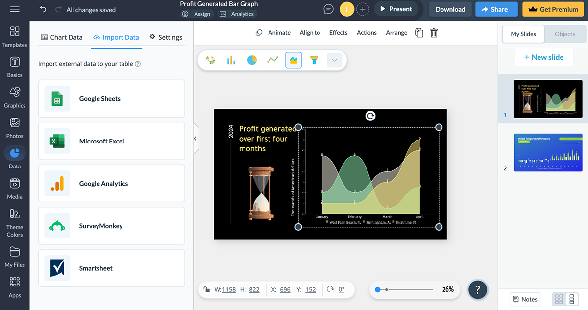
I also love that Visme provides you with two sample data sets you can play around with. It also lets you import external data from Google Sheets, Microsoft Excel, Google Analytics, SurveyMonkey, and Smartsheet into your table.
If you're racing against the clock or just need a hand getting your charts off the ground, you’ll absolutely love Visme's AI chart maker! It’s not just a time-saver; it takes the hassle out of graph creation.
When I opened the tool, I simply typed in a detailed prompt outlining everything I wanted for my chart, including the specific type and any other essential information. Plus, I could upload a document or add a URL to enrich my request!
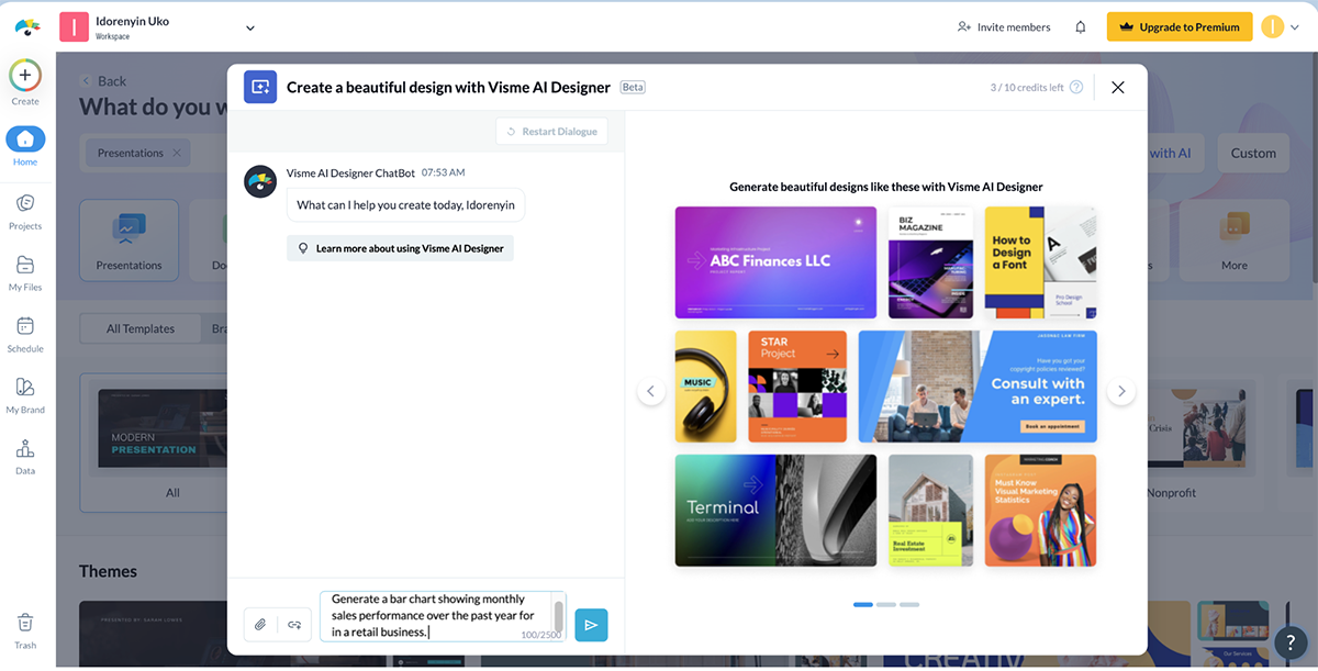
The Visme Chatbot then suggested a variety of visual styles. I chose my favorite, and then sat back while the AI worked its magic.
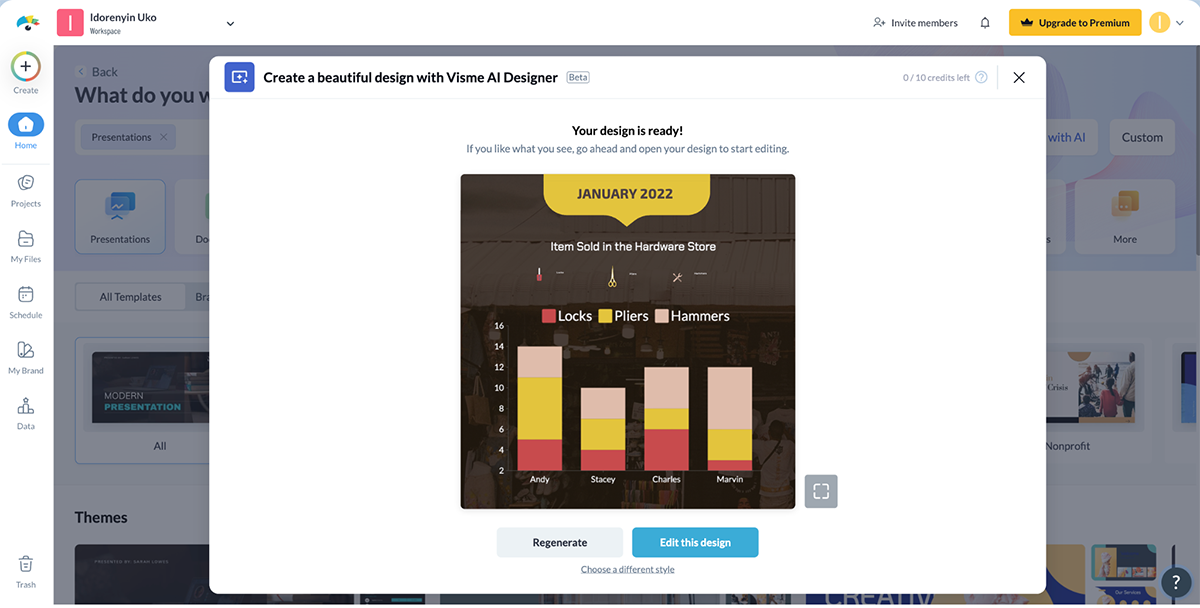
And here’s the best part: I can preview my creation, make edits, or even regenerate the chart if I want something different. It’s pretty impressive.
Visme is particularly strong with interactive visualizations—there were multiple options for adding interactive elements to charts and graphs, like animations, clickable elements, and hover effects.
Plus, you have the option of adding pop-ups and links to other projects in your library or on an external website.
Beyond the basic customization options (color, fonts or size of the chart elements) I found in different tools, Visme took it to a whole new level—now we're talking hyper customization.
I found an overwhelming selection of 2D and 3D icons, illustrations, shapes and graphics that can be used to enhance data visuals.
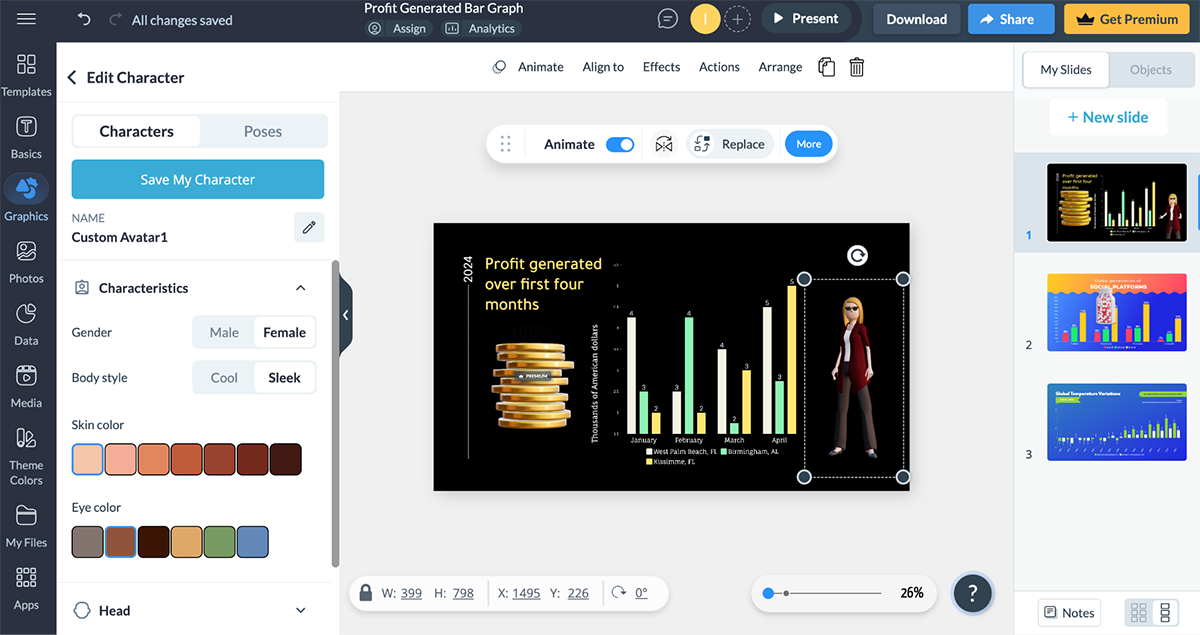
What stood out for me was the 3D characters and scenes which I used in the example below.
Interestingly, Visme has a real-time collaboration feature for teams of all sizes. Team members can view, comment, edit and make changes to your designs.
Just like in Google Sheets, you can check your project’s version history and go back to earlier versions.
This flurry of visually captivating elements and other incredible features makes Visme ideal for creating infographics, presentations, and online content that needs a “wow” factor.
However, the best features are locked behind paid plans, so while Visme’s free version is functional, your ability to export your charts is limited.
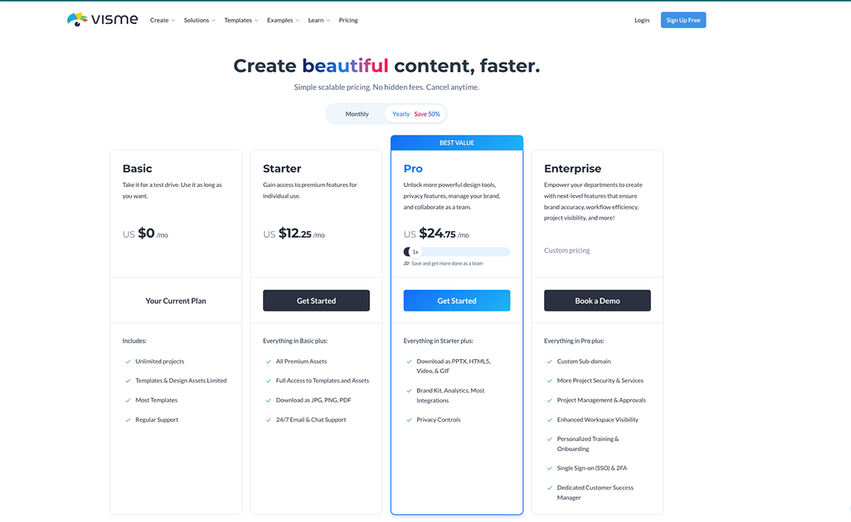
Visme offers a free plan which allows you to take the tool for a test. Here’s a breakdown of the paid plans
Microsoft Excel has been the OG for data analysis and visual storytelling for over 40 years. One of the key reasons for its enduring popularity is its versatility. Excel can handle a wide range of tasks, from simple calculations to complex data modeling.
It’s my go-to tool if I’m working with large datasets or need high customization and analysis tools. It has a vast selection of over 18 chart types—everything from simple bar charts to complex waterfall charts and dynamic pivot charts that update as data changes.
When I chose a vast amount of data and clicked on Excel’s Recommended Charts, it showed various logical ways to display the data’s elements.
I also find the sparklines helpful for highlighting patterns, trends, and specific values in data (without taking up too much space. Not to mention other features like conditional formatting, trendlines and data slicers.
Although I have to be honest, Excel comes across as intimidating for beginners. There are lots of features in different tabs, some without labels or small icons you might miss.
While working on the piece, I literally had to scan through the Microsoft support guide for a short refresher course to find my way around the tool.
Unlike Visme, which offers dozens of templates to help beginners get started, Microsoft Excel has just a handful that is not as captivating. If, like me, you’re a sucker for animations and interactivity, Microsoft Excel is limited in that sense.
Even though Microsoft Excel is powerful, getting familiar with all its functions can be time-consuming. Plus, it requires a Microsoft Office subscription, which can be pricey.
In my opinion, Excel’s value is best when you need robust data analysis and visualization tools in one place and don’t mind spending time on a more complex interface.
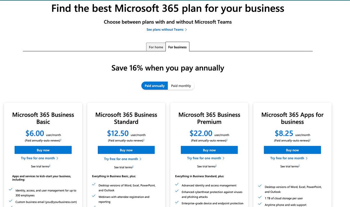
Here are the paid plans for Microsoft Excel:
For Business
I’ve always found Google Sheets to have a refreshingly minimalistic interface compared to Excel. The way options are organized into labeled dropdown menus makes a huge difference for me. It’s refreshing to work in a space that isn’t crammed with features at the top.
This uncluttered layout makes navigating through my spreadsheets feel so much easier and more intuitive—I can focus on my data rather than getting lost in a sea of options!
Much like Excel, Google Sheets has all the main chart types and the helpful recommended chart feature (I’ve covered this before).
Real-time collaboration is seamless with Google Sheets, making it ideal for team projects or sharing reports with clients.
Several teammates can work on a spreadsheet together, with the ability to view each other's cell selections and edits in real time. There's a chat feature that pops up when people work together on the same spreadsheet. Team members can tag each other, leave comments and resolve them when the project is completed.
The version history is easily accessible at the top of every sheet so you can quickly identify contributors and changes they’ve made and revert to earlier versions (if necessary).
When it comes to collaboration, Excel can feel a bit clunky compared to the seamless experiences offered by Visme and Google Sheets. Yes, the web version of Excel allows for real-time teamwork, but compatibility issues often turn what should be a smooth process into a frustrating challenge on a desktop.
On the flip side, while Google Sheets shines in its simplicity, it doesn’t quite match the extensive customization and interactive features available in Visme and Excel.
To sum it up, if I’m looking to whip up a chart with straightforward visuals in no time—especially alongside a team—Google Sheets is my top pick.
For anyone who wants quick, accessible, and free data visualization, it truly stands out as a top choice!
Google Sheets is more budget-friendly compared to Excel—it’s free for individuals. Paid plans for Google Workspace are as follows:
Charts and graphs are often used synonymously, and in other cases, they complement one another. But there’s a subtle difference—a chart is a visual illustration of data, which could be a map, graph, diagram or even a table.
Essentially, it converts your data into a visually structured format.
A graph, on the other hand, shows explicitly a relationship between data points or and how they affect or change each other over time.
Making a chart or graph in Excel is straightforward! Just highlight your data, then go to the Insert tab, and choose the type of chart you want (like bar, line, pie, etc.).
Excel will automatically generate the chart and then you can customize it with colors, labels, and styles. Microsoft Excel’s Recommended Charts option is also handy if you're not sure which chart type to pick.
If you’re looking for a free website to create charts, I’d recommend Google Sheets. It’s user-friendly and allows you to make a variety of charts without any cost.
But if you’re looking for a tool that supports interactive data visualization and data storytelling, Visme is your best bet.
It comes packed with dozens of professionally designed templates to get your creative juices flowing, plus an AI chart maker that will do the heavy lifting for you.
The customization options are endless; you’ll be spoiled for choice. Access millions of design assets and tools for branding, animation interactivity, real-time collaboration, workflow management, and more.
If you’re in Excel, using the Insert > Recommended Charts feature makes it super easy!
Just select your data, choose a recommended chart type, and Excel will do the work for you. It’s also easy in Google Sheets: highlight your data and go to Insert > Chart. Both tools offer quick customization features to make your chart look professional.
Creating a custom graph is easy with Visme's graph maker. Our favorite feature of the graph maker is the way you can switch from graph to graph after inputting your data.
If you're looking for an easy-to-use tool to create fully customizable and professional graphs, sign up for a free Visme account and take it for a test drive for as long as you want.
Design visual brand experiences for your business whether you are a seasoned designer or a total novice.
Try Visme for free