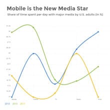
Sulfur Dioxide Emissions Worldwide Line Graph Template
Use This TemplateSurvey global sulfur dioxide emissions levels over the years using this line graph template.
Track worldwide pollutant trends, key contributors to sulfur dioxide emissions, and changes in global air quality metrics easily with this template. Its green color palette paired with a streamlined design creates an engaging visual depiction of data. Distinct graph markers enable the viewer to grasp crucial data points with ease. Utilize Visme's versatile editor to tweak this template to complement your study's objectives.
- Change colors, fonts and more to fit your branding
- Access free, built-in design assets or upload your own
- Visualize data with customizable charts and widgets
- Add animation, interactivity, audio, video and links
- Download in PDF, JPG, PNG and HTML5 format
- Create page-turners with Visme’s flipbook effect
- Share online with a link or embed on your website
Edit this template now, or explore more brilliant line graph templates for endless design possibilities.
Edit this template with our pie chart maker!
-
Dimensions
All chart templates come in two sizes: horizontal (1920 x 1080 pixels) and square (800 x 800 pixels)
-
Customizable
This chart template can be fully customized. You can edit content, change image(s), apply custom colors, add or subtract pages and more.
-
Formats
Can be shared as public or private link online, embedded to a site or blog, or downloaded as JPG, PNG, PDF or HTML5. If downloaded as an image, you can also insert into other documents and presentations.
Related Charts & Graphs


