Professional Comparison Chart Maker for Comparing Concepts

- Free and simple comparison chart maker.
- Start with a comparison infographic template.
- Compare two or more items in a visual design.

Chosen by brands large and small
Our comparison chart maker is used by over 34,300,000 marketers, communicators, executives and educators from over 133 countries that include:
EASY TO EDIT
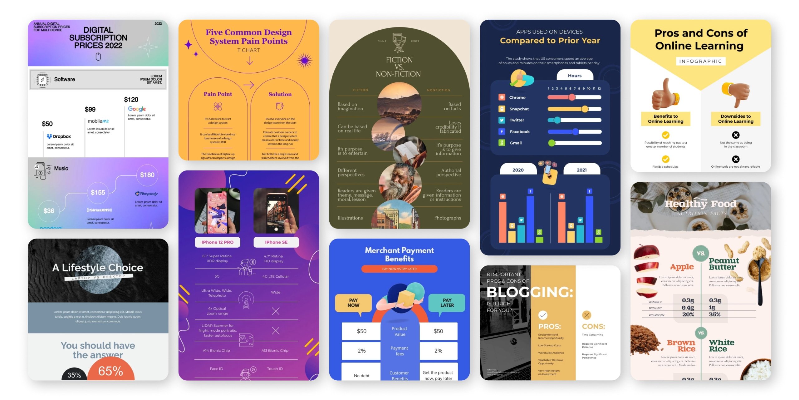
Comparison Chart Templates
Get started with a template to help create beautiful custom comparison chart designs. Place each item you’re comparing at the top of your template and switch out the placeholder content with your own similarities and differences. Customize fonts, colors, icons, photos and more until the template looks exactly the way you want it to.
Features of the Comparison Chart Maker
Beautiful comparison chart templates
Start your comparison chart from a blank canvas, or get a jumpstart on your design by choosing from Visme’s selection of pre-designed comparison chart templates. Find one that fits your objective and fully customize it to match your comparison.

Build your comparison chart
Bring your compare and contrast chart to life by creating a column for each item you’re comparing and a row for each similarity or difference between the two. With Visme’s premade templates and comparison table features, you’ll build your comparison infographic faster than ever.

Customize every aspect of your comparison chart to visualize similarities and differences
Visme’s compare and contrast chart maker is the perfect tool for visualizing similarities and differences between two or more things, whether it’s your competitors, your service packages, your products and more. Start from scratch or choose a template, either way you have full capabilities to customize every aspect of your design so that it fits your brand, your vision and your comparison.

More Great Features of the Comparison Chart Maker
-
Dozens of comparison infographic templates to choose from
-
Millions of stock photos and icons to add to your design
-
Input your brand fonts and colors to create branded company content
-
Easy drag-and-drop design tools, made with the non-designer in mind
-
Compare two or more items with a customizable comparison table
-
Download as an image file to share with your audience
Share Your Comparison Chart
After you’ve finished making comparisons between your items, you should be ready to share your creation with the world. Visme makes it easy with several download formats, embed codes for interactive content, live URLs and more.

LEARN ABOUT COMPARISON CHARTS
What is a Comparison Chart?
A comparison chart or comparison infographic is the perfect way to compare and contrast two or more items or even visualize a pros and cons list. You’re able to create a table with as many rows and columns as you need for each item and each similarity or difference.
You can use the actual table function inside Visme, or simply use lines, arrows and other design elements to separate each item or comparison.

Use the comparison chart maker to differentiate yourself from the competition.
One great way to use a comparison chart is to showcase how your company stands out from its competition. What do you offer that the others don’t? What does your company do better? Use this type of infographic or chart to differentiate your company from the rest so your audience picks you.
EVERYTHING YOU NEED + MORE
More Than a Comparison Chart Maker
Create a standalone comparison infographic, or use a comparison table design template to add product or pricing comparisons to a report or presentation. Your options are endless with Visme’s comparison infographic maker.
MAKE IT ENGAGING
Interactivity
Create interactive and animated comparison charts that are clickable and engaging for your audience to look through and learn more about your idea.
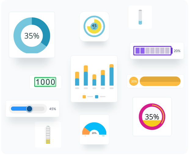
VISUALIZE YOUR DATA
Charts & Graphs
Utilize Visme’s diagramming tools along with other charts, graphs and data widgets to visualize all kinds of information in the blink of an eye.
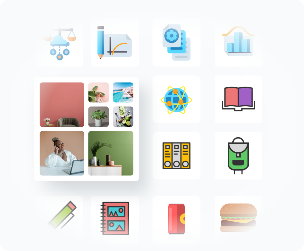
BEAUTIFY YOUR CONTENT
Images & Graphics
Choose from over a million stock photos, icons, illustrations, characters, lines, shapes and more to decorate your comparison charts and accent your content.
HOW IT WORKS
Make Comparison Charts in 5 Steps
Compare and contrast two or more companies, products, features and more by creating a custom comparison chart design with Visme’s comparison chart software. Weigh pros and cons, create a comparison table or design your own unique comparison.
Start with a template, then follow the five steps below to create your very own comparison chart and share it with your audience, team, classmates, etc.
- Determine what you’re going to be comparing and contrasting.
- Start with a comparison chart template by searching in the infographic category.
- Replace the existing content with your title and comparisons.
- Add or remove content blocks to change the length of your comparison chart.
- Share your design by downloading as an image file or embedding in your website.
QUICK TIPS
How to Use the Comparison Chart Maker
When starting a new comparison chart design, the very first step is to pinpoint each of the items you’re comparing.
Enter the Visme comparison chart maker by creating an account or logging in your design dashboard.
Start with a comparison chart template from the Infographics tab or choose to use a blank canvas to build your own comparison.
Use the table function or text boxes to type in each of the similarities and differences between your items.
Add or remove content blocks from your comparison infographic to adjust the length to fit your content.
Customize your comparison chart’s color scheme and fonts to fit your brand guide or match your topic.
If you’re creating an interactive infographic or presentation, customize the animation setting to add extra emphasis to your content. There are four animation options to choose from.
Download your comparison chart infographic in an image or PDF file. Embed onto your website or blog to keep the animation and interactivity.
Frequently Asked Questions (FAQs)
How much does it cost to create a comparison chart with the comparison chart maker?
Creating a comparison chart with Visme is completely free, as is downloading as a JPEG or embedding onto your website. If you want to download as a high-resolution PDF or interactive HTML, you’ll need to upgrade to a Standard plan.
Are the comparison chart templates completely customizable?
Yes! All templates are infinitely customizable. You can change the icons, the graphics, the colors, the backgrounds and the fonts easily.
Why should I create a comparison chart?
A comparison chart is one of the best ways to show off the similarities and/or differences between two or more things. Displaying this information in a visually appealing design can help your audience understand your point and come to a conclusion.
How can I align my comparison chart?
There are two ways to create a comparison chart in Visme – by using the table function or by aligning your elements using the grid. You can turn on the grid by going to Options, making it easy to perfectly line up all elements in your design.
Can I create an interactive comparison chart?
You sure can! You can add animation to any section of your comparison chart, or add buttons and hidden elements to give an element of interactivity to your design.
Can I change the length of the comparison chart template?
Absolutely. There is a draggable button which lets you make the comparison chart longer or shorter. You can also add content blocks to add even more content to your infographic.