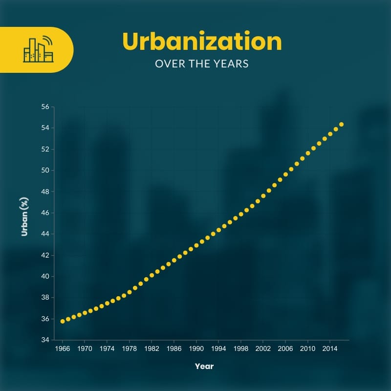
Urbanization Over the Years Scatter Plot Square Template Template
Use This TemplateIdentify and Track Urbanization Over Time With This Scatter Plot
Want to show how your town’s population has changed over the years? This scatter plot makes it easy to see urban growth as a timeline. It's great to spot when towns grow faster, where there are slowdowns and how new projects or rules match up with changes. This template is useful on social media, but also for news stories, reports or planning meetings
You can make it fit your needs. Upload your own data by country, region or city size. Mark important events, like building new roads or changing land laws. Add extra data for things like housing or water goals to show what’s still missing. Export and share the chart with planners, engineers or anyone who needs a clear picture of your town’s story.
- Change colors, fonts and more to fit your branding
- Access free, built-in design assets or upload your own
- Visualize data with customizable charts and widgets
- Add animation, interactivity, audio, video and links
- Download in PDF, JPG, PNG and HTML5 format
- Create page-turners with Visme’s flipbook effect
- Share online with a link or embed on your website
Customize this infographic template now then publish your urban growth timeline with crisp markers.
Edit this template with our infographic maker!
-
Dimensions
All infographic templates are 800 pixels wide with varying lengths. These dimensions can be easily changed and the length adjusted with a slider.
-
Customizable
This template can be fully customized. You can edit content, change image(s), apply custom colors, input your own fonts and logo, and more.
-
Formats
Download as a high resolution JPEG, PNG, PDF or HTML5, embed into a blog post or webpage, or generate a shareable link for online use.
Related Infographics


