Percentage of Profit Scatter Plot Square Template Template
Use This TemplateAnalyze How Budget Impacts Pharma Profits With This Scatter Plot
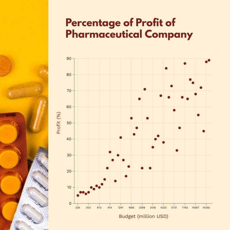
Need to show how budgets connect to profits in the pharmaceutical industry? This scatter plot makes it easy. Each point shows a product’s profit percentage compared to its budget so you can spot patterns and outliers. With this, you see which medicies are scaling, new launches and the products that keep the business strong. It’s a great fit for press releases, quarterly reports, audits, and industry news.
Customizing this chart is simple. Use colors to show channels or approval stages, add labels for important points and draw a trend line to reveal the big picture. Track milestones such as clinical trial phases and patent updates. This way, you can turn complex numbers into a story that’s clear and ready for action.
- Change colors, fonts and more to fit your branding
- Access free, built-in design assets or upload your own
- Visualize data with customizable charts and widgets
- Add animation, interactivity, audio, video and links
- Download in PDF, JPG, PNG and HTML5 format
- Create page-turners with Visme’s flipbook effect
- Share online with a link or embed on your website
Customize this infographic template now, then publish your pharma ROI findings with crisp markers.
Edit this template with our infographic maker!
-
Dimensions
All infographic templates are 800 pixels wide with varying lengths. These dimensions can be easily changed and the length adjusted with a slider.
-
Customizable
This template can be fully customized. You can edit content, change image(s), apply custom colors, input your own fonts and logo, and more.
-
Formats
Download as a high resolution JPEG, PNG, PDF or HTML5, embed into a blog post or webpage, or generate a shareable link for online use.
Related Infographics


