Life Expectancy vs Health Pictograph Square Template
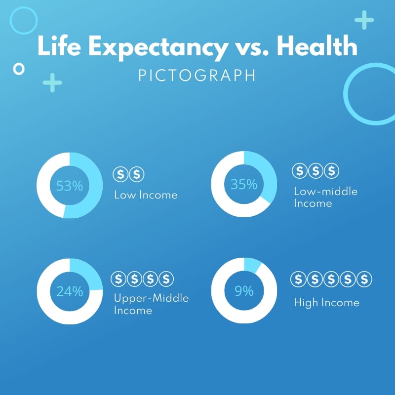
Use This TemplateCreate a visual comparison of income and life expectancy with this captivating infographic template.
Need an engaging infographic template for showcasing how income levels impact health outcomes? This stunning template is right up your alley. Whether you’re highlighting disparities in life expectancy, analyzing socioeconomic trends, or presenting public health data, this design features income groups all mapped out in a clean, visual format capturing attention at a glance. Once customized, you can share it on your social media feeds directly from Visme’s dashboard.
- Change colors, fonts and more to fit your branding
- Access free, built-in design assets or upload your own
- Visualize data with customizable charts and widgets
- Add animation, interactivity, audio, video and links
- Download in PDF, JPG, PNG and HTML5 format
- Create page-turners with Visme’s flipbook effect
- Share online with a link or embed on your website
Personalize this creative template or explore Visme’s library of social media templates for more inspiration.
Edit this template with our infographic maker!
-
Dimensions
All infographic templates are 800 pixels wide with varying lengths. These dimensions can be easily changed and the length adjusted with a slider.
-
Customizable
This template can be fully customized. You can edit content, change image(s), apply custom colors, input your own fonts and logo, and more.
-
Formats
Download as a high resolution JPEG, PNG, PDF or HTML5, embed into a blog post or webpage, or generate a shareable link for online use.
Related Infographics


