Ice Cream Sales Scatter Plot Square Template Template
Use This TemplateVisualize Heat-to-Sales Correlation With a Scatter Plot
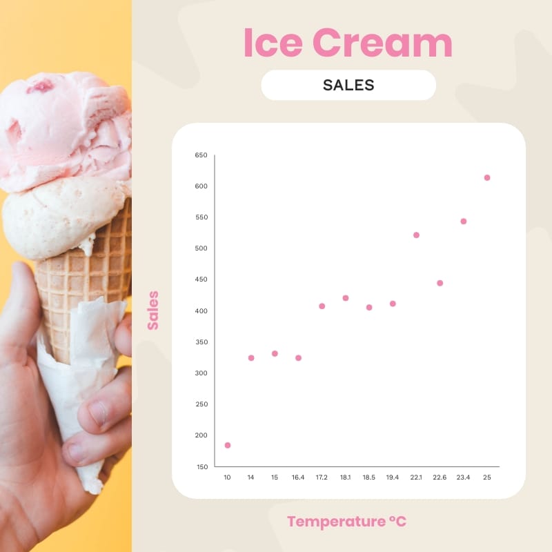
When the weather gets hotter, ice cream sales go up, and this scatter plot shows that link. Simple pink dots on a white background make the pattern easy to spot. The axes and labels are clear and a colored band helps highlight when sales really start to climb. This chart is perfect for reports, blog posts, or any story about how weather changes demand.
Just add your own data, rename the axes and use a CSV file if you want. You can point out the hottest days, draw lines for key temperatures like “sales jump at 28°C” and use your brand’s colors. This chart is great on food blogs, heat wave promos and temperature trends.
- Change colors, fonts and more to fit your branding
- Access free, built-in design assets or upload your own
- Visualize data with customizable charts and widgets
- Add animation, interactivity, audio, video and links
- Download in PDF, JPG, PNG and HTML5 format
- Create page-turners with Visme’s flipbook effect
- Share online with a link or embed on your website
Customize this infographic template now, then publish your temperature-to-sales insights with crisp markers.
Edit this template with our infographic maker!
-
Dimensions
All infographic templates are 800 pixels wide with varying lengths. These dimensions can be easily changed and the length adjusted with a slider.
-
Customizable
This template can be fully customized. You can edit content, change image(s), apply custom colors, input your own fonts and logo, and more.
-
Formats
Download as a high resolution JPEG, PNG, PDF or HTML5, embed into a blog post or webpage, or generate a shareable link for online use.
Related Infographics
