Global Plastic Production Scatter Plot Square Template Template
Use This TemplateShow Plastic Output Over Time With This Scatter Plot
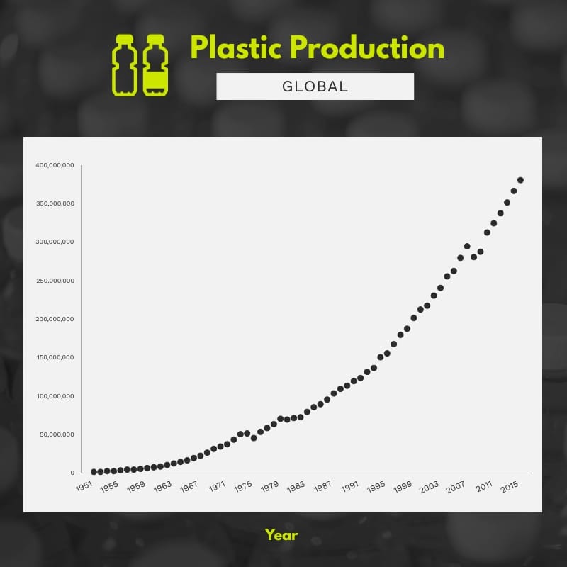
The curve speaks for itself. This scatter plot of global plastic production uses decades of data to provide compelling visual evidence, with clear data points, well-defined axes and contrast that highlights the annual increase in volume. It's an excellent tool for reports, research notes, ESG presentations, sustainability audits and articles analyzing the relationship between industrial growth and environmental impact.
You can customize it to your needs by importing your historical data, adjusting the scale to linear or logarithmic, segmenting by region or resin type, adding annotations for regulatory or market milestones and incorporating reduction target lines.
- Change colors, fonts and more to fit your branding
- Access free, built-in design assets or upload your own
- Visualize data with customizable charts and widgets
- Add animation, interactivity, audio, video and links
- Download in PDF, JPG, PNG and HTML5 format
- Create page-turners with Visme’s flipbook effect
- Share online with a link or embed on your website
Customize this infographic template now, then publish your plastics timeline with crisp markers.
Edit this template with our infographic maker!
-
Dimensions
All infographic templates are 800 pixels wide with varying lengths. These dimensions can be easily changed and the length adjusted with a slider.
-
Customizable
This template can be fully customized. You can edit content, change image(s), apply custom colors, input your own fonts and logo, and more.
-
Formats
Download as a high resolution JPEG, PNG, PDF or HTML5, embed into a blog post or webpage, or generate a shareable link for online use.
Related Infographics


