Top Social Networks Map Square Template Template
Use This TemplateCheck Out this Map of Social Networks by Country with Active Users
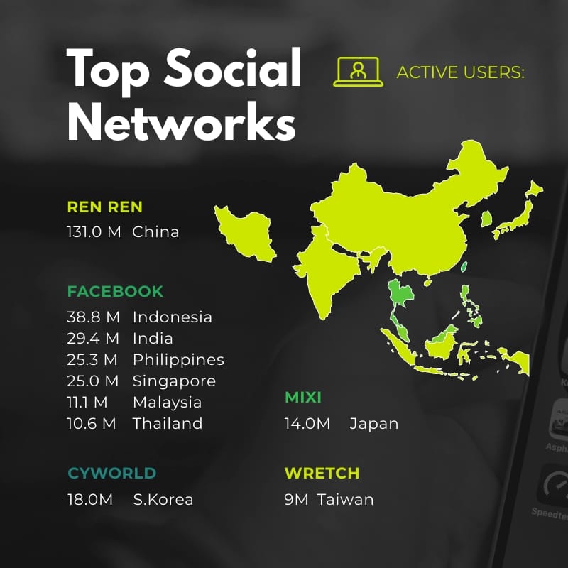
Want to show which social platforms are most popular in Asia without using long, confusing tables? This map makes everything clear. It lists each platform with the number of active users and uses bold colors to show where each network is strong. The design grabs attention, so it’s perfect for reports, presentations or blog posts.
You can make it fit your story. Change the title to match your focus, like monthly users, daily users or growth. You can also include important notes or deadlines. When you’re done, use the map in reports, slides, emails or blog articles. This graphic helps people quickly see what’s happening in social media, so they can make smart choices and understand the big picture.
- Change colors, fonts and more to fit your branding
- Access free, built-in design assets or upload your own
- Visualize data with customizable charts and widgets
- Add animation, interactivity, audio, video and links
- Download in PDF, JPG, PNG and HTML5 format
- Create page-turners with Visme’s flipbook effect
- Share online with a link or embed on your website
Customize this infographic template now then compare platform reach across markets.
Edit this template with our infographic maker!
-
Dimensions
All infographic templates are 800 pixels wide with varying lengths. These dimensions can be easily changed and the length adjusted with a slider.
-
Customizable
This template can be fully customized. You can edit content, change image(s), apply custom colors, input your own fonts and logo, and more.
-
Formats
Download as a high resolution JPEG, PNG, PDF or HTML5, embed into a blog post or webpage, or generate a shareable link for online use.
Related Infographics


