Operational Reporting vs Analytical Reporting Infographic Template
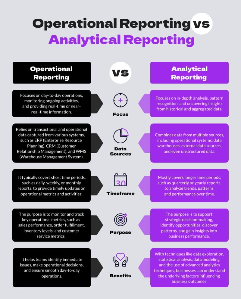
Use This TemplateUnderstand the subtle differences between operational and analytical reporting using this detailed infographic template.
Boasting intuitive design, this template articulates important features like definitions, core purposes, advantages, and illustrations of usage in everyday business scenarios. It displays a clean structure, legible fonts, and relevant graphics, making information consumption easy. Adjust it to your preferences with Visme's efficient editor.
- Change colors, fonts and more to fit your branding
- Access free, built-in design assets or upload your own
- Visualize data with customizable charts and widgets
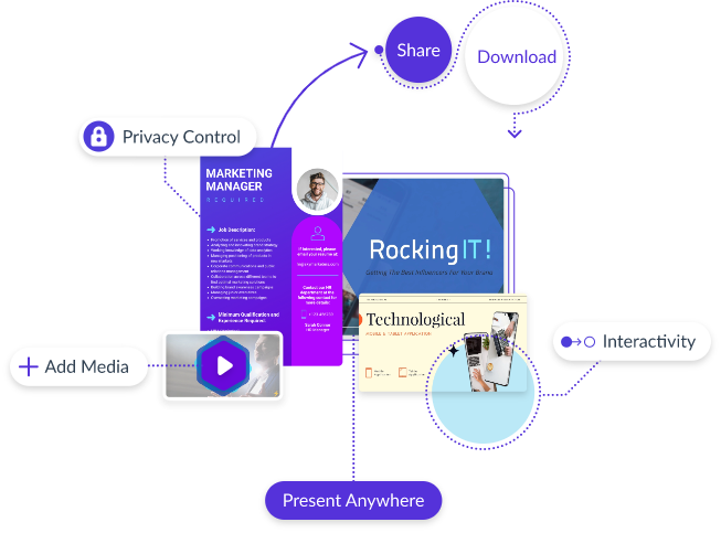
- Add animation, interactivity, audio, video and links
- Download in PDF, JPG, PNG and HTML5 format
- Create page-turners with Visme’s flipbook effect
- Share online with a link or embed on your website
Modify this template to sync with your brand elements or navigate through Visme's rich array of comparison infographic templates to suit a plethora of professional requirements.
Edit this template with our infographic maker!
-
Dimensions
All infographic templates are 800 pixels wide with varying lengths. These dimensions can be easily changed and the length adjusted with a slider.
-
Customizable
This template can be fully customized. You can edit content, change image(s), apply custom colors, input your own fonts and logo, and more.
-
Formats
Download as a high resolution JPEG, PNG, PDF or HTML5, embed into a blog post or webpage, or generate a shareable link for online use.
Related Infographics


