Coronavirus Map Template

Use This Template

Use this map template to illustrate the spread of the Coronavirus (COVID-19) across different regions.

With a blue and a white color palette, this map template is ideal for health departments, hospitals, researchers, or news agencies to visualize the extent of the Coronavirus outbreak. Add your real-time data to show case numbers, death rates, recoveries, or other relevant information across different regions. Use Visme's interactive features to enhance the interactivity and usability of your map.

  • Change colors, fonts and more to fit your branding
  • Access free, built-in design assets or upload your own
  • Visualize data with customizable charts and widgets
  • Add animation, interactivity, audio, video and links
  • Download in PDF, JPG, PNG and HTML5 format
  • Create page-turners with Visme’s flipbook effect
  • Share online with a link or embed on your website

Edit this template now or browse through our range of map templates suitable for a variety of real-time data visualization needs.

Edit this template with our infographic maker!

Coronavirus Map Template
Template Specifications
  • Dimensions

    All infographic templates are 800 pixels wide with varying lengths. These dimensions can be easily changed and the length adjusted with a slider.

  • Customizable

    This template can be fully customized. You can edit content, change image(s), apply custom colors, input your own fonts and logo, and more.

  • Formats

    Download as a high resolution JPEG, PNG, PDF or HTML5, embed into a blog post or webpage, or generate a shareable link for online use.

Compatibility

Related Infographics

Agriculture Choropleth Map Template
Agriculture Choropleth Map Use this choropleth map template to display agricultural data across various regions.
Lung Cancer Cases Choropleth Map Template
Lung Cancer Cases Choropleth Map Use this choropleth map template to illustrate the geographical distribution of lung cancer cases.
Startup Population Choropleth Map Template
Startup Population Choropleth Map Use this choropleth map template to present data on startup population distribution.
Covid19 Vaccine Choropleth Map Template
Covid19 Vaccine Choropleth Map Present a geographical representation of COVID-19 vaccination rates or coverage with this choropleth map template.
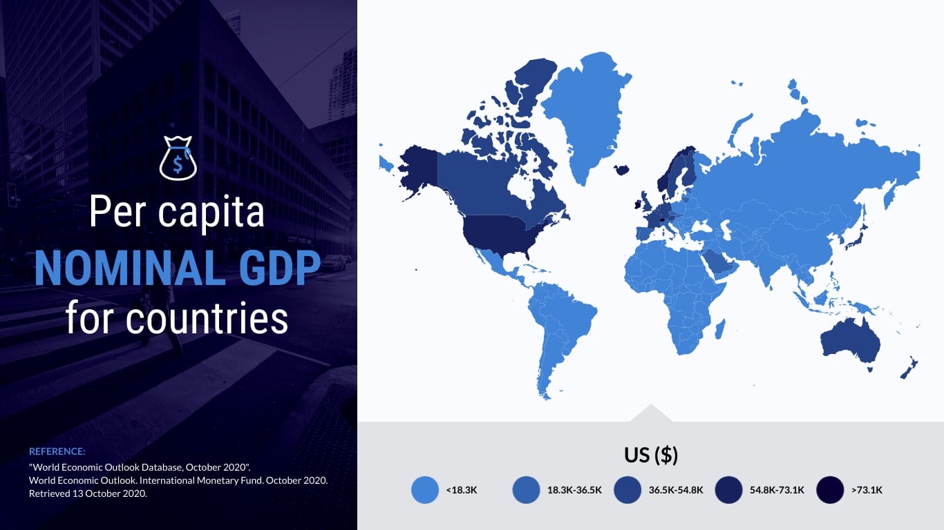
GDP Per Capita Choropleth Map Template
GDP Per Capita Choropleth Map Illustrate the disparity in GDP per capita across regions with this comprehensive Choropleth map template.
World's Best Countries Map Template
World's Best Countries Map Use this map template to show the ranking of the best countries in the world.
Top 10 Countries Map Template
Top 10 Countries Map Use this map template to visualize ranking data for the top 10 countries.
Highest Valued Export Map Template
Highest Valued Export Map Leverage this map template to illustrate the highest valued exports from different countries around the world.
World Forecast Map Template
World Forecast Map Utilize this map template to display weather forecasts for different regions around the globe.
Top Social Networks Map Template
Top Social Networks Map Use this map template to showcase the dominance of different social networks in various countries around the world.
Smart Device Penetration in Europe Map Template
Smart Device Penetration in Europe Map Illustrate the proliferation of smart devices across Europe using this informative map template.
Paid For Daily Newspaper Map Template
Paid For Daily Newspaper Map Use this map template to visualize the distribution and popularity of paid newspapers in different regions.
Most Popular US Attraction Map Template
Most Popular US Attraction Map Use this map template to highlight the most popular attractions across the United States.
Megabrew Latin Roots Map Template
Megabrew Latin Roots Map Use this map template to showcase the popularity and origins of different breweries in Latin countries.