App Usage Comparison - Infographic Template
Use This TemplateCompare different datasets using charts and progress bars with this app-usage comparison infographic template.
Use interactive data widgets like bar graphs and pictograms to visualize numbers. Present information with more visuals and less text to make your content more engaging and funnier.
This data comparison infographic template is ideal to illustrate fun facts and trends in digital and technological industries. You can use its features to illustrate scientific studies and research papers in other fields too.
- Change color themes and font styles with a few clicks
- Access millions of free design assets from inside the editor
- Visualize data with customizable widgets, maps, charts and graphs
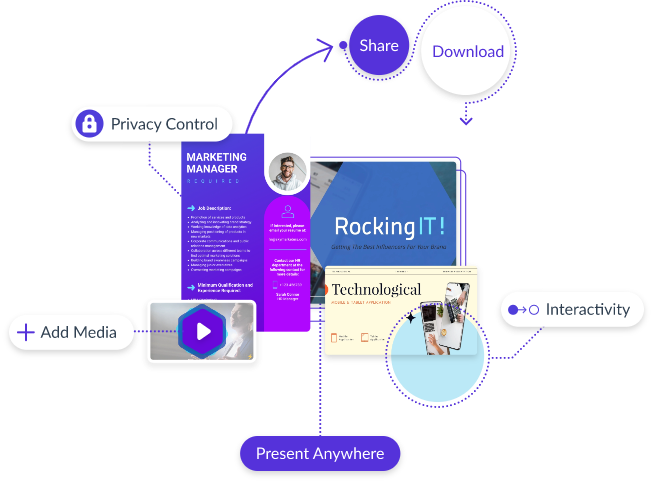
- Add interactive elements like animation, hover effects, pop-ups and links
- Download in JPG, PNG, PDF and HTML5 formats
- Share online with a link or embed it on your website
Present data sets and compare them easily with this straightforward infographic, or skim through Visme’s library of 500+ professional infographic templates to explore more design ideas.
Edit this template with our infographic maker!
-
Dimensions
All infographic templates are 800 pixels wide with varying lengths. These dimensions can be easily changed and the length adjusted with a slider.
-
Customizable
This template can be fully customized. You can edit content, change image(s), apply custom colors, input your own fonts and logo, and more.
-
Formats
Download as a high resolution JPEG, PNG, PDF or HTML5, embed into a blog post or webpage, or generate a shareable link for online use.
Related Infographics


