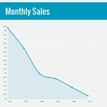
Newsletter KPI Line Graph Template
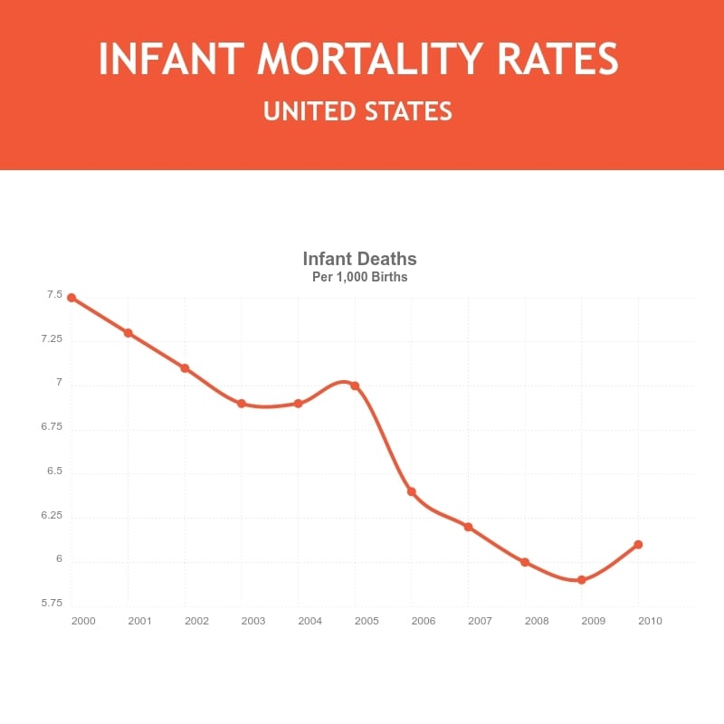
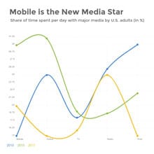
Use This TemplateTrack your newsletter's key performance indicators (KPIs) over different periods with this intuitive line graph template.
Examine various metrics like click-through rates, open rates, bounce rates, and more with this clean, easy-to-read template. The vivid colors and sleek design prioritize data visibility — this means that the insights are clear to your audience. Tweak it with Visme's simple editing tools to better reflect your brand's design principles and metrics.
- Change colors, fonts and more to fit your branding
- Access free, built-in design assets or upload your own
- Visualize data with customizable charts and widgets
- Add animation, interactivity, audio, video and links
- Download in PDF, JPG, PNG and HTML5 format
- Create page-turners with Visme’s flipbook effect
- Share online with a link or embed on your website
Begin editing this template now, or navigate further through Visme's extensive collection of line graph templates to find the perfect match for your data visualization needs.
Edit this template with our pie chart maker!
-
Dimensions
All chart templates come in two sizes: horizontal (1920 x 1080 pixels) and square (800 x 800 pixels)
-
Customizable
This chart template can be fully customized. You can edit content, change image(s), apply custom colors, add or subtract pages and more.
-
Formats
Can be shared as public or private link online, embedded to a site or blog, or downloaded as JPG, PNG, PDF or HTML5. If downloaded as an image, you can also insert into other documents and presentations.
Related Charts & Graphs


