Graduation Rate In Different Years Line Graph Template
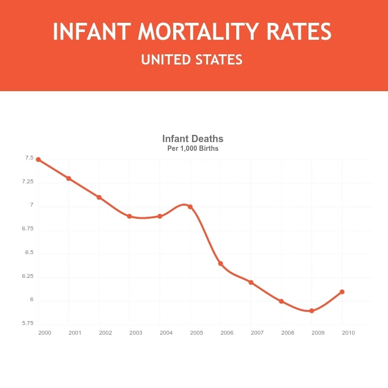
Use This TemplateUnderstand the ebb and flow of graduation rates across different years with this crisp line graph template.
Be it across regions, different educational institutions, or based on demographic factors, this template is designed to make that comparison simple and striking. The clean design and contrasting colors help emphasize the data trends with ease. Reflect your data and brand identity with Visme’s easy-to-use editor and let your brand or institution shine through.
- Change colors, fonts and more to fit your branding
- Access free, built-in design assets or upload your own
- Visualize data with customizable charts and widgets
- Add animation, interactivity, audio, video and links
- Download in PDF, JPG, PNG and HTML5 format
- Create page-turners with Visme’s flipbook effect
- Share online with a link or embed on your website
Start editing this template now, or explore Visme's comprehensive selection of line graph templates suitable for various data storytelling needs.
Edit this template with our pie chart maker!
-
Dimensions
All chart templates come in two sizes: horizontal (1920 x 1080 pixels) and square (800 x 800 pixels)
-
Customizable
This chart template can be fully customized. You can edit content, change image(s), apply custom colors, add or subtract pages and more.
-
Formats
Can be shared as public or private link online, embedded to a site or blog, or downloaded as JPG, PNG, PDF or HTML5. If downloaded as an image, you can also insert into other documents and presentations.
Related Charts & Graphs


