Supply and Demand Graph Maker
to Predict the Market Behaviour

The leading visual communication platform empowering 34,300,000 users and top brands.
Easy to edit
Supply and Demand Graph Templates
Get started with Visme's supply and demand graph templates. No matter how complex your data is, you'll find a template that fits your visualization needs. Easily adjust supply and demand curves, timelines and data points to communicate market dynamics clearly. Change colors, fonts and more to create a visually appealing and informative graph. Choose the ideal template to illustrate supply and demand effectively.


Supply and Demand Graph Maker Features
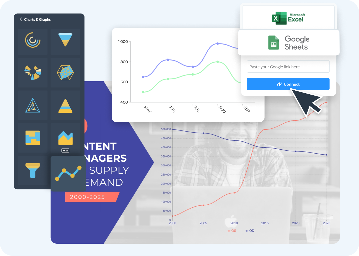
Seamless Data Integration
Connect your supply and demand data directly into your graphs from Google Sheets or MS Excel. This integration ensures all your information is up-to-date and eliminates manual data entry to streamline the graph-making process.
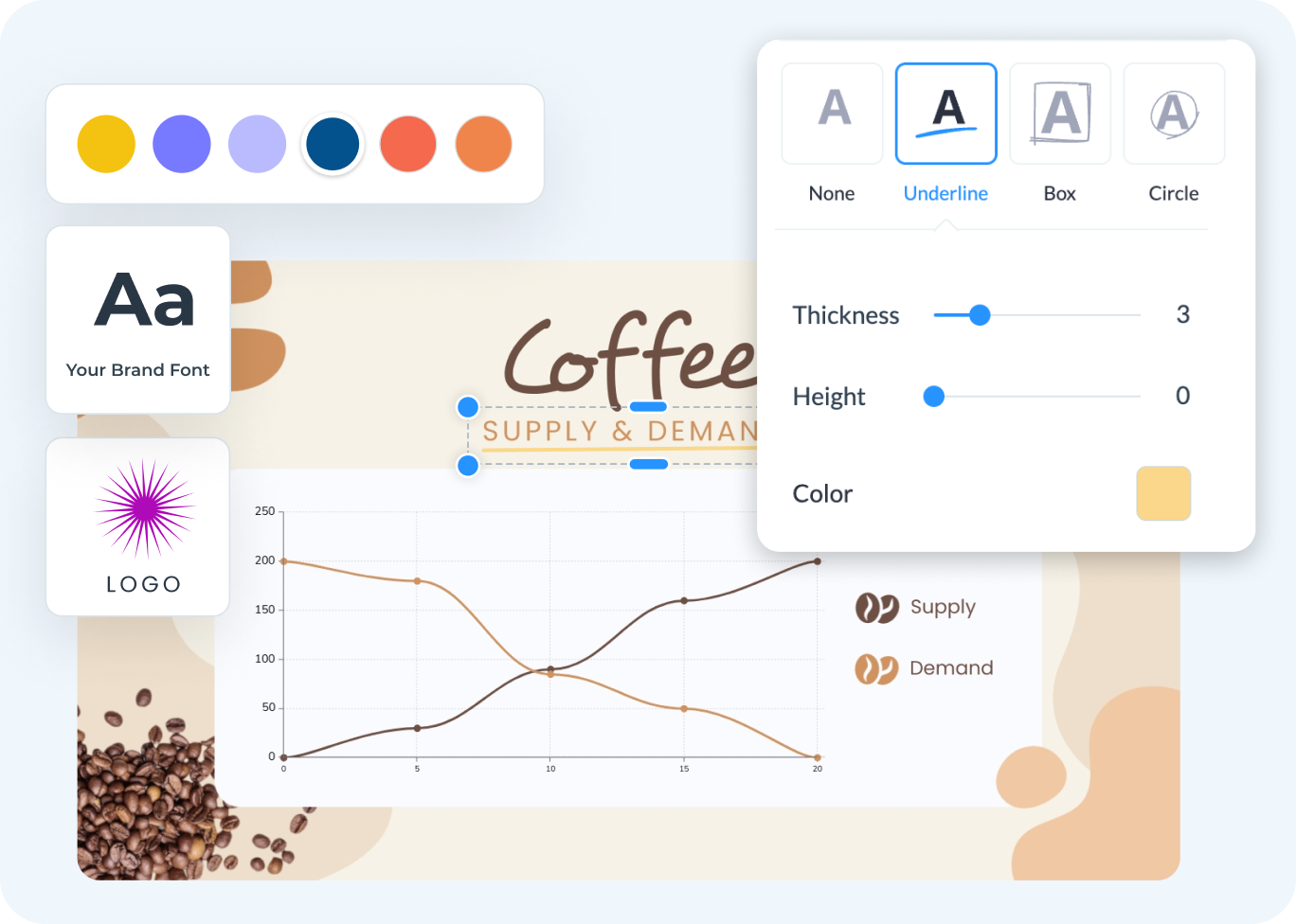
Easy Customization
Explore Visme’s extensive customization tools to personalize your supply and demand graphs. Adjust lines, curves, colors, and add annotations to match your analysis needs and branding. This level of flexibility turns standard data visualizations into compelling market analysis tools.
Real-Time Collaboration
Take advantage of Visme’s real-time collaboration features to enhance teamwork. Invite collaborators via email or shareable link to comment, annotate and edit graphs live. This functionality reduces the back-and-forth communication typically involved in graph creation, ensuring everyone stays on the same page.

More Great Features of the Supply and Demand Graph Maker
Drag-and-Drop Interface
Manage graph elements easily with a user-friendly drag-and-drop interface, making graph creation accessible to all users.
Live Data Updates
Automatically update your graph with real-time data from sources like MS Excel, Google Sheets and more.
Customizable Templates
Use a variety of templates tailored to different aspects of supply and demand analysis.
Color Themes
Apply preset color themes or choose your own colors to differentiate between data points and make your graphs visually appealing.
Rich Graphics Library
Access a wide range of icons, illustrations and animated graphics to enhance your supply and demand graphs.
Interactive Elements
Add clickable buttons, menus and hotspots to make your graphs interactive and informative.
Analytics Insights
Utilize Visme’s advanced analytics to gain insights into how your graphs are viewed and interacted with.
Version History
Track changes and revert to previous versions, providing flexibility and security in your design process.
Export & Sharing Options
Export your supply and demand graphs in multiple formats, including PNG, PDF and HTML and share them across different platforms and devices.
Collaboration Tools
Collaborate with team members in real-time, with options for commenting, sharing and live editing graphs.
Presentation Mode
Use built-in presentation mode to present your supply and demand graphs within Visme without additional software.
One Click Chart Switch
Easily switch between 25+ types of charts and graphs with just a single click to see which data visualization suits your needs.

Learn More
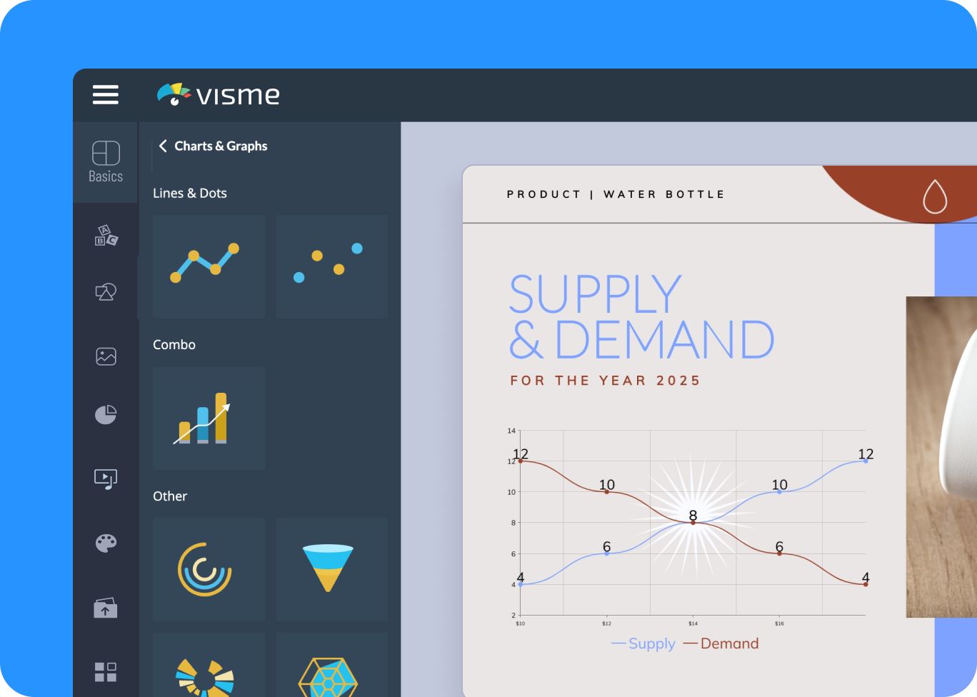
What is a Supply and Demand Graph?
A supply and demand graph is a simple tool used in economics to show how much of a product is available (supply) and how much people want to buy (demand). It helps you see where supply meets demand, which is called the equilibrium point.
The graph has two lines: one for supply and one for demand. Where these lines cross, you can easily see the balance between the quantity of a product available and the quantity people are willing to buy at a specific price.

Use Visme's Supply and Demand Graph Maker to Understand Market Trends
Visme's graph maker helps you understand market data easily. You can quickly identify critical points and trends, which helps you make better business decisions and stay ahead in the market. The graph maker also improves teamwork by presenting data in a clear way, making it easier for everyone to understand and work together.
Everything you need + more
More Than Just Supply and Demand Graphs

Make it engaging
Interactivity
Create interactive reports with popup and rollover effects that allow your viewer to interact with your design to learn more information.

Visualize your data
Charts & Graphs
Showcase sales, marketing, website data and more in your reports with Visme’s easy-to-use charts, graphs and other data visualization tools.

Beautify your content
Video & Animation
Choose from over a million stock photos, icons, illustrations, characters, lines, shapes and more to create a completely unique report.
How it works
How to Create a Supply and Demand Graph in 5 Simple Steps
Creating a supply and demand graph with Visme is easy and efficient. Our tool is designed to make economic analysis accessible and visually appealing. With a variety of customizable templates, you can quickly start plotting your data. Pick a template that fits your needs, enter your data and customize it to your preferences.
Here's how to create a supply and demand graph in Visme:
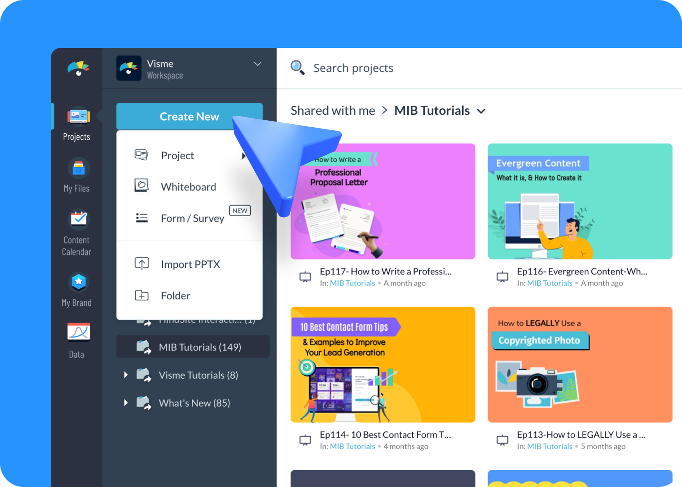

- Log in to your Visme account and select “Create New” from your dashboard to start a new project.
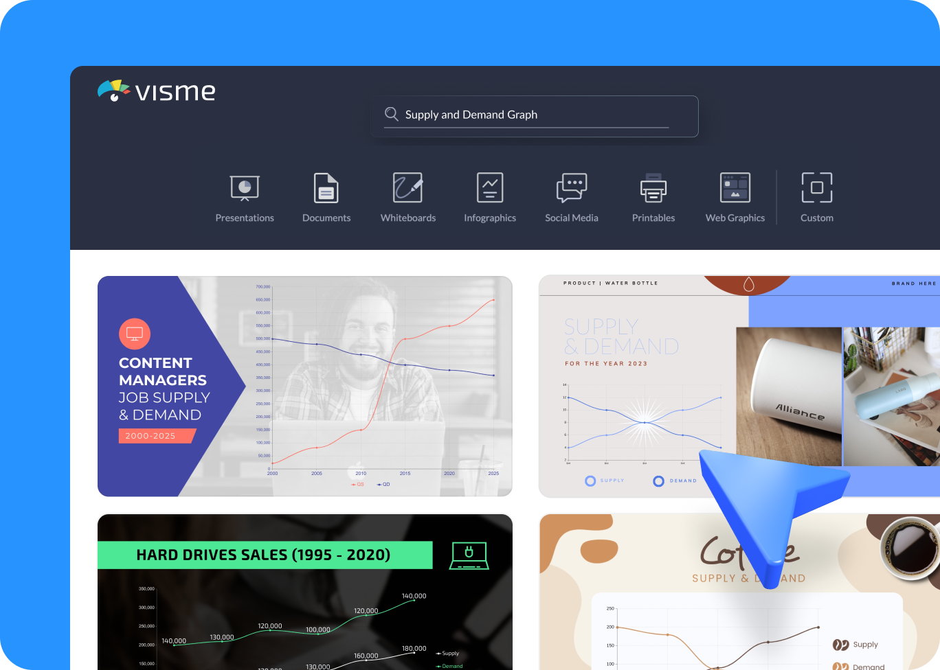
- Use the search bar to find “supply and demand graph” under the appropriate category and explore the available templates.
- Choose a supply and demand graph template that suits your requirements and begin inputting your data.
- Customize your graph by adjusting elements such as colors, fonts and icons to align with your data’s unique presentation needs.
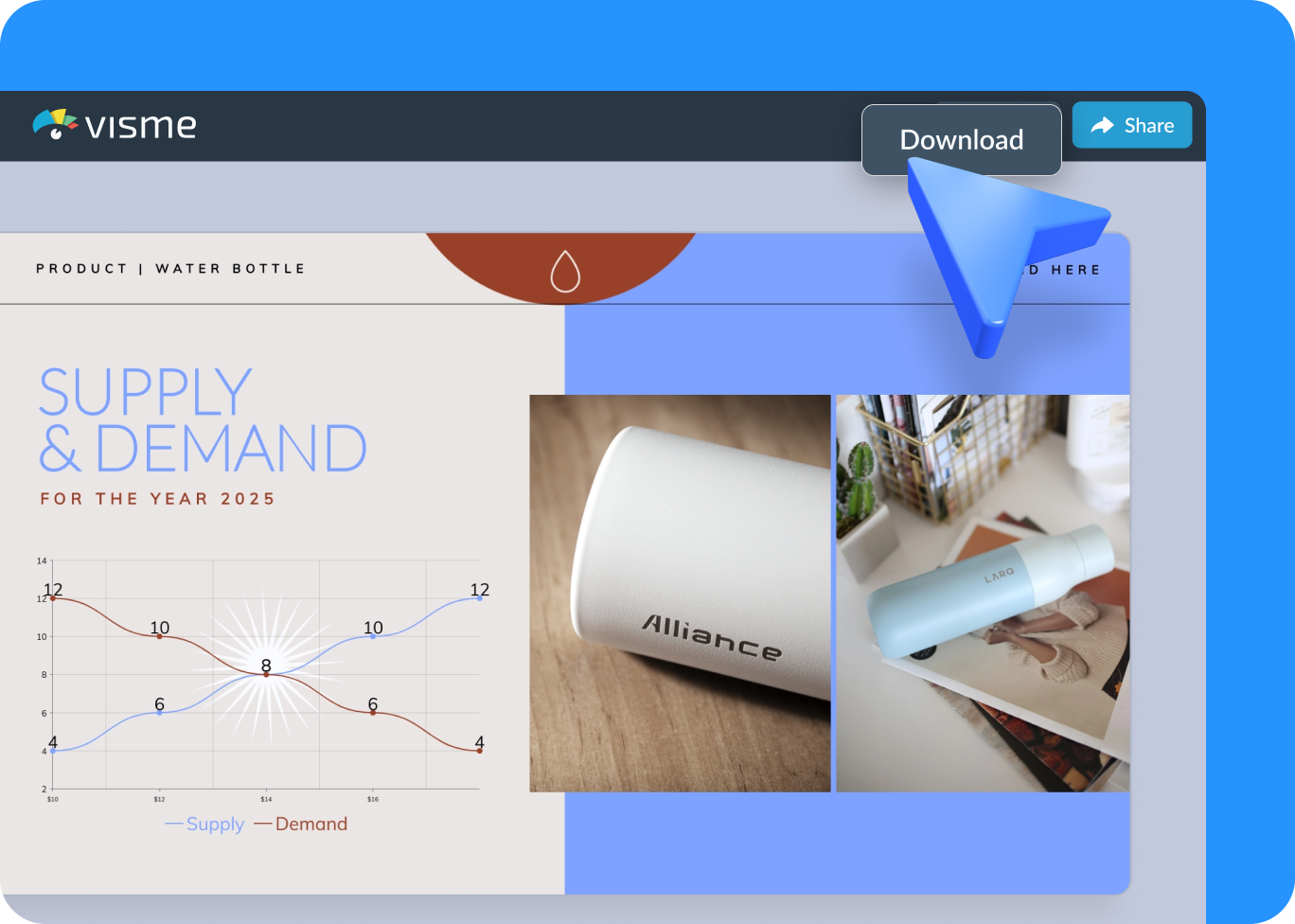
- Once your supply and demand graph is ready, upgrade to download it in your preferred format, such as PDF, JPG, or PNG, share it directly with stakeholders via a link, or embed it on your website.
Quick tips
Improve Your Supply and Demand Graph for Better Market Insights
Use different colors to clearly distinguish between supply and demand curves, helping to visualize the key trends easily.
Label important points such as equilibrium price and quantity to highlight crucial market information.
Add annotations or notes to provide context or explain significant data points to your audience.
Utilize interactive elements, such as tooltips or clickable links, to give additional information without cluttering the graph.
Include distinctive markers or icons to emphasize critical data points and make them easily recognizable.
Regularly update your graph with the latest data to keep your analysis current and relevant.
Control who has view or edit access to your graph in Visme, ensuring sensitive information is protected and managed appropriately.
After presenting your graph, review the feedback and use it to enhance future data visualizations for improved clarity and impact.
Frequently Asked Questions (FAQs)
Simply input your data into the graph generator, choose your preferred template, and customize the graph by adding labels, colors, and additional information as needed.
A supply demand graph maker specializes in plotting economic data specifically for supply and demand analysis, making it easier to visualize equilibrium, shifts and market trends.
A demand graph maker helps you clearly illustrate key economic concepts to your audience, providing visual aids that enhance understanding and engagement.
Use features like hover details, clickable links, and annotations to make your graph interactive, allowing viewers to explore data points without cluttering the visual.
Look for customizable templates, easy data import capabilities, integration with other tools and interactive options to enhance your graph's utility and presentation.
Yes, most demand and supply graph makers allow you to download, share via a link, or embed your graph on a website for easy access.
Ensure you have accurate data inputs and use the graph maker's customization tools to precisely mark and label your data points for clarity.
Visme offers real-time collaboration, allowing team members to view, edit and comment on the graphs to align everyone on shared insights.