How to Make a Gantt Chart in Excel + Easier Alternatives


Do you ever get overwhelmed when you have to choose from a lot of options? Many people struggle with this—whether it's picking a new phone, software for your business, or even deciding what to have for dinner.
It's called "decision paralysis," and it can lead to frustration and indecision. In business, too many choices can result in lost sales and dissatisfied customers.
But there's a way to simplify decision-making. Enter: interactive comparison charts. These charts allow users to compare different items, such as products, services, features or characteristics, side by side.
An interactive chart takes this experience up a notch, letting your audience click, watch videos, and interact with the information to make smart choices.
In fact, affiliate marketer Remy Tennant shared with the Visme team how using interactive charts led to significant growth in his site's traffic and revenue.
Remy isn’t the only one reaping such results. In fact, Demand Gen confirms that 62% of marketers are already using interactive content. And more so, it drives twice as much engagement as static content.
Worth replicating for your business, right?
That’s why we’ve put together this post on interactive comparison charts. We’ll cover what interactive comparison charts are, the easy way to creating them with Visme’s comparison chart templates and enlist all that you need to do to design an epic comparison chart.
Here’s a short selection of 8 easy-to-edit interactive chart templates you can edit, share and download with Visme. View more templates below:


To get a good grip on interactive comparison charts, let’s split the name and explore its components – comparison charts themselves and the interactive in them.
So the former.
A comparison chart goes with the name of a comparison diagram too. Line graphs, pie charts and bar charts also fall under comparison diagrams.
The only thing is that all these other chart types require data for plotting. That’s not the case with a comparison chart. You can simply Google the differences between Coca-Cola and Pepsi and sketch a comparison chart without looking for hard numerical data.
So you can say that a comparison chart is a rather simple and easy to make member of the comparison diagrams family.
As for the mandatory definition now.
A comparison chart is a chart that draws a comparison between two or more items on different parameters.
You can either compare two items such as in the example below.
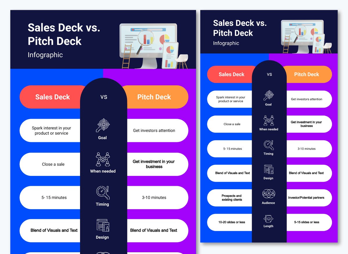
Or, you can use various parameters or comparison points to weigh up two or more items. Like we did in this comparison chart conveying the differences between Visme, Adobe and Canva for making visual content.
We've evaluated Visme in comparison to Canva andAdobe Express based on specific criteria like key features, interactivity, learning curve and customer support.
Made with Visme Infographic Maker
Comparison charts are awesome for guiding customers through choice paralysis by offering a side by side comparison between products they’re confused about.
Next, these charts are quick. Normally, you’d need to read through paragraphs after paragraphs (or probably pages after pages if the information isn’t all in one place) to get an idea of the differences between two things.

In contrast, comparison charts make all of this easy-peasy.
They highlight key points in easy-to-read snippets. It's like reading a well-organized summary instead of a lengthy, complex report.
Here’s the same example of PayPal vs. Paysafe below but in a comparison table format.
Hence, in a nutshell, comparison charts:
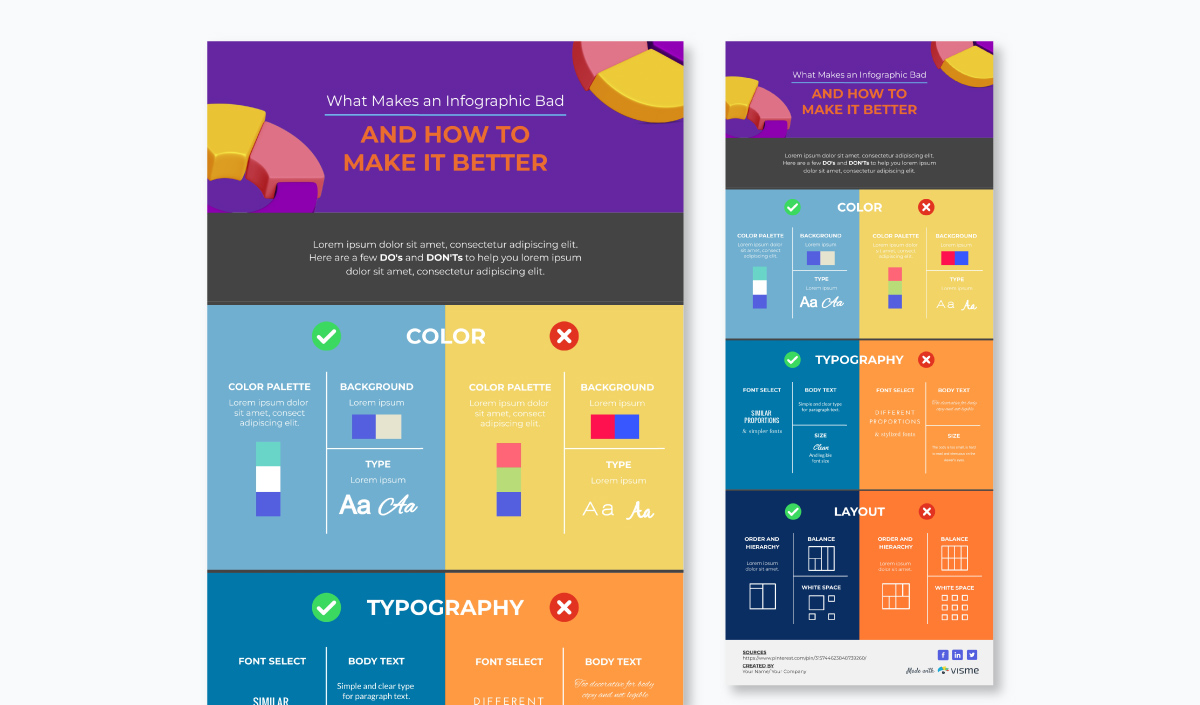
To be completely honest here though not all comparisons are dazzling stars. Some of them can be a bit bland and boring.
Wondering how to make an outstanding comparison chart? Add a dash of interactivity and voila! You have a comparison chart that your audience will love.
Let’s dig into what interactive comparison chart is next.

An interactive comparison chart is one you can interact with by zooming in or out, hovering over a point or clicking a button. The responsive features of this chart allow you to reveal insights or hide unnecessary information with a simple click or hover.
You can easily focus on the important info in this chart without getting distracted.
Using an interactive comparison chart, you can compare complex information by laying your options side by side and drill down into the specifics. Whether price, features or performance, an interactive comparison chart provides a clear, concise and customizable way to evaluate your choices.
Overall, it's a user-friendly solution to help you make informed decisions easily. By giving you the control to define what to compare, the chart turns an overwhelming task into a straightforward and manageable one.
Interactive content lets users interact with your design. Unlike static design, folks can click to open a link among other actions.
Teo Siang at Interaction Design Foundation defines interactive content as, “the design of the interaction between users and products.”
Put simply, these are subtle ways to engage users with any action, be it tapping, clicking, swiping, or more.
In a comparison chart, this means that your viewers can head over to another page if you add an interactive link to it. Or, your viewer can hover over an element and find that it responds to it.
This interactivity increases engagement and conversion rates in contrast with static content. It also encourages “greater cognitive absorption of content.”
Plus, another study learned that the brain area responsible for vision is also involved in decision making. So you know what that means, right?
A visually appealing and easy to understand comparison chart contrasting different products can work wonders in moving the needle in favor of your product.
So you know what comparison charts are and how interactivity can breathe life into them.
But how do you make them?
Let’s see how by splitting the task into two parts—things to do before you create a comparison chart and steps to take for designing it:
You need to gather a few things before you get to making an interactive comparison chart.
Starting with:
The point of a comparison chart is to compare, right?
This could be comparing two different options like we compared Visme with PowerPoint. Or it could be comparing multiple items.
Either way, you need to decide the pointers to compare.
Comparison charts come in a variety. Choose from any of the following:
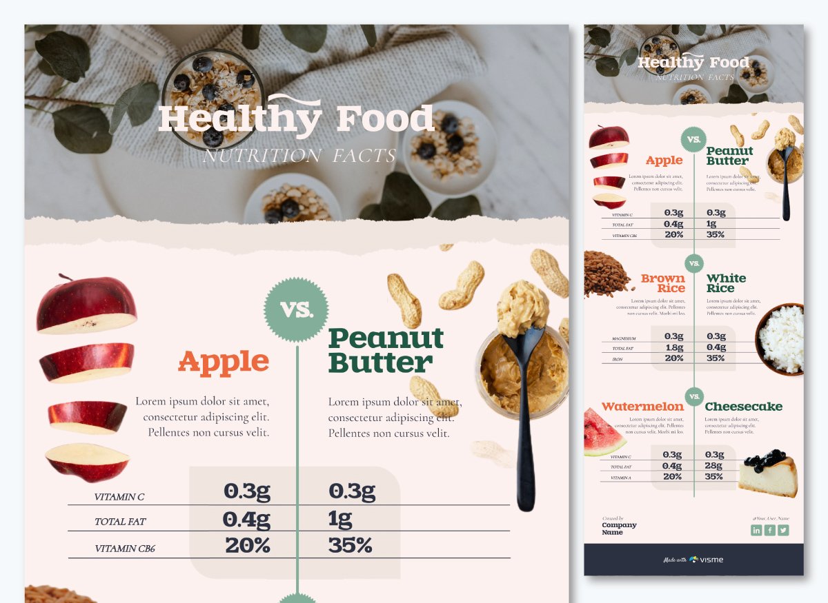
A Comparison Sheet
This is a visually-appealing sheet that compares multiple items. Think of it like a distant relative of an excel sheet. Except, it’s far more beautiful, therefore, engaging.
Here’s an example of a comparison sheet.
If you want to beautify this further, try out a comparison chart template from Visme. You can easily add columns to our comparison sheets if you plan on comparing more than two items, like in the example below.
A Comparison Table
This is a simple table that pits two concepts or other data sets against one another. You’ll recognize this one better as a v/s table.
A well-structured comparison table typically includes rows and columns. Each row represents an item being compared, and each column represents a specific attribute or feature. This layout makes it easy to compare data points.
Here’s a comparison table template example.
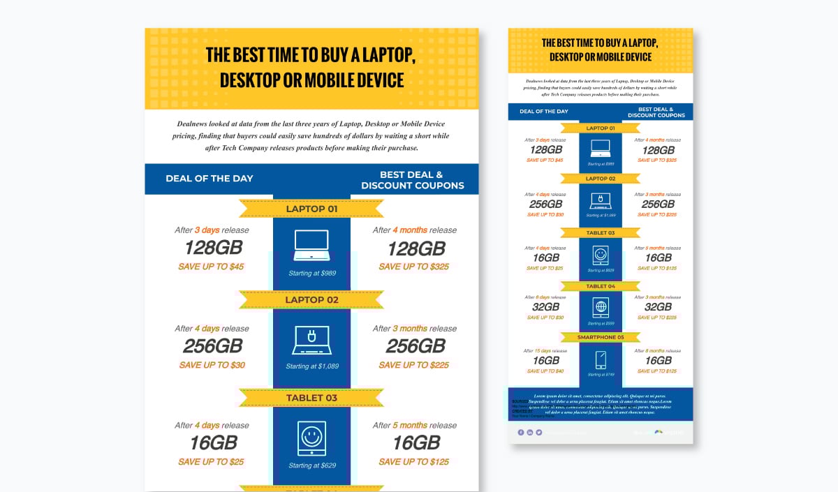
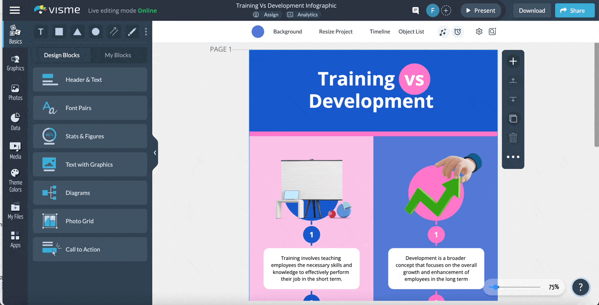
A Product Comparison Chart
This chart compares two products to help break consumers out of choice paralysis. The one that we face when deciding to pick between two good products with similar features and pricing.
You’d have seen these comparison charts a lot when making such choices.
Here’s a product comparison chart template example.

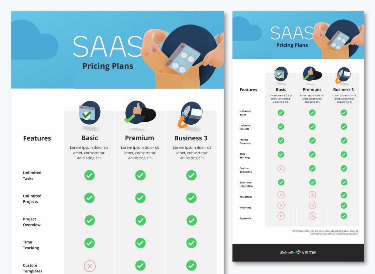
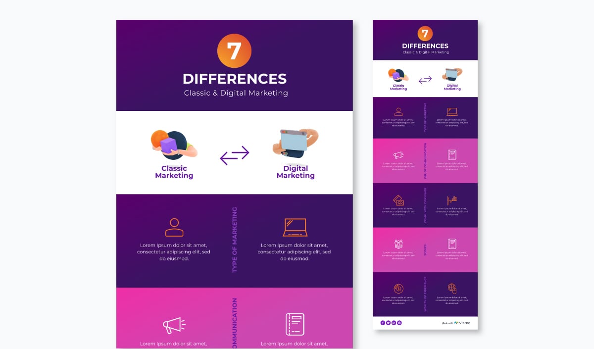
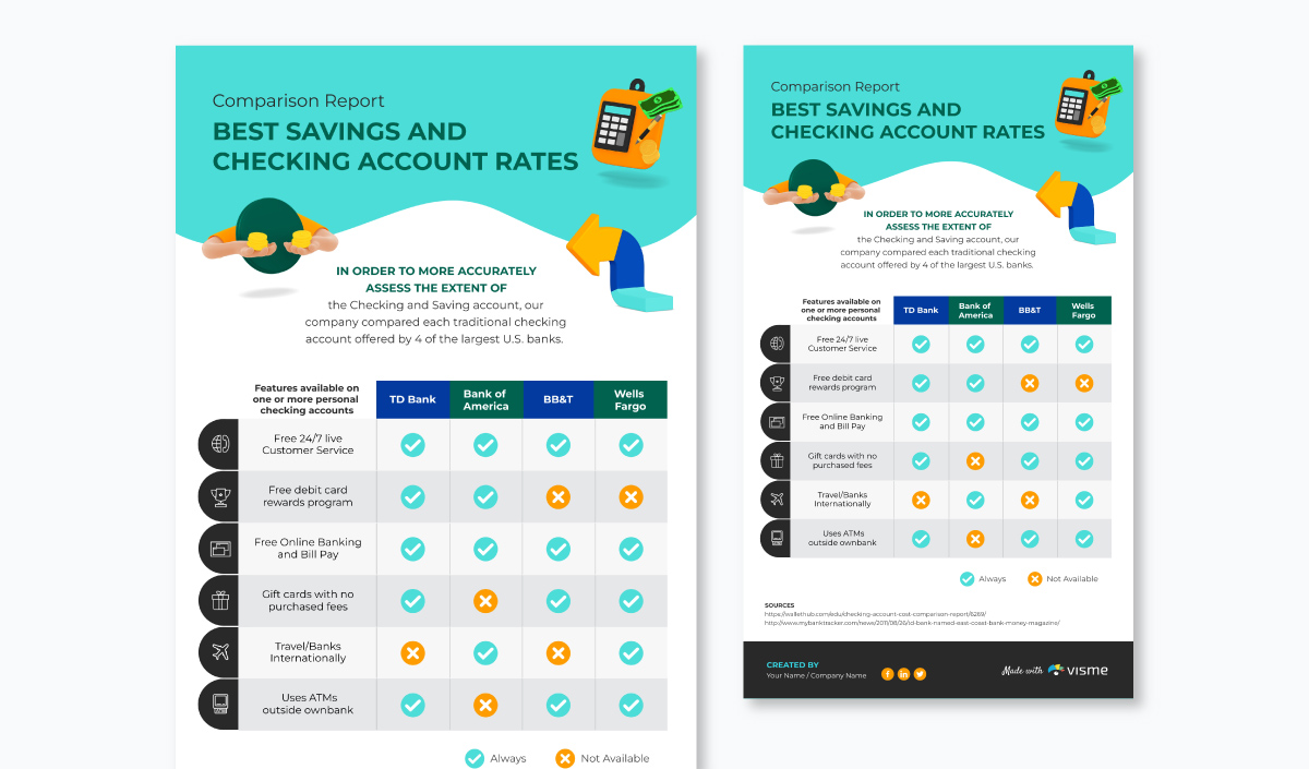
A Feature Comparison Chart
This one’s pretty similar to a product comparison chart. But it veers toward uniqueness by comparing various products along several features. In doing so, the comparison chart compares multiple products by showing how they differ feature-wise.
In the comparison chart template below, you’ll note that the features of at least four banks are compared with one another.
Comparison charts aren’t wordy by nature. Their aim is to convey your point in as few words as possible.
But you still, of course, need words just as you need a compelling copy for infographics.
In certain cases, you only need to add an intro paragraph to explain what your chart is comparing. Numbers do the rest of the talking.
Here’s a good template example showing the need for minimalist copy, the major chunk of which goes to the intro.
Alternatively, you can write an intro para and go on to explain differences between what you’re comparing.
This is exactly what is done in the comparison chart template below.

Before moving on to the last pre-design requirement though, here are some tips for writing copy for your charts.
You can use Visme’s AI writer to create copy for your design and save time and effort. All you have to do is prompt the tool about what you want to generate and the tool will do it for you in seconds. Also, the tool can help you edit and proofread your text, generate layouts and suggest improvements.
This includes all the data that makes the life and soul of your interactive comparison chart.
If you’ve original research, say the findings from your survey, then collect the data entries to bake them into your interactive comparison chart.
If you’re using a comparison chart template from Visme, then you’ll only need to add your data into your chart and you’d be good to go.
If you don’t have original data, you can gather it from around the web. However, one thing of particular note here – don’t forget to credit the sources.
Now how would you go about doing that?
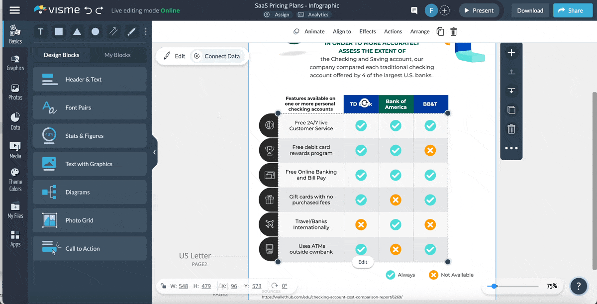
Just as credits roll out when a movie ends, the place for crediting your sources is the end or footnotes section of your comparison chart.
If you’re creating an interactive comparison chart in Excel or so, you’ll always need to be mindful of dedicating the bottom of your comparison chart to credits.
But if you’re using a template, you don’t need to worry as each template already comes with a credit section at the bottom of each chart.
See for yourself:
Remember to involve your team in the design process for the interactive chart right from the start. Their input can be extremely valuable and help you create an outstanding comparison chart.
Visme's collaborative design features make it easy to work together with your team. Simply share the project using a link and allow them to comment, annotate, and even edit it in real time. Additionally, with our workflow management tool, you'll have complete control over project access. You can assign specific parts of the chart to your team, manage design deadlines, track progress and more.
By now you know the comparison chart type that you’ll need and have your copy and data ready. Let’s sail to the design part already.
If you're racing against the clock and need to quickly make an interactive comparison chart, you can use Visme's AI designer. This tool will help you create interactive comparison charts in just a few minutes. Simply provide your requirements for the comparison chart, and the tool will generate it for you, including text, colors, images, and other design elements.
Let’s continue with the design process.
The first step to getting started with design is picking your chart’s color scheme.
You can’t just throw a bunch of colors together and assume you’re good to go. There’s so much more going on when picking colors.
In fact, it’s a point well-explained in this video:
With a Visme interactive comparison chart template, you don’t need to obsess over finding the perfect color contrasts. You already have them in the template.
If you like the template, but the colors don’t go with your branding or you’ve picked another theme, just customize the colors.
If you’re designing your chart from scratch, make sure the color combination you pick is a proven color harmony. These are color combinations that observe the rules set by the color wheel.
In fact, this is one of the basic design principles for infographics that applies to making charts too. What’s more, you also need to tap into color psychology to understand the impact that colors leave on your viewers before you finalize your color scheme.
Lastly, don’t overplay with colors. Stick to 1-2 main colors paired with 1-2 complementary shades. It’s a design must-do that you just can’t ignore.
However, If you already have a visual branding identity in place, then your color choices are going to be obvious and you can skip this step altogether.
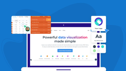
If you use Visme’s brand design tool, your task will become even easier as the tool will help you stay on brand with every document you create. Just copy and paste your website URL, and the brand wizard will extract your branding assets like brand colors, brand fonts, and company logo and save them to apply later with just one click.

The header section in your chart announces what it covers.
Is it going to showcase findings from a recent survey? Or is it going to outline the differences between X and Y?
Since you’ve already planned your copy, you don’t need to worry about it. At this point, your concern should be the comparison chart design.
Use color in your header.
You could pick a contrasting color from your main color theme like this template offers.

Or an entirely different color such as in this case.
Add pattern to make your design pop.
If plain colors aren’t your jam, you can create a patterned header space like this template does.
You now have a design for your header. One last thing before we move on to the next section – the font.
There’s a simple rule of thumb that you need to follow here.
Choose a title font which is simple, bold and prominent. A cursive title font won’t be clear in conveying your message. But a straight and sober font will be.
Additionally, make sure the title you pick is bold or use the bold version of a font if you select a thinner font.
The goal here is simple – be clear. Make all other font-related choices to meet this end.
Since picking from a sea of fonts can be tough, pick from 50 of the best, free fonts.
This section covers the meat of the (comparative) matter. So it’s best you keep the background free from any pattern or image to keep things clutter-free.
Elements that you need to add to your comparison chart go over a plain color background – an important tip among others that you need to take from our guide on creating clutter-free infographics.
In practice, here’s how this would look.
If you plan to go deeper than just comparing two or more pointers, you’ll need to spend some more time on planning the structure of your comparison chart’s body.
In such a case, it’s best you lay out the comparative differences first. Proceed with adding more elements after that.
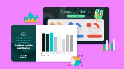
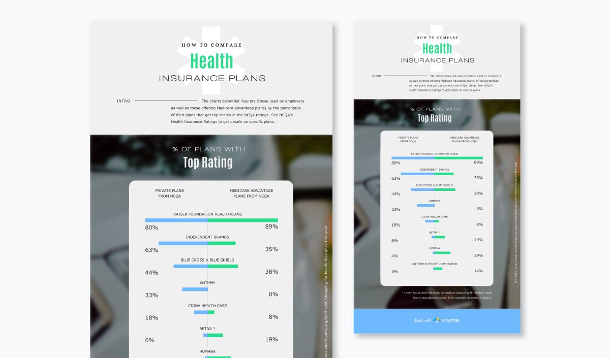
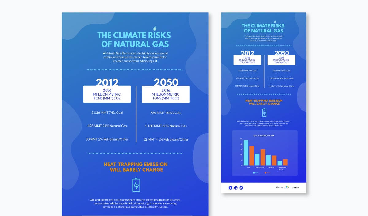
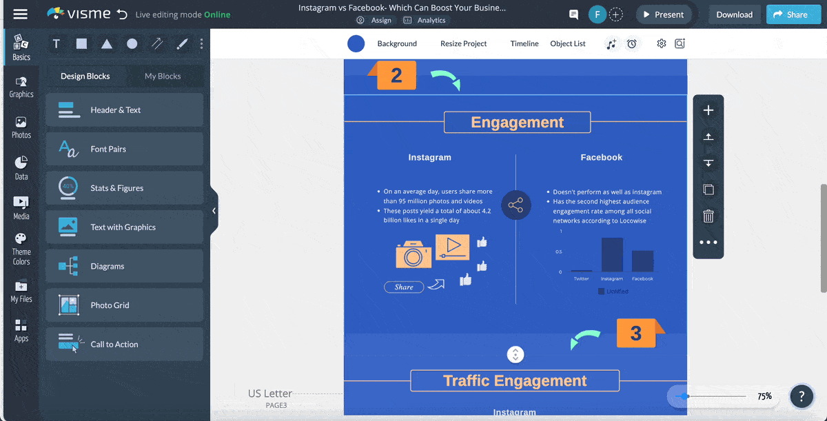
For instance, you can use maps to elaborate your point or you can use a bar chart to illustrate your point as this template does.
You can include other graph types as well.
Visme's advanced data visualization tools help you do more than just basic comparisons. You can access over 30 data widgets, such as progress bars, radial gauges and population arrays. Moreover, Visme provides more than 20 types of charts and graphs, including bar graphs, pie charts, bubble charts and Venn diagrams.
Whether you're comparing market trends, emphasizing proportions, or mapping geographic data, Visme lets you visualize your data in a way that connects with your audience.
And the best thing about Visme's data visualization tools is that they are super easy to create. Here's what one of our satisfied users has to say about the ease of use:
“Visme is super user-friendly. I was able to figure out the system with little to no training and have been using it to build our annual impact reports for the past three years. The data visualization tools are my favorite thing about the product, because they make illustrating complicated figures and concepts easy to create.” - Julie B. | Small-Business
For this section, I’ll leave you with as bookmark-worthy resource: 5 Data Storytelling Tips for Creating More Persuasive Charts and Graphs
Now for the magic part. One that’ll outshine your comparison chart – interactivity.
Interactive design takes your comparison chart from zero to hero. It’s an excellent way to grab and hold attention while engaging your audience.
With Visme's interactivity and animation features, you can easily add this magic touch to your chart. Embed hotspots to reveal hidden details, design clickable menus for easy navigation, add hyperlinks to external resources and use hover effects to provide additional context.
Wondering how you can make your chart interactive?
Let’s break it down for you:
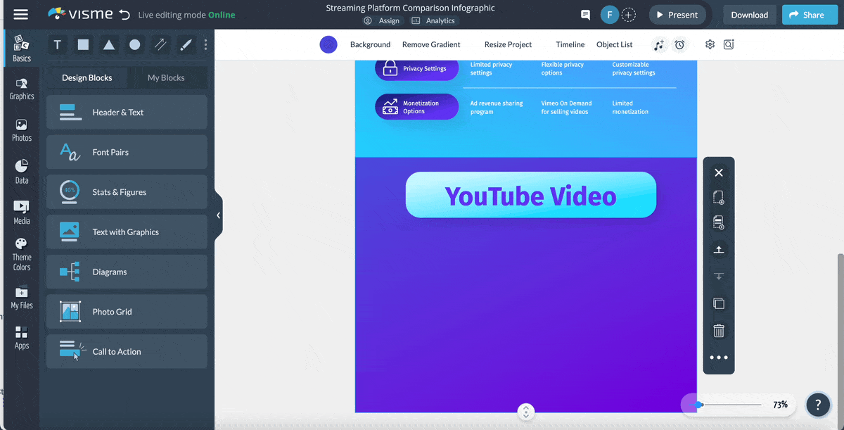
Include a video in your chart.
Videos can help build your comparison case further. Say you can embed a video link to product reviews in your interactive comparison chart.
Or if you’re comparing concepts, you can direct your reader to videos for an in-depth dive into the concepts.
This feature will help your chart to standout in comparison with other charts for offering multiple formats (text + video) instead of a single text-based format.
What’s more, if your viewer is reading your comparison chart on his phone, you’re in luck with the video link in your interactive chart. Because video mobile consumption has gone up by a whopping 100% every year.
So why not make the most of it?
You can use Visme's comparison chart maker to add a video in a few clicks by heading over to the Media section on the extreme left side of your dashboard. From there, select Insert Video to add a link to the video you want to include in your comparison chart.
It’s also here that you can decide if you’d want the video to auto-play.
Add an audio file or two.
An audio file is a mini podcast version for your viewers who want to take a break from all that reading and watching.
Let’s admit it. Our eyes can get tired with all that streaming.
Your comparison chart doesn’t have to end up in the too-tired-to-even-skim corner due to such a reason.
By adding an audio file to it, you can tell your viewers to listen to the comparison you’re making.
If you’re not one for recording audio notes, you can still make use of the audio interactivity feature in your chart. How?
Include a music file. The same as you’d add music in an interactive presentation.
Visme lets you upload music clips as well as audio files so you can enhance your viewers’ experience.
Upload these in the same way you add a video in Visme’s comparison chart template. You’ll find the Add Audio option under Insert Video in the Media tab.
Pack a quiz into your comparison chart.
What if your chart could answer your reader’s questions?
It could lead them through a quiz that helps them figure out which of the products being compared is suitable for them.
Sounds cool, doesn’t it?
This brings us to a third way to make your chart interactive – add a valuable, problem-solving or simply entertaining quiz to your comparison chart.
Visme can link objects on a page so when your reader clicks one element, another appears. In doing so, you can lead him to the answer.
Just make sure you add a sign board like CTA that says, "click here to find your answer" to let your viewer know that he can interact with the chart.
Animate your comparison chart.
Animations are subtle movements to catch your audience’s attention. Plus, they help leave an initial impression.
For instance, if there’s a “vs.” text that slides in a second late in a comparison chart, it’ll instantly capture focus. In fact, it will get better attention than the static element as the brain is not likely to push it to the background. It’s a proven matter.
To play with animation, you can take advantage of a ton of options that Visme offers.
Let’s say we want to animate "solo" in this template.
Simply select it and click Animate on the right side of your dashboard. Once you do, you can pick from options like making the text Fly from Left or Fly from Right, Fade In or Pop Out and so on.
Add links to your comparison chart.
Okay so you’ve got your audience’s attention with animated elements. The video or audio content in the comparison chart has also done its job – won users’ hearts. And the quiz has assisted the audience in calling the shots.
In short, you’ve made your case with the comparison. And your reader is ready to take his next step. Perhaps he’s ready to purchase the product you wanted him to.
But hang on…
Does that mean this person needs to leave your chart and make his way to the product page with a couple of clicks?
That’s a lengthy process.
And one that comes with the risk of your reader losing interest just because he has to do all this extra work.
The solution, you ask?
Add a link to your chart and directly lead your viewers to the product or any additional resources that’ll be beneficial for them.
Using Visme, add links to your chart in two simple steps. First, select the text you want to hyperlink. Second, insert the link to the selected text by clicking on the link sign beside the delete bin icon.
You can choose to link to a website, social media channel or email address. You can also enable hover effect in the same section to indicate your viewer that the link is clickable.

To take your content engagement to the next level, you can create interactive infographics using Visme’s free online infographic maker. Read this article for a step-by-step tutorial on how to create an interactive infographic using Visme.
Lastly, you’ll need this section to conclude your chart. But what do you add here?
Your name and your company’s name. Because you need to share who has designed the comparison comparison chart alongside your social icons.
If you’re sourcing data, this section is also the place to give credit to the sources.
Here’s what I mean.
If needed, you can also add a conclusion. One that shares the verdict or summary of the comparison you’ve made.
This interactive comparison chart template has a built-in conclusion section if that’s what you’re planning to do.

With Visme, you can track how your audience engages with your comparison chart. After creating the chart in Visme, you can easily share it online by providing a link to your audience. Then, Visme's advanced analytics features will give you valuable insights such as total views, average time spent, unique visits and even visitors’ IPs. You can use these insights to evaluate your content's performance and make improvements.
Interactive comparison is when you can change or interact with a comparison chart to get different data views. This might include sorting the information by category, filtering the data to see specific items or clicking on elements for more details. It makes exploring comparisons more engaging and helps you focus on what's most important to you.
The best chart for comparison depends on what you're comparing and how you want to present it.
Some popular options are:
Visme offers a range of customizable chart templates to help you create interactive comparison charts that are both visually appealing and informative.
A Bar chart is the simplest type of comparison chart. It uses bars of different lengths to visually show and compare different values. This makes it easy to understand the differences between items or categories at a glance.
We've looked at interactive comparison charts, from their basic structure to the benefits of using interactive elements. These charts can help reduce decision fatigue, increase engagement, and present complex information in an easy-to-understand way.
Visme offers all the tools you need to create impressive interactive comparison charts. Choose a customizable template from our library, explore various chart types and include interactive elements. With features like hotspots, clickable menus, hover effects and more, you can bring your data to life and help your audience make informed choices.
Ready to make your data more engaging? Sign up for a free Visme account today and create interactive content and charts that make a lasting impression.
Design visual brand experiences for your business whether you are a seasoned designer or a total novice.
Try Visme for free