Coronavirus Map Square Template Template
Use This TemplateHighlight Coronavirus State Trends with a Clean Map
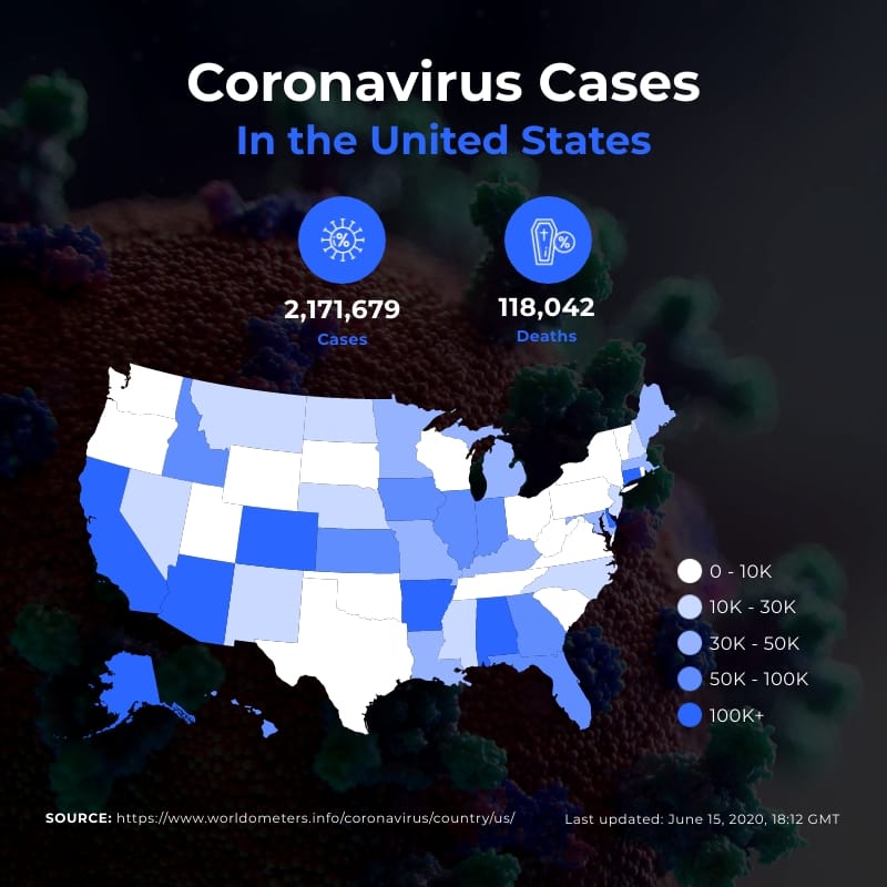
This state-by-state map communicates the epidemiological situation with remarkable efficiency. A solid technical foundation, a clear color scale and two main headers for cases and deaths are key. They are great for situation reports, briefings, dashboards and publication appendices.
You can update figures with your trusted sources, like line lists, SIVIGILA, HHS and CDC. You can also adjust scale thresholds and add key metrics. These include incidence, positivity rates, ICU occupancy, reproduction number (RR) and vaccination coverage. You can also embed it in a landing page or dashboard. This format shows patterns clearly. It prioritizes responses and helps with clinical and public health decisions.
- Change colors, fonts and more to fit your branding
- Access free, built-in design assets or upload your own
- Visualize data with customizable charts and widgets
- Add animation, interactivity, audio, video and links
- Download in PDF, JPG, PNG and HTML5 format
- Create page-turners with Visme’s flipbook effect
- Share online with a link or embed on your website
Customize this infographic template now then share your latest state totals with a clear legend for your campaign.
Edit this template with our infographic maker!
-
Dimensions
All infographic templates are 800 pixels wide with varying lengths. These dimensions can be easily changed and the length adjusted with a slider.
-
Customizable
This template can be fully customized. You can edit content, change image(s), apply custom colors, input your own fonts and logo, and more.
-
Formats
Download as a high resolution JPEG, PNG, PDF or HTML5, embed into a blog post or webpage, or generate a shareable link for online use.
Related Infographics


