
10 Style Guide Templates to Make Your Own & Best Practices to Use

Branding is everything. In theory, it’s every employee’s responsibility to maintain brand consistency in their work. Truth be told, in most organizations the responsibility lies mostly within the design team due to the nature of their job. Considering that for every 300 employees there’s one designer, holding everyone accountable is a challenge, to say the least.
The answer? Creating a style guide that’s easy to follow by everyone in your company.
In this article, we feature 10 style guide templates you can use. We also shed light on what a style guide should include and how it differs from a brand guide. Let’s dive right in.
Table of Contents
- What Is a Style Guide?
- The Benefits of Creating a Style Guide
- 10 Style Guide Templates to Make Your Own
- How to Create a Style Guide with Visme
- Real-Life Style Guide Examples
- 3 Best Practices When Using a Style Guide
Quick Read
- A style guide is a document that explains how a company uses visual assets like logos, typography, colors, grids and images.
- The purpose of a style guide is to ensure design consistency across the organization. Among others, it helps you create better user experiences, save time, and increase your team’s productivity.
- To create a style guide with Visme, pick a template that you like, customize it to match your brand. You can also invite your team and work on it together. When you’re done, download it as a PDF, slide presentation or launch it as a website.
- Make sure that your style guide is understood by developers. Also, bear in mind that it’s not a one-off project, and you should collect feedback and improve your guide over time. Finally, if you want everyone to use it, ensure that it’s easily accessible.
- Visme offers an extensive library of style guide templates. You can use each template as-is or adjust it according to your requirements.
What Is a Style Guide?
A style guide is a document that includes detailed information on how a brand wants to be perceived from a visual and language perspective.
The main goal of a brand style guide is to ensure consistency across the board. Irrespective of who works on the company’s assets, whether external or internal contributors, they can follow the guidelines to perfectly reflect the brand’s personality.
Style Guide vs. Brand Guide: What’s the Difference?
Made with Visme Infographic Maker
In terms of terminology, some brands use ‘style guide’ and ‘brand guide’ interchangeably. Others treat them as two separate documents, so let’s take a look at how they can differ.
A style guide explains how elements like logos, fonts, colors, grids, photos, etc. should be used. It’s mainly targeted at designers.
It’s up to the brand to decide how detailed and lengthy this document should be. Some companies go with basic dos and don'ts, while others opt for book-sized guides.
What should be included in a style guide? A style guide usually covers:
- Logo usage
- Color palettes
- Typography
- Image guidelines, including photos, illustrations, videos, etc.
- Grids
- And, occasionally, the tone of voice.
Check out what a brand style guide looks like:
A brand guide or brand guidelines focuses on the company’s fundamentals, including its vision, mission, strategy, target audience, tone of voice, etc. It acts as a bible for the entire company as well as for anyone cooperating with the brand externally.
What should be included in a brand guide? These are the most common elements that you can expect to see in brand guidelines.
- Mission, vision, purpose
- Value proposition
- Positioning
- Ideal Customer Profile
- Slogan
- Tone of voice and
- All the elements included in the style guide.
Here’s an example of a brand guideline template. You can find more of these in Visme’s comprehensive template library.
The Benefits of Creating a Style Guide
Here are some of the reasons why it’s worth creating a style guide:
1. It helps create consistent user experiences. Style guides set clear expectations as to how your product should look and feel to users. It serves as the pillar for any creative work, like designing and writing copy for a new landing page.
In essence, it makes your product and marketing team members’ daily work much easier, as they have a solid style guide template to rely on.
Not to mention, if you have a new team member, they can quickly self-onboard and get up to speed by reading your style guide. This leads to the next benefit.
2. It saves you time. You don’t have to refer to existing screens and layouts to understand what colors, fonts and buttons you can use in your work.
Style guides include all the information you need. Better yet, using the right tool, you can also set your styles as your default settings. Next time anyone creates a visual asset, your fonts, spacing, etc. will already be there!
3. You and your team members are more productive. You don’t have to spend time working out basic information, like which fonts or imagery you can use. As a result, you can focus on more demanding, creative tasks like discussing technical solutions with developers or analyzing usability testing results.
Simplify content creation
and brand management for your team
- Collaborate on designs, mockups and wireframes with your non-design colleagues
- Lock down your branding to maintain brand consistency throughout your designs
- Why start from scratch? Save time with 1000s of professional branded templates

10 Style Guide Templates to Make Your Own
With all of the above in mind, you might be wondering – what is the best style guide for your company? There are plenty of options you can inspire yourself with. Below, we share 10 examples of style guide templates you can try out for free with a Visme account.
You can customize every one of them to fit your needs—adjust the colors and fonts, add animations, or insert any of your existing design assets. Let’s jump right in.
1. Brand Style Guide Checklist Lead Magnet Template
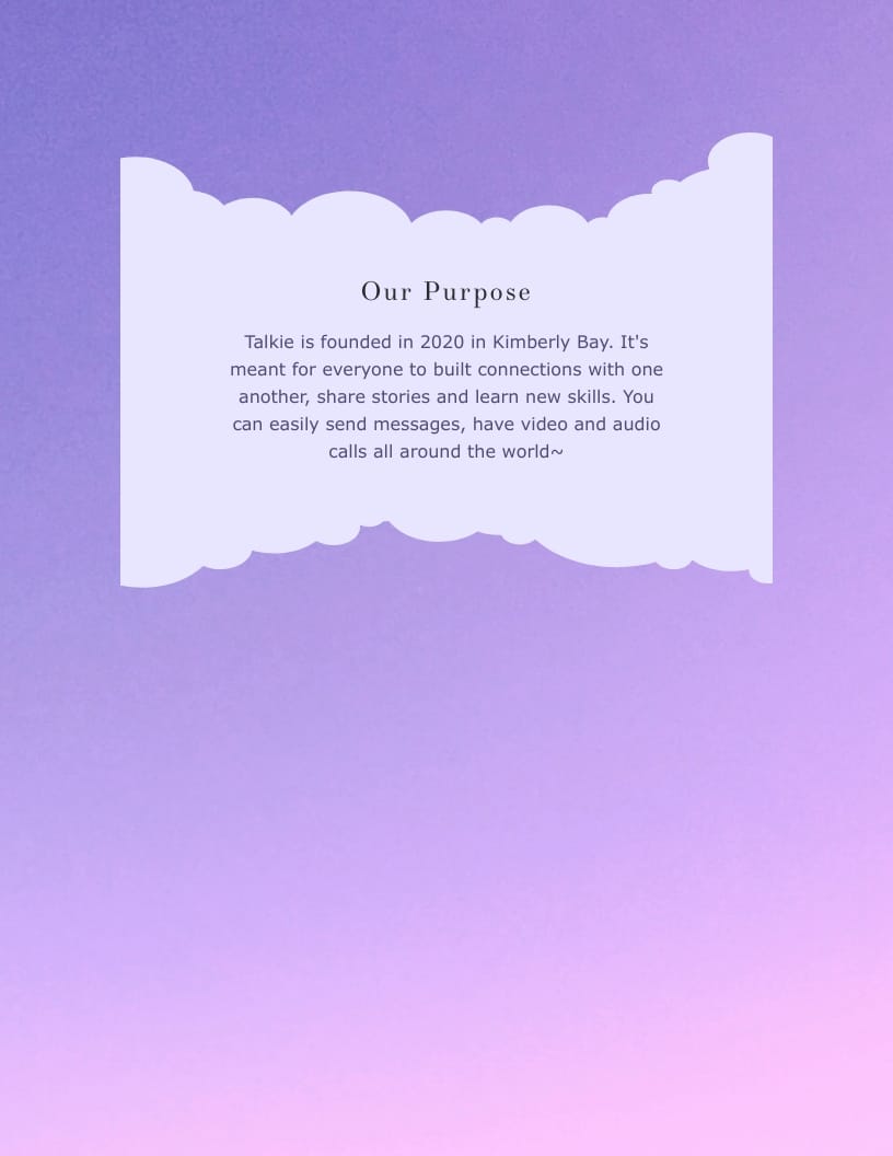
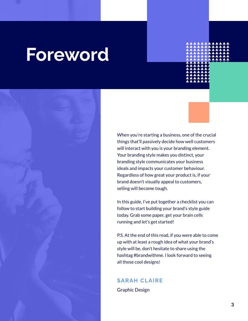
If you’re looking for a way to present your branding research to your target audience, then this Visme brand style guide template is a perfect choice! It includes eight aesthetically pleasing slides, which you can use to discuss your logo usage, typography, color palettes, etc.
It’s designed in a way that maintains a good balance between text and visual content, making information easy to absorb. You can download it in PDF, JPG, PNG, and HTML5 format. Share it with your target audience via a link or embed it on your website.
2. Brand Guidelines Presentation Template
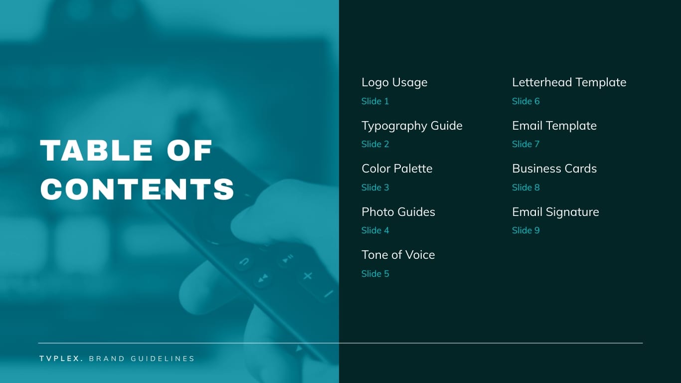
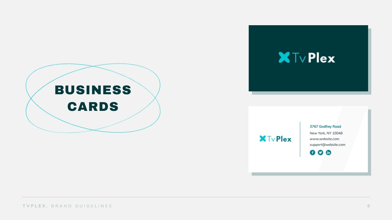
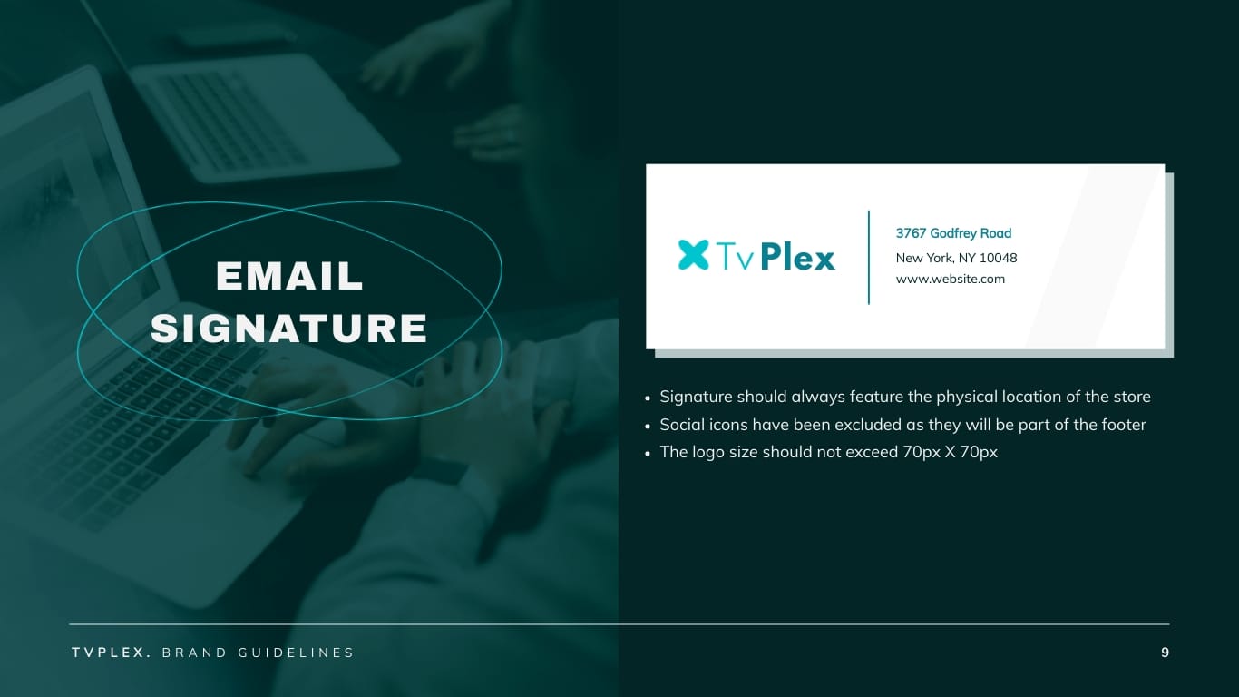
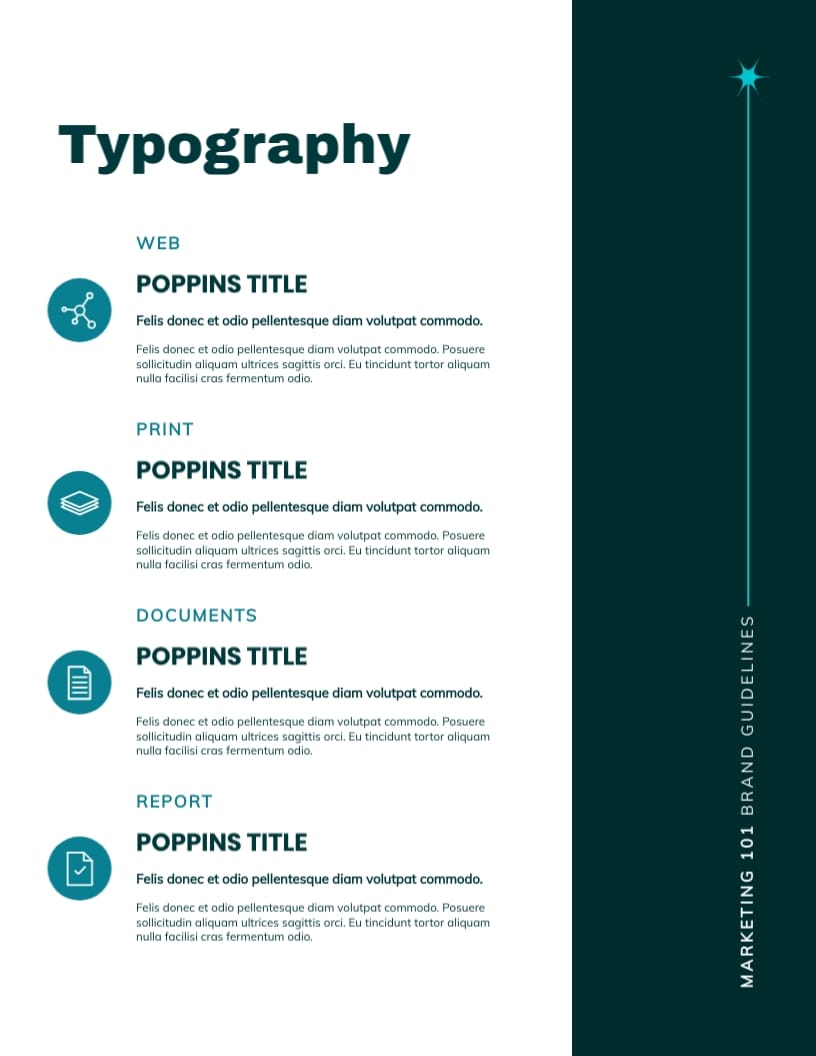
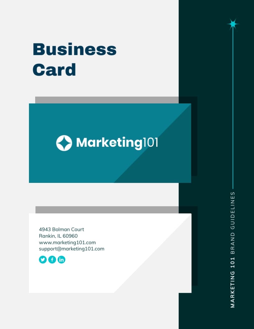
This brand guidelines template features a darker theme, making it look more professional and giving it a slightly more corporate feel. It includes 11 slides covering photo guidelines, tone of voice, email templates, business cards and others. It’s fully customizable; you can change the colors, graphics and fonts to perfectly reflect your brand’s personality.
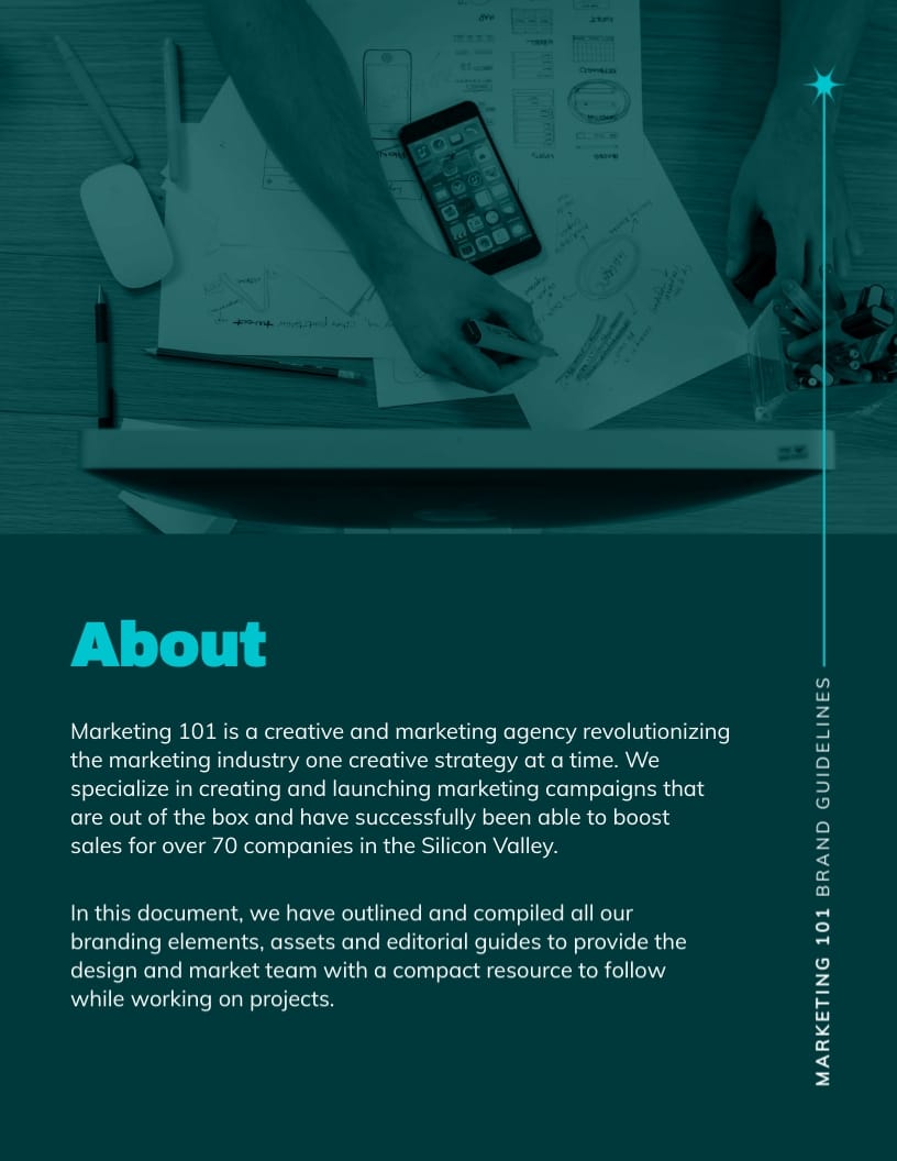
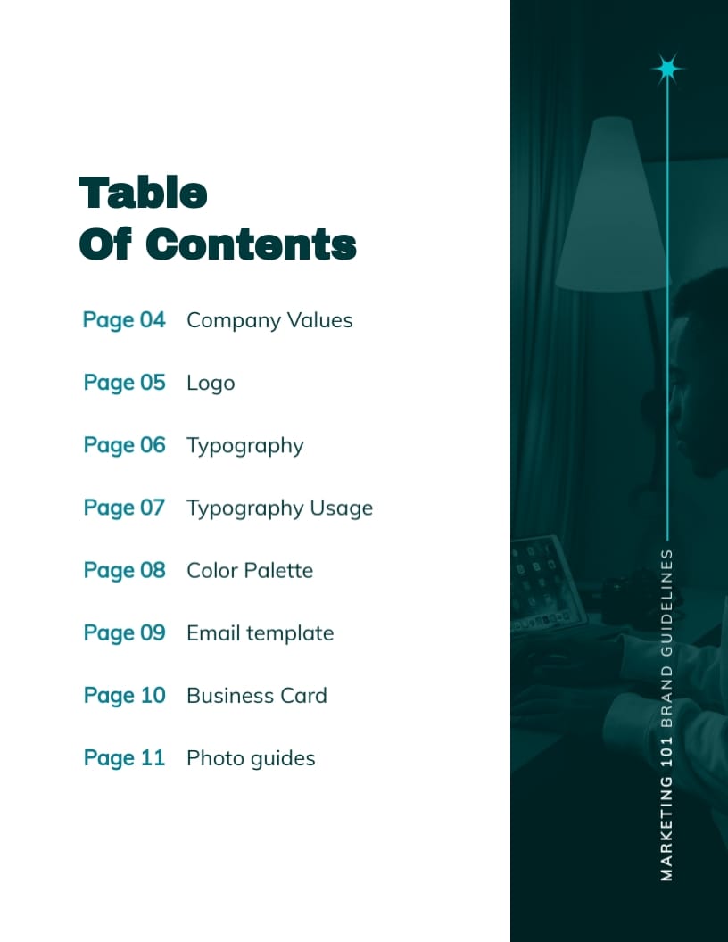
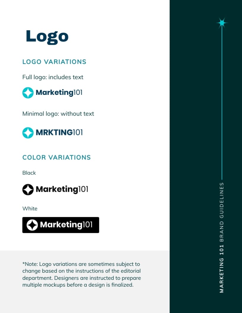
3. Marketing Agency Brand Guidelines Template
If you’re in the creative industry, Visme has a template that will fit your needs. This template includes plenty of beautiful photos, icons, fonts and data widgets.
The best part? You can make these elements interactive, like hover effects and popups – talk about impressing your audience!

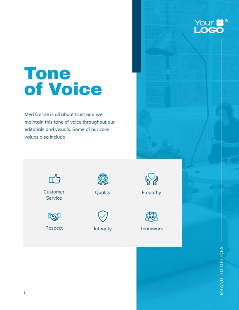
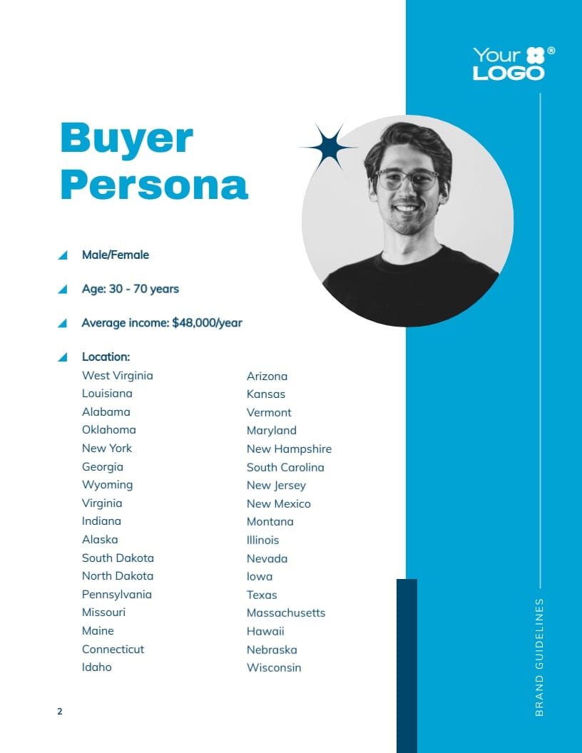
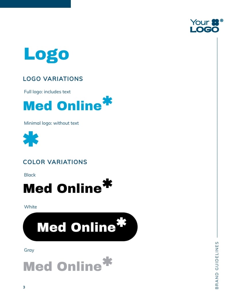
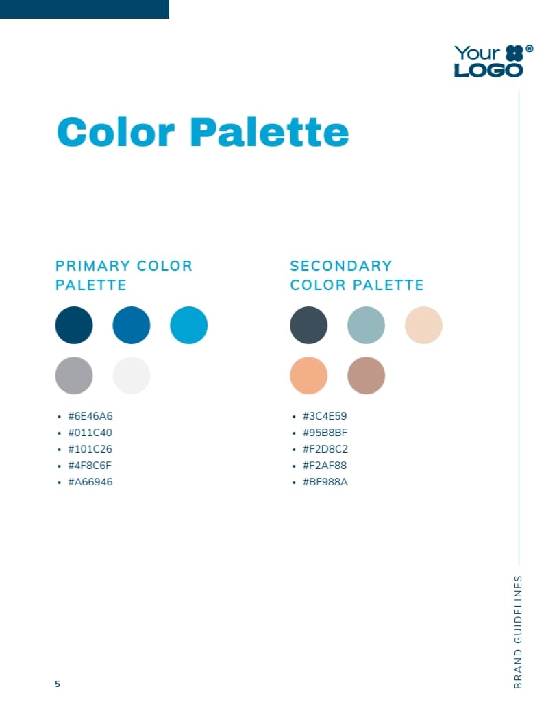
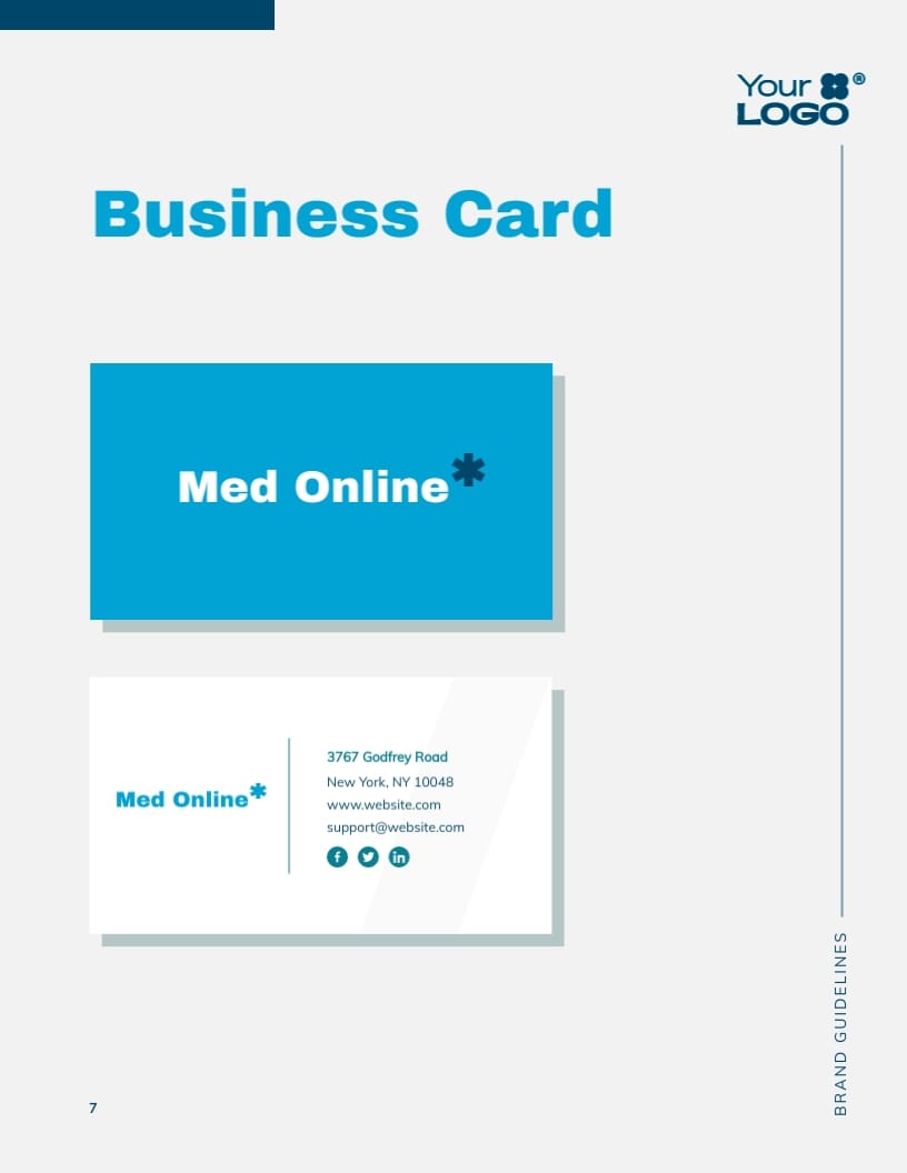
4. E-Medicine Store Brand Guidelines Template
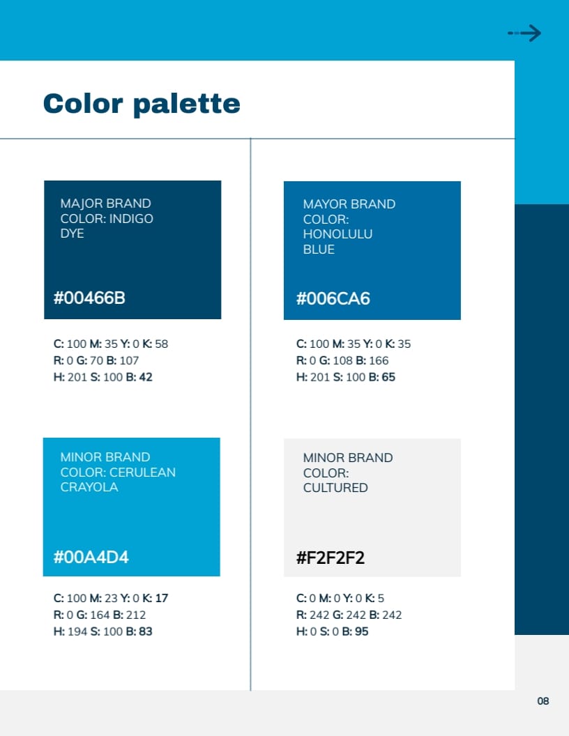
If you’re on the lookout for something slightly less playful and more professional, then check out this brand style guide template. It features blue and white colors, which work well for medical brands.
The slides include dynamic content blocks allowing you to easily enter your text and visual content. If you’re unhappy with the photo selection, you can quickly replace them with your own images.
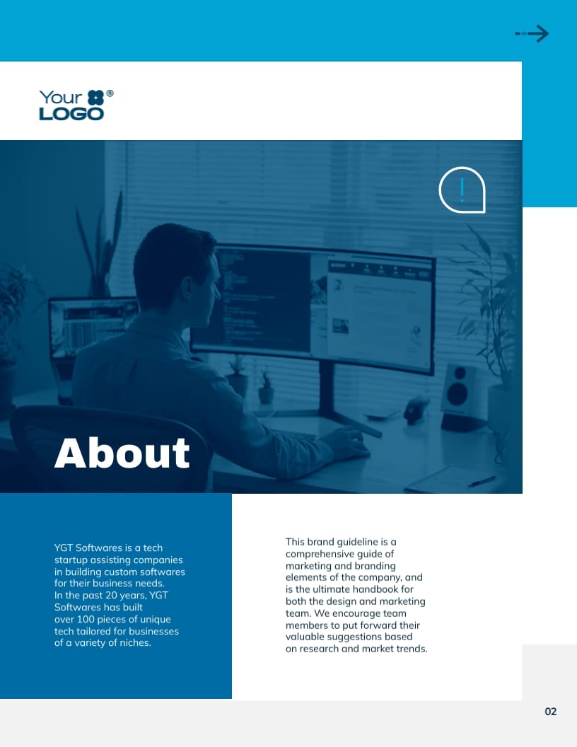
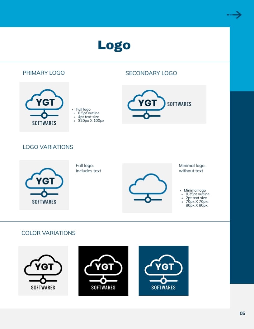
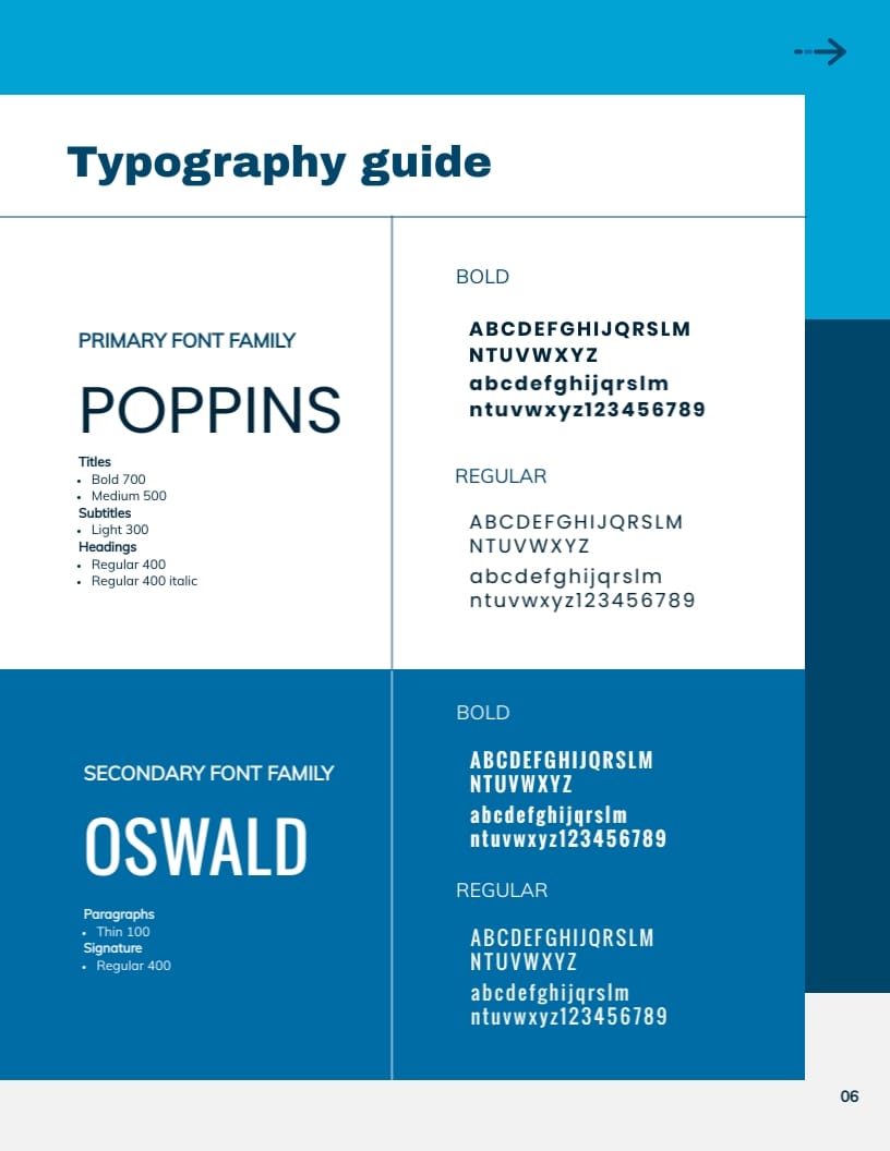
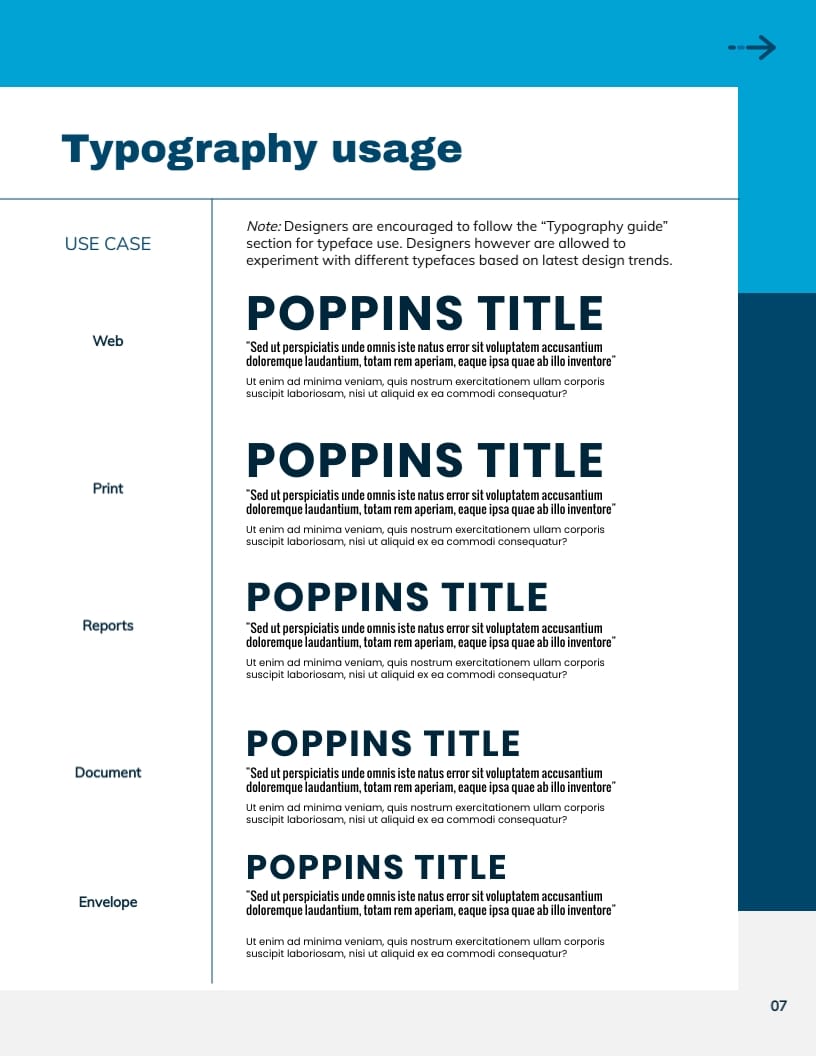
5. Software Company Brand Guidelines Template
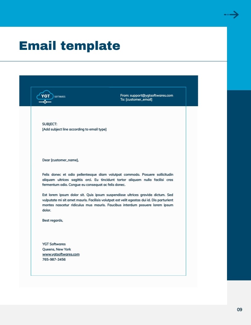
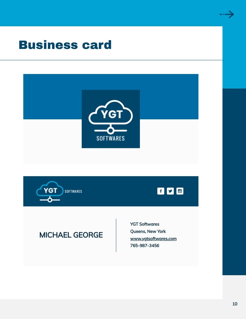
Here is another template that we can categorize as “professional.” It’s a good choice for tech companies, including software agencies. It includes 11 slides with lots of whitespaces to help you avoid clutter and clearly present your content.
Replace the placeholder text with your own content and remember to adjust the visuals to match your style.
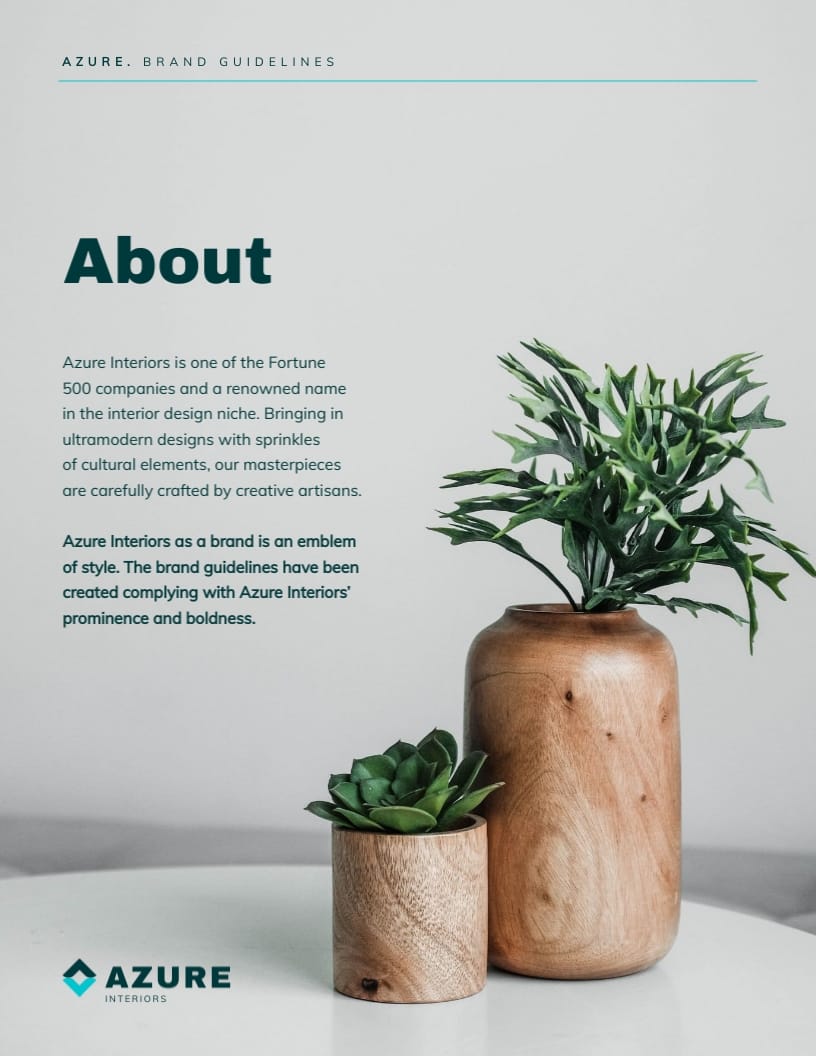
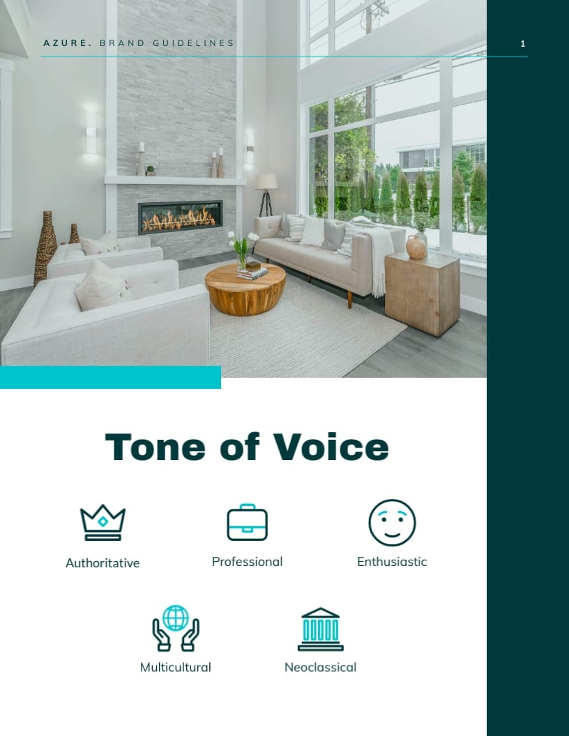
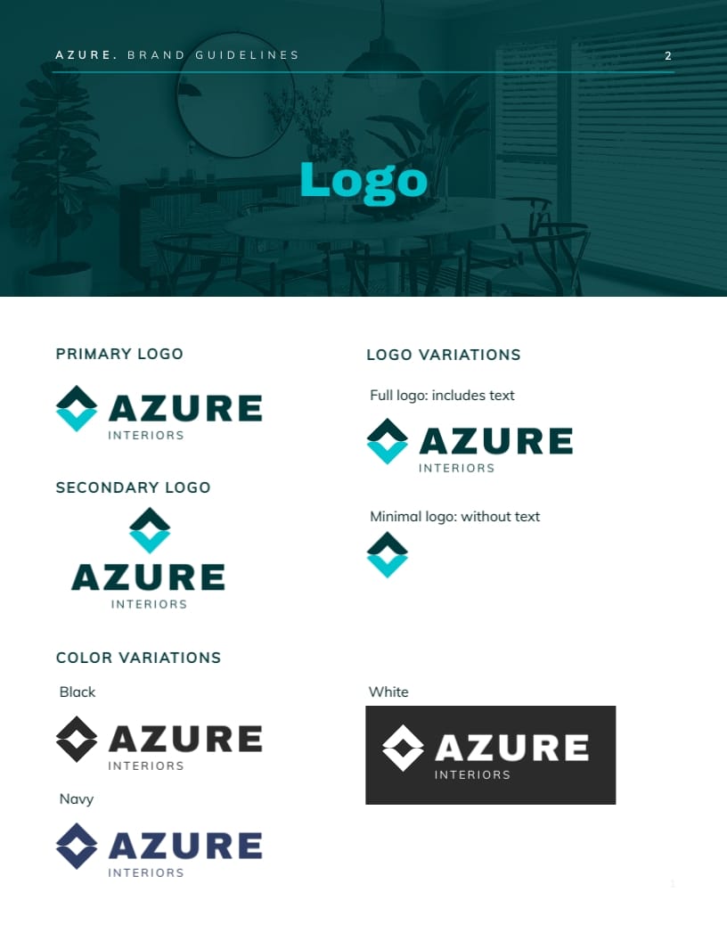
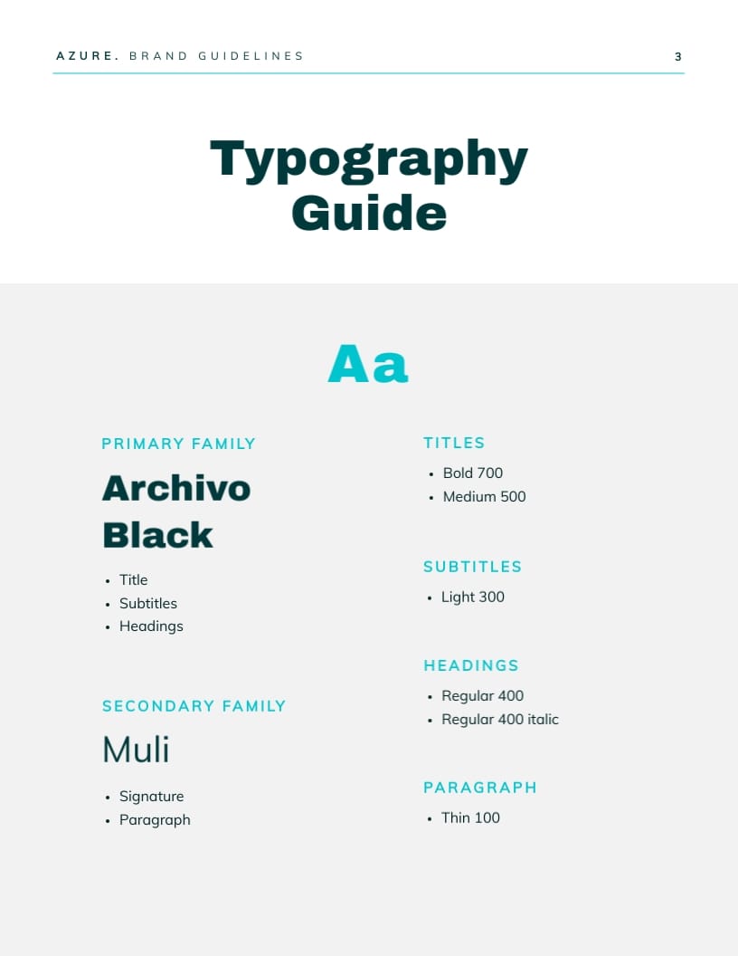
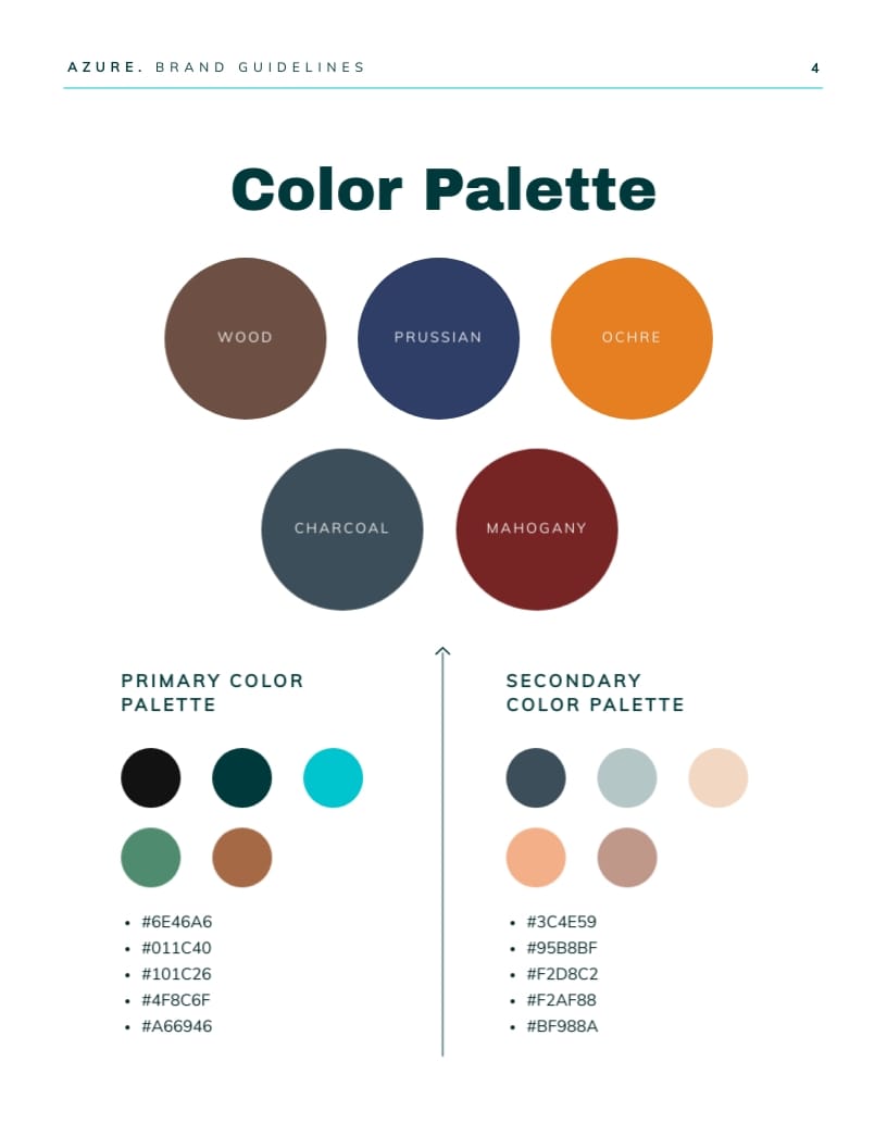
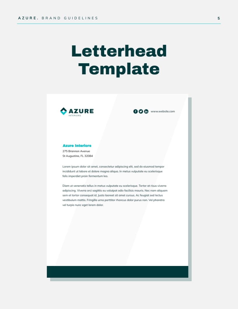
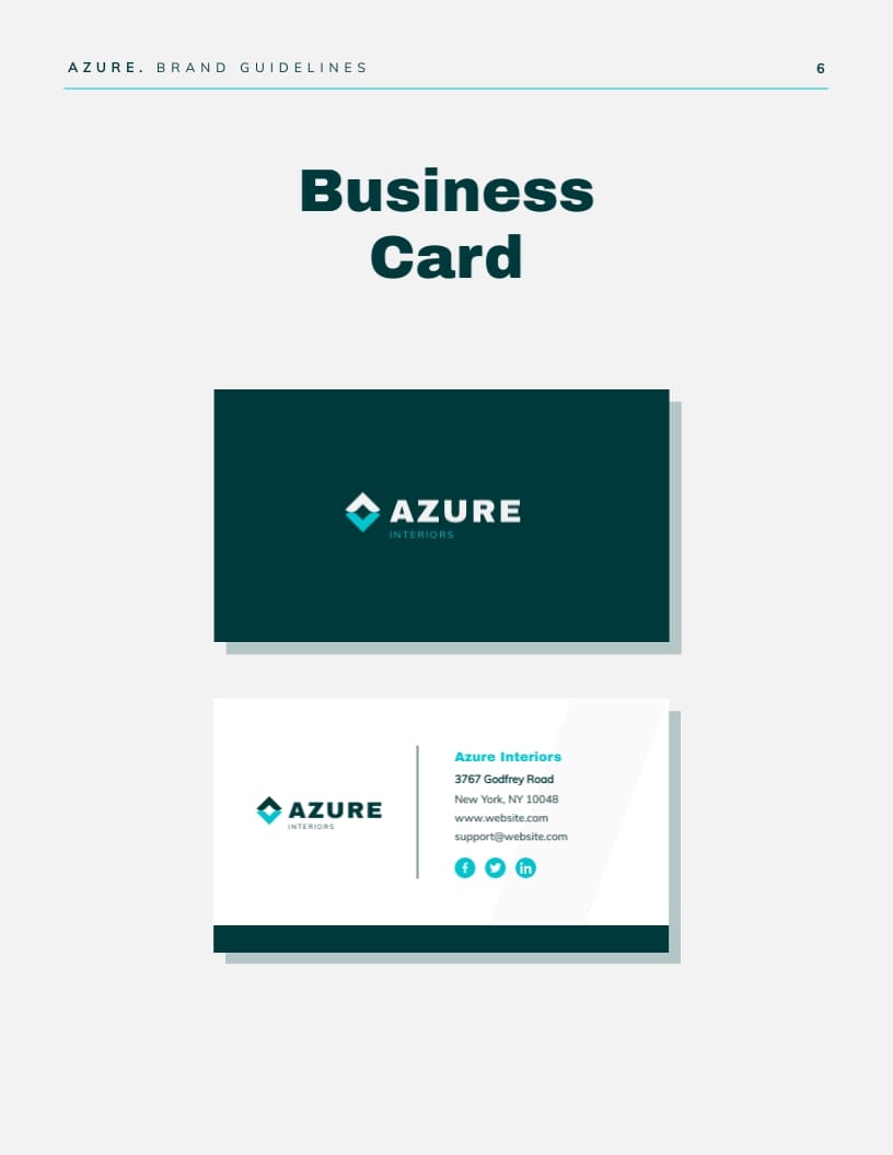
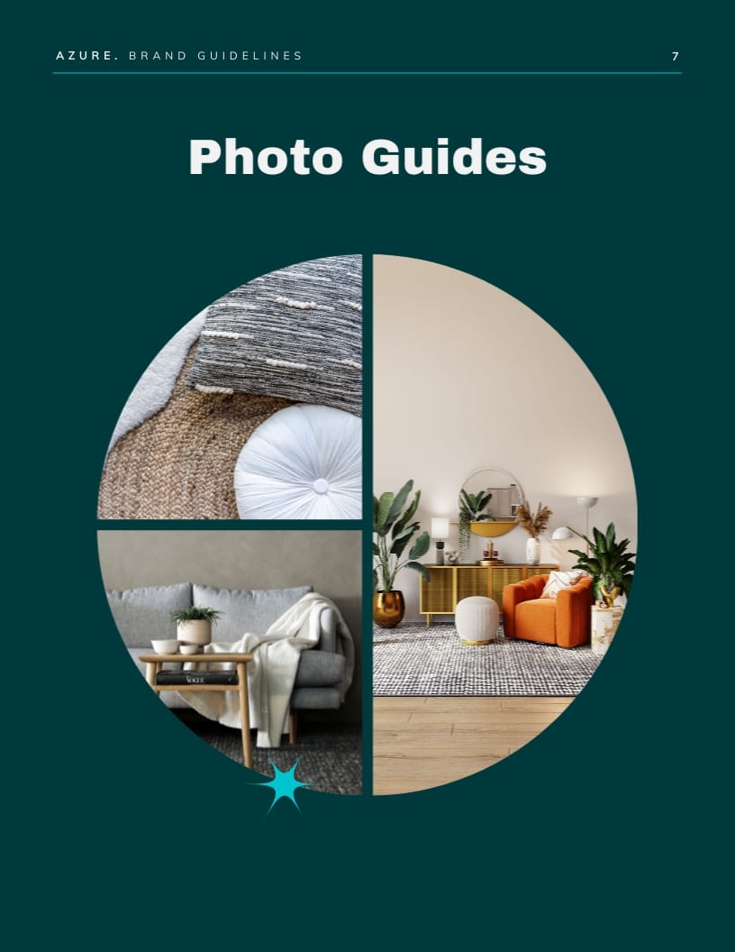
6. Interior Design Company Brand Guidelines Template
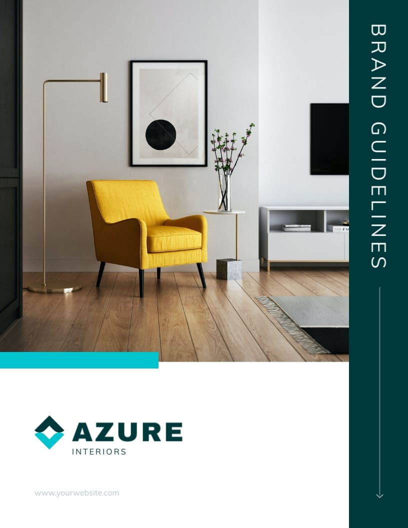
This style guide template might be perfect if you’re in a B2C industry like interior design and want your assets to include examples of client work. It’s also a great choice if you want to keep your style guide in a PDF and need an A4 format.
The template has 10 pages and includes all the crucial information, like:
- A high-level overview of the tone of voice
- Font size and logo variations
- Color palette and business card layout.
Notice how this brand style guide template perfectly communicates the most important characteristics of an interior design business – creativity and professionalism. As all other ready-to-use Visme assets, it’s fully customizable. By using dynamic fields, you can also easily add in relevant text.
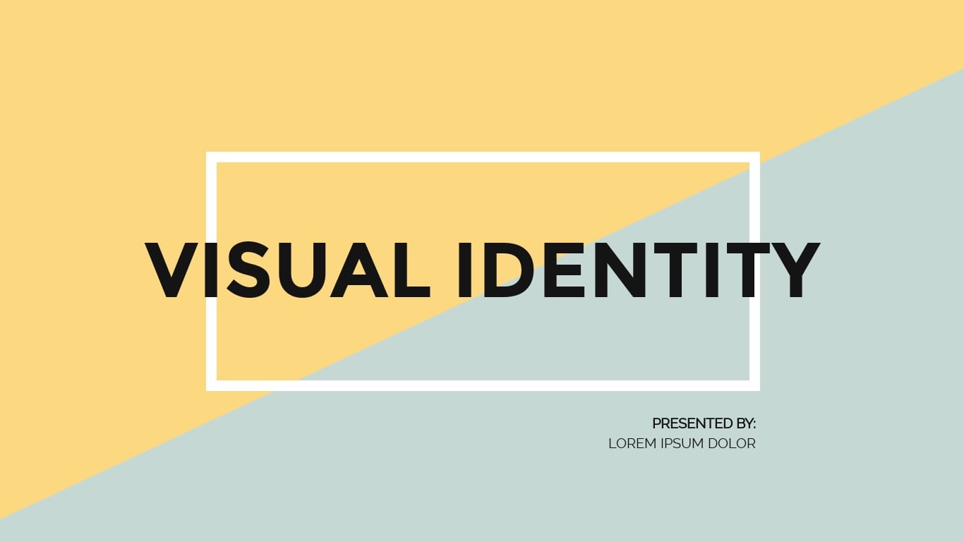
7. Brand Visual Identity Presentation Template
This brand style guide template is an ideal choice if you’d like to present your company’s visual identity in a short slide presentation. It features 10 ready-to-use, editable slides. You can easily copy-paste your own images, icons or even citations.
It’s fully customizable (some screens, as the one above, even tell you what to fill in!), so it’s a good choice for most industries.
With Visme’s brand wizard, you can keep your company’s branding consistent across all your projects. Simply input your brand URL and our AI-powered brand design tool will pull your brand elements and apply them to your projects.
8. Travel Agency Brand Guidelines Template
It’s a perfect choice for companies not only in the travel sector but any other type of business that heavily relies on images and wants to appeal to human emotion. The lively color combination and vivid imagery in this template almost make you want to pack your things and head over to the closest airport.
You can use this Visme template as-is or switch the sections up. All you have to do is copy and paste information about your company colors, typography and user personas, add in any photo guides and there you have it!
After sharing your brand guidelines with your team, track Visme analytics to see who has viewed or taken action on your document.
9. Financial Consultancy Firm Brand Guidelines Template
Let’s now look at an example of a style guide template for a more formal business, like a financial consultancy. Like several other examples in this section, this is another take on an A4 asset. The color palette in this example includes dark colors, paired up with green and blue—two popular choices among fintech brands.
There’s a total of 10 pre-designed pages, which let you include information on your company’s logos, primary and secondary colors, tone of voice and letterhead layout, among others. Since you can customize all the elements, it’s a perfect choice for a variety of industries.
Stay organized and keep critical information consistent across your document using Dynamic fields. With a single click, you can update information throughout your projects
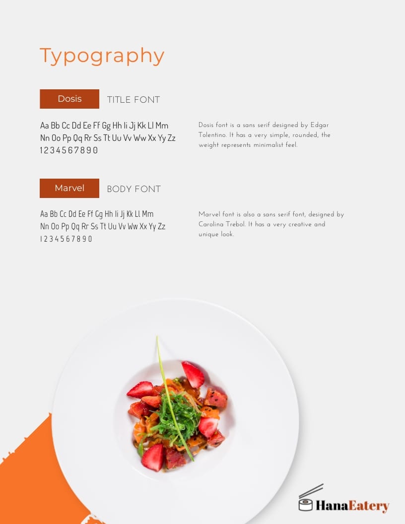
10. HanaEatery Brand Guidelines Template
If you’re in the restaurant industry or in any other B2C business, this guide might just be what you need. There are seven pages, which include a pre-designed layout for your company’s typography, logo usage, an ‘About Us’ page and a section on the integrity of the brand mark.
While this brand style guide template features colorful images from our in-app stock video and photo library, bright colors and modern typography, you can easily customize it to fit your business.
This will be an ideal choice if you’re looking for a template that lets you take a deep dive into the permissible logo variations.
How to Create a Style Guide with Visme
Creating a style guide with Visme is extremely easy. Here’s how to do it step by step.
1. Start with a Style Guide Template
You can select one of the options we listed above or head over to our template library. All of our templates are easy to use and made by professional designers who ensure that their branding, color and text combinations fit specific industries.
Style Guideline Templates
2. Customize Your Template
Fill the template with your assets and text. Among others you can:
- Add your logo and all the company information that your style guide needs to feature
- Insert stock images or upload your own
- Apply filters, insert animations and 3D icons
- Customize the text font and colors and adjust tables or create borders

3. Collaborate on the Style Guide with Your Team
Now’s the time to bring on other members of the product team to collect their feedback. You can add multiple users to your workspace, control user permissions, leave and receive feedback.
With Visme’s collaboration feature, team members can tag each other, leave feedback and comments and work on style guides and other projects both synchronously and asynchronously. Visme also lets you control which comments are set to public and which ones are private, and who is currently viewing your guide.
Read this article to see how to do collaborative designs in Visme. Or watch the video below to learn more.
4. Download Your Style Guide
Once you’ve collected feedback from your team and applied any changes, you’re ready to download or share with the rest of the company. You can do so in numerous ways, including:
- Creating a URL (i.e., a shareable link)
- Embedding it on your website (HTML5)
- Downloading a PDF, PNG, JPG
- Turning it into a video
Watch this video to learn more about the options available for downloading and sharing your style guide.
And there you have it—your company’s very own style guide!
Real-Life Style Guide Examples
So, what is the best style guide? We’re going to take a look at a few real-life examples from the world’s well-known brands to figure it out.
Spotify
Spotify’s style guide is simple and straight to the point. It focuses on design and covers elements like:
- Attribution
- Content usage
- Logo
- Color palette
- Fonts, etc
All rules are communicated clearly, so it’s hard to get them wrong. A lot of the content in the style guide revolves around logo usage—clearly, it’s rather important to them. They even mention how proud they are of their logo in the guide itself.

Source: Spotify
Spotify allows you to download an icon version of their logo without manually recreating it and uses many visuals to better illustrate their requirements. For example, you should only use an icon if there is not enough room to use the full logo.

Source: Spotify
TikTok
TikTok’s style guide is fun to use as not only is it visually appealing but also interactive. Initially, they explain their approach to design and emphasize how important it is.
Next, they move on to discussing their logo usage (and there is a lot to learn, since there are three different logos). The style guide also includes a link where you can download their logo pack – quite handy.

Source: TikTok
There is a graphic that nicely visualizes the do’s and don’ts around the logo – it’s hard to get it wrong, isn’t it?
The style guide also covers such areas like:
- Co-branding
- Typography
- Color

Source: TikTok
Apple
Apple is famous for its cohesive, minimalistic design. This is thanks to their well-thought-out style guide. Given that Apple works with hundreds, if not thousands of resellers worldwide, their guide is used not only internally but also to onboard their franchisees.
Take a look at the example in the image below. Notice how Apple sets a clear standard for product images and forbids photo modifications. All this helps the electronics giant maintain the same experience wherever a user comes across their company.

Source: Apple
Medium
Medium has millions of active monthly users, given that it’s an open publishing platform. No wonder that the brand has decided to take control of its logos and other style guide assets. They published a detailed post which explains, among other things, how people can use the logo and symbol and which colors can be used as a background for any images featuring the Medium logo.

Source: Medium
Still, their most treasured (and protected) asset is the font set as the default for all Medium publications. Since they’re a platform for readers, this is hardly surprising—seeing the typeface makes you recognize the brand in a heartbeat.

Source: Medium
3 Best Practices When Using a Style Guide
Let’s now take a look at how you can make the most of your style guide.
Make Sure That It’s Understood by Developers
While your style guide will be mostly used by designers, it must be easy to understand and navigate by developers. Ultimately, whenever they’re asked to code a new screen or apply your new styles online, that’s the resource they’ll turn to.
Preparing a user-friendly style guide is essential for proper designer-developer handoffs. Here’s where using a data visualization tool like Visme will do wonders.
You can either create a style guide by using one of our 20+ style guide templates or create a brand kit and send it over to the software team. It helps you avoid any miscommunication by giving developers all they need to start development.
If you don’t have a style guide yet, then it is also a good idea to involve developers in the creation process. You can collect feedback by asking them if everything is clear to them and if they’d know how to use it. This leads to the next point.
Treat Your Style Guide as a Living Organism
Your users’ needs and, let’s face it, design trends will change over time. This means you should never treat your style guide as a one-off project.
Communicate with customer-facing teams regularly and ask them for any design-related feedback. Take advantage of our collaboration features to streamline your design process.
Also, stay on top of the latest design evolutions, especially in your market. This way, you’ll be able to decide when it’s time to revisit your style guide to stay relevant to users.
Make It Easily Accessible
Make sure that your style guide and brand guidelines are available in one central location. They should be easily accessible for everyone. If they’re hard to find, high chances are people won’t abide by the rules. You can also consider sending them via email.
Easily Create Style Guides & Manage Your Branding with Visme
Creating a style guide is the best way to make sure your design is consistent across the board. Still, it will only serve its purpose if your team knows where to find it and how to use it.
While it might seem like a daunting task, it comes down to putting your thoughts on paper and turning them into a document that everyone in the company (as well as external collaborators) can use.
Visme offers 20+ free style guide templates that you can modify to match your brand visual identity.
On top of using one of our style guide templates, you can also use Visme to create other types of company assets, social media images, infographics, videos, or charts. Better yet, create a brand kit – your styles will automatically appear in the editor the next time you work on any type of design.
Ready to give it a try? Sign up now and start creating your branded content assets with Visme.
Create Stunning Content!
Design visual brand experiences for your business whether you are a seasoned designer or a total novice.
Try Visme for free

























![What is a Creative Brief: The Complete Guide to Create Your Own [+Templates]](https://visme.co/blog/wp-content/uploads/2023/05/What-is-a-Creative-Brief-The-Complete-Guide-to-Create-Your-Own-Thumbnail.jpg)

![How to Create Stunning Letterhead Designs to Showcase Your Business [+ Templates]](https://visme.co/blog/wp-content/uploads/2023/03/How-to-Create-Stunning-Letterhead-Designs-to-Showcase-Your-Business-Thumbnail.jpg)