


Visme Forms Walkthrough: Build a Form That Routes, Syncs and Converts


Writing a report that people will want to read and act on must be easy to scan and understand effortlessly.
The difference between reports that achieve that objective and those that don’t usually comes down to structure and formatting, not the content itself.
That's why following a report-writing format is critical to your report-writing process. It gives your valuable content a logical path from beginning to end. Having this knowledge ultimately makes the writing process less overwhelming and ensures your findings land the way they're supposed to.
This guide has the tools you need: the standard format structure, a breakdown of the eight main report types (with their subtypes and formatting differences), a step-by-step writing process, pro design tips and real-life examples and templates to help you visualize it all.
Report writing format is the structure that organizes a report's content into clear, logical sections, from the title page and executive summary through to the conclusion, recommendations and appendices. It gives both the writer and the reader a consistent framework, making the information easier to produce, navigate and act on.
The exact format varies by report type, but the core structure applies to most business, research and academic reports.
While report formats vary depending on the data and information they share, there’s a standard report-writing format that works for most scenarios.
Having a consistent report format is a practical way to simplify and improve efficiency. That’s exactly what Stanislav Khilobochenko, VP of Customer Services at Clario, suggests:
When reports follow the same format year after year, it's much simpler to spot trends, monitor performance and measure progress without the need to reformat older documents. Using the same financial report format, for example, allows for comparing quarterly or annual earnings, allowing for the assessment of growth or the identification of improvement opportunities.
If you’re unsure which sections you need, start with these, then add the specific ones that matter only to your report type.
We’ll look at those differences a bit further on.
For now, these are the standard sections:
Now, let’s take a look at every section in detail using the pages of a sample report to visualize each section.
The title page is the first thing your reader sees, so it needs to do its job fast. The title itself must clearly state what the report is about in simple terms. Add a subtitle if the topic needs more context, and ensure the font hierarchy reflects the distinction between the two.
A well-designed cover page includes:
Keep the design clean and on-brand using the same visual style as the rest of the pages. A polished cover page signals to the reader that the content inside is worth their time. If you need some guidance, Visme's report cover page guide has practical design tips and several examples.
Need help writing the title for your report? Use Visme's AI Writer; it’s right inside the editor. Drop in a description of your report and ask it to generate a few options. Edit from there.

Readers rarely read a report cover to cover. They scan, skip ahead or go straight to the section they’re most interested in. A well-structured Table of Contents helps with all that.
List every section and subsection with its corresponding page number. For digital or interactive reports, hyperlink each entry directly to its section so readers can get there fast.
This page depends on proper alignment so the navigation is simple and easy to understand. Use bullet list formatting or a grid with smart guides to help you keep everything balanced.
It’s a good idea to build the table of contents last. That way, you won’t have to redo the layout if any headers change or the number of pages is different.

The name of this section changes depending on the context. Business and corporate reports call it an executive summary. Academic and research reports use an abstract. Shorter internal reports often just call it a summary.
That being said, the format and purpose are the same across all three: a short, self-contained overview that gives the reader the full picture of the report. It must give enough succinct information so that the reader gets the full idea without reading anything else.
The content covers the report's purpose, what was studied or analyzed, the key findings, the conclusion and the recommendations. You’ll find a full breakdown of how to write it in the How To section further down.

Unlike the executive summary, the introduction does not reveal findings or recommendations. Its job is to provide context, not to draw conclusions. It explains the background, frames the problem or opportunity the report addresses and gives the reader enough information to understand why the report exists.
Depending on the length and type of report, the introduction can be a single paragraph or a full page. A social media report introduction might be three sentences. An annual report introduction might run an entire page and include a personal statement from a senior leader or industry expert.

The methodology section explains how the report's information was gathered. It covers the sources used, how the data were collected, and why that approach was chosen.
Not every report needs a methodology section, though. Internal business reports, weekly updates and project status reports typically skip it. Research reports, academic reports and feasibility reports almost always include one, because the credibility of the findings depends on the reader's ability to evaluate how they were produced.
A strong methodology section is transparent and specific. Vague descriptions like "data was collected from various sources" do not give the reader enough to assess the quality of the findings. So, name the sources, explain the process and note any limitations.
The body is the longest section of the report, and where all the information comes together. Depending on the scope and type of report, it can span anywhere from 5 to 50 pages.
It’s organized into sections and subsections, each covering one clear topic that builds on the previous one. The content must flow to make it easier to grasp. A reader moving through this part should always understand where they are and where the report is going next.
Visuals help with both. A well-placed data visualization breaks up dense text, signals a transition between topics and gives the reader a moment to absorb data before moving on. Used consistently, they also create a visual rhythm that makes long reports easier to navigate.
Digital reports often include a navigation bar in the body that directs to different sections. This is especially helpful when the report exceeds 45 pages.

The conclusion summarizes the report’s key findings. It doesn’t introduce new information or raise points that haven't already been covered. Its job is to give the reader a clear, final summary of what the report showed before the recommendations section.
If the report opened with a question, the conclusion must answer it directly. For example, if at the start you asked, "Why is customer retention dropping?" the conclusion answers that question, backed by everything the body covered.

Directly after the conclusion, the recommendations section lays out a clear set of next steps; specific, realistic and directly tied to what the data showed.
Not every report needs this section. School reports, book reports and purely informational documents typically skip it. But in business, research and feasibility reports, it is often the most important section of the document.

The appendices hold everything that supports the report but would interrupt the flow of the main body if included there. These can be source lists, raw data, detailed charts, survey questionnaires, legal documents and supplementary references, all of which belong here.
Keep it relevant and lean. Only include material that was directly referenced in the report. You can always add hyperlinks to further information.
Use reference annotations like numbers or asterisks inside the report to link to the content in the appendix, so readers can find supporting material quickly.

The report content used in this sample report design can be found here.
Not every report needs the same level of depth or length. Your choice must match the scope of the information, the intended purpose, the audience who needs it and how the report will be distributed.
Let’s compare a short report format with a long report format. Some characteristics are unique to each type, while others apply to both, and finally, for some, “it depends.”
This Venn Diagram lays it all out.
Made with Visme Infographic Maker
Reports exist across many different professional and academic spaces, meaning there are a lot of them. We’ve categorized the most common and most impactful report types in the table below.
Keep scrolling to read more about each report type in detail, including format styles, suggestions to help your audience get the most out of your information and some real-life examples.
Includes: daily, weekly, monthly, quarterly and annual reports.
Most organizations run on cycles: weeks, months, quarters and fiscal years. Periodic reports document those cycles and help teams make better decisions for the upcoming cycle.
These reports capture and analyze events over a set time interval and are typically submitted on a recurring schedule to keep teams and stakeholders informed.
The format follows a similar structure every time: a summary of the period, completed work, what is in progress, blockers and priorities for the next cycle. Consistency through every iteration is what makes these reports useful, readers know exactly where to look for comparisons across periods.
Daily, weekly, monthly and quarterly reports are primarily internal. They are practical documents, clear, direct and built for agility. The audience is usually a manager, a team or a department, and the priority is accuracy over aesthetics. But that doesn’t mean they need to be boring and drab; you can make them nice to look at as well.

Krystyna Bodlieva, project manager and QA specialist at Visme, shares valuable insights on the importance of weekly reports for keeping teams aligned and focused.
Weekly reports are an essential tool for fostering team alignment and maintaining transparency. They provide a snapshot of progress, help identify roadblocks early, and ensure everyone stays focused on shared objectives. Over time, these reports contribute significantly to organizational success by promoting accountability and enabling data-driven decision-making.
Annual reports, on the other hand, reach a wider audience: investors, partners, clients and the public. That broader reach means that design, brand and narrative also matter. An annual report is one of the few report types where visual presentation carries as much weight as the data itself.

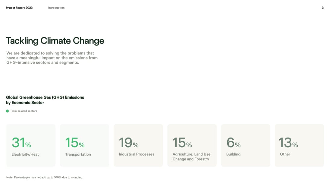
Tesla's Impact Report is an excellent example of a company's annual report. It's well-structured and easy to read, with a clear title, table of contents and introduction. The report also includes a variety of visuals, such as charts and graphs, to present data in an engaging way. Additionally, the report includes a section on recommendations, which is important for a company report.
Includes: sales, marketing, performance and operational reports.
Business reports communicate performance, strategy and operational data to the people who make decisions. They pull from real company data, present findings clearly and almost always end with a recommendation or a next step.
The format varies by subtype, but most business report writing formats share a common spine: an executive summary, a findings section, analysis and recommendations. The executive summary gives senior readers a concise overview without sacrificing the key findings. The findings and analysis sections serve the people who need the details.
Performance reports, sales reports and marketing reports each follow this same structure but differ in the data they share. A sales report focuses on revenue, pipeline and conversion. A marketing report tracks campaign performance, reach and ROI. A performance report evaluates output against targets, whether for a team, a product or a business unit.

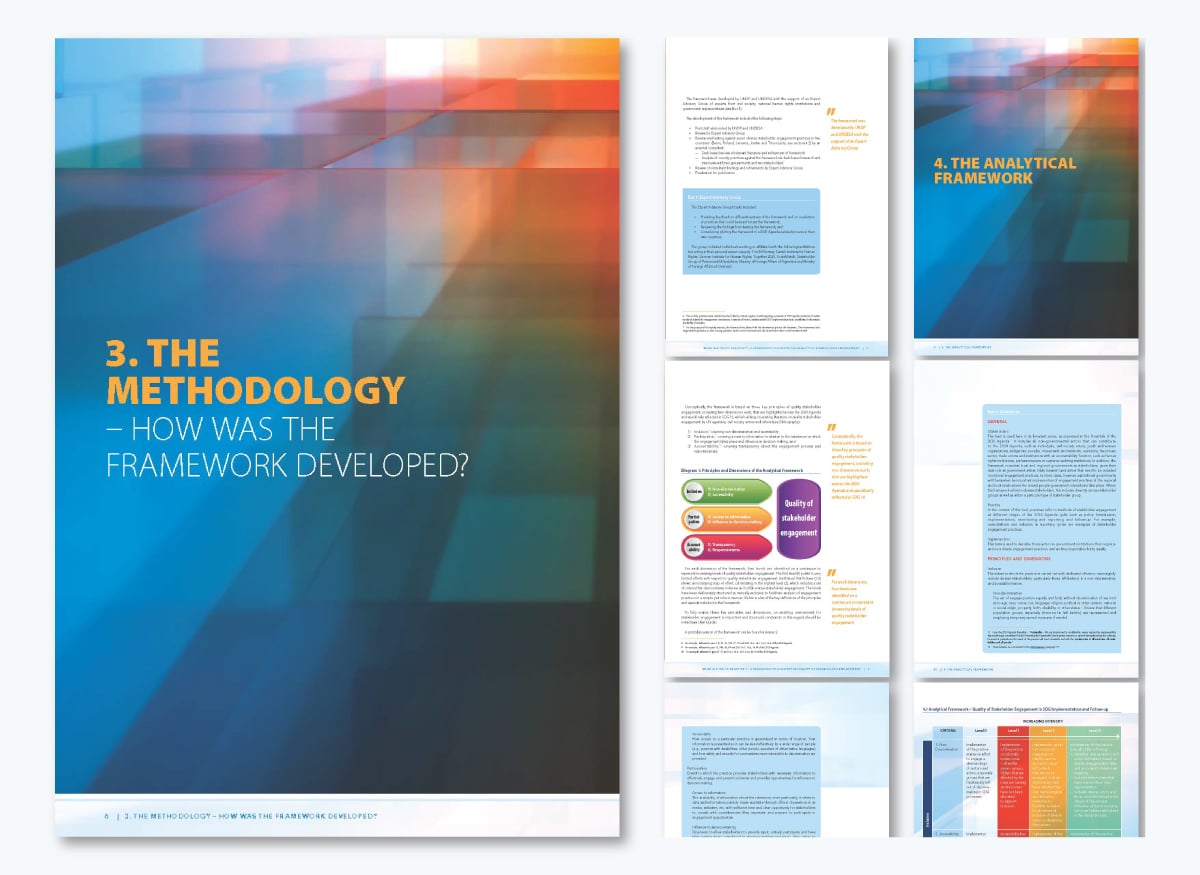
Here’s an example of a stakeholder engagement report from the United Nations. The structure is clean and logical: an introduction frames the problem, a methodology section explains how the analytical framework was developed, findings from testing are presented with supporting evidence and a practical user guide closes the report with actionable next steps.
Key Takeaway: Note how the methodology section is set up. It names the expert advisory group, lists the five countries where the framework was tested, and explains exactly how the testing was conducted. That level of detail and transparency is what gives a report credibility.
Sales and marketing reports are crucial for tracking progress and identifying areas for improvement, but they can be tough to make engaging.
If you get overwhelmed by data and struggle to present a clear narrative, Kalyn Lewis, our Head of Sales & Customer Experience, has some great tips that will help:
"When I’m creating a sales report and I have a scope of analysis and data that needs to be reviewed together to drive decisions and follow-up actions:
Includes: budget, profit and loss, cash flow and audit reports.
Financial reports document an organization's financial health. They give executives, investors, auditors and regulators a clear picture of where money came from, where it went and what it means for the organization going forward.
The format is highly structured and, in many cases, governed by accounting standards like Generally Accepted Accounting Principles (GAAP) or International Financial Reporting Standards (IFRS).
Financial statements present revenue, expenses, assets and liabilities, variance analysis explains the gaps between projected and actual figures, and notes provide context for anything that needs clarification. Recommendations close the report with what needs to change.
Unlike other report types, financial reports leave little room for interpretation in the data itself. The numbers are what they are. The skill is in how clearly the analysis explains them and how actionable the recommendations are.
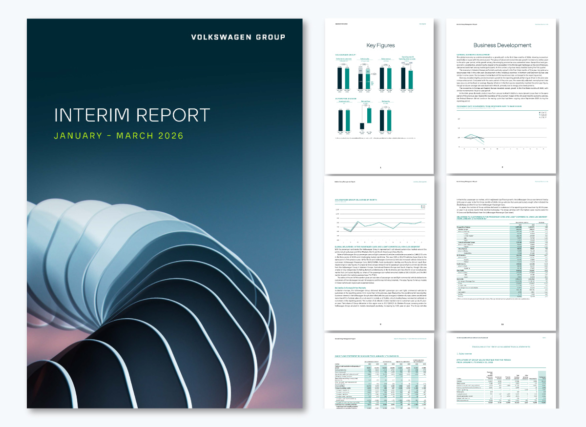
The Volkswagen Group Q1 2026 Interim Report is a strong example of a quarterly financial report prepared under IFRS standards. It opens with a key figures summary and key facts section that gives the reader the headline numbers immediately, before the full management report, financial statements and notes that follow.
What stands out across these pages is the consistency of the color-coded tables, which make comparisons with previous periods easy. The fact that the same layout repeats is what makes the report dependable and easy to scan.
Key Takeaway: In a financial report, visual consistency is as valuable as the data itself. When the format doesn’t change, comparisons become effortless and readers can appreciate the effort.
Includes: progress, sprint and post-mortem reports.
Project status reports keep everyone aligned on where a project stands. They give project managers, clients and sponsors a snapshot of progress, risks and next steps. They’re invariably shared during meetings or, sometimes, replace meetings entirely.
The format is concise and consistent. Most include a project summary, a status indicator showing whether the project is on track, at risk or delayed, key milestones completed and upcoming, active risks with mitigation notes and a clear next steps section.
Regarding visuals for a project status report, the typical contenders are Gantt Charts, timelines, percentage gauges and swimlane diagrams.
Periodically submitting a project status report for a long-running project builds a paper trail that protects both the team and the client. When scope shifts or timelines change, the record is there for clarity and reference.
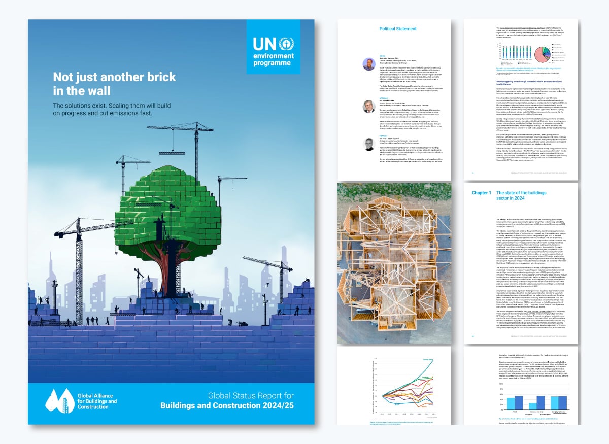
Take a look at this example, another from the UN. Their Global Status Report for Buildings and Construction 2024/25 by UNEP tracks the global buildings sector's progress against Paris Agreement decarbonization targets. It benchmarks key metrics like emissions, energy intensity, investment, and certifications against 2030 and 2050 goals, then identifies what needs to accelerate and by when.
Key takeaway: A project status report measures progress against a defined goal, flags what's off track, and points to next steps. It’s important that you have a set goal and metrics to compare to.
Includes: scientific, market research and survey reports.
Research reports present the findings of a structured investigation. The goal is to document what was studied, how it was studied and what the data showed, so the reader can evaluate the findings and either act on them or make decisions for their own organization or project.
The format is more detailed than most other report types. An abstract opens the report with a summary of the entire study. The methodology section explains how data was collected, the findings section presents what the data showed and the discussion section interprets what it means.
A conclusion answers the original research question directly, followed by recommendations and a full reference list.
Visuals in research reports are mostly data visualizations that help readers absorb findings quickly before digging into the text.

Includes: engineering, IT systems and lab reports.
Technical reports document the process, findings and outcomes of technical work. They give engineers, IT teams and analysts a formal record of what was done, how it was done and what the results showed.
The format follows a logical progression. An introduction establishes the purpose and scope, a technical background section provides the context needed to understand the work and a methodology section explains how the investigation or process was carried out.
Results and analysis follow, and finally, appendices containing any supporting data, specifications or references close the report.
Unlike other reports, the audience for technical reports usually has specific domain expertise, so the writing must be precise and technical.
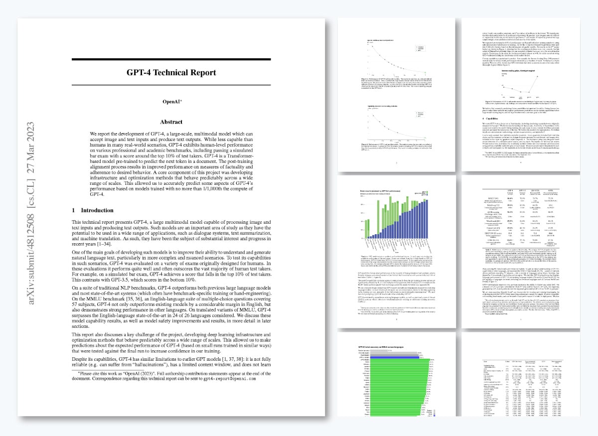
Technical reports aren’t typically very visual or have conceptual design layouts. Take this example from OpenAI. Their GPT-4 Technical Report documents the development, capabilities, and limitations of the GPT-4 model.
It covers benchmark performance across academic and professional exams, safety evaluations, known failure modes, and the infrastructure that makes model behavior predictable at scale.
Key takeaway: This technical report doesn't just describe what was built; it shows how it was tested, what the results mean, and where the limits are. Use this as inspiration for your own technical reports and remember to include all the important details.
Includes: cost-benefit, risk assessment and market feasibility reports.
A feasibility report answers one important question: Should we do this? It evaluates a proposed project or plan against a set of criteria: budget, timeline, technical requirements, market conditions, and delivers a clear recommendation based on the findings.
The format builds toward that recommendation step by step. First, an executive summary opens the report, followed by background context, the criteria used to evaluate options, an analysis of each option and a final recommendation supported by the evidence. Every section exists to support decision-making.
Feasibility reports are most common before major investments, product launches or organizational changes. The people reading them are decision-makers, and they need the analysis to be rigorous and the recommendation to be unambiguous.
Includes: literature review, field and dissertation reports. Case studies also appear frequently in academic contexts, though they also cross over into business reporting.
Academic reports present research or analysis conducted within an educational or scholarly context. They follow formal writing conventions and are structured to meet the standards of a specific institution, discipline or publication.
The format is usually quite detailed and citation-heavy. To begin, an abstract summarizes the study, the introduction frames the research question and a methodology section explains how the work was conducted. The findings and discussion sections come next, with the discussion interpreting the results in the context of existing research.
A conclusion answers the original question directly and a full reference list closes the report. Style guides like APA, MLA or Chicago also govern formatting depending on the discipline. For example, getting citations right matters as much as the content itself.
For more report examples to learn from and get inspired, check out our guide on Report Examples With Sample Templates.
We’ve looked at several report formats and a suggested list of sections to include. This knowledge is what builds your report outline, the skeleton you’ll build upon with content. What comes next is writing the text and planning for how it will all fit in the final format.
Here are some tips and best practices to help you get off on the right foot.

Start with the report body before you write the introduction or conclusion. Writing the meaty part first gives you a clear picture of what the report actually covers, making the opening and closing sections much easier to write accurately.
If you're working on the report as a team, Visme's team collaboration feature will help. It lets you assign specific sections to different members, work simultaneously, and leave comments or notes. Once the body is complete, write the intro and conclusion, or assign someone to do it, using the body text as the foundation.
Write With the Right Style and Tone
How you write a report affects how seriously it gets taken. A well-formatted report that looks great in a skim but has sloppy writing loses credibility fast. Keep these principles in mind when drafting your report.
Use active voice. Active voice makes your writing direct and easier to follow. Passive voice adds distance and slows the reader down. Here is an example:
Match your tone to your report type. Not every report calls for the same register. These are the most common types and tone alignments:
Cut anything that doesn't add information. Use plain English to avoid bloating the text. If a sentence can be said in fewer words without losing meaning, tighten it. Here are a couple of examples:
Use AI to speed up the writing process. Tools like Claude, ChatGPT and Visme's AI Writer can help you generate structured drafts, suggest phrasing and clean up text. For best results, follow these tips:
Before you hand it off for review, read it out loud. If you stumble over a sentence, rewrite it. Then run it through Grammarly or Hemingway Editor and ask a colleague to do a final once-over. Send them a shareable link to the report project in Visme, or invite them via email.
Every visual in your report must have a clear purpose, making it easy to read and understand quickly. Visuals are meant to help both with comprehension and with flow, so plan them accordingly. A well-placed chart can replace a paragraph of explanation. A contextual photo can ground an abstract concept. An icon can guide the reader's eye to a key point.
When writing your report, consider the format and plan the visuals to support it. Ask yourself this question: Does this visual replace text, support a data point, help the reader understand something they couldn't from words alone, or help balance the comprehension on a page? If the answer is no, leave it out.
Different report types call for different visuals. Here are some common guidelines:
The L'Oréal 2025 Annual Report is a strong example of brand-led visuals done well. There is rich photography and conceptual moving imagery that reinforce the brand throughout the design.
https://visme.co/blog/wp-content/uploads/2026/04/5.gif
Source; https://www.loreal-finance.com/en/annual-report-2025/
Compare that to the McKinsey Global Institute: 2025 in Charts, where the cover features a conceptual visual, but everything else is data visualization.
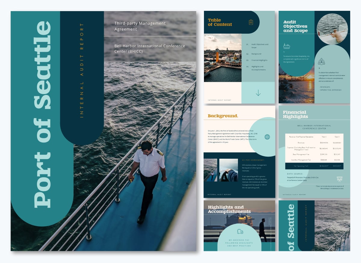
Not all reports are as big as those two examples. But smaller reports also benefit from well-chosen visuals. Visme’s Port of Seattle Internal Audit Report template shows how to combine photography with graphical imagery to create an engaging document.
For the visuals themselves, Visme's library offers royalty-free images, data visualization tools and an AI Image Generator to create custom visuals that match your report and brand. Open it inside the editor, type in a prompt and generate exactly what you need.
If you’re writing a report for the first time or after several difficult attempts and you want to optimize the process; a good place to start is reviewing the essential steps.
Here’s what we’ll cover in this section
Before you put pen to paper, identify your reasons for writing the report.
Start by answering these questions:
The knowledge you gather will support your process equally, regardless of what type of report you need. Take this foundational step every time you create a monthly, weekly, or annual report. And also when preparing a business report that highlights sales, marketing or social media data and performance.
For example, if you are writing a sales report for your team and stakeholders, it’s important to include data that shows exactly what you want the audience to know.
By the end of this step, you should have a one-sentence objective statement and a named audience like this: "This sales report summarizes Q2 sales performance for the leadership team to support budget decisions for Q3."
With that information, you have clarity on the need to include data showing performance across the three months of Q2. This is especially important when working with a team, as you can add that sentence to the report brief or the card on your Kanban board.
The next step is to gather the research that will form the core of your report, whether you're pulling it manually or extracting data with AI. Overall research depth will depend entirely on the objective you drafted and the type of report it is. Know what your report type requires before you start gathering sources.
Here are the most common sources by report type:
Wherever your sources come from, quality always matters. A 2025 IBM Institute for Business Value report found that over a quarter of organizations lose more than $5 million annually due to poor data quality. That means that if your report is built on weak or unverified sources, I won’t just make you look bad, it can also lead to bad decisions.
Finally, before adding any source to your list, run it through the CRAAP test, a source evaluation framework developed by librarians at California State University:
By the end of this step, you should have all the data and sources needed to fill your outline, with each source checked for credibility and logged for addition to the appendix later.
Your outline is the structure from which you’ll write the report content and then put it all together into a document.
Here’s how to do it. Start with the main sections: introduction, body and conclusion. Under each, add subheadings for the key points you'll cover, using one or two sentences to describe what goes there.
Here's what makes an outline actually useful:l:
By the end of this step, you should have a complete section-by-section outline with each heading labeled, key points noted under each and your data sources mapped to the sections they'll support.

With your outline ready, start writing the content. Work section by section, following the structure you built in the previous step.
Keep these in mind as you write:
For a faster first draft, use Visme's AI Writer to generate structured section drafts from your outline. Feed it your objective, audience and key data points, then edit the output for accuracy and tone.
By the end of this step, you should have a complete first draft with all sections filled in, ready for revision.
Step 5: Revise and Edit
Revision is what makes the report a solid document you can be proud of. This is also the right moment to write your introduction and conclusion. The body is complete, so you know exactly what the report covers and how it ends.
For best results, work through the whole thing in two passes.
We share some pro tips for both passes in the Top Report Writing Tips section below.
By the end of this step, you should have a clean, reviewed draft with no structural gaps and no formatting inconsistencies.
The executive summary is the most-read section of any report. It is the first thing most readers open and, for senior stakeholders, often the only section they read in full. Ironically enough, it’s also the very last thing you need to write.
It will be much easier to write the executive summary accurately once the full report is complete. You can draft some rough notes as you work on the outline and content, but finalize this section only after everything else is done.
One page is typically enough for most business reports. For longer or more complex reports, two pages is acceptable. A common rule of thumb: the executive summary should be no more than 10% of the total report length.
As covered in the format section above, the executive summary addresses five things: the report's purpose, its scope, key findings, conclusion and recommendations. With the full report in front of you, you now have everything you need to write each of these accurately.
Here’s an example and what to do and what not to do for the wording in your executive summary.
Once your report is complete and you are satisfied with the results, it’s time to share it with your audience. The format you share it in depends on where it's going and who's reading it.
For example, downloading it as a PDF preserves your layout across every device and makes it easy to share externally.
Visme has several download and share options:
By the end of this step, your report is out in the world. If you shared via a link or embedded on your website, use Visme's built-in analytics to track views, time spent per page and engagement.
If you want to take your report format a bit further and ensure that it’s at a professional level, these tips will help you achieve it.
Do you still have questions about good report writing and the best report writing formats? These FAQs will help.
Start by feeding the AI your report’s purpose, outline and key data. Prompt it to generate section drafts, suggest phrasing or clean up text. Tools like ChatGPT, Claude and Visme’s AI Writer work well for this. Always edit the output for accuracy and tone.
Here are some key characteristics that will ensure your report looks polished and professional:
1. Consistent Font and Size: Use a readable font like Arial or Verdana, and maintain consistency in font size throughout the report. Typically, a 12-point font is standard for most reports.
2. Clear Headings and Subheadings: Employ clear and descriptive headings and subheadings to organize your content. Use a consistent hierarchy, i.e., Heading 1, Heading 2, body text, etc, for a neat structure.
3. Adequate Margins: Ensure proper margins on all sides of the page (usually 1 inch or 2.54 cm) to provide white space and enhance readability.
4. Line Spacing: Use 1.5 or double spacing for the main text to prevent overcrowding and improve readability. Single spacing is acceptable for footnotes, references, and captions.
5. Page Numbers: Include page numbers, typically in the header or footer, to aid navigation. Ensure they are placed consistently and formatted appropriately.
6. Bullet Points and Numbering: When listing items or creating outlines, use bullet points or numbering for clarity. Maintain uniformity in style and indentation.
7. Tables and Figures: Format tables and figures consistently by providing clear labels and captions. Ensure they are properly aligned within the text.
8. Alignment: Align text and paragraphs consistently. Use left-justified text for most reports, as it’s the easiest to read. Justify text only when necessary.
9. Page Breaks: Insert page breaks as needed to avoid awkward page transitions within sections or paragraphs.
10. Use of Color: If your report allows for color, use it sparingly and consistently. Ensure that text and background colors provide sufficient contrast for readability.
11. Proofreading and Editing: Always proofread and edit your report for grammar, spelling, and formatting errors. Consistency in formatting is essential for a polished look
12. Citations and References: If your report includes citations and references, follow a specific citation style guide (e.g., APA, MLA, Chicago) consistently throughout the document.
13. Review for Accessibility: Consider accessibility guidelines, such as providing alternative text for images and using accessible color choices, to ensure all readers can access your report.
A well-crafted report possesses five key qualities that make it effective and valuable. They include:
1. Clarity and Conciseness: A good report presents information in a straightforward manner and avoids unnecessary jargon or overly complex language. Readers should easily understand the content without confusion.
2. Relevance: Every piece of information in a good report is relevant to the report’s purpose and objectives
3. Structure and Organization: Reports are structured logically, with a clear beginning, middle, and end. They typically include sections like an introduction, body, and conclusion, ensuring a logical flow of information.
4. Accuracy and Reliability: Accurate and reliable data is a hallmark of a good report. Information presented should be based on thorough research, sound methodology, and credible sources. Any data or facts should be verifiable.
5. Actionable Recommendations: In many cases, a good report includes actionable recommendations or insights. After presenting the data and analysis, the report should offer practical suggestions or solutions that readers can implement or consider for decision-making.
A standard report includes a title page, table of contents, executive summary, introduction, body, conclusion, recommendations and appendix. The exact format varies by report type, but these sections apply to most business and research reports.
Yes, it can generate text-based and data reports, but not visually rich, well-designed ones. ChatGPT and its Deep Research feature can draft content, suggest structure, analyze data and export in .xlsx or .csv formats. But for branded layouts, infographics and designed multi-page reports, you’re better off with a dedicated tool like Visme.
A report presents facts, data and findings for a specific audience and purpose. It uses clear sections, headings and visual aids. An essay develops an argument or perspective in continuous prose. Reports are structured for scanning; essays are written to be read linearly.
You now have a good idea of the structure, the step-by-step process and some pro design tips to help you build reports that are easy to follow, credible and worth your reader's time.
It’s all about knowing where and how to start. Pick the right format for your report type, build your outline before you write the content, and then let the structure guide you.
The fastest way to put it all into practice? Starting with Visme's AI report generator. Describe your report, pick a template and let it build the structure for you. Then in the editor, customize the design, drop in your data and you’ll have a polished, on-brand report ready to share.

Design visual brand experiences for your business whether you are a seasoned designer or a total novice.
Try Visme for free