

























Typography Infographics: 12 Inspiring Examples & Techniques


We've created a massive list of 103 infographic examples for beginners in infographic design. This list will give you all the inspiration you need to create a beautiful infographic.
We’ve divided the infographics included in our list into nine categories. Choose the category that best fits your needs and find the right infographic for you.
Create your own infographics in minutes using Visme's drag-and-drop infographic maker. Tap into easy design tools, free graphics and hundreds of infographic templates to create yours quickly.
Before we start looking at examples, let's discuss what exactly separates a strong infographic from a forgettable one. There are six aspects that make the difference.
Infographics that visualize data must offer full clarity for the viewer. The numbers should be easy to read at a glance, with one idea per chart, labels next to the data they describe and no mental math for the reader. Name the one question your chart answers before you build it. If a chart needs a paragraph to explain it, split it into two charts or drop the secondary variable.
Alejandra Mariscalez, Design Production Manager at Visme, adds: "One of the most common issues I see in infographics is the inclusion of too much text."
The hierarchy starts at the header which is the main focus. Everything below it must adhere to a clear flow. Use size, color and spacing to organize the information: set your headline figure larger than anything around it, give supporting detail a visibly smaller size, and use white space to group related points so the eye moves in blocks rather than wandering. When everything is bold, nothing is.
Monfa Cabrera, Creative Director at Visme: "Design should actively guide the user through the information, rather than leaving them to decipher a maze of data."
A strong infographic moves in a clear narrative order: open with a question, work through the answer and land a point. For example, consider customer churn. The header asks why a quarter of new customers leave inside 90 days, the middle walks through the three drop-off points in the order they happen, and the footer gives the one fix that addresses all three. Same data with no order, and you have six unrelated statistics on a page.
The best examples look unique even when created with a template or AI. A distinct layout, palette or concept is what gets an infographic saved and passed along. Visual metaphors help: annotate an everyday object like a technical diagram, or explain a dry business model through an unlikely comparison. Both borrow a format built for objective information and aim it somewhere unexpected.
Following accessibility guidelines doesn't only serve readers with limitations; it makes your infographic better for everyone. Check your contrast ratios and never carry meaning in color alone, since WCAG 2.2 AA requires 4.5:1 for body text and 3:1 for large type.
Write alt text that states the finding rather than the chart type. "Support dropped 12 points between 2023 and 2026" tells a screen reader user something. "Bar chart of survey results" doesn't. Low-contrast text remains the most common accessibility failure on the web, appearing on 83.9% of the top 1 million home pages.
Daniela Verduga, Creative Graphic Designer at Visme: "The alt text should provide meaningful context instead of just listing the elements in the design."
A great infographic is repurposeable, and its shape shouldn't limit how it gets distributed. A long vertical infographic can be split into smaller chunks for social media or newsletters. Design in self-contained sections from the start so each block holds a complete idea and reads on its own once separated. Inside the editor, use Visme's AI Resize Tool to convert the design into a Pinterest pin, a LinkedIn carousel or a newsletter image.
Chelse Hensley, Social Media Strategist at Visme: "You can break up pieces of the infographic and restructure them into five or more swipeable placements on Instagram or LinkedIn."
Don’t forget that timing matters as much as format. Check the best times to post on Instagram and other social channels.
Want to see these six put into practice? This video walkthrough covers the same ground.
Six shifts are shaping how infographics get made and shared right now.
1. Motion, scroll and interactive formats. Static infographics are increasingly sharing space with scrollytelling, animated charts and click-to-explore graphics. Newsroom data teams at the New York Times, South China Morning Post, Reuters and The Guardian publish this way constantly.
2. AI-assisted design. You've surely noticed the sheer number of AI-made infographics out there. That trend isn't going away. 88% now use AI design tools in some capacity, yet only 18% say those tools reduced their need for designers. What they hand over is repeatable work: image editing (45%), social graphics (36%) and ad variations (35%).
Jack Oddy, Managing Director of Soap Media, told Clutch: "It's not that design work is resistant to automation; what's resistant is the judgment."
Shlomi Ron, founder of the Visual Storytelling Institute, adds a warning: "Always be validating the data the AI gives you."
3. Accessibility as a legal requirement. The European Accessibility Act became enforceable on 28 June 2025, covering any business selling to EU consumers wherever it's based.
This hits infographics because of the trend above. A scrollytelling piece or embedded interactive chart is a web page, not an image, so it carries the same requirements as the rest of the site: keyboard navigation, screen reader labels, contrast ratios and accessible fonts.
4. The shift from SEO to AEO. Infographics used to earn their keep through links and image search rankings. Now the real test is whether an answer engine can read the graphic at all. Otterly.ai tested this in April 2026 and found that the clearest way to help AI search "see" an infographic is to write the key numbers out as body copy around the graphic, then add alt text that states the finding directly.
One caveat: this is current crawler behavior, not a permanent limit. Agentic browsing already renders pages and reads images, so writing the text out costs nothing either way.
5. Hand-drawn and illustrated styles. Custom illustration and textured, handmade looks are returning as a way to stand apart from work that reads as machine-made, a shift Creative Bloq calls anti-AI crafting.
Adriana Danaila, professional infographic illustrator: "Hand-drawn infographics work best when a brand wants to connect on a human level, not just push information."
Marketing is where most infographics end up, which means the bar is higher here. These examples work as ads, lead magnets, LinkedIn posts and trend roundups, not just as illustrations dropped into a blog post.
Before the examples, here's a quick primer on building infographics for marketing.
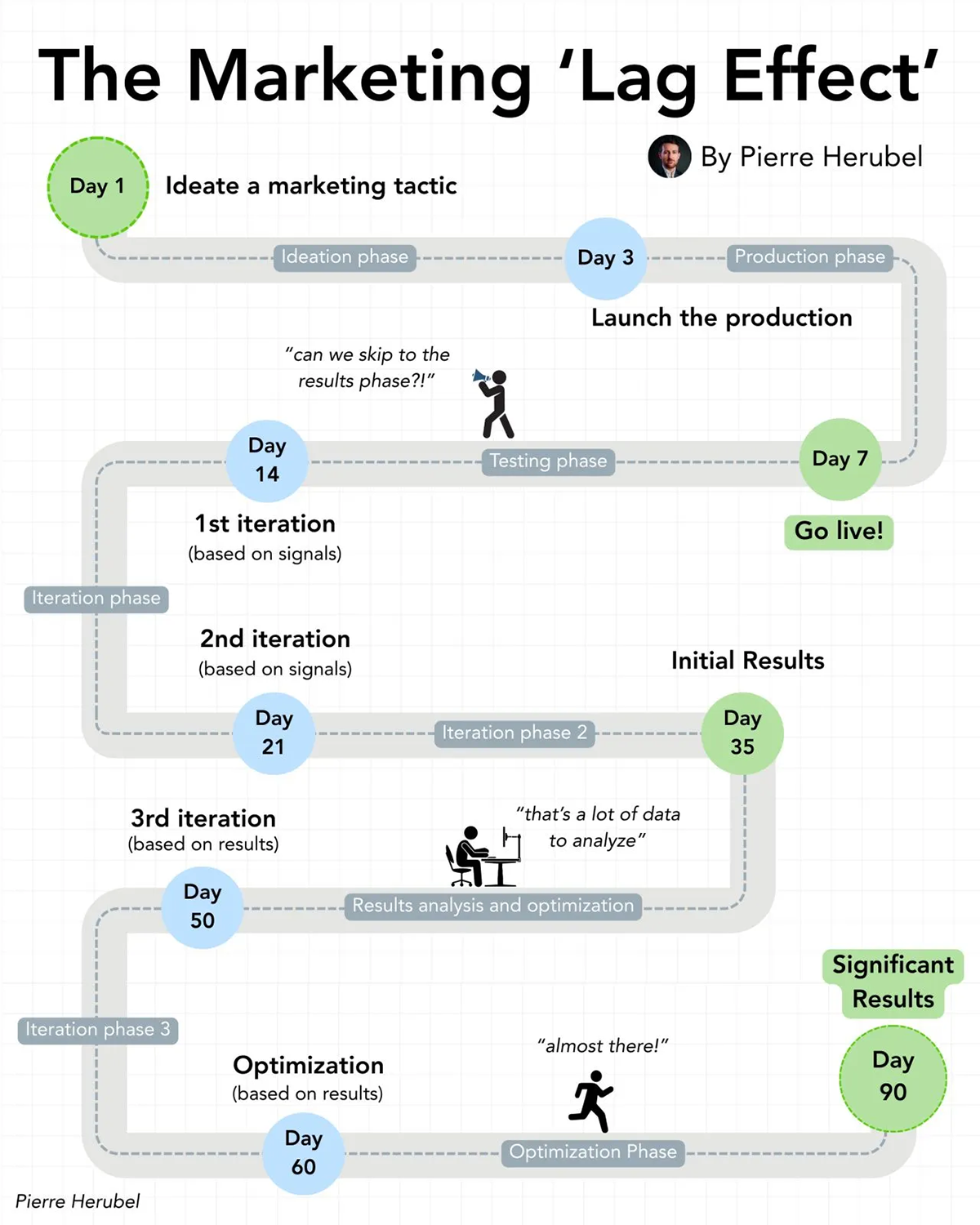
The marketing lag effect is the delay between doing the work and seeing results, and Pierre Herubel maps it across three phases: ideation and production, early traction and real impact. Then he speaks to founders and early-stage marketers who expect returns within a week of launching.
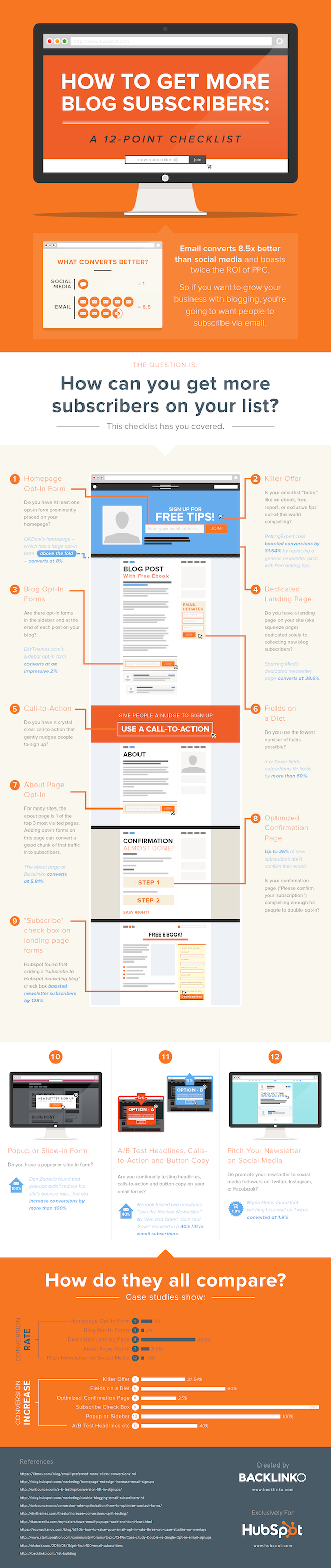
HubSpot packs a dozen subscriber-growth tactics into a branded infographic built for bloggers and content marketers. The numbered layout helps with the visual hierarchy and skimming effect. They used an anatomy-style visual in the center to show exactly where the tactics make a difference.
The payoff of more subscribers is real: Did you know that email still returns $36 for every $1 spent? To use these tactics, pick two or three and test them one at a time instead of rolling out all twelve.
new: Image Source
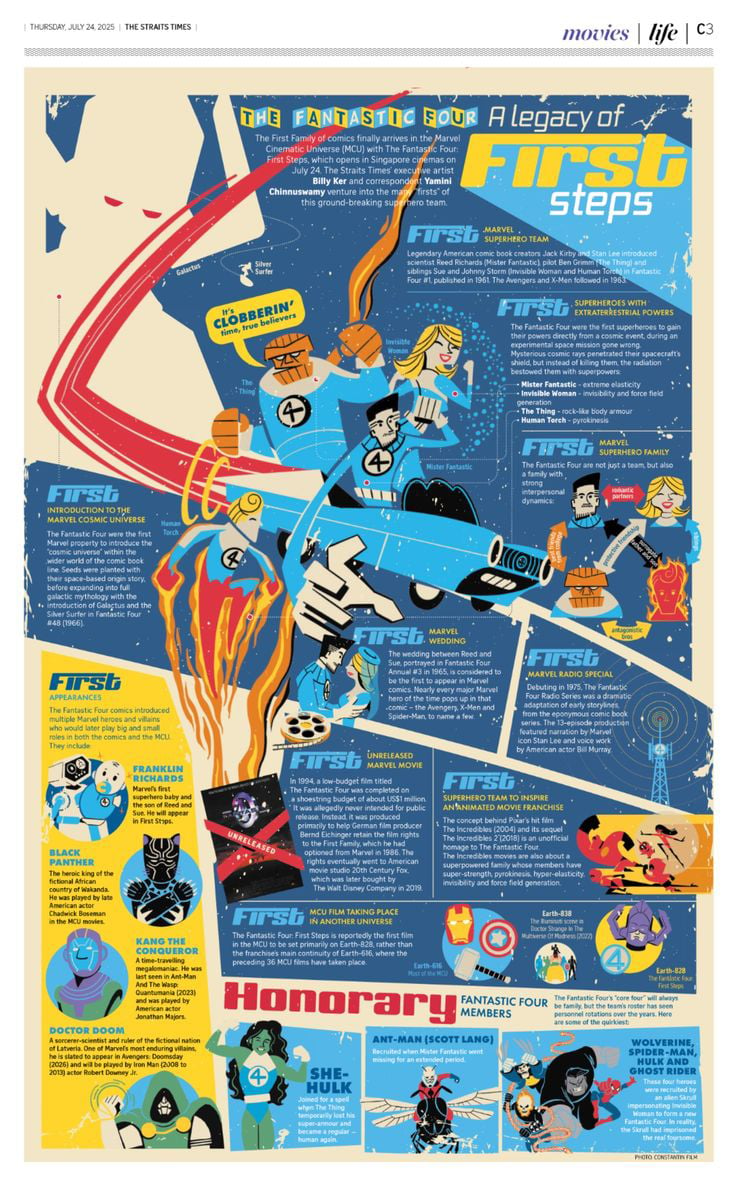
This infographic is actually a print advertisement for the film The Fantastic Four. The concept of the infographic was to frame the 2025 release against the franchise's legacy that traces back to the team's 1961 comic debut. The visual quality is reminiscent of comic books in the 60’s with a more modern feel. This print infographic ran in the Straits Times, reaching film fans and casual readers at the same time.
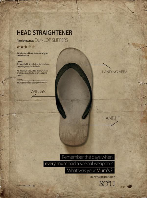
Nigerian agency SO&U turned an ordinary Dunlop slipper into a mock technical diagram for a Mother's Day ad, tagging its "landing area," "wings," and "handle" alongside a deadpan usage-and-warning spec sheet.
The infographic format usually promises objective information, so wrapping it around a nostalgic household object that moms also used to threaten kids to obey plays the layout against the punchline. The funniest part about this ad is that it would apply not only in Nigeria but also in all of South America.
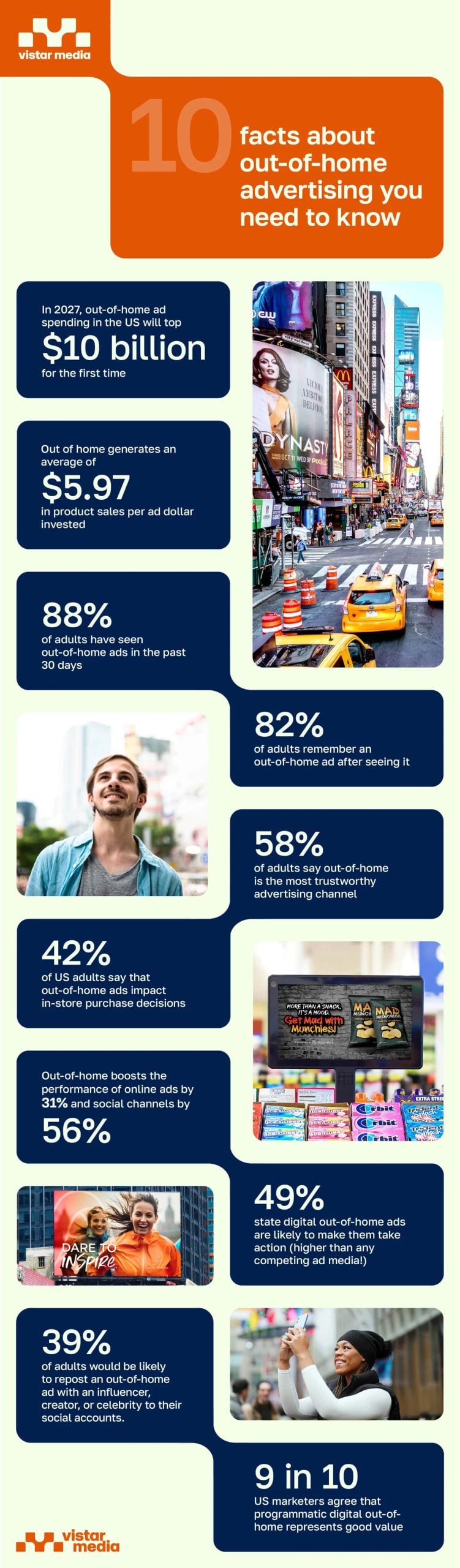
This infographic by Vistar Media is a classic blog related design that collects the information published in the text. The information is ten stats about out-of-home advertising, including future projections about the industry. For example, OOH returns $5.97 for every $1 spent, and 82% of adults remember the ads. So, if your infographic is mostly statistics, one number per block keeps it readable.
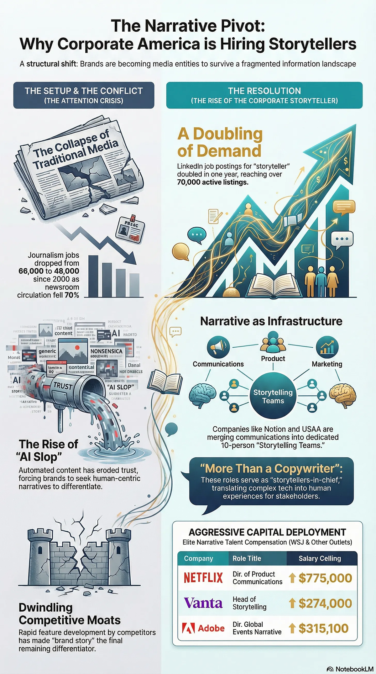
Shlomi Ron, founder of the Visual Storytelling Institute, shared this infographic in an issue of his newsletter. The topic was generating infographics with AI rather than a full design team. He built this one in Google NotebookLM as an example.
The design splits down the middle: the left column sets up the problem (shrinking journalism jobs, "AI slop," weak differentiation) and the right delivers the resolution (a jump in "storyteller" job postings and dedicated storytelling teams), with a gold thread linking the halves.
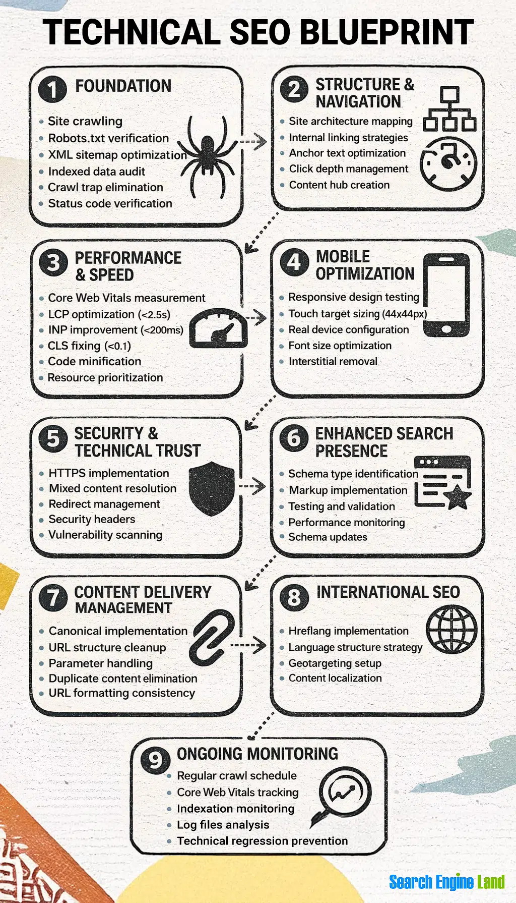
Search Engine Land published a multi-layer guide on SEO and included several AI-generated infographics to visualize the information. This particular one is a list infographic about the nine characteristics that make up a technical SEO blueprint.
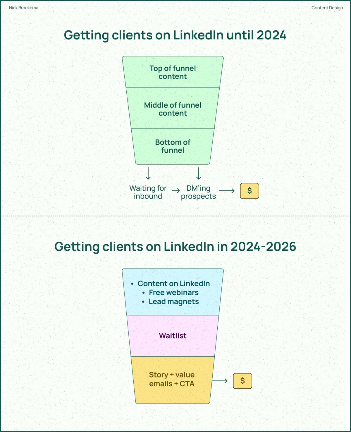
Nick Broekema built a content-design business on LinkedIn after leaving agency work in 2022, and he shares his client-getting process through branded infographics.
This one, in particular, breaks down how winning clients on LinkedIn has changed, moving from the old inbound-and-DM approach to an email nurture sequence. It speaks directly to freelancers and founders who sell through LinkedIn and feel like their old playbook has stopped working.
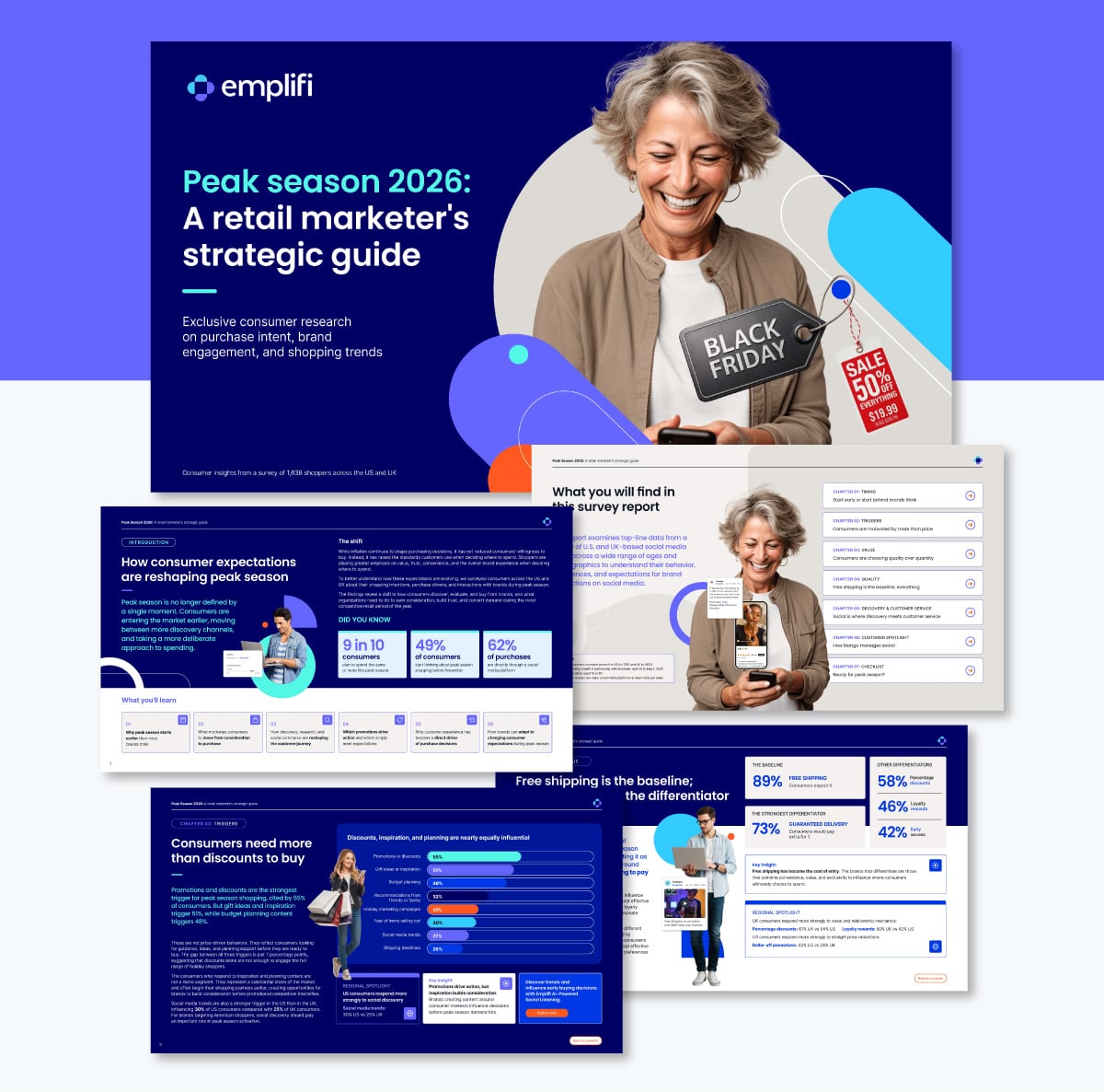
Emplifi's "Peak Season 2026" report shares consumer research results aimed at retail marketers planning for the holiday rush. What stands out is that almost every page includes an infographic. The report runs as a sequence of visual chapters that cover timing, triggers, value and discovery.
Building your report as connected infographics will keep a long document readable. If you have a lot to cover, treat each section as its own visual accompanying the text.
TechWyse rounds up the year's digital marketing trends across seven disciplines: content, SEO, social, paid media, web and UX, creative and video. The design showcases a lot of information but its easy to read thanks to the color-blocked sections.
This style of infographic is highly repurposeable because each block can be used individually. They make great social media or newsletter graphics for the company.
Have you ever considered using an infographic as a lead magnet? It’s not very common, but it’s not a bad idea. That’s what Stack Adapt does with their The State of Programmatic Advertising 2026 Sneak Peek.
All this was a marketing play in 2025, so now you can see both the infographic and the report. This is a great example of how important branding is at every touchpoint of your marketing funnel.
AI is both the subject and the tool in this section.
Some of these visualize research and adoption data; others were generated using AI image models; and a few do both at once.
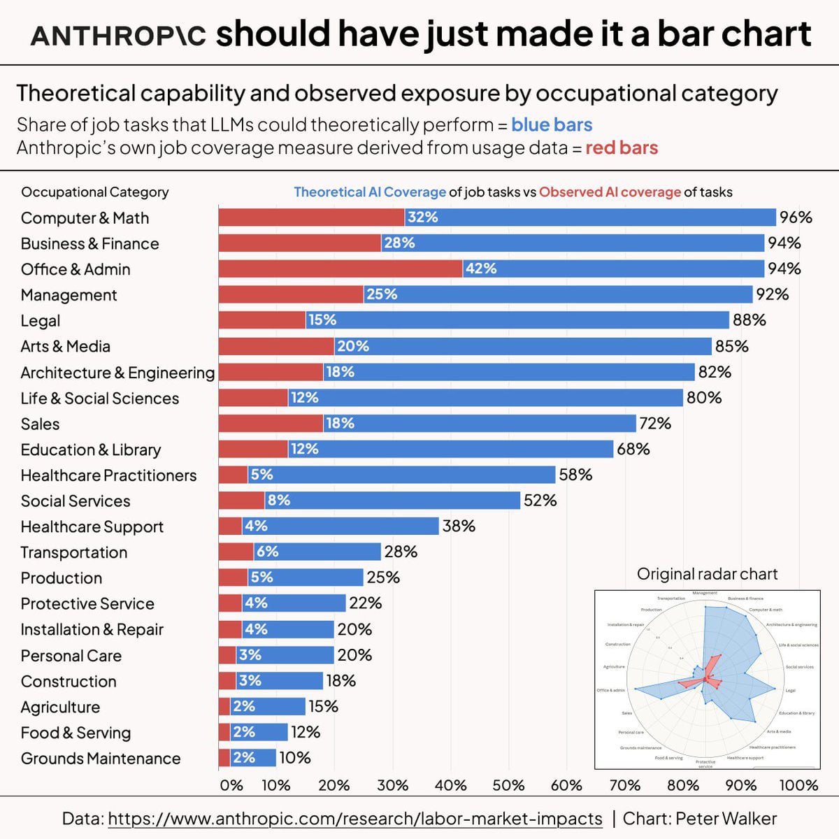
Peter Walker, Head of Insights at Carta, took a radar chart from Anthropic's labor-market research, rebuilt it as a horizontal bar chart and created this infographic.
In his words: “A universal truth: most radar charts should just be bar charts.”
The data compares what AI could theoretically do in each job category against what it actually does, and Walker's remake keeps the original radar version tucked in the corner so you can compare the two directly.
When creating your charts in Visme, switching from a bar chart to a radar chart with the same data is simple. Actually, you can run it through 30+ options in the data visualization tools and see which one reads clearest before you commit.
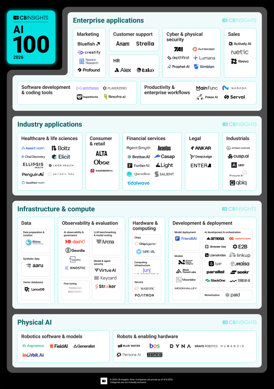
CB Insights publishes this list every year, and the 2026 edition is its tenth. 40K+ startups were scored on funding, partnerships, hiring and their own predictive metrics.
Then, the 100 winners are arranged on a vertical infographic grouped by category, spanning from AI infrastructure to physical AI and vertical agents.
The infographic, called a Market Map, is part of a comprehensive report and serves as a landing page for interested readers. On the page, the infographic is static, but they offer the possibility to open an interactive version that you can navigate by clicking company names and using the filtering settings.
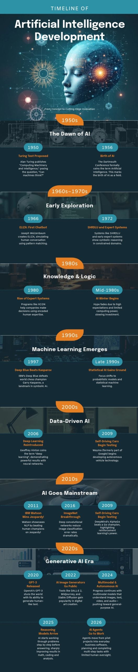
[cta_button text="Customize this Infographic template and make it your own!" link="https://dashboard.visme.co/visme/create-project/banner/1425295130?vc=In-Text-Blog-CTA" button_text="Edit and Download"][/cta_button]
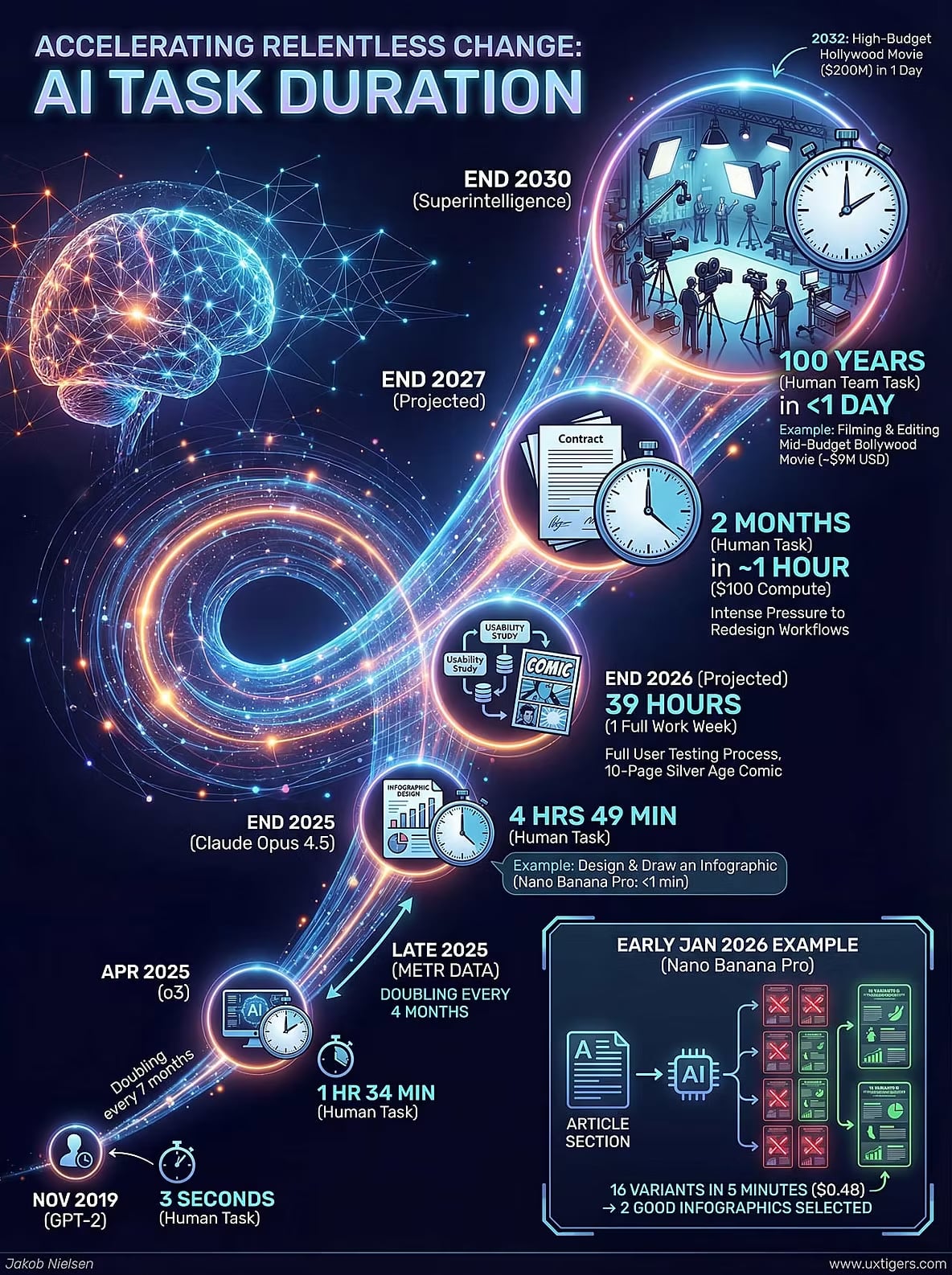
Jakob Nielsen, the usability expert who founded Nielsen Norman Group, publishes yearly predictions about the UX industry.
This one is about how long a task AI can do on its own, from a 3-second job in 2019 to a projected 100-year human-team effort done in under a day by 2032. Each milestone sits inside its own section along a glowing path.
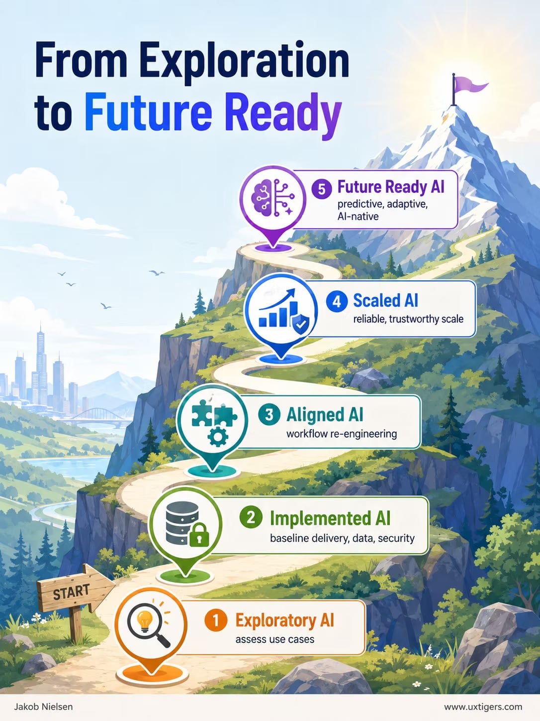
This is another infographic example from Jakob Nielsen, this time from a roundup he published about current UX advancements. The source data comes from Carnegie Mellon's Software Engineering Institute, which laid out a five-stage model for how organizations mature in AI, from ad-hoc experimenting up to "future ready."
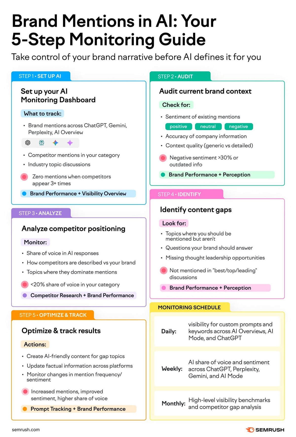
The purpose of this infographic was to call attention and lead viewers to Semrush’s AI Visibility Toolkit. The infographic is not published on their site; it was created uniquely for social media. This is a practice Semrush is well known for.
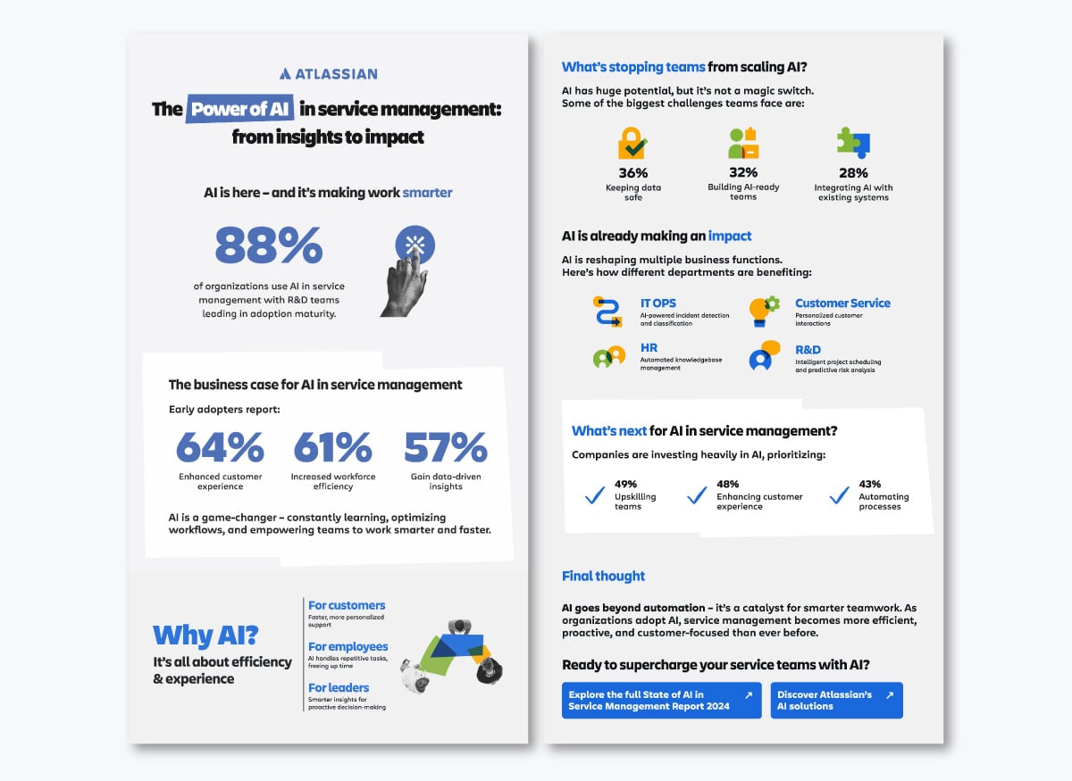
This infographic example is another lead magnet that you have to sign up to see. It’s the summary of a longer report which you can access from inside the infographic itself.
The stats get room to breathe before anything else competes for attention, and the same blue keyword-icon pairing repeats down the page so your eye already knows where to land before you've read a word. It also has the sense to end on a stated business case and two CTAs instead of just trailing off after the last number.
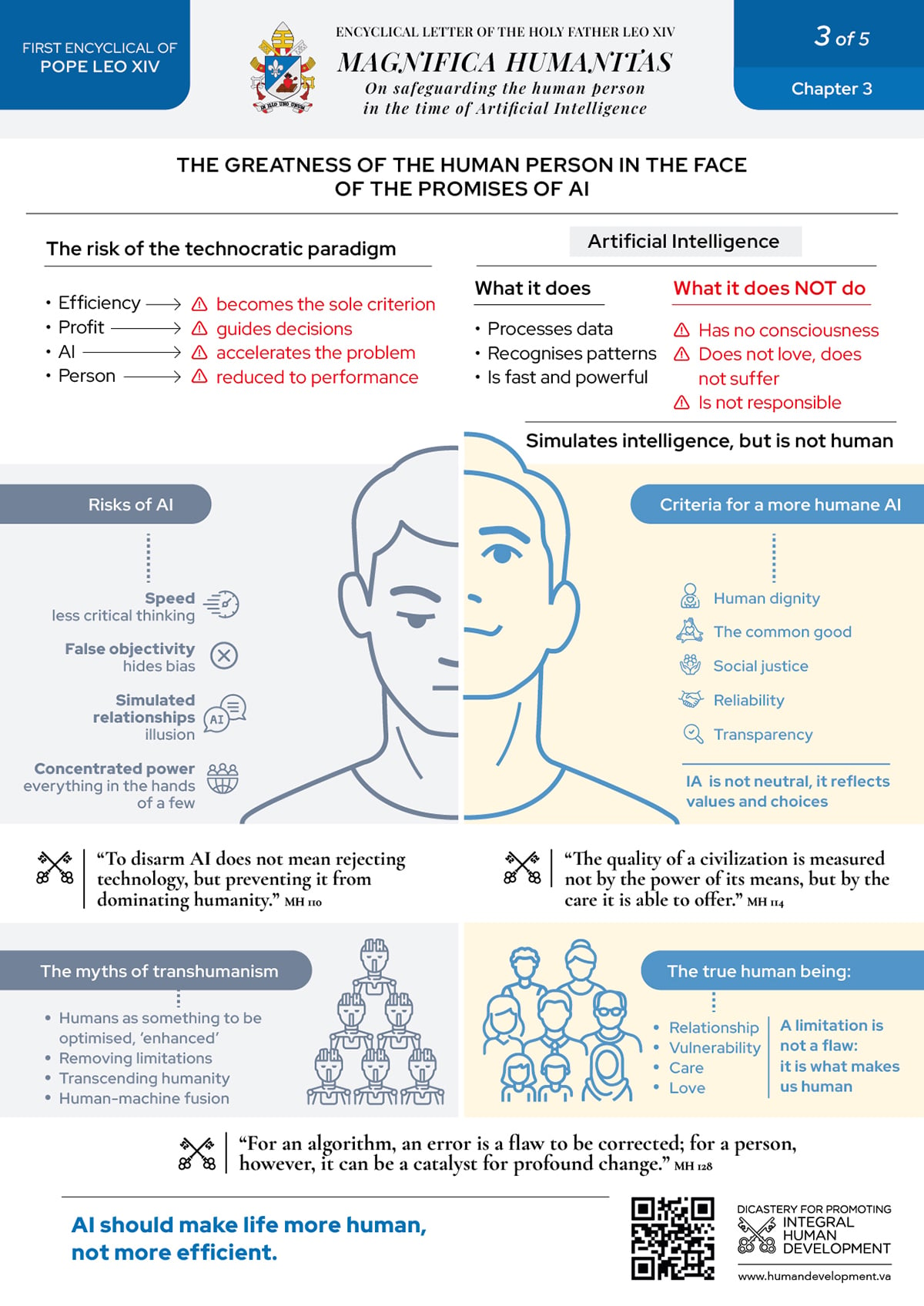
The Vatican released a series of infographics to visualize the content inside Magnifica Humanitas, Pope Leo XIV's first encyclical, published in May 2026 on safeguarding human dignity in the age of AI. This example is one of several distributed through a Google Drive link.
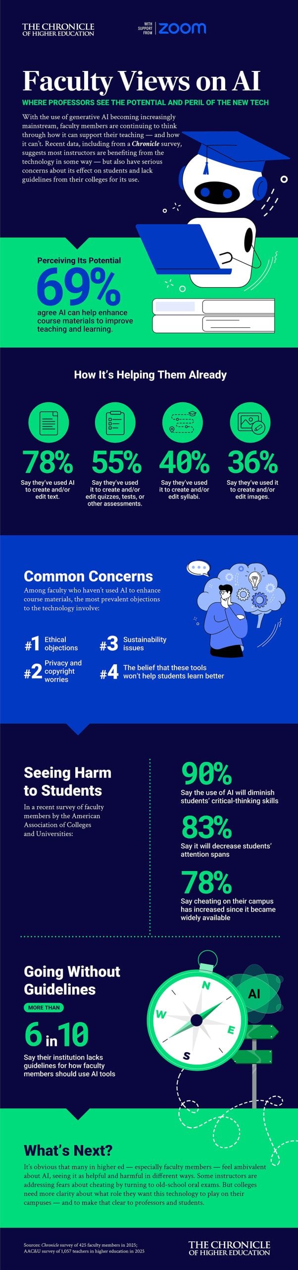
The Chronicle of Higher Education, with support from Zoom, surveyed 425 faculty members about how they use AI in teaching and where they see it helping or harming, and then packaged the findings into this infographic.
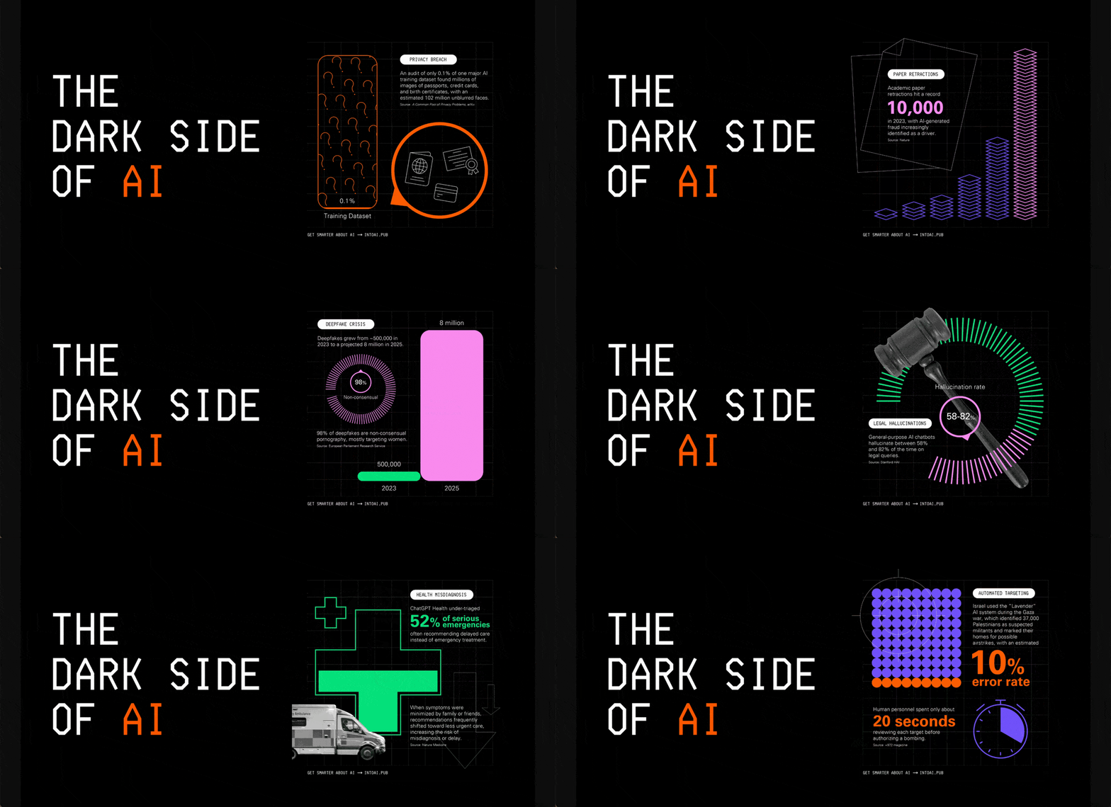
An article published on Medium grouped 11 infographics on the risks buried in current AI systems. All 11 infographics share a consistent visual style that holds the collection together. When you publish a recurring series, using this technique will make the collection a recognizable body of work.
Money and business data can turn dry fast. The examples below make funding rounds, inflation and business models easier to read, usually by anchoring the numbers to something familiar.
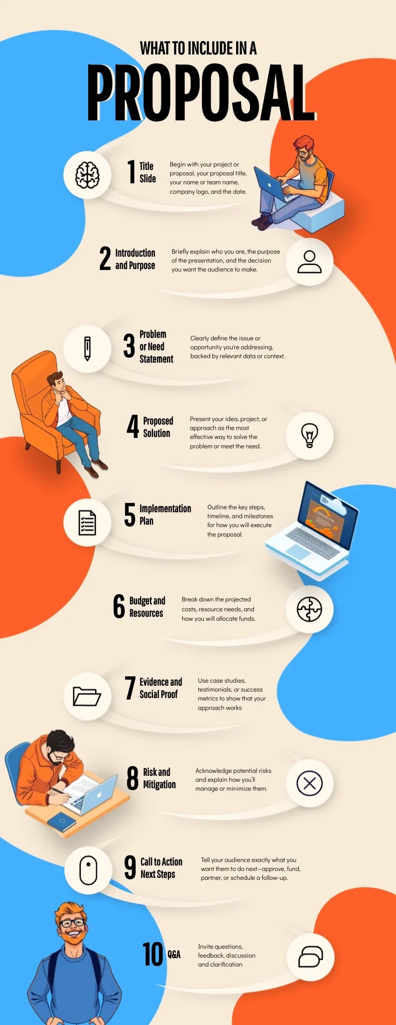
[cta_button text="Customize this Infographic template and make it your own!" link="https://dashboard.visme.co/visme/create-project/banner/1425295429?vc=In-Text-Blog-CTA" button_text="Edit and Download"][/cta_button]
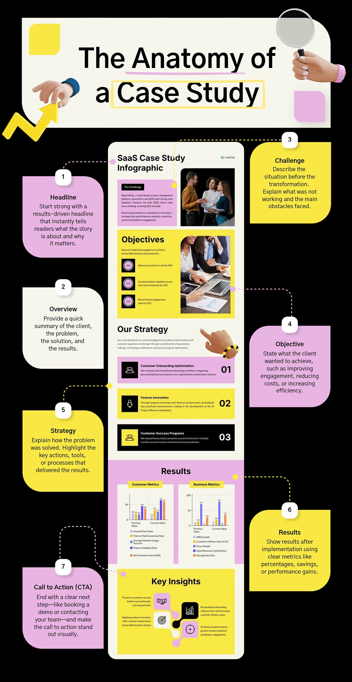
[cta_button text="Customize this Infographic template and make it your own!" link="https://dashboard.visme.co/visme/create-project/banner/1425296156?vc=In-Text-Blog-CTA" button_text="Edit and Download"][/cta_button]
Funding solutions company Business Backer illustrated eight business models in a creative and quirky manner using cows and milk to explain how different interactions compose various schemes.
The unique message takes a boring concept and presents it in a way that engages readers’ attention and imaginations.

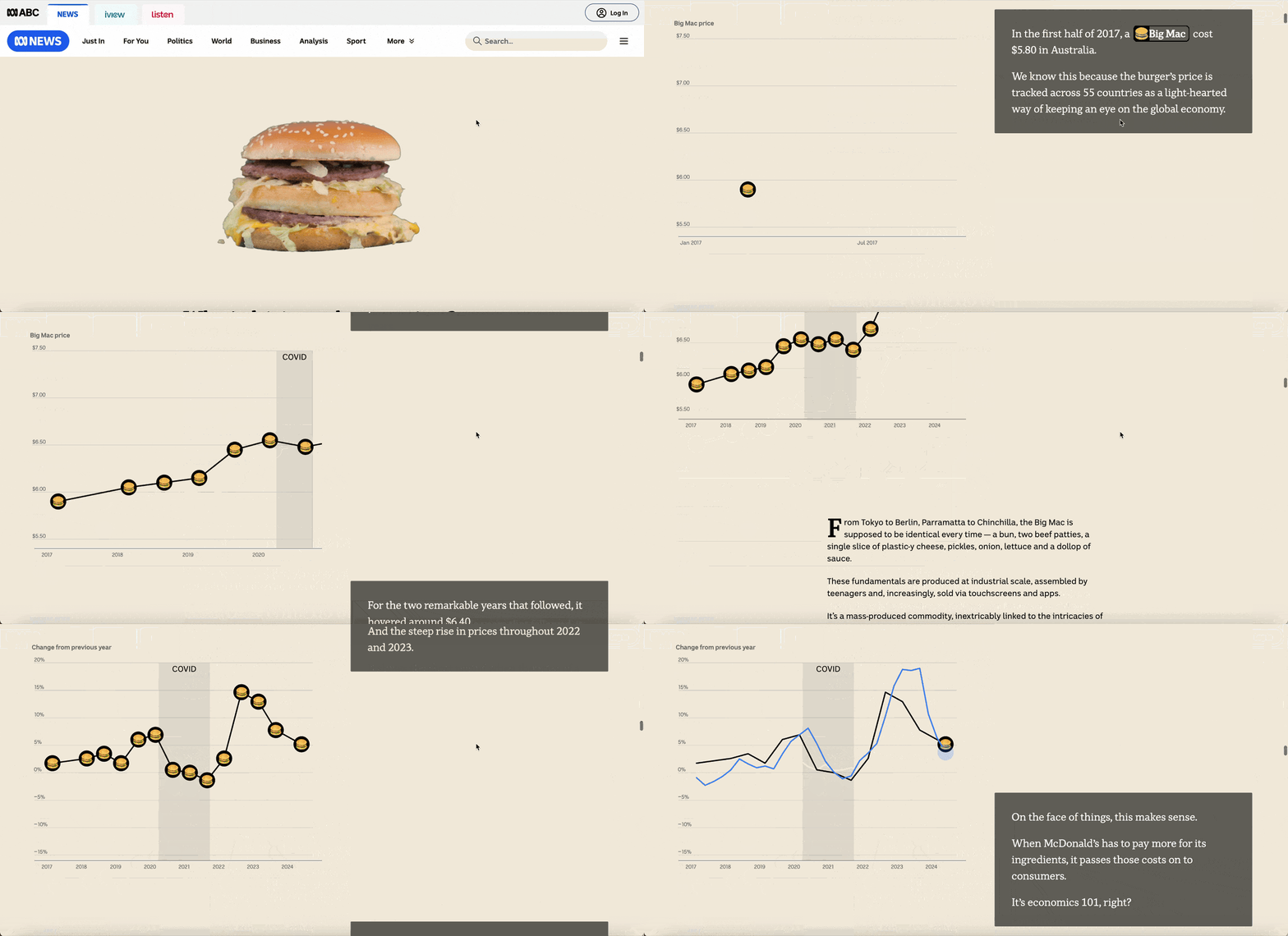
ABC (the Australian Broadcasting Corporation) explained the country's inflation figures through one familiar object: the Big Mac. It breaks a burger into its parts and traces the rising cost of each, using rotating food photography, illustrations and charts.
It's actually been proven that exercise can make you a better entrepreneur, so it makes sense that some of the most successful startup founders know how to keep themselves in shape.
Need motivation to start your own exercise regimen? Take a look at how Richard Branson, founder of Virgin Media Group, runs, lifts weights, swims, does yoga and even finds time to kitesurf.
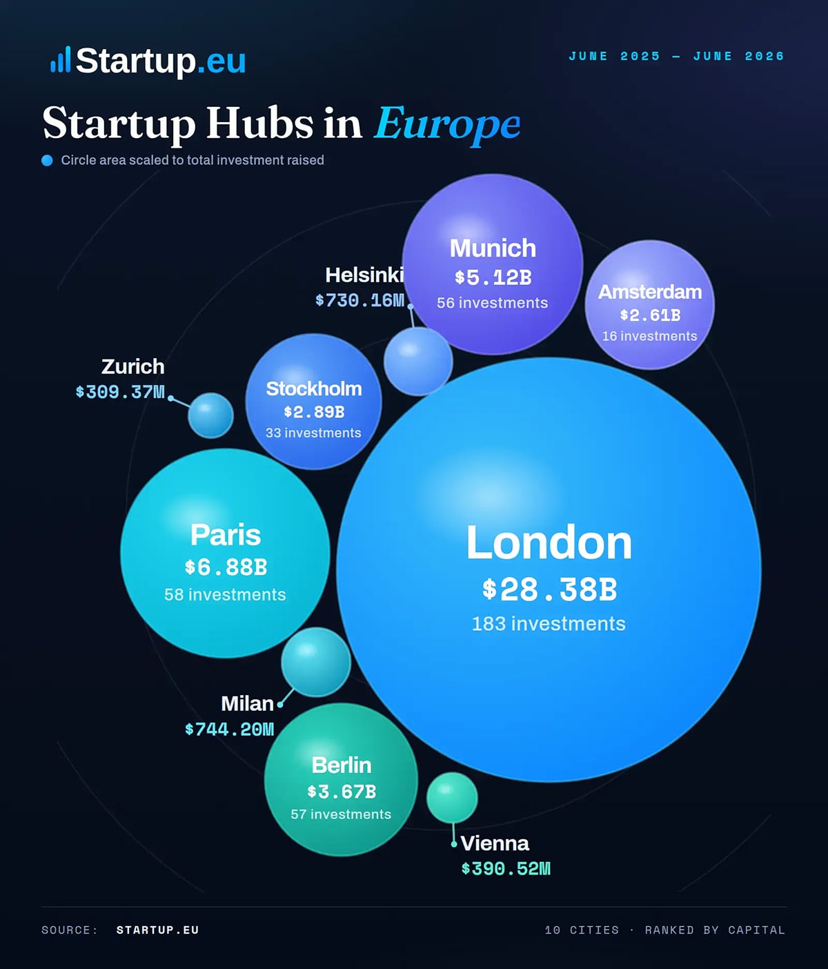
London leads the race between Europe's startup cities. Startup.eu draws the top ten as bubbles sized to the money each raised from June 2025 to June 2026, and London fills the frame at $28.38 billion across 183 rounds. The instant size comparison is the whole reason to use a bubble chart over a table.
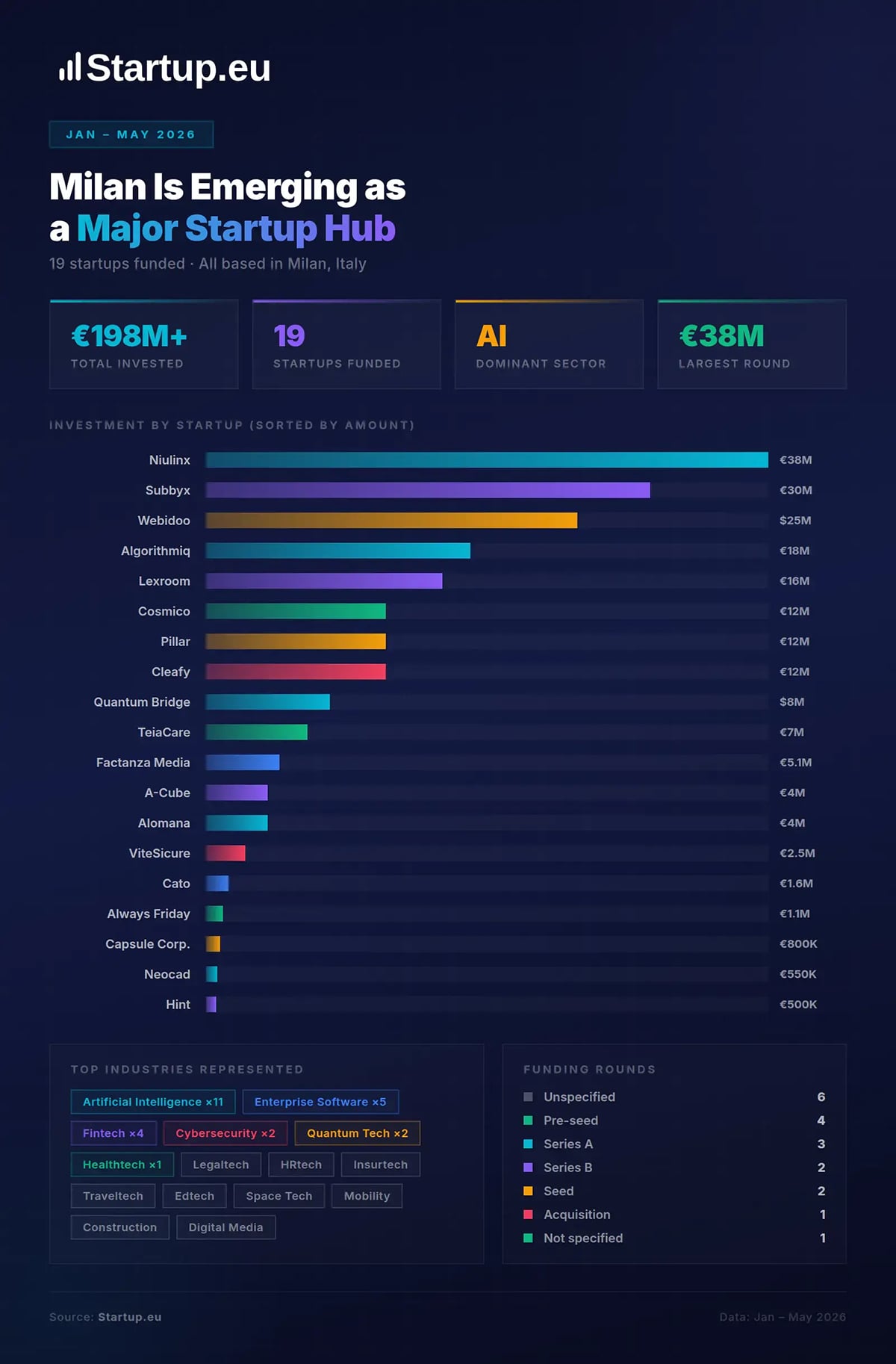
Startup.eu tracks 19 Milan startups that raised over €198M between January and May 2026, ranked in a horizontal bar chart. Four stat cards up top showcase the headliner figures, and then the bars fill in the detail.
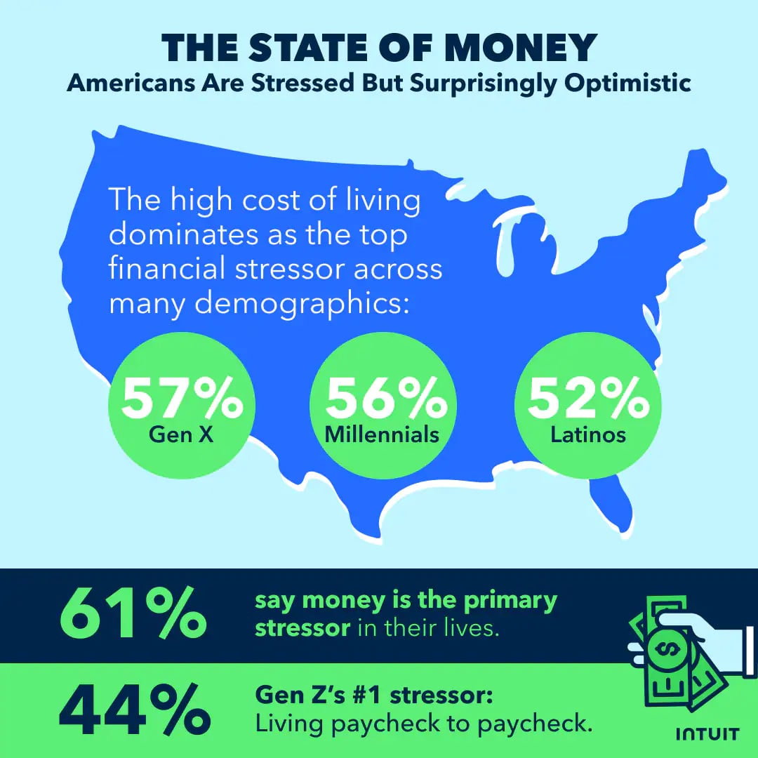
For their 2026 Financial Forecast article, Intuit split their Financial Wellness survey into three small infographics placed throughout the content. This one covers stress about money. A US map backdrop holds the cost-of-living breakdown by demographic, then two stat bars land the headline.
Why do oil prices swing so much? There's no simple answer, and this infographic, designed by Pablo Benites for Jones Oil, untangles the web of factors behind it, from supply and demand to geopolitics. The original Jones Oil page is gone, though Benites kept it in his portfolio.
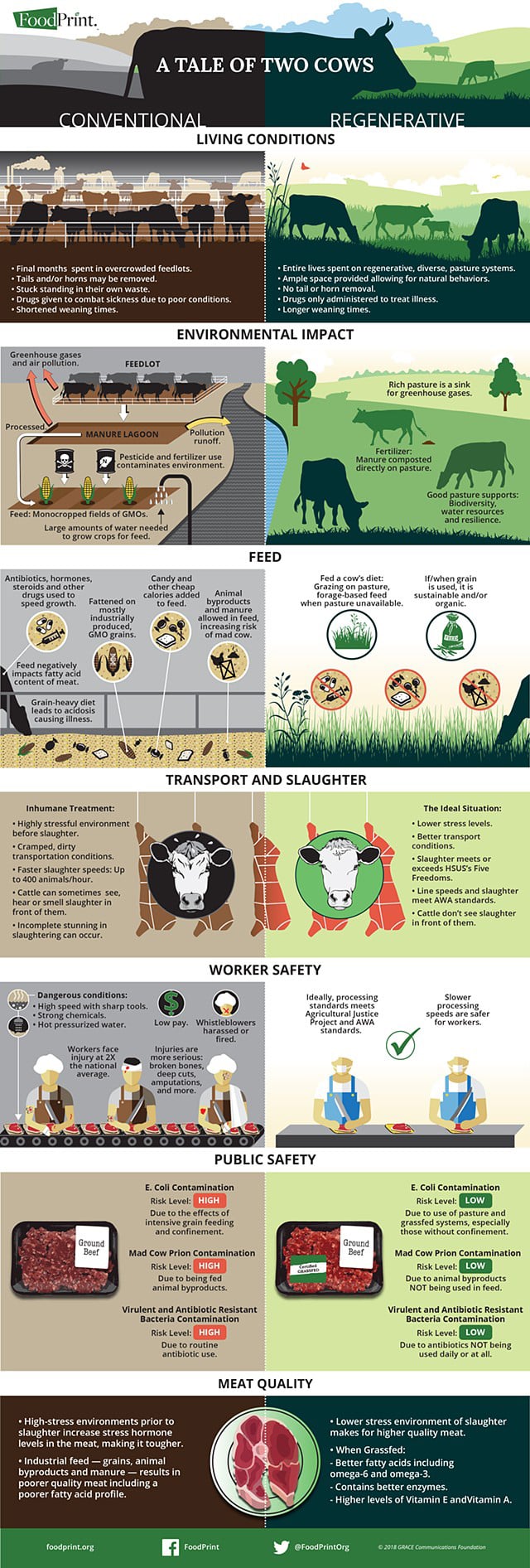
This infographic closes out the "sustainable beef" section of The FoodPrint of Beef, a report from the nonprofit FoodPrint. Designed by Chantelle Norton, "A Tale of Two Cows" sets a conventional cow against a regenerative one, split down the middle of the frame.
This section covers concept explainers, term glossaries and training resources, most of which are designed to be saved and revisited later.
A variety of useful design-related definitions are presented in this infographic from Pagemodo. The company illustrated a number of terms that amateur designers need to know if they want to use tools such as Visme to craft visual content like a pro.
Creative processes are more daunting than most people imagine. This infographic weaves a hilarious, relatable narrative about the realities of the creative process and gives the audience a glimpse into the not-so-glamorous world of writing.
From staring at blank pages for hours to battling with writer's block, the content highlights the rollercoaster ride of emotions writers experience as they try to bring their creative ideas to life.
Amp up the infographics with visuals from Visme’s extensive library of icons, stock photos and videos or feel free to upload your own visuals. If your photos need some editing, you can leverage Visme’s AI Edit Tools. Once you’ve shared the infographic with your audience, you can track how many people have clicked or viewed it using the Visme analytics tool.
This Visme template outlines the steps for building an employee training schedule, designed for HR and team leads planning onboarding or upskilling.
Replace the steps with your own program and export it as a SCORM file to drop straight into your LMS.
This infographic targeting an audience of amateur graphic designers was created by Red Website Design, and it clearly defines basic principles of design, such as typography, hierarchy and colors.
What better way to share the six critical elements of visual hierarchy than within a design? Very cool. This infographic includes a list of visual hierarchy elements in a grid format—size, color, contrast, alignment, repetition, and proximity—creating a really great piece of visual content.
Working on other concepts? Use Visme’s AI writer to generate content ideas, create a content structure and generate first drafts for your design copy.
Have you ever wondered how some of the more popular typefaces got their names? From the famous Times New Roman and Arial all the way to Papyrus or Wingdings, how did these names come about? This fascinating infographic example helps detail the history behind some of the font faces that we all know and love.
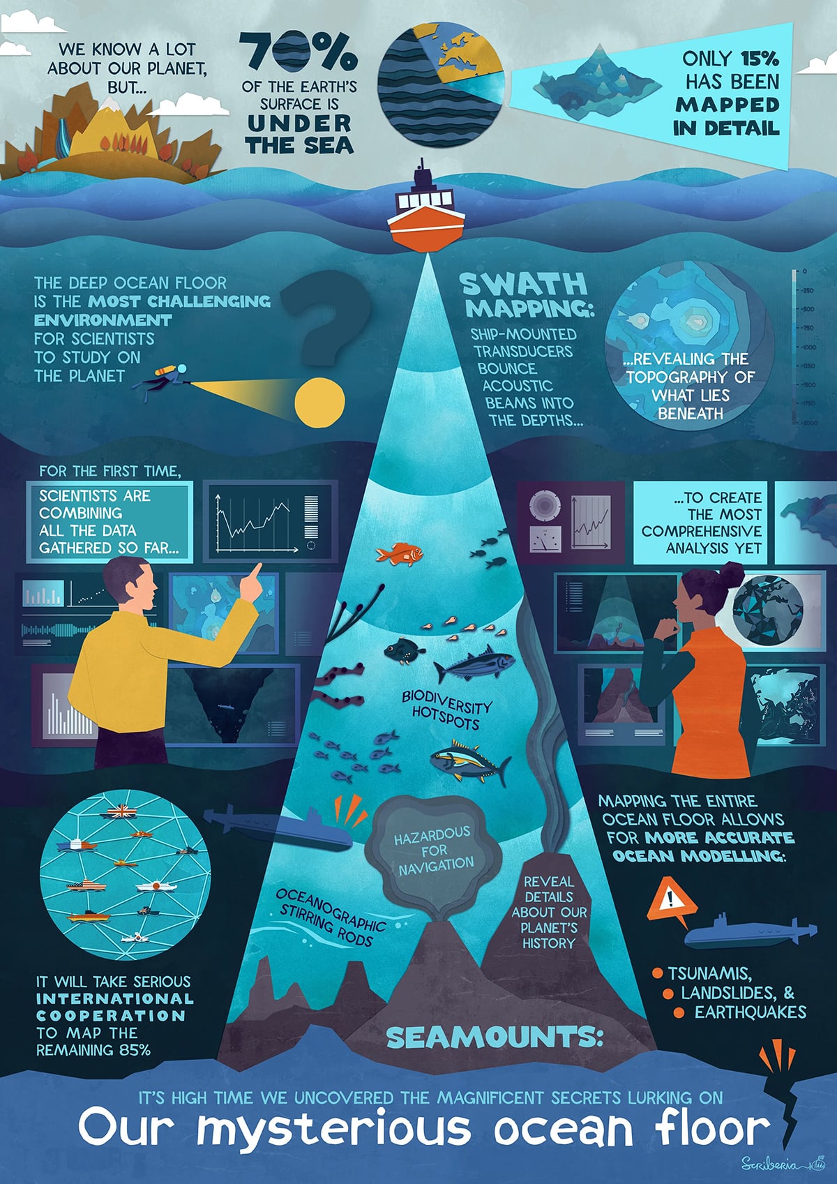
Oxford Sparks, the University of Oxford's science outreach team, worked with Scriberia to create this fully illustrated infographic. The textured, hand-painted style pulls you into the setting with a beautiful artsy style.
The editors at Masters in Special Education created one of our favorite infographics, “The ‘Special’ In Special Ed,” which educates viewers on a sensitive topic with engaging images that visually represents facts and statistics.
Who knew so many of history’s most famous names fell somewhere along the autism spectrum?
We all know that TED has become all the rage in online learning. The organization’s famous talks featuring experts in an ever-expanding array of fields is the world’s most popular online lecture series.
The infographic from onlineclasses.org shares facts that explain just how popular TED Talks are and why they’re so attractive to audiences. It also visually diagrams the anatomy of a TED Talk, detailing what the most popular TED speakers have in common.

London Speaker Bureau provides readers with a visual guide on how to create a killer presentation. It summarizes essential tips that are often overlooked when preparing for a creative presentation.
The Line Wolf Librarian designed a beautiful infographic using the no-fail color combination of blue and orange. The complementary pallet creates an energizing effect to illustrate 10 body postures that create a winning presentation.
PresentationDeck created an easy-to-follow infographic detailing what to do and what not to do when leading public presentations. This list of tips is illustrated by simple graphics that deliver an immediate message.
WriteMyEssays also illustrates strategies for effective presentations with its infographic that lists speaking habits that will help you appear smarter to your audiences.
The designer expertly uses icons to illustrate a variety of concepts and draws attention to certain points with well-chosen colors.
Toggl once again delights its audience with a quirky and humorous explanation of software development—using cars. With a unique graphic style and references that may only be familiar to software developers, this visual is a one-of-a-kind cross between an infographic and a comic illustration.
NeoMam Studios produced this infographic to illustrate its data-driven approach to explaining why people crave infographics. Statistics from a variety of scientific sources are brilliantly displayed in shades of red and blue and illustrated with informative images.
Visme’s engaging infographic illustrates the science behind viral infographics, according to its study of the most shared visuals across all social networks. The design colorfully illustrates 10 traits that all viral infographics have in common.
A statistic on its own gets skimmed and forgotten. These examples give their numbers a form people actually remember, and a couple of them are funnier than the data deserves.
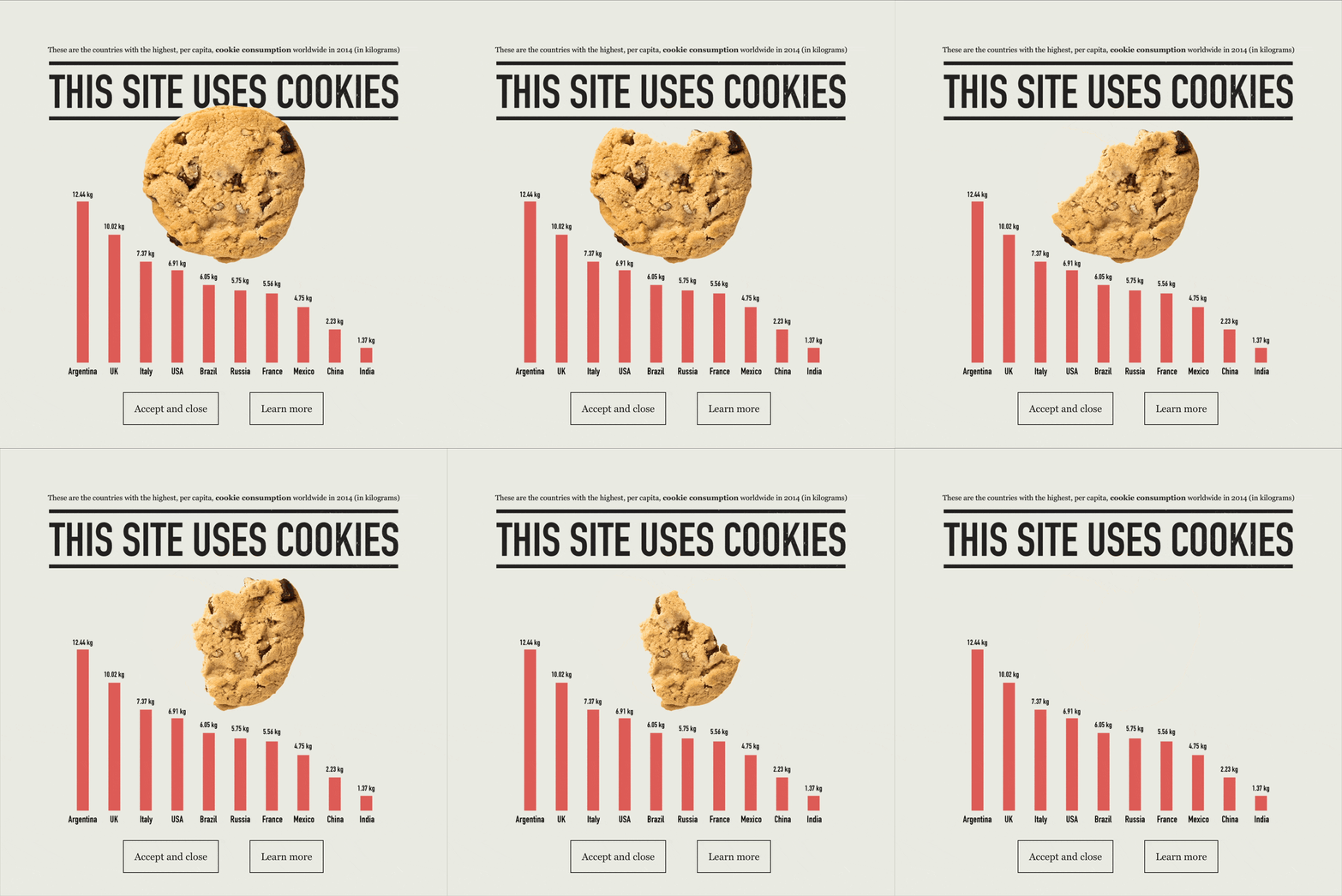
ChitChart, a data-visualization site, turned the most ignored element on the web into a joke worth reading: its cookie consent popup is an infographic. A bar chart ranks per-capita cookie consumption by country (the edible kind), under a "THIS SITE USES COOKIES" headline, with working Accept and Learn More buttons built in.
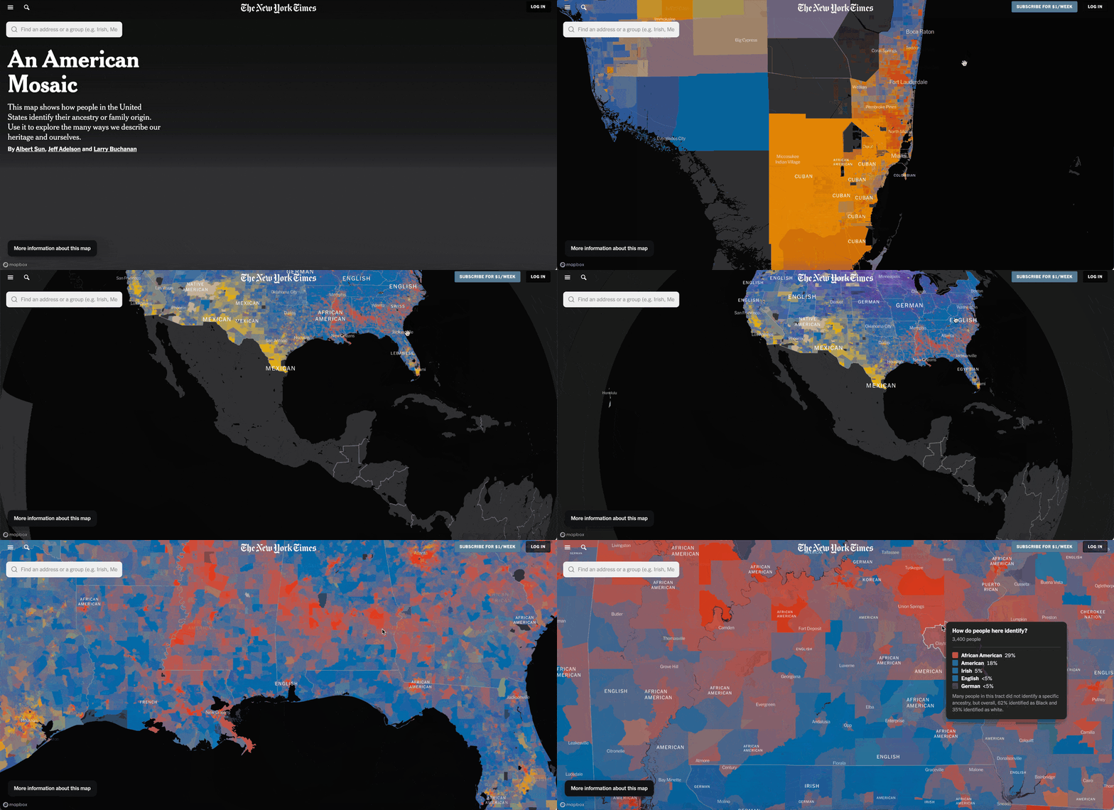
The New York Times mapped how Americans describe their ancestry, using Census survey data across nearly 200 identities in all 50 states. Instead of one color per region, each area's shade blends the ancestries of the people living there.
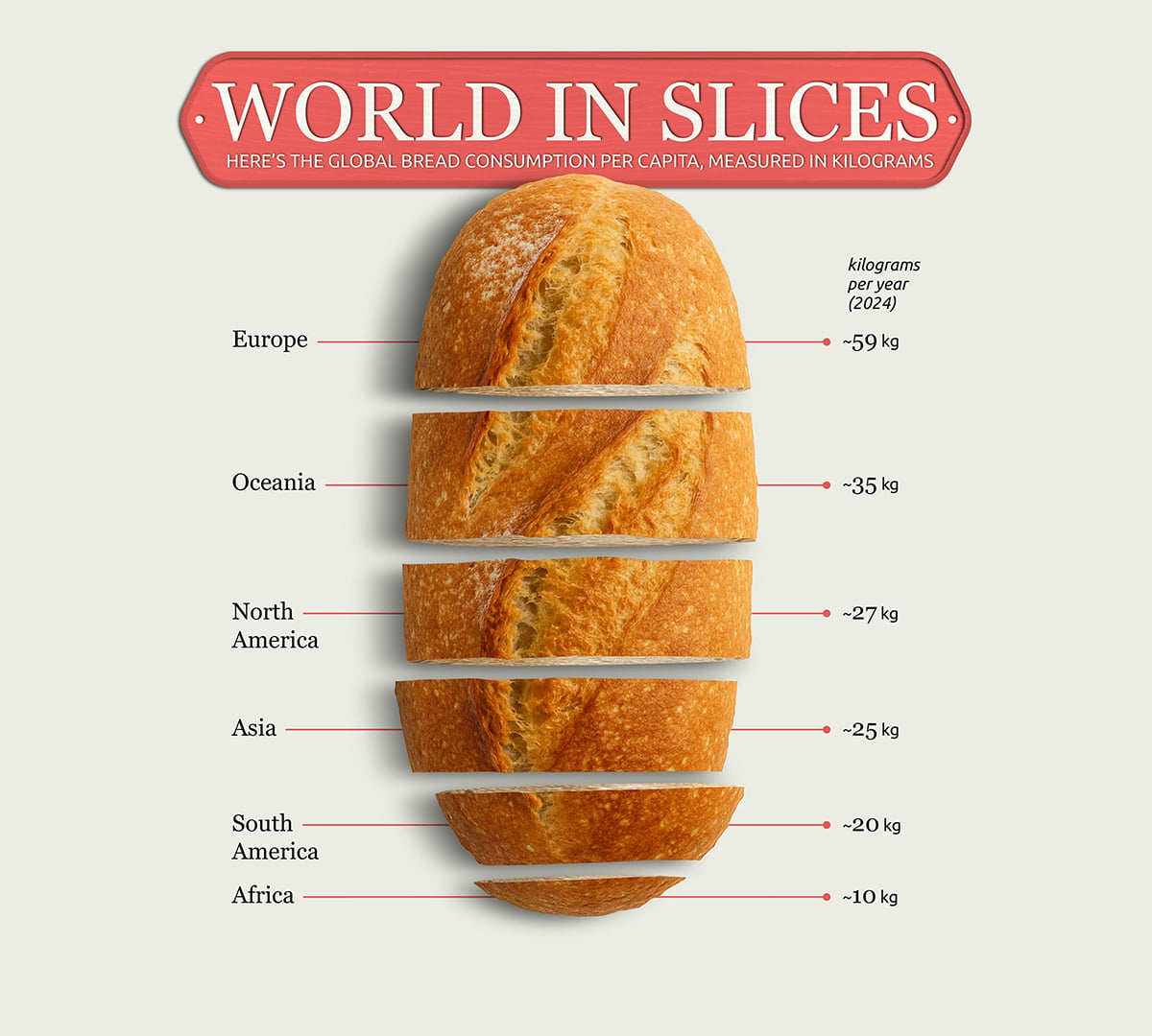
Where do people eat the most bread? ChitChart sliced a photo of an actual loaf into six pieces, one per continent, each sized to the amount of bread that region eats per year. This data could have been presented as a bar chart, but using literal slices of bread makes the whole thing more memorable.
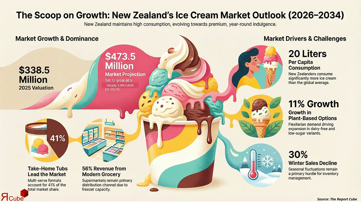
The Report Cubes, a market-research firm, condenses its New Zealand ice cream study into a single graphic: market size, growth rate, the leading product types and who's buying. It's a teaser, giving away enough of the findings to prove the full report is worth paying for.
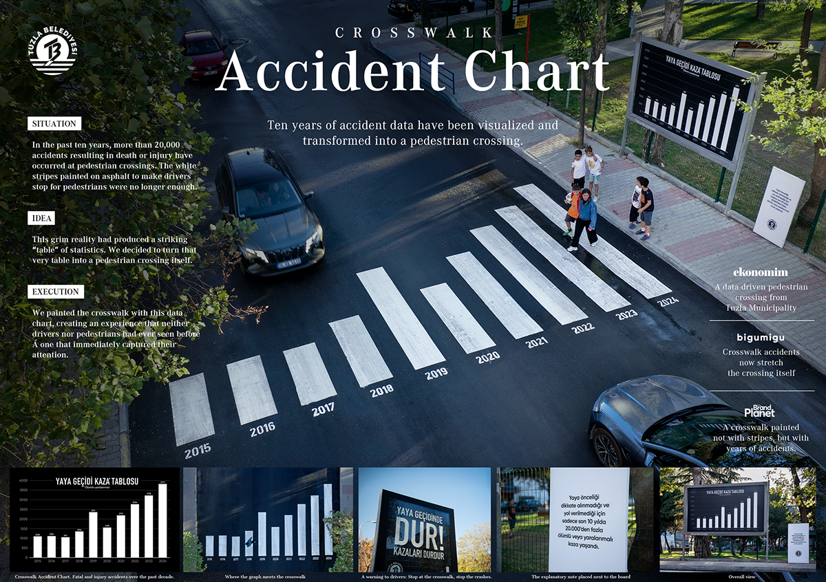
Here's an infographic you can walk across. Tuzla Municipality in Istanbul repainted a zebra crossing so its stripes double as a chart, showing more than 20K pedestrian crashes in the last decades. This example is a reminder that an infographic doesn't have to live just on a screen or a page.
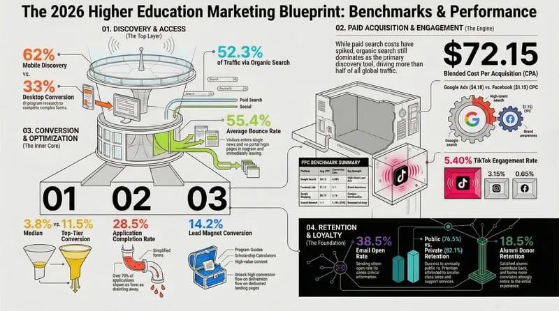
Benchmark infographics exist so a marketer can answer one question fast: am I above or below average? CUFinder built this one for university marketers, collecting the metrics that matter into a single reference they can measure themselves against.
Science and health topics come with dense source material, which makes them a good test of design. What follows runs from a full-page newspaper spread about bananas to a policy factsheet written for fisheries managers.
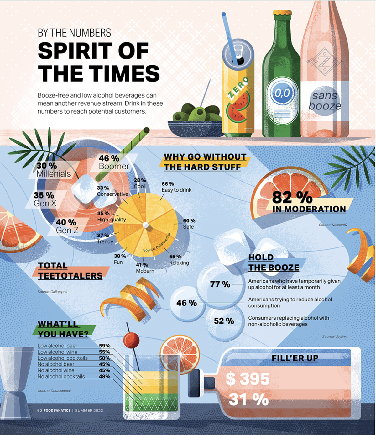
Adrian Bauer illustrated this infographic for the Food Fanatics magazine. The style with bold geometric shapes, loud colors and a flat paper-collage feel proves that an infographic can carry a strong artistic signature and still do its job.
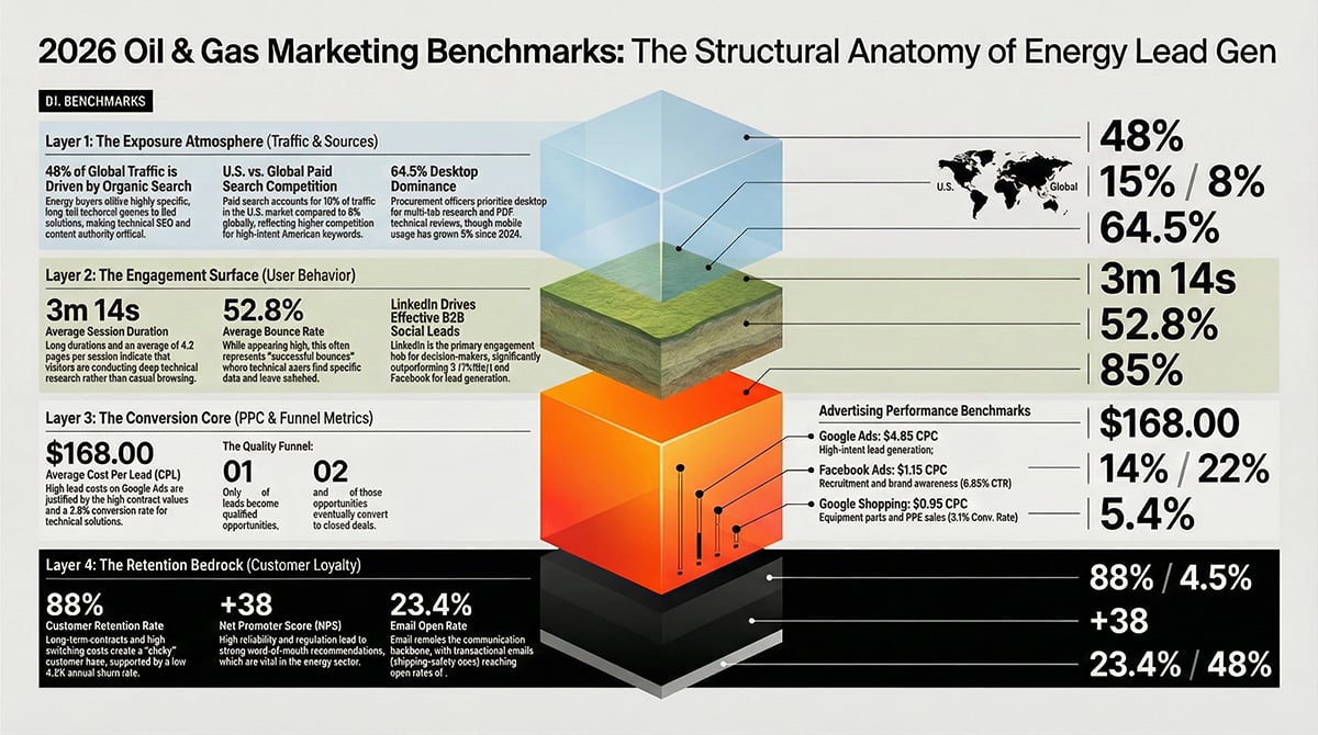
In this horizontal infographic, CUFinder stacks the oil and gas benchmarks as geological strata, from an atmosphere layer down to a black "retention bedrock," a clever nod to drilling. What's interesting is that oil and gas has some of the weakest digital benchmarks of any industry, and the graphic doesn't hide it.
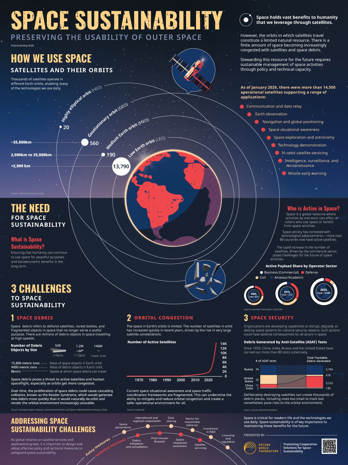
More than 14,500 operational satellites from over 80 countries now orbit Earth, with debris moving fast enough to wreck any of them. The Secure World Foundation's poster maps where they sit across low, medium and geostationary orbit, treating orbit as a limited natural resource.
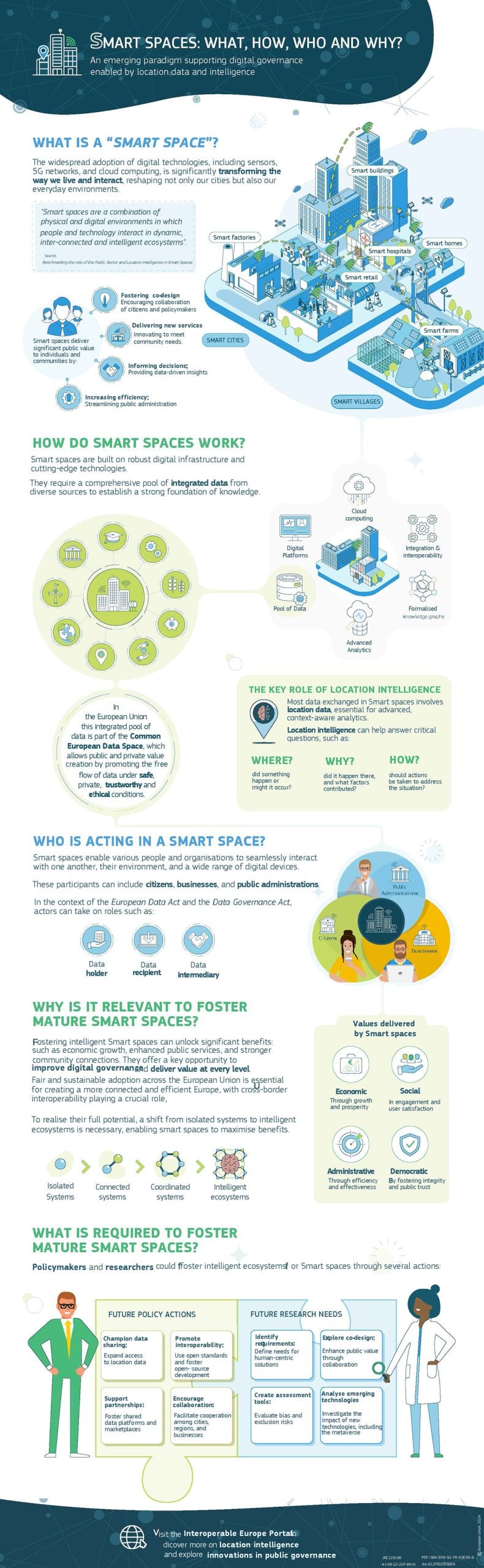
What is a smart space? How does it work, who's involved, and why should anyone care? The EU's Joint Research Center built this infographic around those four questions, using them as the actual section headers.
Precision Nutrition presents a series of fitness tips in a colorful and informative infographic. An anatomical drawing illustrates the various parts of the body aided by the 10-minute routine, and each exercise is illustrated for readers to understand.
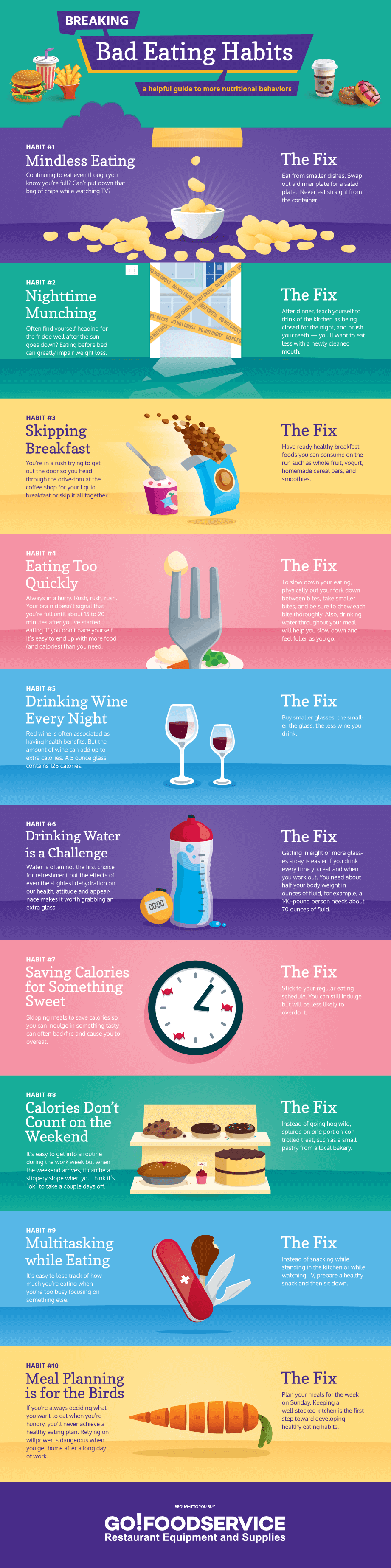
TheGo! Foodservice team illustrated the hidden dangers of habits like skipping breakfast or nighttime munching—and how to break them—with this attractive infographic. Each of the 1o points is illustrated with a drawing in flat-design style and well-chosen color schemes.
Serenata Flowers designed an infographic to present its “8 Things You Didn’t Know Your Plants Can Do,” a beautifully illustrated reference guide with images of various plants and flowers. Each species is highlighted by alternating colors and information on its health benefits.
This bold infographic created by Sure Payroll highlights a variety of facts and statistics supporting the importance of sleep. Basic icons and shading are used to visually describe group sizes, and large typography is used to emphasize figures.
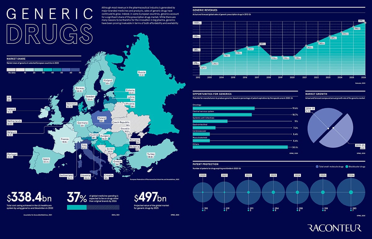
Raconteur created this to show how cheaper off-patent medicines have quietly grown into a major share of the prescription market. The design treads the data with the powerful restraint of good editorial design: a tight palette, clean charts, and perfectly aligned elements.
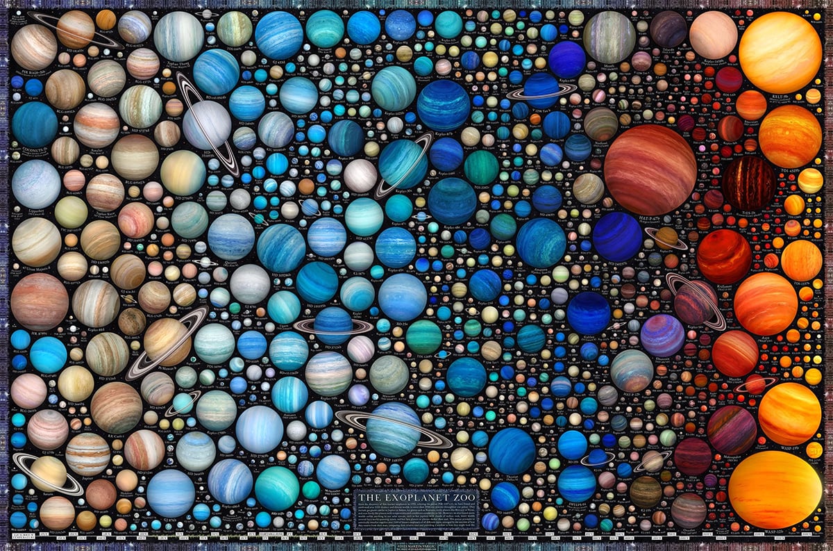
Martin Vargic, a Slovak artist, spent six to seven months hand-rendering more than 1,100 exoplanets into a single infographic poster with data from three exoplanet databases. Each one is individually illustrated and arranged according to how much heat it receives from its star.
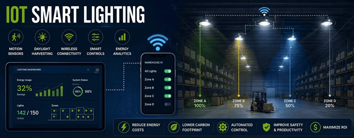
Lighting is one of the easiest places for a building to cut its carbon footprint, and Faraday Lighting's graphic shows it in action. It visually maps a real warehouse, with each zone dimmed to a different level, with the ambiance reflecting that. Then, on the left, is a dashboard showing 32% energy savings.
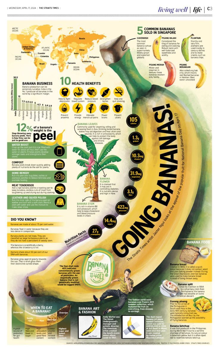
The Straits Times print edition in Singapore gave an entire page to the humble banana for National Banana Day. Artist Jaster Ngui made the most of it. One enormous illustrated banana runs corner to corner, and ten health benefits, nutrition facts, uses for the peel, even Warhol's banana and Cattelan's duct-taped one, orbit around it.
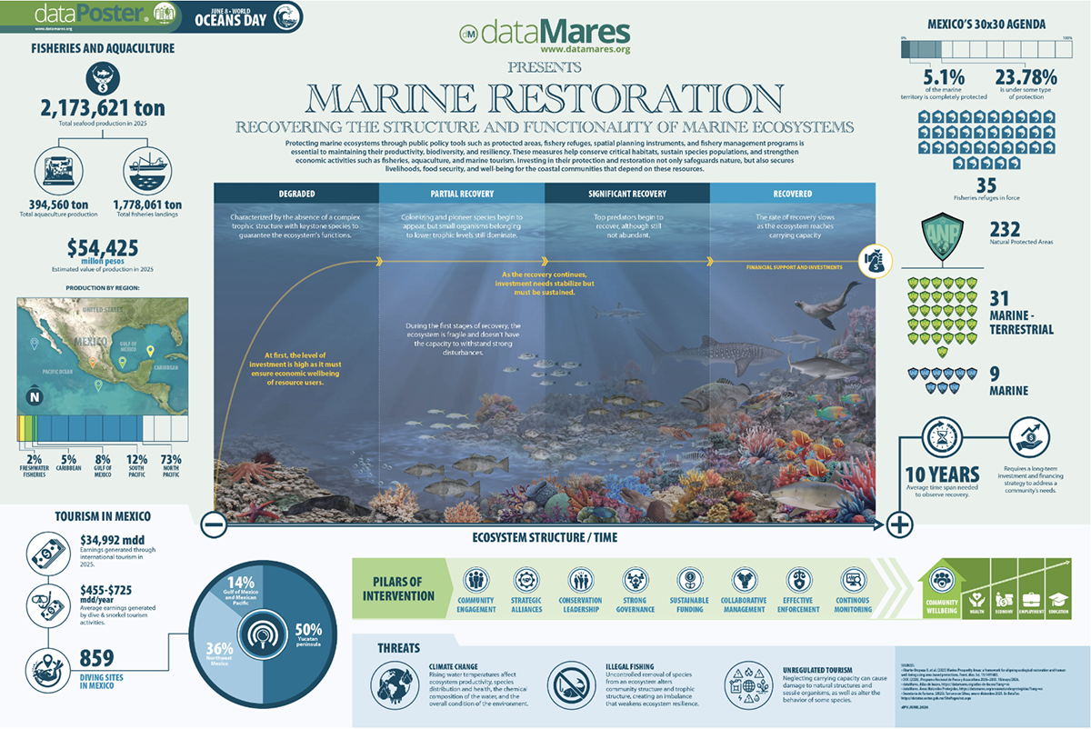
This infographic is a dense, scientific poster designed to hold a large amount of information. DataMares packs a lot in: a reef illustration running left to right from degraded to fully recovered, Mexico's fisheries and aquaculture figures, protected-area counts, tourism earnings, threats and intervention pillars.
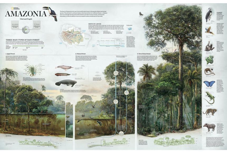
National Geographic's Amazonia infographic maps the rainforest ecosystem, the water cycle, the food webs, and the three distinct forest types. It's educational but not aimed only at students. It's rich enough to study closely and clear enough to enjoy.
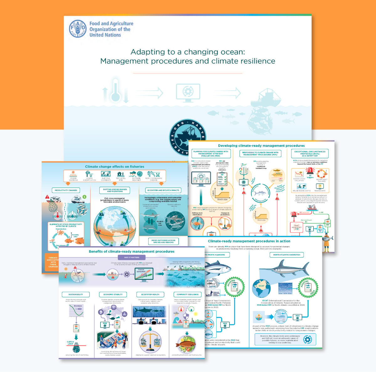
This 2026 factsheet infographic from HarvestStrategies.org, backed by The Ocean Foundation and the FAO, explains how fisheries adjust their management as the ocean warms, a narrow, technical subject aimed at scientists and policymakers, not a general audience.
These are the infographics people come back to. Some break a task into steps; others sit open beside you while you work, like a knife guide or a baking substitution chart.
This creative dark blue-themed infographic topic walks readers through the steps involved in a design process—from brainstorming to the actual design and feedback process. The beautiful icons, elegant fonts and illustrations in this infographic not only make the content fun but also boost overall visual appeal.
Collaborate with your team to edit this infographic in real-time, leave feedback and resolve comments until it matches your unique design needs. During the process, effectively manage roles and tasks, track deadlines and make corrections using the workflow tool.
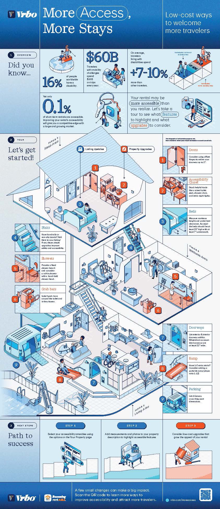
This Vrbo infographic walks hosts through accessibility amenities worth adding and listing- handrails, non-slip stair treads, wider doorways- then tying each one back to revenue rather than obligation. It is accessibility framed as good business.
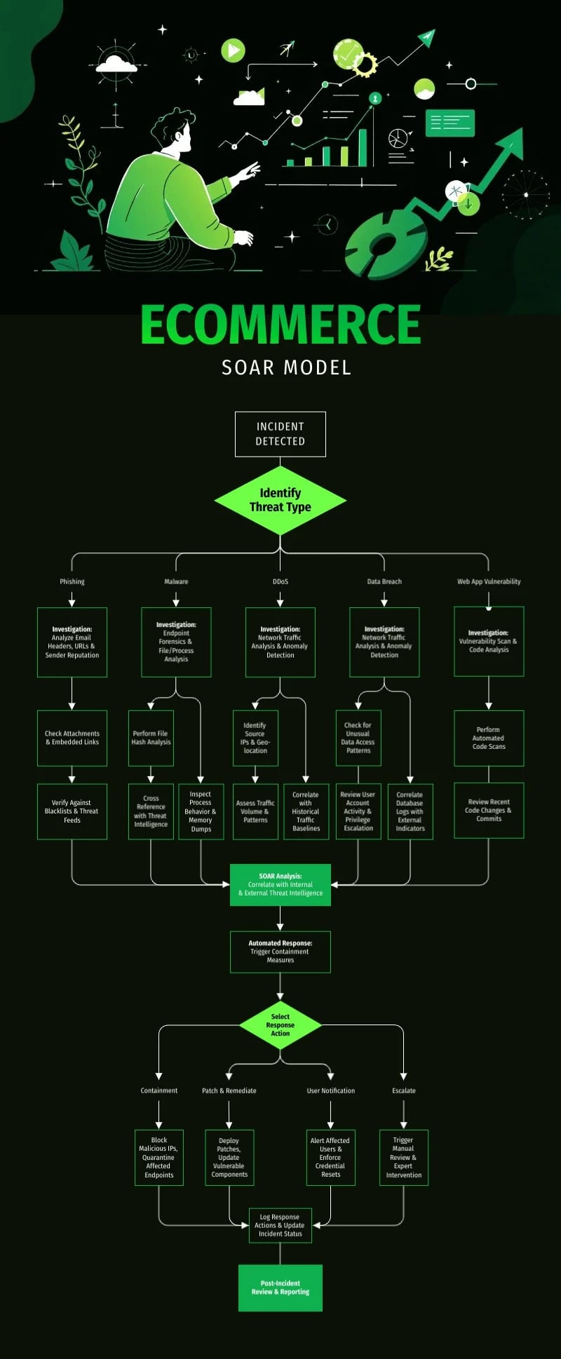
[cta_button text="Customize this Infographic template and make it your own!" link="https://dashboard.visme.co/visme/create-project/banner/1425294367?vc=In-Text-Blog-CTA" button_text="Edit and Download"][/cta_button]
Infographics make ideal reference guides for both experienced and amateur chefs. Images allow for quicker and easier reference while creating a culinary masterpiece. The wine and cheese guide makes an easily understandable guide for both connoisseurs and budding enthusiasts.
The proper knife is an essential tool for chefs of all skill levels. Nisbets Catering Equipment Supplies shared this useful infographic that graphically illustrates each of 11 common kitchen knives, while describing its features and use.
eReplacementParts.com designed its guide to cooking and baking substitutions as a simple chart with images to represent various cooking ingredients. The resulting infographic is an easy-to-reference guide that can be used in and out of the kitchen.
Everest designed an infographic that can serve as a catch-all reference for cooks of varying skill levels. The design features charts for proper oven temperatures, measurement conversions and even a diagram of beef, pork and lamb cuts.
With so many types of cooking oil in today’s cupboards, it can be tricky for cooks to know how each varies from the others. This infographic from SheKnows visually illustrates various oil types and lists their cooking qualities.
Discover how to crush procrastination and grow more productive with this vibrant design from Essay Expert. Each of the 15 tips is vividly illustrated with comical graphics, and the complementary color scheme makes the design jump from the page.
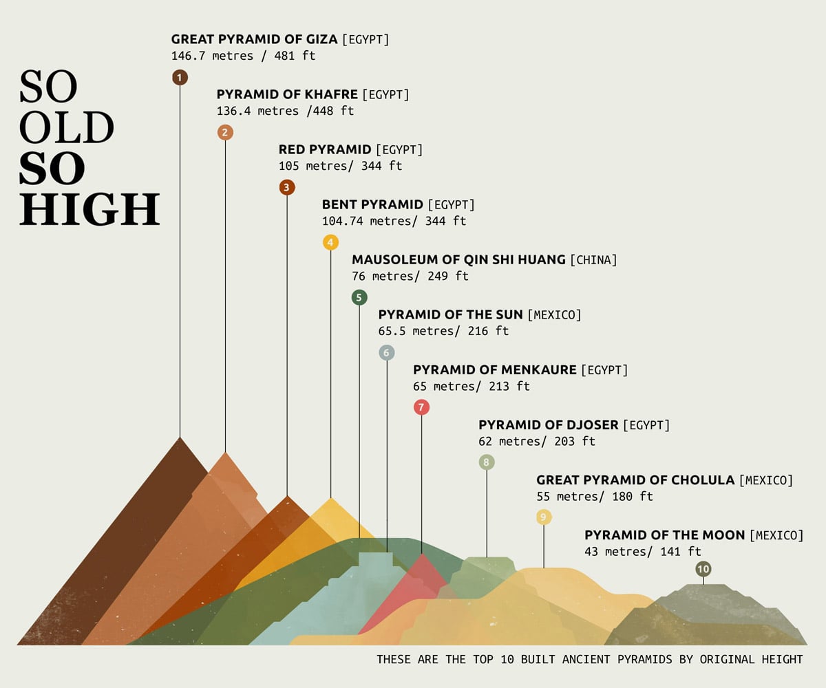
In this simple infographic, ChitChart ranks the tallest ancient pyramids by height. And since the data is literally about height, the bars are just the pyramids themselves. When you find a way to visualize the data with off-the-cuff visuals, you most always have a winner.
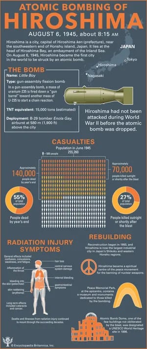
Britannica's infographic on the Hiroshima bombing handles a devastating subject objectively. It lays out the facts and the human cost that followed. With grave subject matter, clear reporting must respect both the material and the reader. Design flourish in this case would be unnecessary and unwarranted.
How do the world’s most successful people start the day? This infographic from Sleep Matters uses actionable advice, bright colors and photo cutouts to illustrate how millionaires and billionaires stay on top of things by starting their days right.
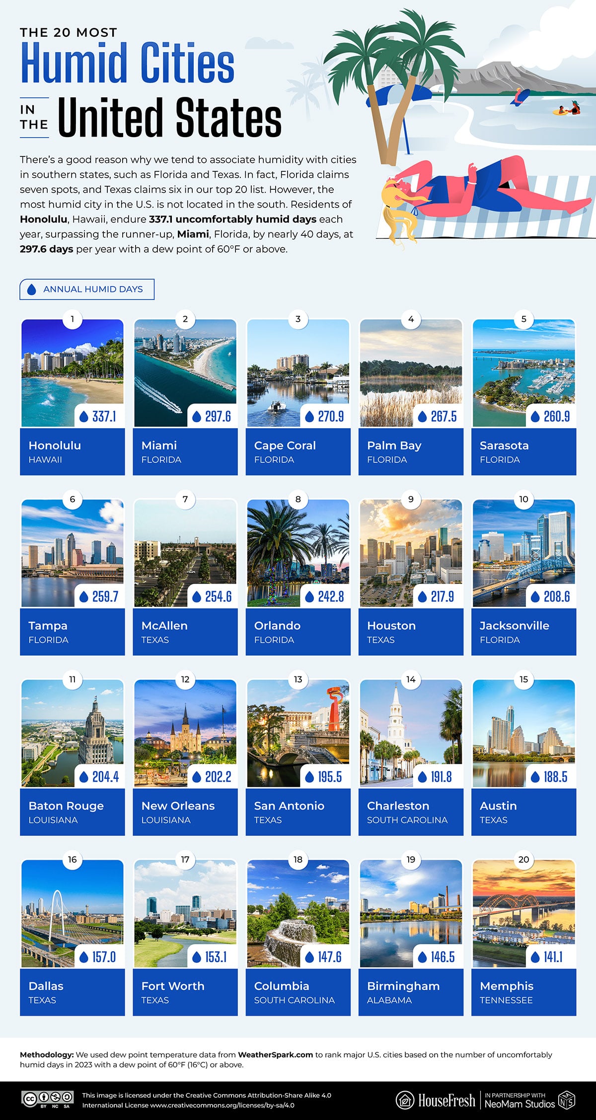
HouseFresh ranked the 20 muggiest US cities by the number of uncomfortably humid days per year. Honolulu tops it at 337.1, beating runner-up Miami by nearly 40 days. The layout is a simple photo grid, each city as a numbered card with a skyline shot and a number. Pairing every entry with an actual photo makes an abstract ranking feel more personal.
Did you know that you can legally marry a dog in India? Or that you can walk around completely naked in Spain – in any public space?
These are just a few of the bizarre things you can actually get away with if you're in the right country, humorously summarized in this entertaining infographic by Citybase Apartments.
Ever wonder if you were born in the wrong country? This amusing flowchart may confirm or refute your suspicions, based on your responses for each of the nodes in the chart.
If you prefer to arrive stylishly late to a party, you may feel at home with Argentinians. Or if you like leaving hefty tips, you might just fit in with the locals in South Africa.
Some of the most widely shared infographics nowadays are not only intended to explain complex subjects or visualize hard data.
Sometimes they're created for pure entertainment, like this infographic from Sous Vide Tools, which gives readers a visual tour of the world through 20 tasty street foods.
The range of timelines here covers empires, currency, the internet, one footballer's career and more.
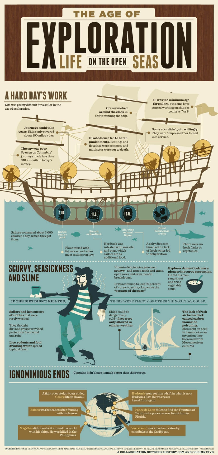
Design studio Column Five made this infographic with History.com to visualize just how tough it was to be at sea during the Age of Exploration. The design walks through a sailor's daily reality: 3,000 calories of salted beef, hardtack and ale; a single set of clothes; journeys stretching for years while the ship moved slowly, with scurvy and mice for company.
Simple pixelated images expertly illustrate the theme of this timeline infographic from the team at SSLs.com. The online evolution that occurred since 1971 would be unbelievable if we weren’t continuing to witness it on a daily basis.
To help today’s students understand what Americans experienced during the Great Depression, The Money Project designed an infographic full of actual photos of the period, as well as a number of charts to represent economic conditions.
The grey color scheme of the infographic helps communicate the dismal outlook of the period.
Humans have used a variety of currencies throughout history, from the early days of bartering to the modern bitcoin revolution. Mint.com’s infographic colorfully illustrates the long history with timelines, images and statistics.
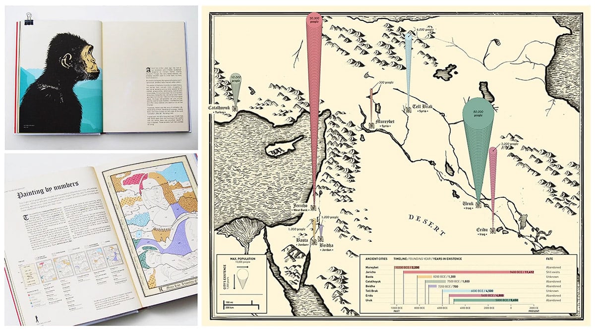
This book tells 13.8 billion years of history across 100+ infographics. The book opens on parchment-like paper with primitive type and no color, then shifts to glossy pages, minimalist layouts and full color as it reaches the modern age. The object itself evolves alongside the story it tells.
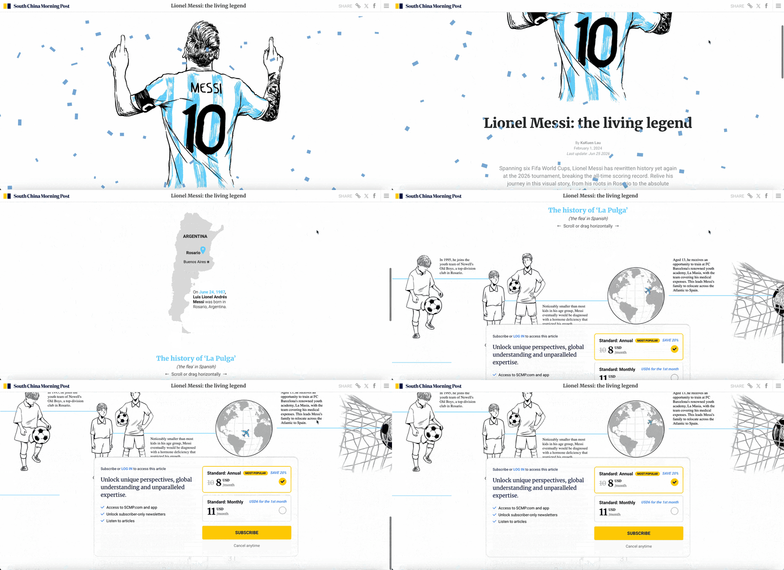
Built around Messi's 2024 visit to Hong Kong, the piece breaks down his career and playing style as a scrollable visual explainer, the kind of work SCMP's award-winning graphics desk is known for.
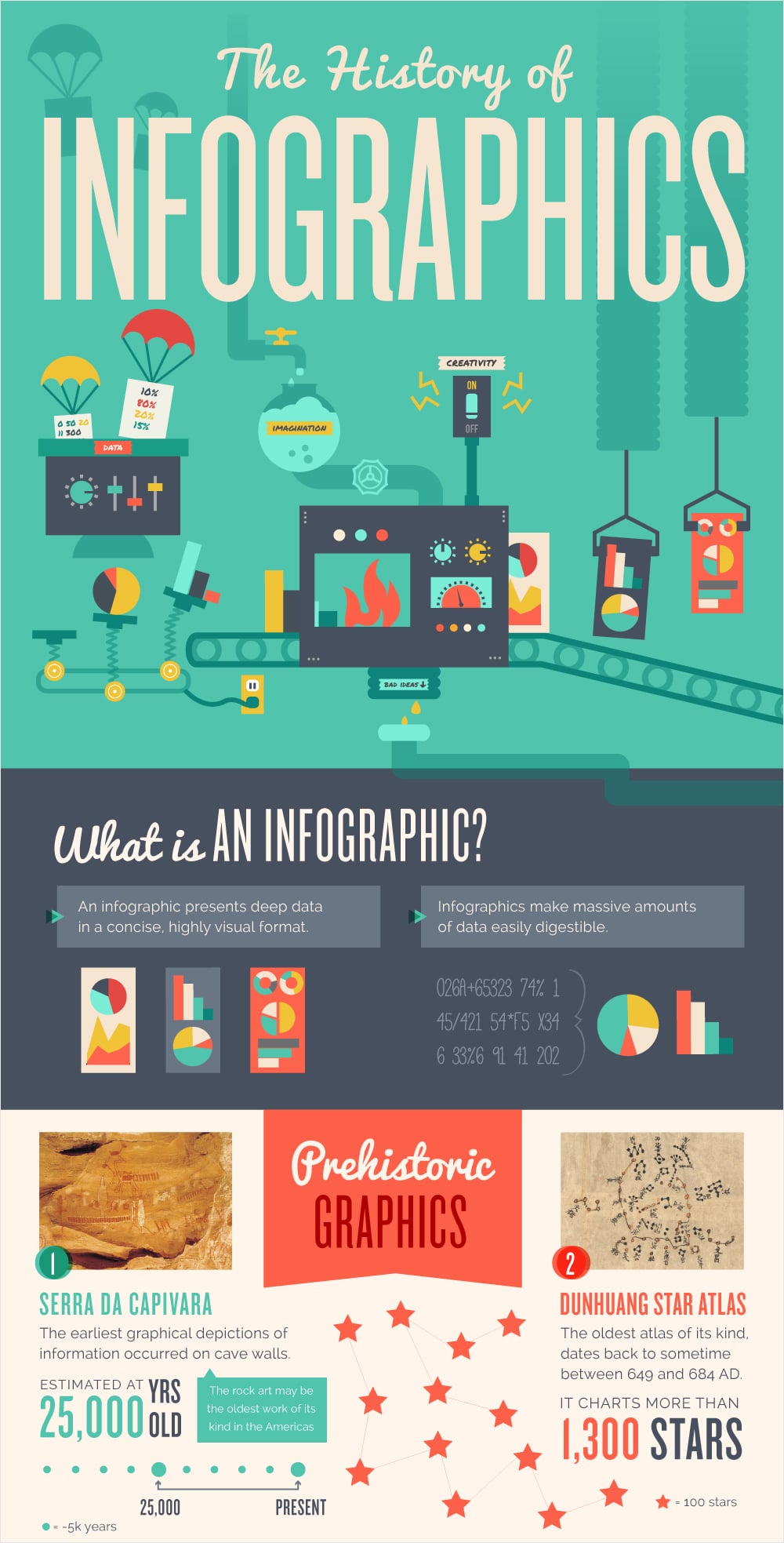
Readers love infographics about infographics, and this ultra-informative design from Easel.ly illustrates a history that spans millennia. The design not only illustrates its timeline, but its structure draws readers' eyes from beginning to end, top to bottom.
History isn’t limited to tales of past governments and societies. Every subject has an origin and an evolution, which is almost always well illustrated with a timeline, such as this history of Daft Punk's contribution to music.
Just the Flight examined the greatest empires throughout human history in this unique infographic that combined a timeline with world maps and icons to represent figures. The infographic not only highlights historical people and events, but describes how the cyclical nature of those changing empires can provide lessons for modern times.
These examples move, respond and let the reader explore. You can build the same behavior into your own designs with Visme's animation and interactivity tools.
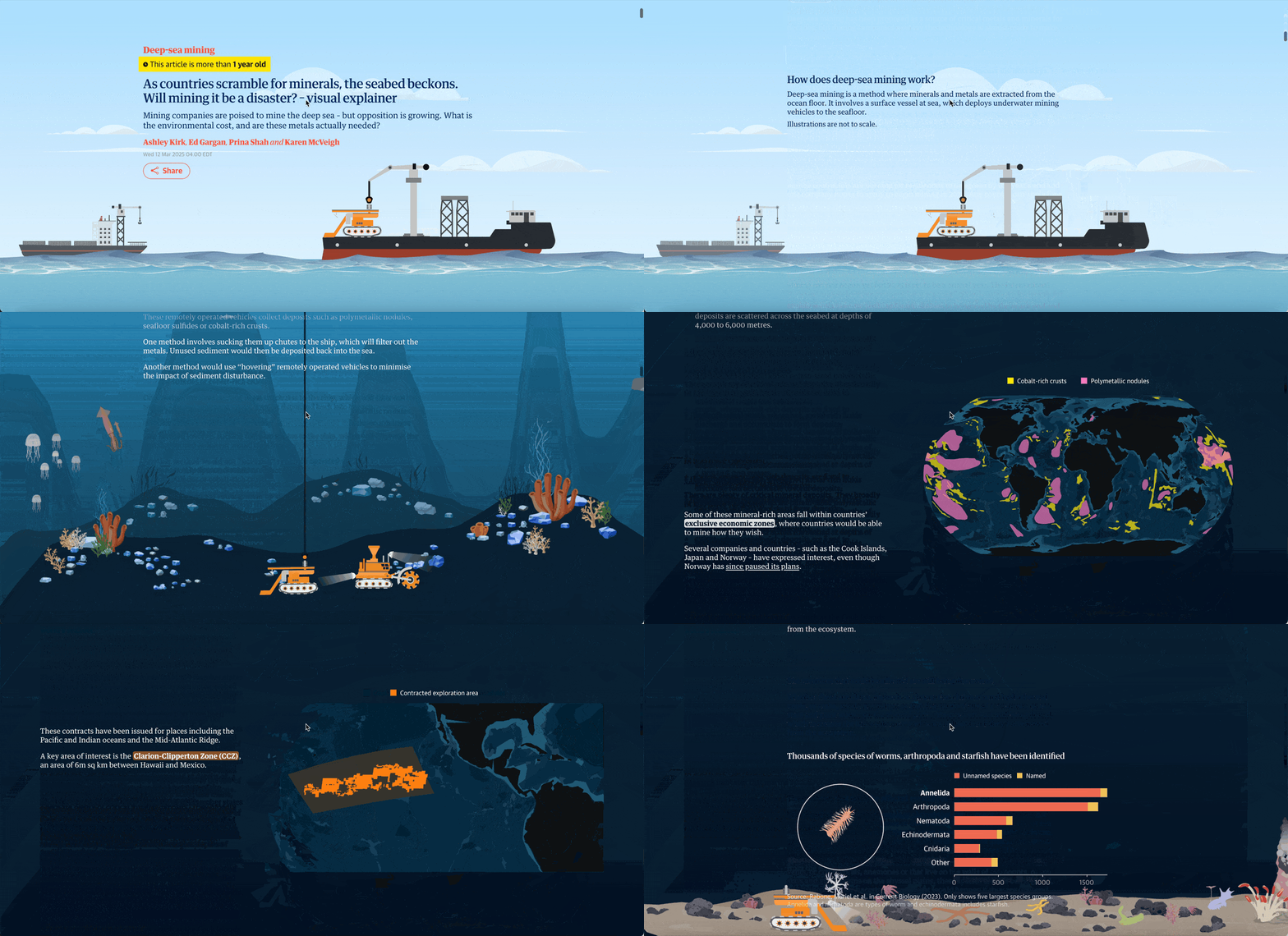
Most people have no mental picture of the deep-sea floor, which is exactly the problem this Guardian explainer solves. It walks readers down through the water column to the ocean bottom, where nations are eyeing mineral deposits, using scrolling to convey the sheer depth involved and to show what mining machinery would actually do down there.
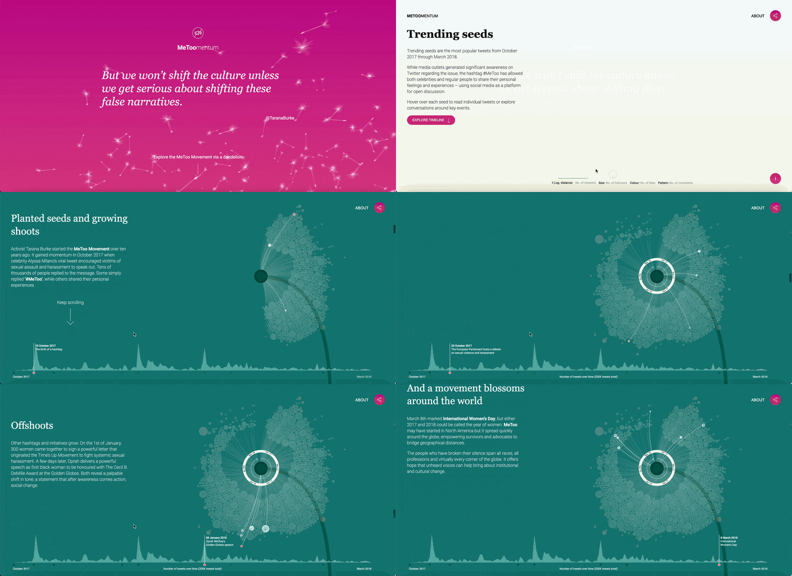
Data designer Valentina D'Efilippo visualized the #MeToo movement's first six months of tweets as an interactive project built on a single metaphor: the dandelion. Chosen for its power to spread and take root anywhere, the flower shapes three visualizations covering the movement's influencers, its global reach and its recurring themes.
A project by graphic designer José Guízar, Windows of New York is a beautifully illustrated work that represents the different architectural styles of windows in the Big Apple.
Seen through the eyes of someone who has a self-professed "obsession" with the windows and fire escapes of New York City, this project catches viewers' eyes through the expert use of white space and attractive color palettes to visually delineate each section.
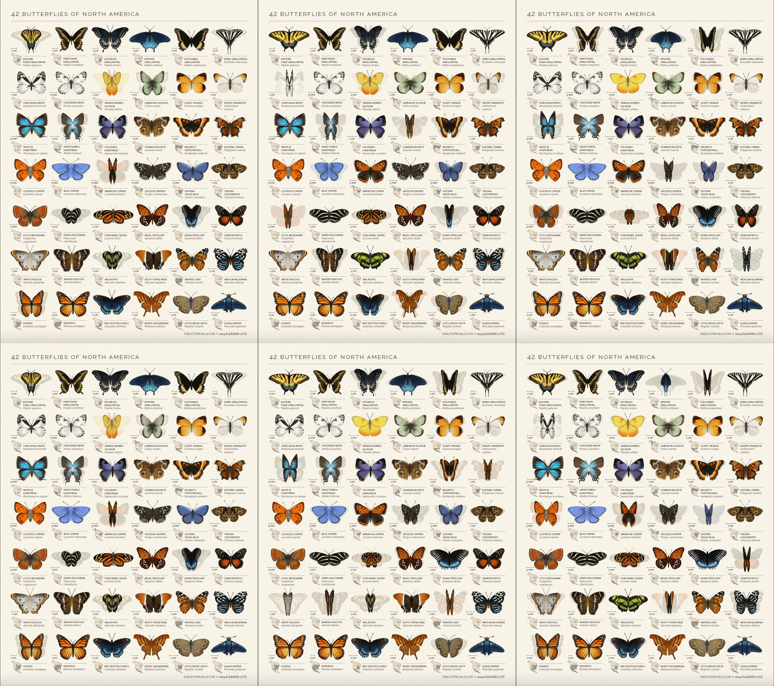
Eleanor Lutz creates science infographics that move. This one arranges 42 butterfly species into an identification chart, then gently sets each pair of wings to flap in a looping animation that turns a flat taxonomy into something you want to keep watching.
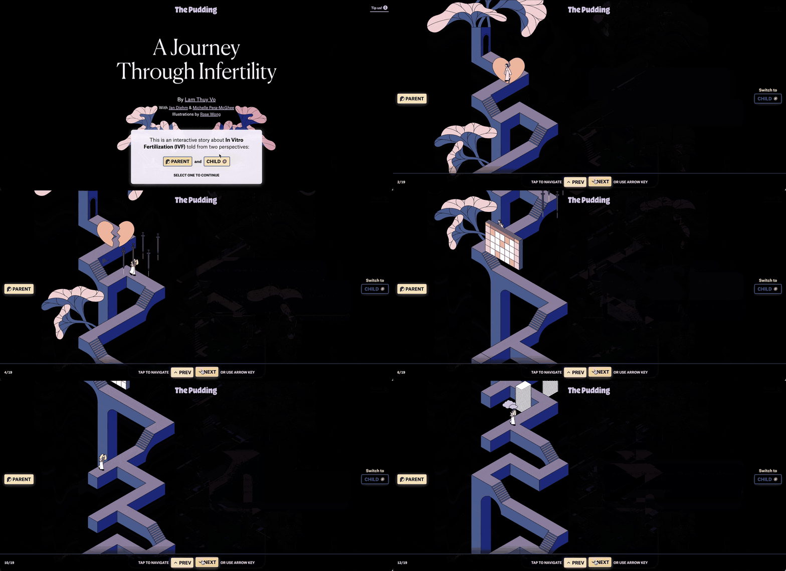
Here, the Pudding tells the story of IVF from two perspectives at once, letting the reader move through the same journey as it's experienced differently by two people.
Handing the reader control of the pace matters with material this personal. You move through it as slowly as you need to.
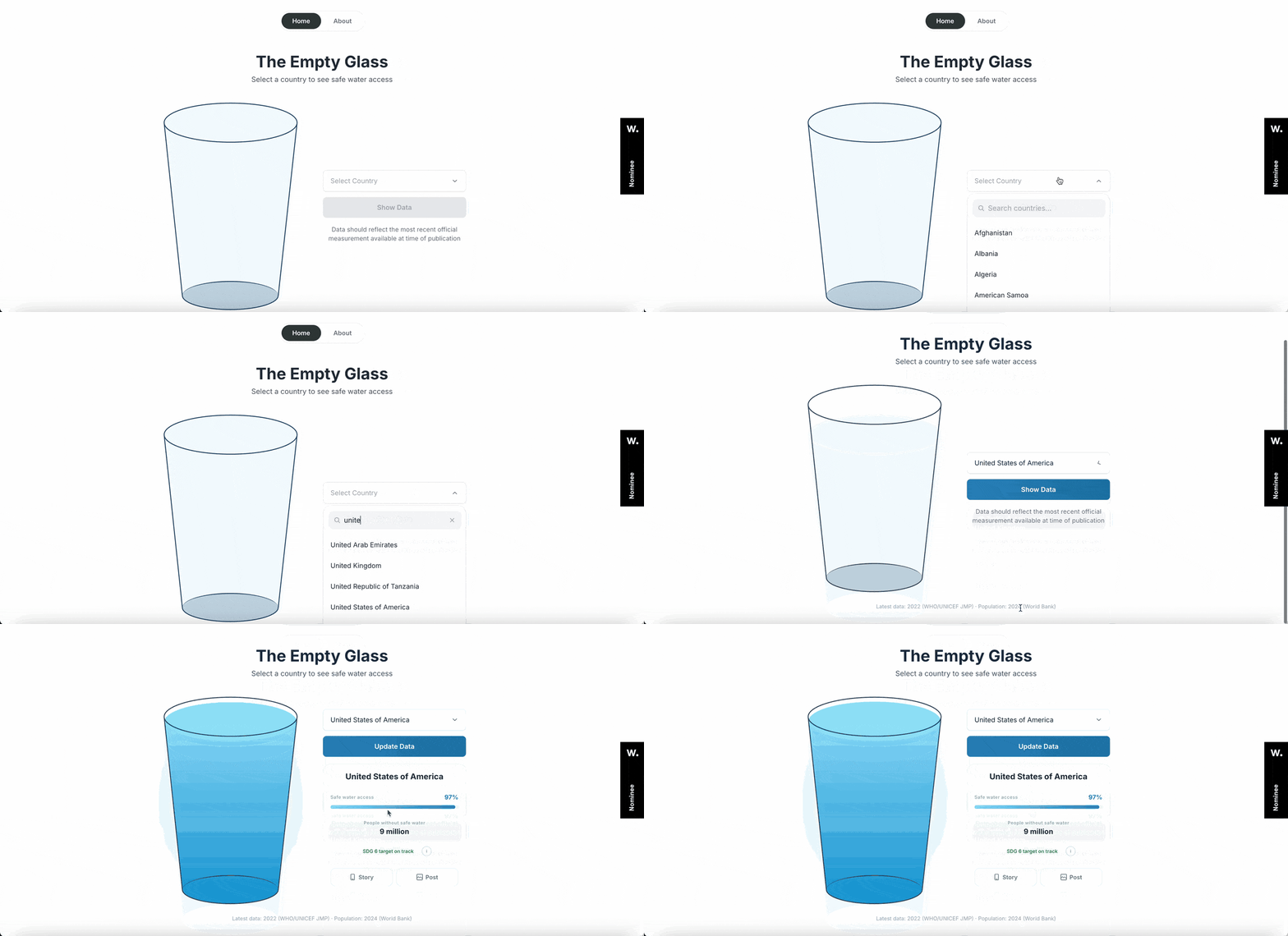
Using WHO and UNICEF figures, Inumimo Idowu, a Canada-based designer, built this interactive infographic to display one data point per choice: pick a country and a single glass fills to the share of people with access to safe drinking water.
If an interaction with a familiar object can carry the finding, you may not need a chart.
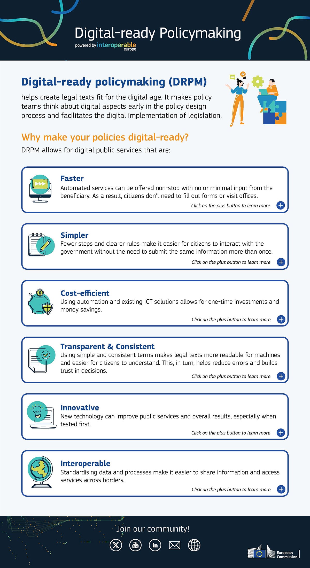
The European Commission's Interoperable Europe team had to explain six benefits of digital-ready policymaking, and built it as a downloadable PDF with clickable elements that open informational windows for each point. Furthermore, the reader can click an airplane icon to access the source data.
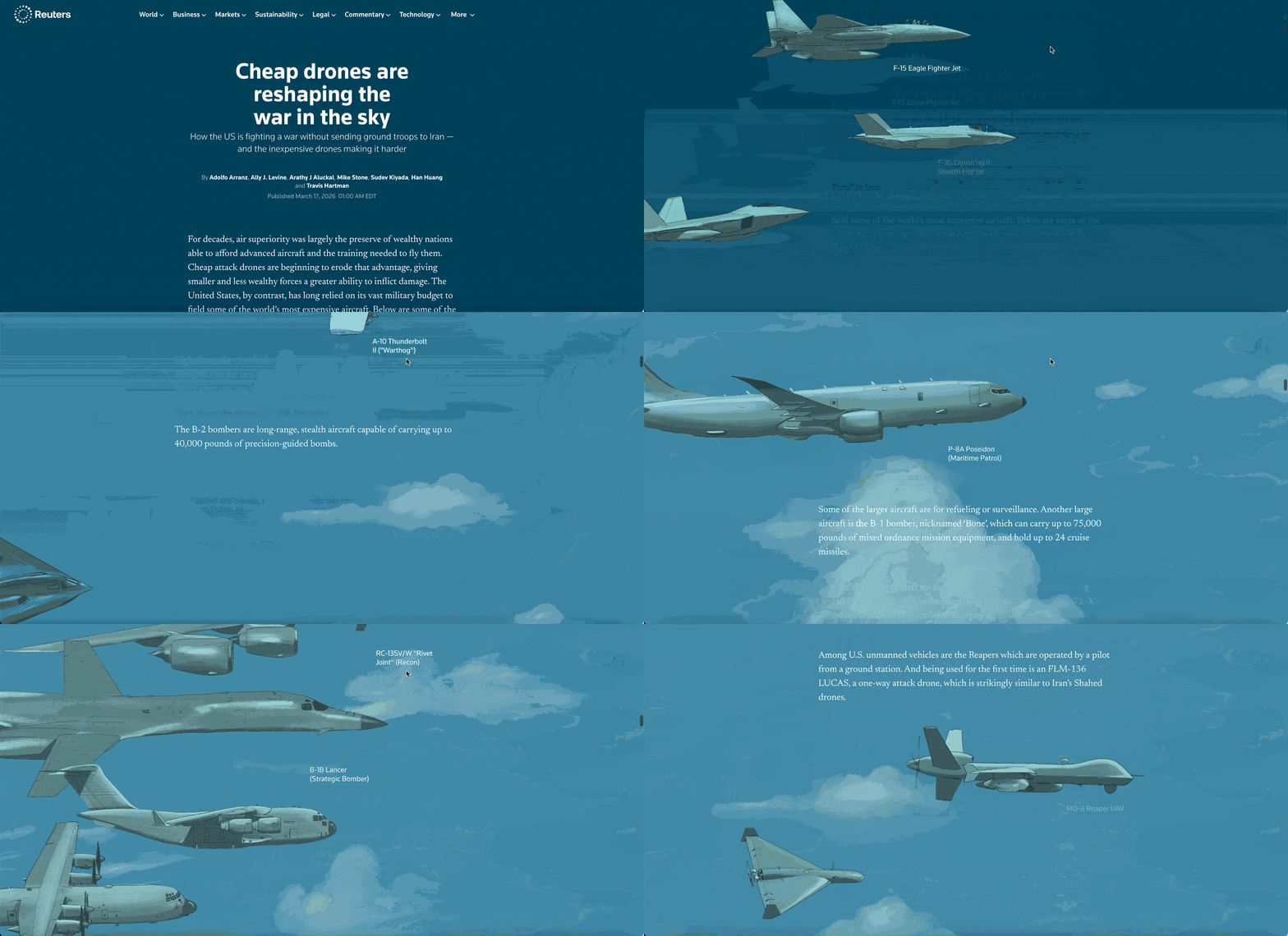
$4 million buys a single Patriot interceptor, or 115 one-way drones at roughly $35,000 each. This Reuters scrolling graphic visualizes the imbalance. If you’re visualizing findings with an unbalanced comparison, get inspiration from this example and draw both sides at true proportion, letting the scroll help you carry the argument.
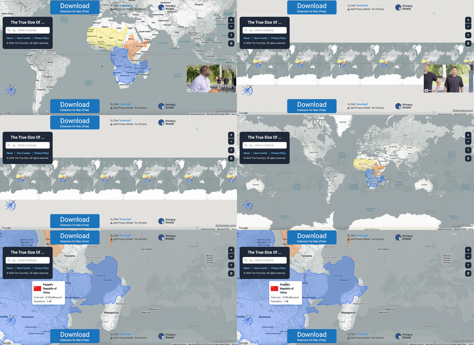
The True Size is an interactive world map where you can drag any country, and it resizes to its true size as you move it. Pull Greenland or Russia down toward the equator, and they shrink to a fraction of the size you're used to seeing.
Have a few more questions about infographic design? No worries! We've got answers.
A good infographic should include a catchy header, your body information and a footer, complete with your sources and logo. What goes inside your infographic body depends on the type of infographic you’re trying to create, but can be anything from charts and data widgets to a flowchart with step-by-step information.
Different types of infographics range from comparison infographics and informational infographics to process infographics, timeline infographics and more.
You can easily make an infographic online using a tool like Visme, one of our templates and our easy-to-use infographic editor.
There’s a variety of infographic software available like Canva, Venngage, Piktochart and Infogram, but the best infographic software is Visme. You can create a free account in seconds and start designing today.
The most important part of an infographic will be your body. This is where you insert your information in a visual, digestible format. However, adding your sources at the bottom is another essential part of your infographic and helps ensure credibility.
Infographics have many uses, from being used in marketing to sharing report data to visualizing complex information and more.
You can make free infographics with Visme. Choose from one of our free infographic template designs and access hundreds of thousands of design elements in the editor to help customize your design before downloading or sharing online.
It’s hard to make a bad infographic, but a few mistakes to watch out for are using hard-to-read fonts, choosing a color scheme that clashes or using a chart that doesn’t make sense for your data.
The length of an infographic depends on two things – the amount of data you have and where you plan to distribute your infographic. Infographic dimensions need to be kept in mind when you think of your sharing strategy as some social platforms prefer square graphics while others prefer horizontal graphics.
You should be just about ready to go after seeing these 101 examples of infographics. You can easily get started with Visme's infographic maker. Choose a template that resembles your vision for the finished product and start customizing with your information and branding.
Not quite ready yet? Check out the resources below to learn more about infographics:

Design visual brand experiences for your business whether you are a seasoned designer or a total novice.
Try Visme for free


![How to Make an Interactive Infographic [+Templates]](https://visme.co/blog/wp-content/uploads/2023/11/How-to-Make-an-Interactive-Infographic-Quick-Guide-8-Customizable-Templates-Thumbnail.jpg)