


Typography Infographics: 12 Inspiring Examples & Techniques

“Color is a power which directly influences the soul” is a famous saying by one of the artistic greats, Vassily Kandinsky.
And color does, in fact, directly influence the soul. Nobody knows that better than the Pantone Institute.
Every year, at the beginning of December, the Pantone Institute announces a NEW Pantone Color of the Year.
A color they select after analyzing many levels of design and society in general. They then explain how the color relates to how people live their lives and how it can influence the soul.
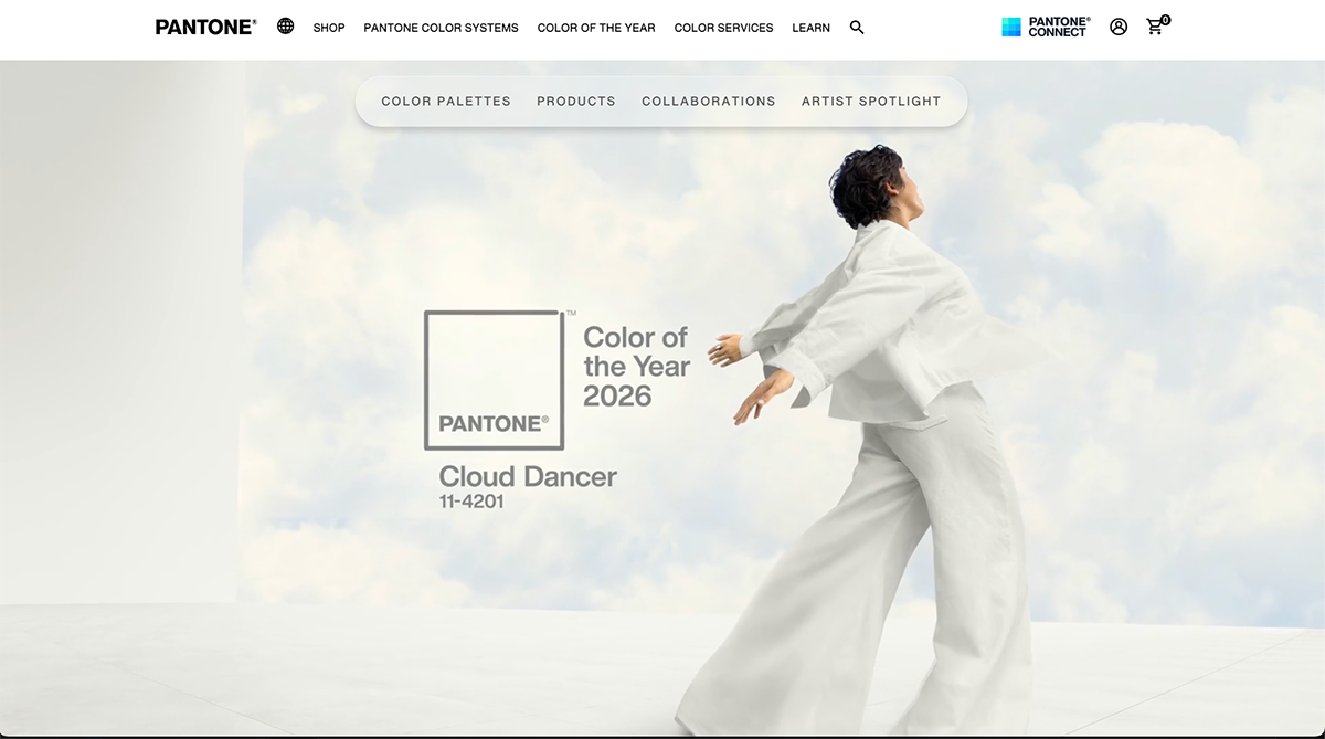
This year’s Pantone color of the year is Cloud Dancer, which is a calm, billowy white tone that inspires a new start, a clean reset. It’s a noticeable jump from the rich brown of last year’s Mocha Mousse. This time, the idea is that in 2026, we get to start over instead of getting comfortable.
As a designer, I love this moment for the anticipation and excitement of seeing the new color and what the collaborating brands create as part of the celebration. This year, my favorites are the Play-Doh and Post-It collaborations because they’re so simple yet also serve as launching pads for creativity.
Keep reading to learn more about Cloud Dancer and what experts in the industry have to say about it. Plus, we’ll look back at all the colors of the year before 2026.
On every launch, the Pantone Institute website changes to showcase the new Pantone Color of the Year. The Executive Director of the Pantone Color Institute™, Leatrice Eiseman, shares her thoughts in a press release that we, and every journalist in the world, use as a source to share the news.
"At this time of transformation, when we are reimagining our future and our place in the world, PANTONE 11-4201 Cloud Dancer is a discrete white hue offering a promise of clarity. The cacophony that surrounds us has become overwhelming, making it harder to hear the voices of our inner selves. A conscious statement of simplification, Cloud Dancer enhances our focus, providing release from the distraction of external influences."
Made with Visme Infographic Maker
The overall reception of Cloud Dancer has been positive but also a bit doubtful if it was the right direction to take. Tom May, design expert, shares this thought on his article for CreativeBloq,
“There's a certain audacity to announcing your 2026 Colour of the Year is white. Not cream, not ivory, not even that trendy greige that's been haunting Pinterest. Just white. Okay, 'Cloud Dancer' if you're being fancy, but let's not pretend a dreamy name makes it any less... white.”
After attending the launch event, Ximena Zaratiegui, a creative senior specialist at Avon, shared her experience, noting that she was surprised in a good way.
“What first felt unexpected quickly became something deeply thoughtful and intentional.Cloud Dancer is a soft, warm white chosen as Pantone’s Colour of the Year. It symbolizes calm, simplicity, and a fresh start, a kind of visual reset in an overstimulated world.”
She continued with, “Far from being 'just a white’ 🤍 it invites us to rethink how we communicate, create, and design in a moment where everything can feel a little too loud. A reminder that clarity, calmness, and honest visual storytelling can be just as powerful.”
Unfortunately, though, there has been some discussion about the unfortunate association of the color with white supremacy, especially since Pantone says they take everything into account when choosing the color, including society as a whole.
The Pantone Color System is the most detailed color-matching system in the world. The system originated in 1963 to solve the printing industry’s problem of color reproduction and matching from a sample.
They ensured that every color, tone, and tint was assigned a number for classification. Pantone now offers the most extensive library of color codes to classify, communicate and match colors for the design industry, as well as for paint, textile and plastic manufacturers.
The Pantone Color Institute offers designers, marketers, creators, artists and brands a chance to collaborate and build a strong color presence. As representatives of Pantone’s leading color-matching system, they have unparalleled knowledge of color.
They are experts in how color affects design and consumer behavior. They are also the ones who decide the color of the year.
In 2000, the Pantone Color Institute had an idea to share their vision on what they named the color of the year. Seeing its positive reception, they continued doing it yearly until it grew to what it is today.
The introduction of the Pantone Color of the Year confirmed the Pantone Color Institute as the leader in all things color-related.
Visme's Head of Designer Alex, explains it perfectly,
“A group of color experts spend the year studying trends in areas like fashion, marketing, social media, and even politics to choose this color. It’s not just a random pick; it’s a powerful way to reflect the current global culture and shift how people think about color. Something as simple as a color can make a big difference in a company’s success. The Pantone Color of the Year is more than just a shade; it’s a strategic tool you can use in your marketing to shape your brand’s image, boost engagement, and even drive sales when used thoughtfully.”

Pantone usually announces The Color of the Year in early December or just before Christmas of the year before. Since Cloud Dancer was announced on December 2025, it’s safe to say that The Color of the Year 2026 will probably be announced around the same time.
Some creatives and designers start to speculate on what color it will be, around November, watching for any major color trends or announcements that hint at the selection. But we won’t know until Pantone shares it in December.

The Pantone Color Institute studies color trends throughout the year to decide on the next Pantone Color of the Year. They consider all aspects of society, including fashion, marketing, social media and even politics. The hue chosen as Color of the Year has become increasingly influential in design and brand marketing.
The first Color of the Year was selected in 2000, but it wasn’t until 2007 that the color trend forecasting took on a life of its own. Nowadays, when a new color is announced, Pantone offers color lovers an array of inspirational products and color combination palettes designed especially with the corresponding color in mind.
Hundreds of brands design products around the Color of the Year, reinforcing the importance of Pantone's color trend forecast.
The announcement of the new Color of the Year receives extensive media coverage. Bloggers write articles about how to use the color; companies create products to sell; graphic designers offer social media templates. And that just skims the surface.
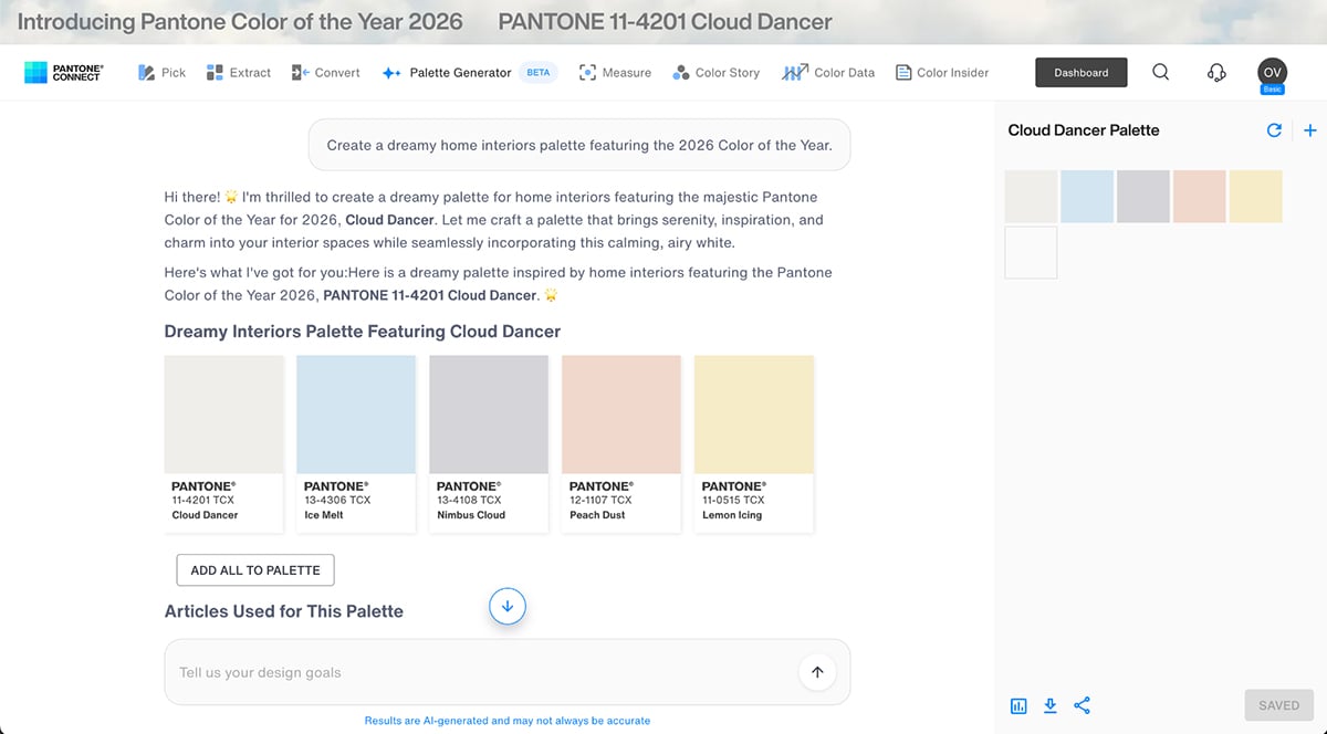
This year, Pantone announced Cloud Dancer alongside the launch of the web version of its Pantone Connect app. Pantone Connect is an AI-powered color palette generator that now offers a Color Story feature, which is much like a mood board creator.
Aside from the amazing array of products available from Pantone with Cloud Dancer, Pantone also collaborates with other brands to create unique products with the Color of the Year.
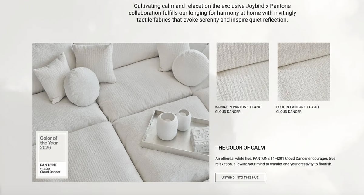
Joybird, known for their mid-century modern furniture, created a stunning collection featuring Cloud Dancer upholstery and accent pieces. Their collaboration showcases how this soft white works beautifully in home interiors, especially on sofas, ottomans and armchairs.
The Cloud Dancer pieces bring a sense of calm and spaciousness to any room. What I love about this collaboration is how it proves that white furniture doesn't have to feel sterile; Cloud Dancer's warm undertones make these pieces feel inviting and livable.
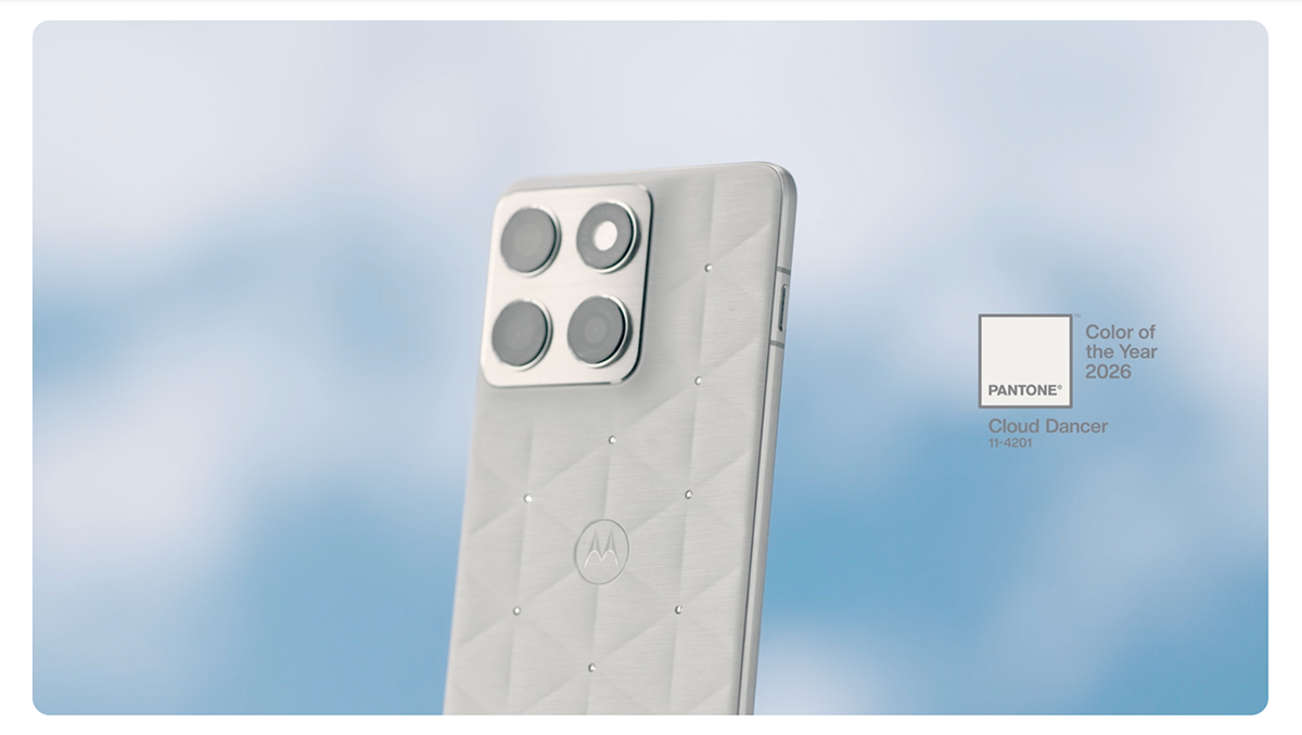
For yet another year, Motorola launched a limited-edition smartphone in the Pantone Color of the Year. The phone's soft white finish in Cloud Dancer is both elegant and practical. It offersa refreshing alternative to the usual black, silver or brighter color options. This partnership demonstrates how the Color of the Year isn’t just for fashion or interiors. It works for consumer electronics as well.
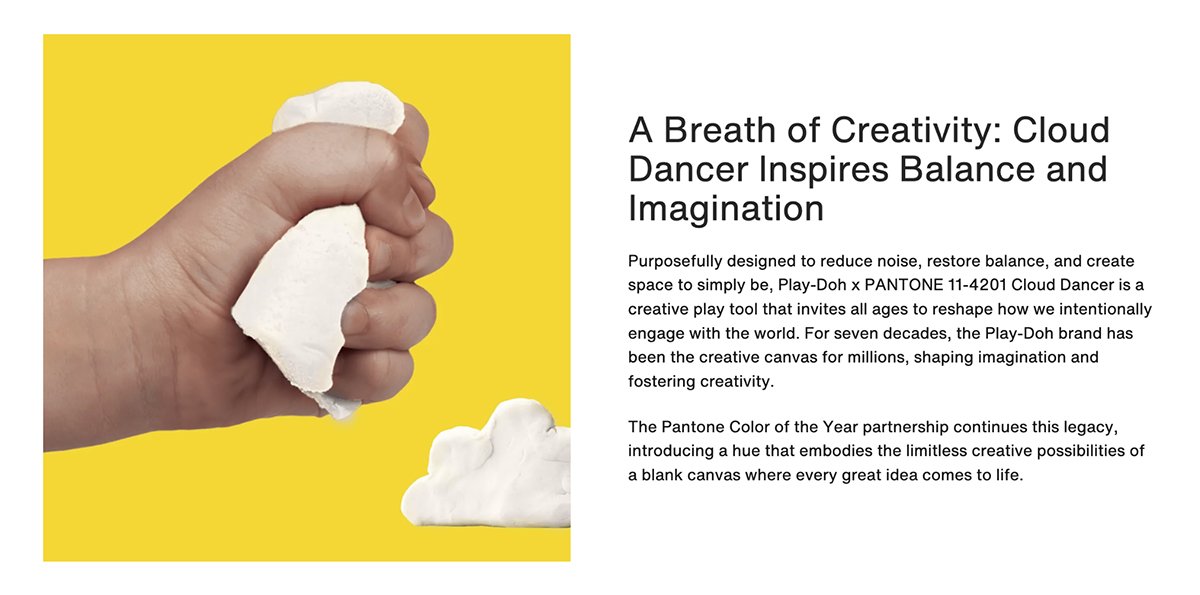
Perhaps the most playful collaboration, Play-Doh released a special Cloud Dancer set that's both nostalgic and trendy. This partnership is brilliant because it introduces the Pantone Color of the Year to a younger audience while giving adults a creative outlet to work with the color in a tactile way.
Creators can combine Cloud Dancer PlayDogh with complementary shades, making it perfect for creating mood boards, conducting design experiments or just having fun.
The extensive color-trending research done by the Pantone Color Institute saves you countless hours of marketing research for your own business. When the new color is announced in December, you or your designers should look into how it can be incorporated into your business.
The Pantone Color of the Year is a color trend forecast for the consumer, which means that it’s intended to be used for consumer products and designs created for clients. Some creative brands renew their look every year according to the new color, but most businesses cannot handle that much change.
The Color of the Year is intended for marketing and product development, but not necessarily for rebranding. This means that you can create ads with the new color, just don’t change your logo or brand colors.
When posting your Cloud Dancer inspired visual marketing designs on social media, don’t forget to use the dedicated hashtag #COY2026 and get extra (and unexpected) exposure.
The possibilities are truly endless when it comes to using the Color of the Year in consumer products, graphic design and more.
I asked Visme's social media manager, Chelse Hensley, for some tips on using Pantone in social media and marketing strategies. This is what she had to say:
“The Pantone Color of the Year has become culturally iconic in predicting trends and setting the mood for what to expect in design for the next year.
A way Social Media Managers can capitalize on the COTY is to create a content series, graphics, and mood boards featuring the color.
For example, at Visme, we create a Color of the Year LinkedIn carousel featuring our design templates that match the color and mood. Or even a Pinterest board filled with inspiring color palettes of foods, libations, decor, fashion, and design, all reflecting the specific color profile.”
One of our Head Graphic Designers at Visme, Daniela, also has some tips for how to use Mocha Mousse in your designs:
“You can incorporate the Pantone Color of the Year into your designs as an effective marketing strategy. For 2026, using Cloud Dancer can help you connect with audiences who value modern culture and design trends.
If you offer products, consider integrating Cloud Dancer into your packaging or launch campaigns to gain relevance and recognition in your industry, especially if you want to convey a new start or fresh beginnings.
However, remember that 2026’s Pantone color is not a replacement for your brand colors. Use it thoughtfully in ways that align with or reinforce your core values, messaging, and tone for a cohesive and authentic brand presence.”
Since 2013, Pantone has offered color and design tools matching the announcement of the Color of the Year.
Graphic designers, fashion designers, makeup designers, interior decorators and product manufacturers have access to various Pantone Color System tools available for creating new and trending products and graphics with the Color of the Year.
Any product can be manufactured in the Color of the Year. For example, Pantone offers a line of products that are renewed each year with the new color: mugs, keychains, and specialized color chips.
Pantone also offers a specialized color-matching system for manufacturing products in different materials like plastic, metal and more.
The Pantone Matching System (PMS) originated as a system for printed materials. But through the years, it evolved into more than that. Now it’s easy to use on several materials, including digital products.
Through the use of specialized codes, Pantone makes it easy for web designers, marketers and industrial product manufacturers to use any Pantone color, including the Color of the Year.
So, how do you use a Pantone color online? You need the HEX code.
For other purposes, there’s also a corresponding RGB, CMYK and HSL.
These are the color codes for this year’s color, Cloud Dancer:
| Pantone (PMS) | HEX | CMYK | RGB | |
|---|---|---|---|---|
| Full Name | Pantone Matching System | Hexadecimal Color Code | Cyan, Magenta, Yellow, Key (Black) | Red, Green, Blue |
| What It Is | Standardized spot color system with pre-mixed inks | Web color code using base-16 values | Four-color printing process using ink percentages | Additive color model using light values |
| Color Range | 2,000+ standardized colors | 16.7 million possible colors | Thousands of colors (limited by printing) | 16.7 million possible colors |
| Primary Use | Print (branding, packaging, merchandise) | Digital screens (websites, apps, UI design) | Commercial printing (magazines, brochures, flyers) | Digital displays (monitors, cameras, screens) |
| How It Works | Pre-mixed ink applied in single layer | RGB values converted to 6-digit code | Four ink layers blended to create colors | Three color channels (0–255 each) combined using light |
| Best For | Brand consistency, specific color matching | Web design, digital graphics | Full-color photos, multi-color designs | Photography, video, digital displays |
| Cost | More expensive (requires specific inks) | Free to use | Cost-effective for multi-color prints | Free to use |
| Limitations | Limited color range, costly for multi-color | Not suitable for print without conversion | Cannot match all Pantone colors, less vibrant | Not suitable for print without conversion, varies by screen |
Are you interested in creating a color palette inspired by Cloud Dancer and then using it for your Visme projects?
There are two main ways to create a palette that captures the essence of this year's color: manually or using a palette tool. The issue with creating a manual palette, though, is that it’s quite difficult to achieve a balanced color scheme, especially when you’re not a designer.
For that reason, I suggest using a palette generator such as Coolors or Colormind.
Every single template inside Visme can be transformed into Cloud Dancer inspired visual content. But to help you get started quickly, we’ve adapted four of our existing templates using colors from Pantone’s Cloud Dancer palettes.
Remember that Cloud Dancer’s soft, billowy white works best as a background or neutral anchor in any design, but will also work wonders as elements over a darker background.
Use this mood board template to create a serene, inspiration-focused mood board using Cloud Dancer’s soft white, plus the gentle beiges and calming neutrals from Pantone’s Light & Shadow palette. This template is perfect for presenting and sharing design concepts, brand direction or creative briefs with that fresh-start energy that Cloud Dancer embodies.
The clean layout lets your visual elements shine while maintaining a cohesive aesthetic.
Made with Visme
This social media carousel template uses another Cloud Dancer based palette to create a peaceful, scroll-stopping design to share your content. The soft color scheme is ideal for wellness brands, minimalist lifestyle content or anyone wanting to convey clarity and calm with their social media presence.
Made with Visme
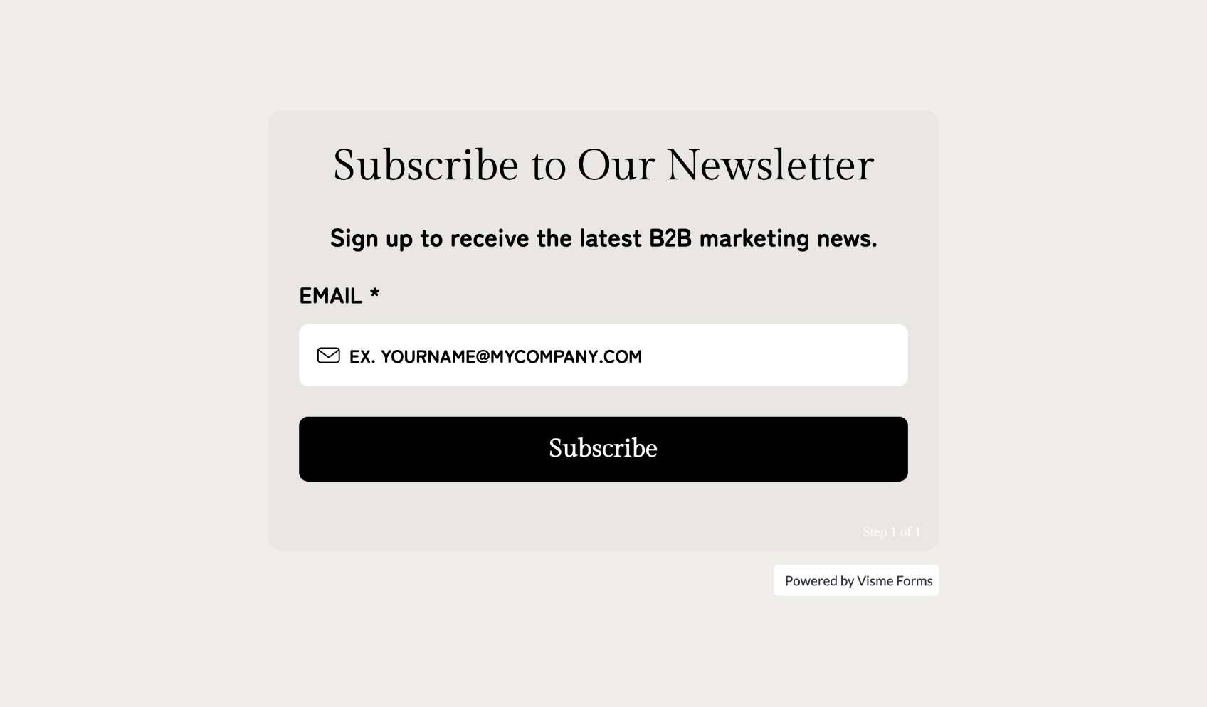
Often, the best call-to-action is one that feels inviting rather than pushy. This sign-up form uses Cloud Dancer's calming tones to create a welcoming entry point for newsletter subscribers. The neutral palette reduces visual stress and makes the form feel like a natural next step towards lead generation.
Whether you're promoting a wellness event, service or product, this poster template leverages Cloud Dancer's promise of calm and new beginnings. It’s perfect for yoga studios, wellness centers, creative workshops or any brand aligned with simplification and fresh starts.
Made with Visme
Made with Visme
We've created an extensive list of all the Pantone Color of the Year from 2000 to 2004, plus we have some tips or expert points of view to give you a better understand of their use case, selection and vibrant appeal.
Made with Visme Presentation Maker
Below is a list of the Pantone color of the year, along with their code:
Unfortunately, Pantone didn't issue any official press releases for the Colors of the Year from before 2007. Thanks to the magic of the internet, we know a little bit about how and why each color was chosen. Let’s take a look at the first Colors of the Year and the color collections that were inspired by them.
Here's a quick list of them below. We also have them listed in the presentation in the previous section as well! The Pantone colors before 2007 include:
Pantone is famous for creating a standardized color-matching system that has become the global standard for color communication in design, fashion, printing, and manufacturing.
Founded in 1962, the company revolutionized color reproduction by developing the Pantone Matching System (PMS), which provides a universal language of color.
Designers, artists, and industries worldwide rely on Pantone’s precise color specifications to ensure consistent color reproduction across different materials, mediums, and locations.
To find a Pantone color code, you can:
Yes, it is legal to use Pantone colors, but with some important considerations:
Pantone is a powerful color-matching system that helps with cross-material color stability, but it also has some disadvantages:
There are several Pantone licenses, and their cost depends on their use. Pantone Connect is the most common app extension for using Pantone in Adobe Creative Cloud software. It’s $14.99 a month.
Pantone Business Licensing has options for color display manufacturers, color printer manufacturers, colored materials, consumer products and software + web. The cost for all these is at the request of Pantone sales representatives.
Design visual brand experiences for your business whether you are a seasoned designer or a total novice.
Try Visme for free