


Typography Infographics: 12 Inspiring Examples & Techniques

Wondering where to start with infographic design without having to be a trained designer?
Don’t worry, I got you. In this guide, you’ll find:
So, if you’re looking for the ultimate infographic design guide, keep reading.
Even if you're not a designer, I'll walk you through the process of creating an infographic with an intuitive drag-and-drop editor and professionally designed infographic templates.
But if you’re short on time, or prefer watching instead of reading, check out this video to learn the do’s and don’ts of designing engaging, animated infographics.
If you want your infographic designs to generate shares, build links and bring people to your website, here are the 12 tips you need to follow.
The first tip you need to know when making an infographic is to fully plan out your design from head to toe.
This helps ensure you:
Planning an infographic design involves nine easy-to-follow steps:
Following these will make sure your infographic content is relevant to your audience, goals and business and help you get the most out of your designs.

This will take you through steps like ensuring your infographic content is relevant to your audience, goals and business so you get the most possible success out of your design.
Then, it’s a good idea to get an idea of the way you want to lay out your infographic design before choosing a template or sketching out a wireframe. But we’ll get into more detail on this in the next tip.
After planning out your infographic design and the kind of information you want to share, it’s time to choose the right layout for your data.
There are various infographic layouts to choose from, each helping you to convey information in different ways.
Take a look at these layout examples to get an idea of what your infographic design could look like depending on the kind of information you’re planning to share.

Whether you’re sharing a step-by-step process, a comparison of two or more things, or a roundup of data and statistics, your infographic layout design is going to differ.
You can easily find a template that fits your design in Visme's infographic template library.
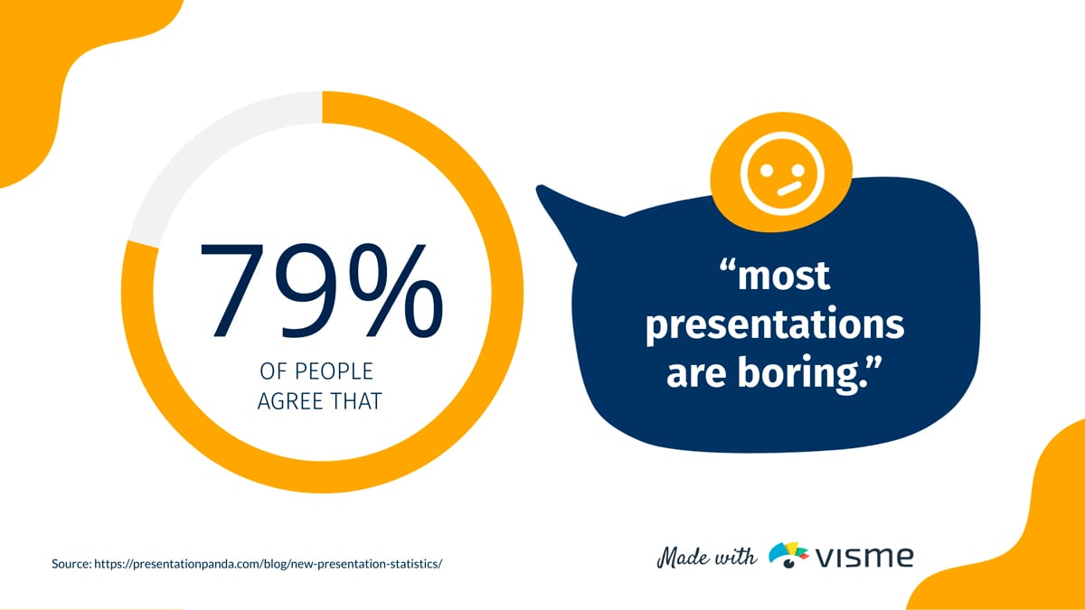
Research shows that 80% of people will read a headline, but only 20% will read the rest of your content, so if you want your infographic to grab your audience’s attention, get your headlines right.
A formula I like to follow to craft a compelling infographic header is:
Our favorite formula for crafting a compelling infographic header is: Number + Adjective + Noun + Keyword + Promise.

So for example, you might be interested in an infographic showcasing 8 Surprising Tips for Lead Generation That Will Exponentially Increase Conversions.
In this title, we have:
Easy enough, right? Try to put this formula into play within your next infographic headline.
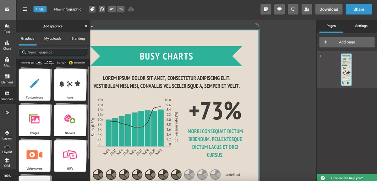
There are so many different types of charts, graphs and data widgets that you can add to your infographic. And with Visme, you can make all your data visualizations interactive and engaging.
There are dozens of data visualizations to choose from:
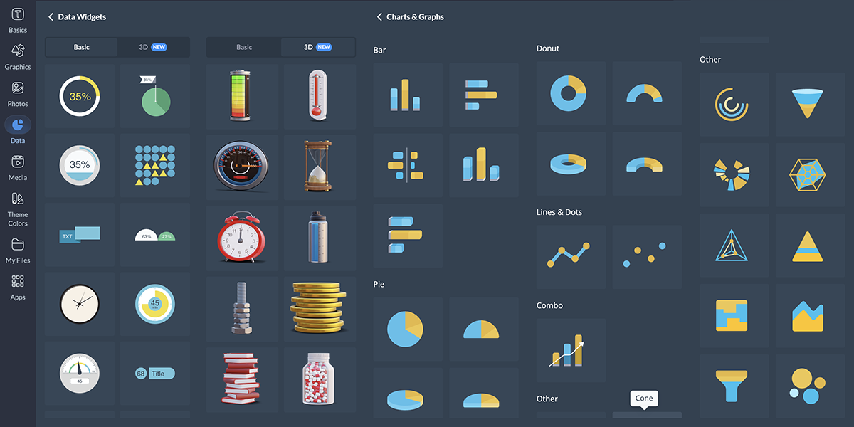
But how do you know which chart to use when? We’ve put together a guide on creating charts and when to use each one to help you out, but we’ll summarize quickly below.

In an infographic, you can easily combine multiple types of graphs and charts all into a single infographic design by strategically placing them around your design. And since infographic dimensions are traditionally longer, you have plenty of space to do this.
But while you’re adding interactivity and animation to your content, don’t forget why you’re doing it in the first place: to make your infographic more engaging.
Here’s what Alejandra Mariscalez, Design Manager at Visme has to say about this:
Design Manager at Visme
Regardless of what topic your infographic is about, the main goal in a good infographic design is to have a solid balance between the text and the visuals throughout.
Here’s a great example of what we mean by this. Take a look at the two infographic blocks below.
Sign up. It's free.Want to create your own beautiful infographics?
It’s easy to see which of these two infographic blocks is more eye-catching and therefore, a more effective infographic design.
In the first example, there’s entirely too much text, especially for an infographic.
The best way to create balance is to parse your information down to just the essentials, as we see in the second example.
Not only that but adding decorative elements to your text, like a background color or a call-out, is the perfect way to offset your visual right next to the text and pull the entire infographic design together.
Alejandra emphasizes that having too little content can also be a negative.
Design Manager at Visme
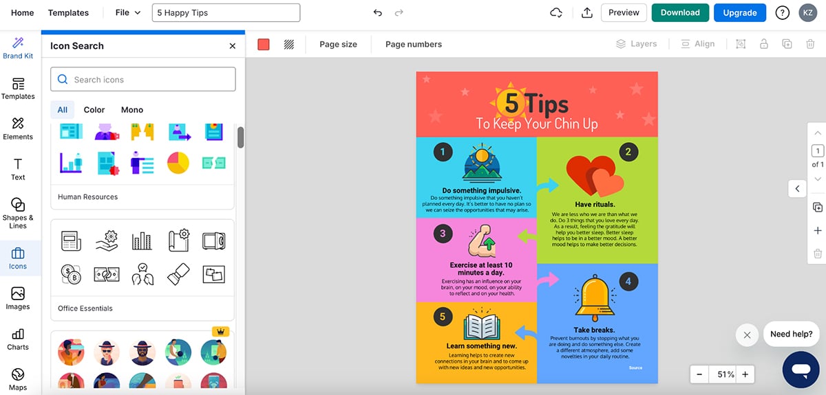
When creating an infographic, you’ve got a whole world of design elements at your fingertips. And Visme’s extensive library offers everything you need to make your infographic visually stunning.
You'll find icons to symbolize concepts, shapes and lines to create structure and flow and text frames to organize your content.
But that's just the beginning.
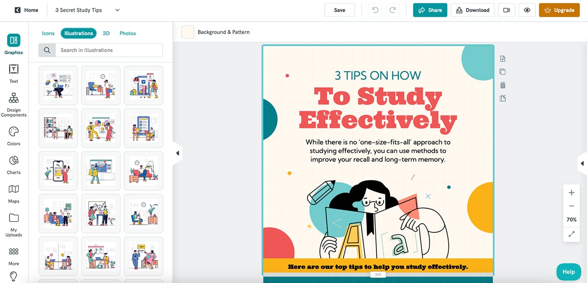
You can add depth with 3D elements, bring emotion with 3D characters and illustrations and create movement with animated graphics.
Visme also has a stock photo library integration through Unsplash that lets you access over a million free images.
You just need to determine what kind of design you’re going for and make sure your elements match.
For example, if you choose to use icons in your infographic, you need to stick with the same style throughout. Doesn’t matter if you want to add isometric illustrations, icons or 3D elements to your infographic, make sure the style, size and color is consistent throughout the project.
I asked Hylie Zhan, Graphic Designer at Visme, about the common design mistakes she sees non-designers make, and here are the major ones she pointed out.
Your next challenge is to tackle your infographic’s color palette. To create an infographic design with colors that make sense, you have two things to keep in mind:
Take a look at this infographic below for a cheat sheet guide into color meanings and the positive and negative connotations they hold.

Choosing an infographic color scheme requires understanding your audience, your topic, your brand and the basics of color to ensure you’re choosing the best colors for your design.
Once you’ve got your colors, it’s time to focus on fonts. Do you want to just use the same fonts in your brand guidelines? Or do you want to explore other typography options?
Finding fonts that pair well together can seem like an art form all its own, but it doesn’t have to be that way.
Try choosing a bold serif or sans serif font for your headers and an easy-to-read sans serif font for your infographic copy. This is the perfect way to take a great infographic design to the next level.
And if you’re still not sure where to start, here are a few tried and true font pairings that go well together in nearly any infographic typography.

One must-have design principle all comprehensive and beautiful infographics need to have is a cohesive flow.
Take a look at this infographic below. The design provides a clear-cut understanding of where a viewer’s eyes should go first, second, third and so on.

This is important to consider in any infographic design you create, otherwise your viewers could be left with no clear understanding of how they should be digesting your visual content.
You can create flow in a business infographic in a number of ways depending on the way that you plan to present your information. Use numbers, lines, arrows and more.
Contrast is also important in a high-quality design. You want to use colors, fonts and design elements that pair well together but still create enough contrast to stand out and grab attention.
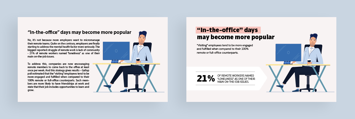
Check out this infographic about remote work trends below. In the example on the left, there’s a monochromatic color scheme of dull blue in a variety of very similar shades.
But in the example on the right, we’ve matched blue and pink, creating much more contrast between the illustrations and the rest of the infographic.
 Pro Tip: The difference between good and bad infographic designs is that the former includes elements that “pop” on the canvas, so viewers can quickly understand the main point of the infographic. Bad designs, on the other hand, have design elements that all look the same, making it difficult for viewers to know where to focus their attention. Adding contrast to your infographics isn't just about aesthetics, it’s about helping viewers navigate content effortlessly.
One major rule in graphic design is ensuring your design elements are clutter-free. This can be avoided by always allowing for enough white space or negative space in a design.
This can be done by including margins in between your design elements as well as the edges of your canvas.
Design Manager at Visme
Take a look at the two examples below. There’s a definite don’t on the right as we see small margins and design elements nearly touching each other.
By contrast, the left keeps equal margins between elements and plenty of white space around the design. This makes for a balanced infographic design that your viewers will flock to.

The last tip is to always, always, always cite your sources.
Whether it’s research you conducted yourself, statistics from a trusted website or data from your own blog post, you want to include where the information came from.
This helps ensure your infographic is a credible source of information and that you’re fact-checking everything you’ve compiled.
Take a look at the infographic footer example below:

This helps ensure your infographic is a credible source of information and that you’re fact checking everything you’ve compiled.
Infographics are a smart tactic in any SEO and marketing strategy, so ensuring people feel comfortable sharing your content by adding sources is essential.
Want more infographic design ideas, check out this video:
Now that we’ve covered 12 essential infographic tips, let’s dive into 15 of the best infographic design examples to help you create your own infographic.
If you’re looking to create a listicle infographic in order to visualize a list of items or concepts, this infographic template is a perfect option.
Simply customize the content with your own list, search for icons that perfectly represent each item, brand the design and download.

Anatomy infographics are great for showcasing so many different things, from actual body parts to parts of a computer to ingredients in a food dish.
You can use the above human body anatomy infographic template to showcase the anatomy of a job, body parts and so much more.

Sometimes all you need is to showcase information in a more visual and digestible way. This informational infographic template is perfect for visualizing a list and making it easy to share your content.
Customize the above template with your brand colors and fonts, input your information and share with your audience.
Pro Tip: Once you’ve finished designing your infographic, share and publish it with your audience using a link, embed it on your blog or website or a QR code. Visme lets you track analytics of all projects shared using the “Share” button inside the editor, so you can see who has viewed your infographic, from where and for how long.
A statistical infographic is probably what people think of first when the word “infographic” comes to mind. This is where you’re visualizing data, statistics and numbers using charts and data widgets.
However, it doesn’t have to be the only type of infographic you focus on, as you’ll see in the variety of templates we’ve included in this list.
But if you do have a list of statistics you want to share with your audience, this template is the perfect starting point.
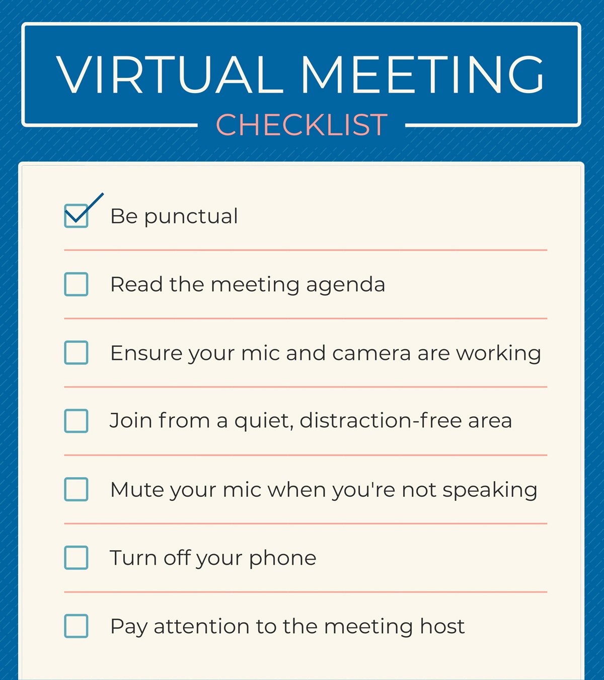
A checklist is a perfect way to visualize information that people need to remember, and this infographic template is just the one you need to get started.
Customize the template above with your own checklist items and encourage your readers or followers to save and print it for their own needs.
Infographics don’t always have to be long-form, vertical graphics. If you want to visualize a single, quick statistic, a mini infographic template like this is the perfect way to do so.

Infographics are also a great tactic in a brand's content marketing strategy, as we can see with the above template. We actually created this to accompany a blog post from Neal Schaffer, and you can easily customize this template or create your own infographic to summarize your blog content.
If you want to design infographics for Instagram, check out this blog for unique ideas and how to create your own.

Comparison infographics are another great way to visualize information, especially when comparing companies, products or services, like you see here in our template comparing Visme vs. Piktochart.
Customize this with information about your own company or switch it up completely to add comparisons about something totally different. Just keep it relevant to your brand.

There are many different ways to showcase your brand guidelines, but one of your options is in infographic form. Customize this template with your own logo, colors, fonts, patterns, brand information and more.
Learn about the best practices for designing high-quality infographics by clicking here.
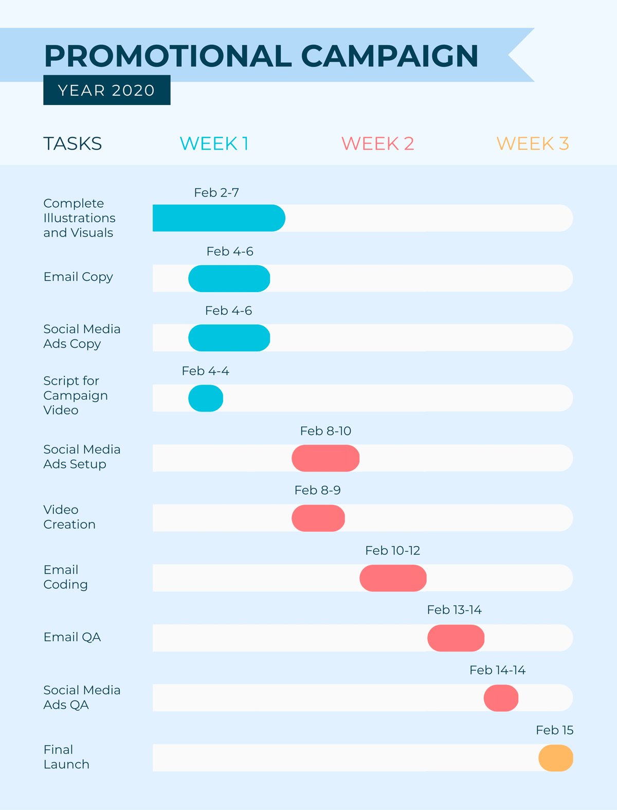
Creating visuals for project management is a great way to keep everyone on the same page, whether it’s a project plan or something like this Gantt chart.
Next time you need to visualize a project timeline, customize this Gantt chart template to share with your team.
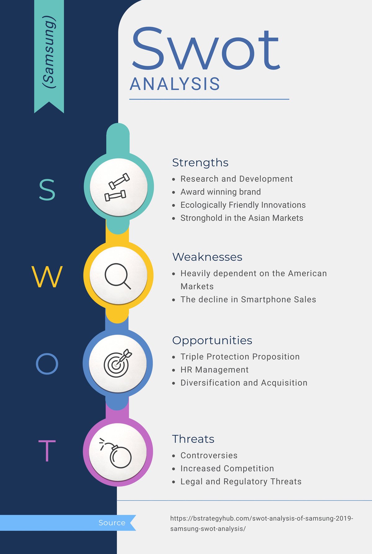
A SWOT analysis is a great tool to have when creating or adapting a business plan or marketing strategy. It gives you an idea of what your strengths and weaknesses are as well as the opportunities and threats to be aware of in your industry.
This SWOT analysis infographic template is a great one-sheeter to have with you when analyzing your performance.
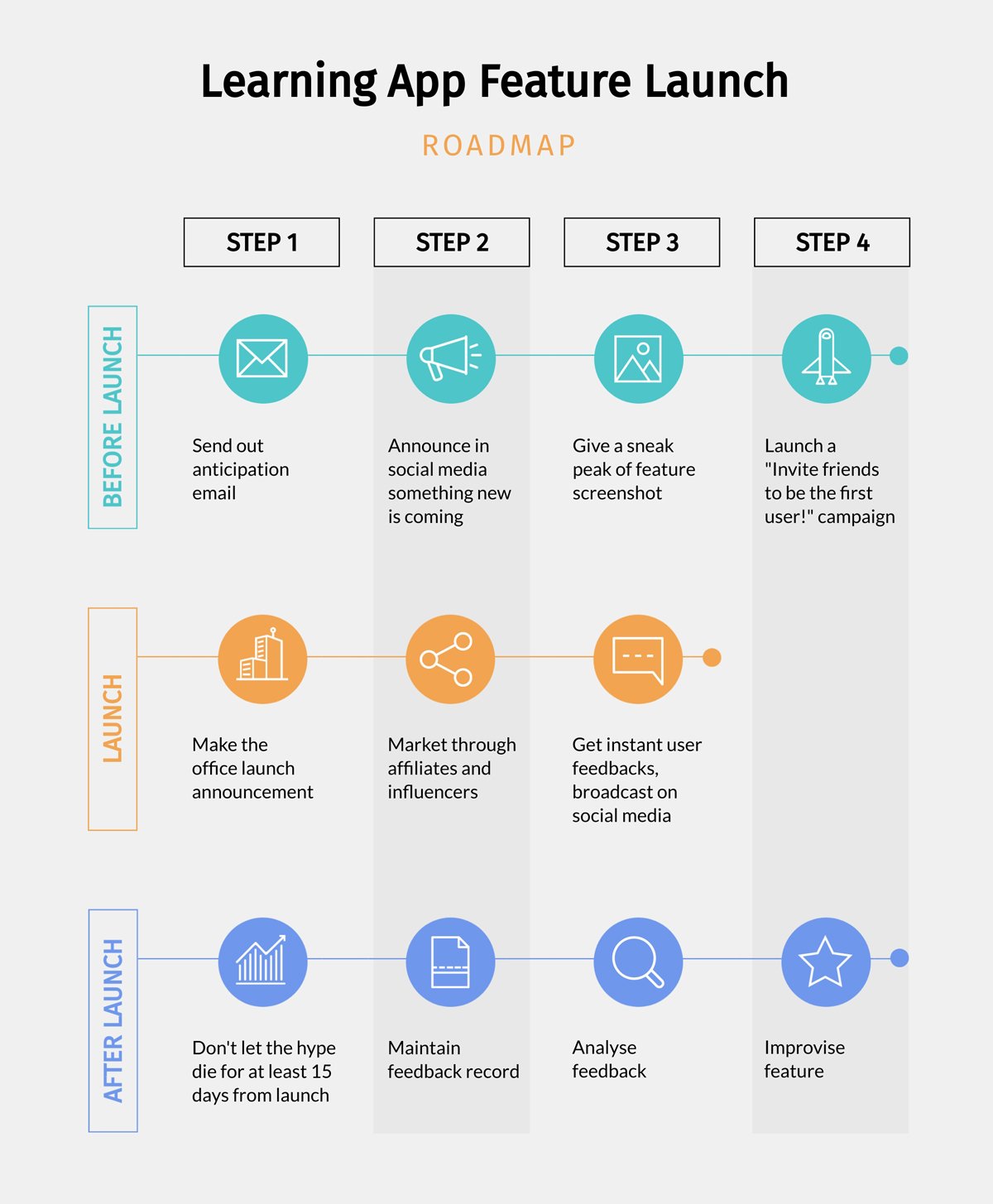
Getting ready to launch a new product? Putting together a roadmap or a process infographic is the best way to present your launch timeline in a visual format.
Utilize this product roadmap infographic template the next time you’re launching anything, whether it’s a new product, service, online course, etc.
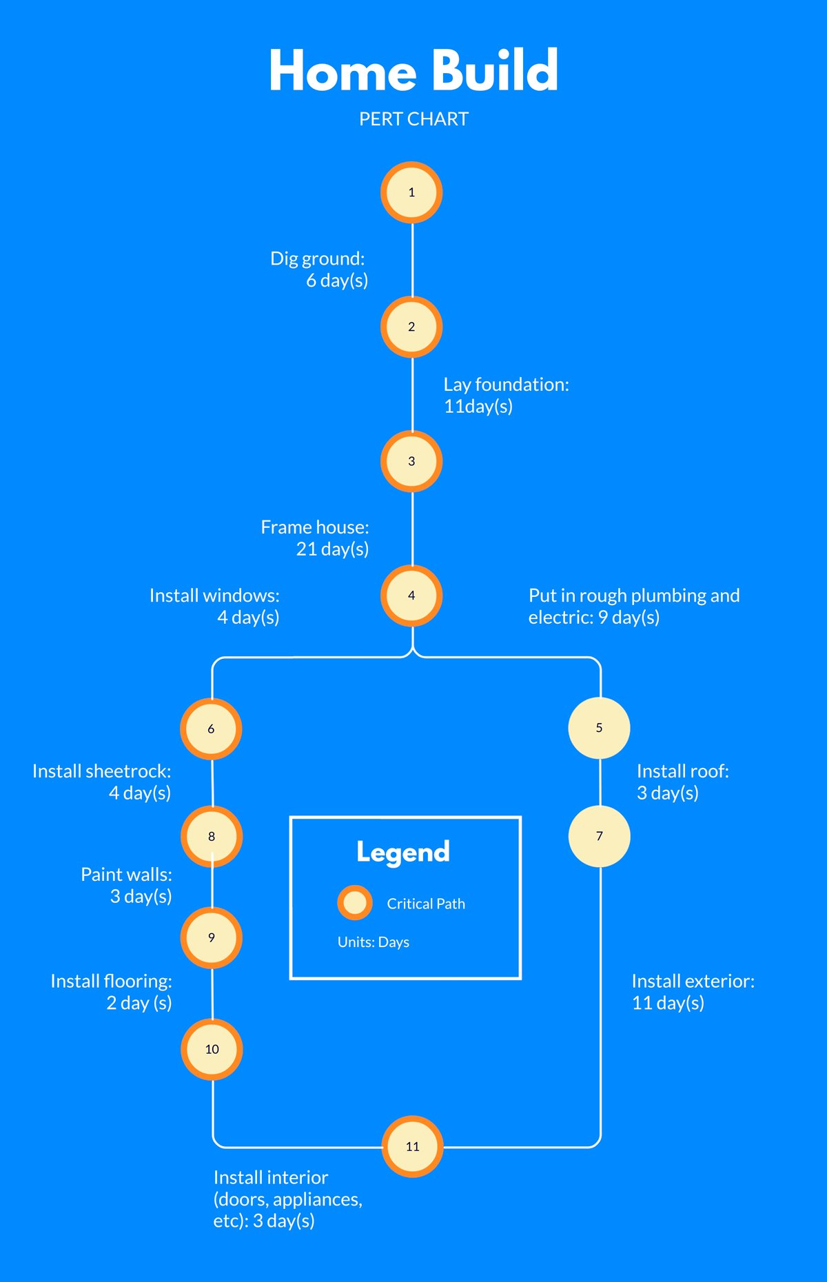
PERT charts are more technical flowcharts, visualizing exact steps between project phases. This template is the perfect starting point for a more straightforward process visual.

Timeline infographics are so useful for so many things – the timeline of someone’s life, a company’s history, an era in history and so much more.
This creative timeline infographic template is the perfect way to visualize a biography or historical time period.
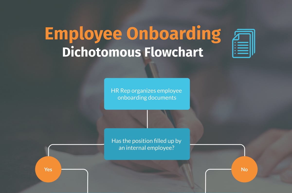
A dichotomous key is another type of flowchart that asks yes or no questions before leading users onto the next step in the process.
Use these for both creative and professional instances by simply customizing the above template and moving the flowchart elements around to fit your narrative. In this post, we've covered the topic of dichotomous keys and how to create one.
Did you know IBM uses Visme’s infographics as part of its recruitment strategy? Check out this case study for more details. Spoiler alert: it reduced their costs and time per job posting by 75%!
This infographic design guide will be incomplete if we don’t talk about the tools needed to design stunning infographics.
I’ve searched the web, compiled a list of top infographic makers and tested each of them to see who they’re best for.
But before we go ahead, here’s a quick breakdown of the testing methodology I followed:
If you’re short on time, check out this comparison chart of the top infographic makers I’ll be discussing in detail in this section:
| Software | Key Features | Best for | Pricing | G2 Rating |
| Visme | 1,000+ ready-to-use templates, 30+ types of charts and graphs, interactive data visualization, editable design assets, AI design generator, AI image generator, 3D character creator, real-time collaboration, brand kit features, third-party integrations | Businesses, educators and teams | Free;Paid from $12.25/ month | 4.6/5 |
| Canva | Massive template library includes both in-house and third-party designs, AI-powered Magic Studio, brand kit, real-time collaboration, third-party apps. | Small business owners, marketers and teams | Free; Paid from $15/month | 4.7/5 |
| Venngage | Extensive library of templates and design elements, smart data import, brand kit management, AI design assistant | Marketers, professionals and data analysts | Free; Paid from $10/month | 4.7/5 |
| Piktochart | Built-in templates, animation toolkit, AI infographic generator, smart resize tool | Educators, nonprofits and small businesses | Free; Paid from $14/month | 4.4/5 |
| Infogram | Data visualization tools, smart template library, team collaboration capabilities, interactive features, multi-format publishing | Data analysts, marketers and teams | Free; Paid from $19/month | 4.7/5 |

Visme is an incredible infographic maker due to its extensive template library, millions of design assets, AI-powered capabilities and flexibility in creating every single type of visual content available.
It's pretty straightforward to get started—pick a template, and start customizing the graphics, fonts and colors to match your design aesthetic.
But if you don't want to go through the hassle of manually uploading your branding to the template, they have an AI-powered brand wizard that automatically pulls all design assets from your website and stores them for future use. This saved me at least 20 minutes to design the infographic—a definite win.
I love the usability of Visme’s AI writer too. All you have to do is enter a detailed prompt (like you normally would in ChatGPT) and wait as the AI produces actually usable first drafts. You can edit them to fit your tone or ask AI to regenerate.
I also liked how easy it was to take my designs to the next level by adding animation and interactivity to the content like textboxes, data visualization and other graphic assets.
From reports to presentations to video infographics to newsletters, I found Visme the perfect visual content creator to keep in your toolbox.
Visme’s free, basic account has everything you need to get started with any type of visual content, not just infographics. The paid plans are as follows:

Canva is another infographic software I tested. It has thousands of custom templates, a built-in asset library, a drag-and-drop interface, AI capabilities, solid animation features and plenty of third-party apps.
Getting started is easy. Once inside the editor, Create a design → Infographic → Select a template → Start editing.
I liked the asset library which comes with plenty of free options. Click on the asset you want to add to the project then resize, change colors, add animations and interactivity to customize it to your liking.
Once you’re done editing, download your infographic for offline use, or share it with your audience using a public view link, embed it on your blog or QR code.
You can get started with Canva for free. The paid plans are as follows:

Next on my list is Venngage. I loved the short onboarding questionnaire they had me fill out after I signed up for the tool. It was short, non-intrusive and provided value for new users.
Venngage has an extensive template library, built-in design elements, multiple interactive elements and powerful AI-powered capabilities like AI writer, Alt text generator, AI background remover and AI branding.
There are plenty of data widgets to choose from, but I found Visme much better for data visualization. And it also has a map generator where you can granular with the country of your choice—I like this option but couldn’t test it because you need to be a premium member.
Venngage has multiple download and sharing options, but you can’t use any of those features if you’re a free user.
Venngage has a free plan with plenty of free templates and assets, but you won't be able to share or download your project. The paid plans include:

Piktochart is another great infographic maker that comes with an extensive template library, an intuitive drag-and-drop editor and powerful data visualization capabilities.
I liked that it has an AI infographic generator for people who don’t want to go through the hassle of finding a template. Simply choose the type of infographic you want to create, enter the topic, select a style that matches your aesthetic and click on Edit on the top-right of your screen to get started.
There are plenty of free assets to choose from as well—icons, illustrations, stock photos, charts, maps and built-in design components to speed up the creation process.
Once you have a design you like, download the infographic for offline use (you get 2 downloads on the free plan) or share it publicly on the web via an embed code or directly to social media.
Piktochart has several paid plans:
Individuals & Businesses
Teachers & Students
Nonprofits

Last on my list is Infogram—a versatile infographic maker that comes with an extensive template library, drag-and-drop editor and powerful data visualization capabilities. It's also a great Piktochart alterative to consider.
I like how easy it was to get started with the platform. Just had to click on Templates (you can also begin with a blank canvas, or create a design using AI), pick a design, assign a name and…done.
Once inside the editor, everything was pretty straightforward. There are plenty of visual assets to choose from, including high-res images, animated stickers and GIFs.
But what really caught my eye was Infogram’s data widgets. There are plenty of options to choose from like Tornado diagrams, Sunburst, Stream area, Sankey and Alluvial. You can change their colors, add legends or animate the data widgets to make the infographic more engaging.
If you’re using the free version of Infogram, you can share your project via a link, embed on your website or directly to your socials. But to download your projects in JPG, PNG, PDF, GIF and MP4 formats, you'll have to become a paid member.
Infogram offers a free plan with complete access to interactive charts and other visual elements in the editor. Their paid plans include:
For more info, check out this article: Infographic Cost: How Much Is It & How to Save
An infographic design is a visual representation of any kind of information, data or knowledge. It combines different types of charts and graphs and other elements like text, images and diagrams to provide a summary of a complex topic.
While most infographics have one-page designs (for impact and shareability), they can vary in length when needed.
Your infographic design is considered good as long as it communicates your message without overwhelming the reader. This can be done through eye-catching visuals, consistent colors and styling, minimal text, relevant charts and icons and logical information flow.
The four important elements of an effective infographic design are:
Creating compelling infographics from scratch doesn't have to be difficult.
With this infographic design guide, you'll be able to create a beautiful and effective visual quickly and easily. Sign up for a free account to create your first infographic.
Design visual brand experiences for your business whether you are a seasoned designer or a total novice.
Try Visme for free


![How to Make an Interactive Infographic [+Templates]](https://visme.co/blog/wp-content/uploads/2023/11/How-to-Make-an-Interactive-Infographic-Quick-Guide-8-Customizable-Templates-Thumbnail.jpg)


