Visualize Your Data With Customizable 3D Charts
- Edit your 3D charts by rotating their position, adjusting the size or changing colors and fonts.
- Five options to choose from: line and multi-line graphs, or bubble, pie and ring charts.
- Add them to your presentations, documents, infographics or any of our 100+ content types.

Chosen by brands large and small
Customer Satisfaction 98%+
Used by 34.3 million users
What Can You Do With The 3D Chart Maker?
Easily Customize Your 3D Chart’s Appearance
Using the 3D chart editor, you can customize and personalize your chart’s visual appearance. Color code the data sets in the Chart Data tab by clicking on the color tiles. In the Settings tab, change the font, color and size of all text elements like the heading, axes points and legend. Also, show or hide the axes and legend with a simple toggle. Toggle the automatic 360 rotation on or off. Finally, adjust the viewing angle of your chart and select whether it will rotate or remain stationary when viewed.
Input, Upload or Connect Your Data
When adding data to the 3D chart maker, you have a few options. You can add the data by hand, but why waste time? You can also copy and paste from a spreadsheet. Or even better, import the data directly from Google Sheets, Excel, Google Analytics, Survey Monkey, SmartSheet or Airtable. And if you want to show live data that updates with a simple refresh, connect to a Google Sheet that’s published to the web, your Excel Online account or your Google Analytics dashboard.
Make Your 3D Charts Interactive
Your 3D charts come equipped with animation and interactivity right out of the box. When people view your 3D chart, it’ll rotate 360 degrees automatically (you can toggle this off if you want, but keeping it on makes your chart super different and edgy.) Additionally, there’s a setting where you can choose to offer viewers the ability to rotate the chart manually so they can see all angles. Finally, you can also use Visme’s animation features to add entry and exit movements to your chart.
Share, Download or Embed Your 3D Chart
Getting your finished 3D chart into the world is simple. Download it as a PDF, JPEG, PNG or HTML file. Keep the chart’s interactivity intact by sharing online with a live link or embedding it onto your website or an email. You can also send it to another app using our integrations with Hubspot, Salesforce and more. Finally, include a chart in a social post and publish to social media through the content calendar. Regardless of whether you created the chart on its own or inside an ongoing visual project, the options are the same.
3 Easy Steps to Make a 3D Chart
From your dashboard, open the editor with a blank canvas or pre-designed template. In the left-hand toolbar, select Data > 3D Charts. Choose one type and input your data.
Change the colors of the data points. Adjust the fonts, color or size of the headings, labels and legend. Set the chart to rotate or stay still, and choose the option for viewers to be able to interact with it. Hide or show the axis and remove the background if you want to layer the chart over something else.
If you added the 3D chart inside another project, align the colors and fonts to match the rest of the content. To accompany your chart graphic, add a descriptive text box or a relevant image. Otherwise, save the chart as a content block and place it inside a report, presentation, infographic, ebook or white paper.
Classic Charts and Graphs
Display your data beautifully with thousands of amazing templates. Customize line charts, bar charts, pie graphs, Mekko charts and much more to easily amplify your brand or design. Upload data or connect live to Excel Online, Google Sheets, and more.
Visualize Location Data With Maps
Use interactive maps to present location data in any Visme-made project or document. Easily add and personalize hover effects. Apply a custom color scheme to match your brand guidelines or a selected palette.
Unique Data Widgets
Quickly visualize snackable data with dozens of drag-and-drop widgets. Our in-house designers have created 2D and 3D data widgets for numerous industries and use cases. You won’t find them anywhere else. Customize them in seconds using your brand colors and style. Easily resize them to fit your design, layout or project.
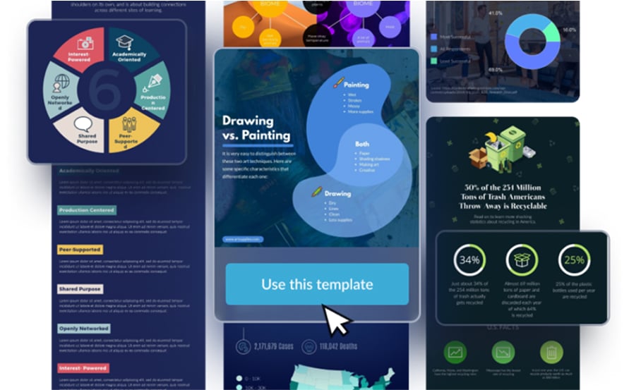
Tell stories with infographics and pictograms
Use any of the hundreds of customizable templates plus a full library of icons, characters, and more. Build a custom layout from ready-made content blocks and infographic shapes that display data, images and text.
Much More Than
a 3D Chart Maker
Visme is a unified content platform where you can create 3D charts and so much more. There isn´t just an editor full of incredibly helpful design and editing features, there’s also an infinite whiteboard where you can collaborate in real time with your team. Plus, Visme makes branded content management easy with the brand kit and media library.
Over 100 Content Types
Make, create and design over a hundred types of content. We have templates for digital documents, presentations, infographics, social media graphics, videos, GIFs, wireframes, whiteboards, flowcharts and more.

Complete AI Toolkit
Supercharge your designs with Visme’s AI toolbox. Create complete designs from a prompt with Visme AI, generate and edit images, craft text, get enhanced search results, and build your brand effortlessly.
Interactivity Features
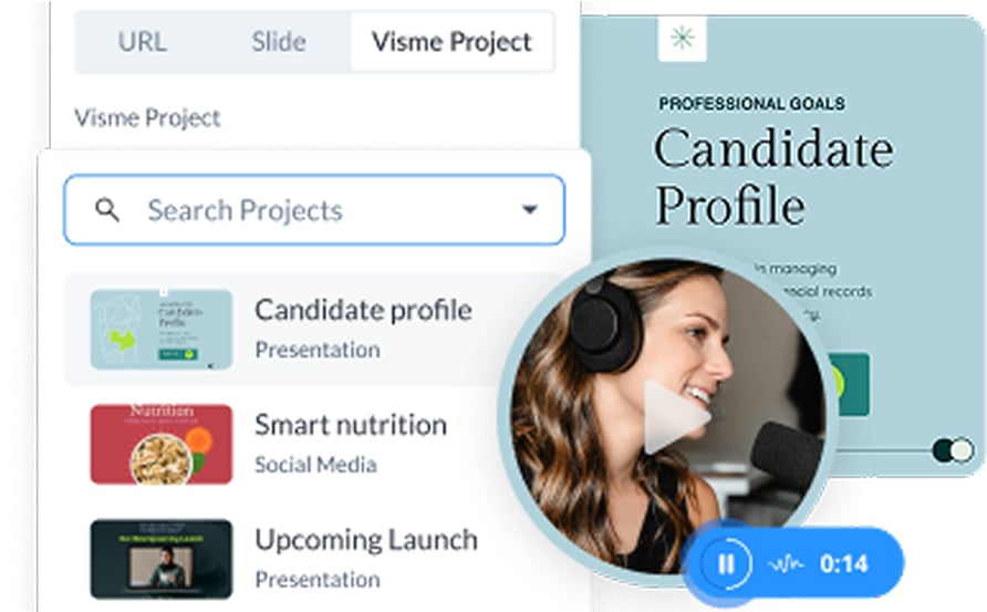
Access Visme’s easy-to-use interactivity and animation features to make your content more engaging. Built interactive experiences with hotspots, popups, embedded media, voice narrations, and video recordings.
Frequently Asked Questions (FAQs)
3D charts add depth to your data visualizations, making them more engaging than our classic 2D charts. 3D charts look different because they use perspective to create an immersive viewing experience. They also rotate and have adjustable viewing angles.
Visme’s 3D chart maker is designed for users of all skill levels. You can easily customize colors, fonts and sizes in a few clicks. You can also color-code your data and adjust elements like axes and legends.
Creating a 3D charts with Visme is quick and straightforward. Once you have your data ready, you can set up a 3D chart in just a few minutes. Applying basic customization might take you 5 minutes. Including the chart with other elements or incorporating it into another project may require a bit more time.
As of now, there are line graphs, circular graphs and bubble graphs. Our designers are working on creating more.
Visme offers five different 3D chart types. Line graphs for showing trends over time, multi-line graphs for comparing multiple data series, pie charts for displaying parts of a whole, ring charts for a different take on pie charts and bubble charts for showing relationships between three variables.
Yes, Visme makes it easy to use your own data in several ways. You can manually enter date, copy and paste from spreadsheets, or import directly from Google Sheets, Excel, Google Analytics, Survey Monkey, SmartSheet or Airtable. To share live data, you can connect to a Google Sheet published to the web, Excel Online or your Google Analytics dashboard.
3D charts can be added to any Visme project, whether you’re creating a presentation, report, infographic, document or social media graphic. You can also create standalone charts and save them as content blocks to use in future projects. Once you add a saved chart to the canvas of another project, you can easily resize, reposition and recustomize as needed.
Visme offers both free and premium features for 3D charts. You can create and customize 3D charts with a free Visme account, but some advanced features and export options do require a premium subscription.